Overview Version History Q & A Rating & Review
Device Simulator
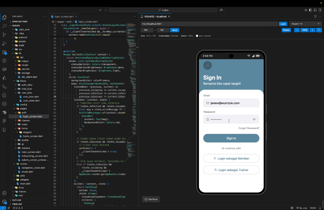
Test responsive design website Anda langsung di dalam VSCode tanpa perlu membuka browser! Device Simulator memungkinkan Anda untuk melihat bagaimana website Anda tampil di berbagai perangkat mobile dan tablet dengan mudah.
🖥️ Local Web preview
📱 Emulator Android/IOS
✨ Fitur Utama
🎯 15+ Device Presets - iPhone, iPad, Android phones & tablets
📐 Custom Viewport - Atur ukuran viewport sesuai kebutuhan
🔄 Rotate Device - Switch antara portrait dan landscape mode
🔍 Zoom Controls - Zoom in/out (10%-200%) dengan kontrol yang mudah
📏 Manual Resize - Drag handles untuk resize viewport secara real-time
⚡ Live Preview - Preview website langsung tanpa reload
💾 History Manager - Simpan dan akses kembali website yang sering ditest
📱 Run with Emulator - Buka URL langsung di Android Emulator atau iOS Simulator
Auto-detect emulator yang tersedia (Android SDK & iOS Simulator)
Start emulator baru jika belum ada yang berjalan
Support untuk memilih device/simulator yang ingin dijalankan
Smart platform selection (otomatis pilih jika hanya 1 platform tersedia)
🚀 Cara Menggunakan
Quick Start
Buka Device Simulator
Tekan Ctrl+Shift+V (Windows/Linux) atau Cmd+Shift+V (Mac)
Atau klik icon mobile (📱) di toolbar editor (pojok kanan atas)
Atau buka Command Palette (Ctrl+Shift+P) → ketik "Device Simulator"
Load Website
Masukkan URL website (contoh: https://example.com)
Klik tombol "Load" atau tekan Enter
Pilih Device
Klik tombol device selector (default: iPhone 15 Pro Max)
Website akan otomatis menyesuaikan dengan ukuran device
Test Responsiveness
Gunakan tombol "Rotate" untuk mengubah orientasi
Drag resize handles untuk test ukuran custom
Gunakan zoom controls untuk melihat detail
Run with Emulator (Opsional)
Klik tombol "Run with Emulator" atau tekan Ctrl+Alt+E / Cmd+Option+E
Pilih platform (Android/iOS) jika keduanya tersedia
Pilih device/simulator yang ingin dijalankan
URL akan otomatis terbuka di emulator setelah boot selesai
Keyboard Shortcuts
Shortcut
Fungsi
Ctrl+Shift+V / Cmd+Shift+VBuka Device Simulator
Ctrl+M / Cmd+MPilih device type (Web Simulator / Android / iOS)
Ctrl+Alt+E / Cmd+Option+ERun with Emulator (bisa dari mana pun)
Tips & Trik
Quick Device Selector : Tekan Ctrl+M / Cmd+M atau klik icon mobile (📱) di toolbar editor untuk memilih device type:
Web Device Simulator : Buka simulator web-based di VSCodeAndroid Emulator : Langsung pilih dan start Android emulatoriOS Simulator : Langsung pilih dan start iOS simulator (macOS only)
History : Klik sidebar icon untuk melihat history website yang pernah ditestAuto-refresh : Centang "Auto-refresh" untuk reload otomatis saat ganti deviceZoom : Gunakan tombol "Fit" (⛶) untuk auto-fit viewport ke layar VSCodeRun with Emulator : Test website di real device emulator untuk hasil yang lebih akurat
Pastikan Android SDK atau Xcode sudah terinstall
Tombol akan otomatis tersembunyi jika tidak ada platform yang tersedia
Emulator akan auto-start jika belum ada yang berjalan
Shortcut Global : Tekan Ctrl+Alt+E / Cmd+Option+E dari mana pun untuk langsung start fresh emulator
Pilih platform (Android/iOS)
Pilih device/simulator yang ingin dijalankan
Emulator akan start tanpa membuka URL (fresh emulator)
Device Presets
iPhone
iPhone 13 Pro : 390 × 844iPhone 15 : 393 × 852iPhone 15 Pro Max : 430 × 932iPhone 12 Mini : 360 × 780iPhone 14 Pro : 393 × 852iPhone 11 : 414 × 896
iPad
iPad Pro 11 : 834 × 1194iPad Air : 820 × 1180iPad Mini : 768 × 1024
Android
Samsung Galaxy S25 : 360 × 800Google Pixel 9 : 412 × 915OnePlus 10 Pro : 412 × 916Xiaomi 14 : 360 × 780Samsung Galaxy Tab S8 : 800 × 1280Google Pixel Tablet : 800 × 1280
Other
Auto Size : Menyesuaikan dengan ukuran panel
⚙️ Requirements
Visual Studio Code versi 1.75.0 atau lebih baru
🐛 Known Issues
Beberapa website mungkin tidak bisa ditampilkan karena:
Website memblokir iframe embedding (X-Frame-Options header)
Website memerlukan HTTPS dan tidak mengizinkan mixed content
Solusi : Gunakan local development server atau website yang mengizinkan iframe embedding.
👨💻 Author
@tomyoktavian
Dibuat dengan ❤️ untuk memudahkan testing responsive design
Enjoy testing! 🚀


