HUEFORM
VS Code Theme & Icon Collection
“Colour with intention.”



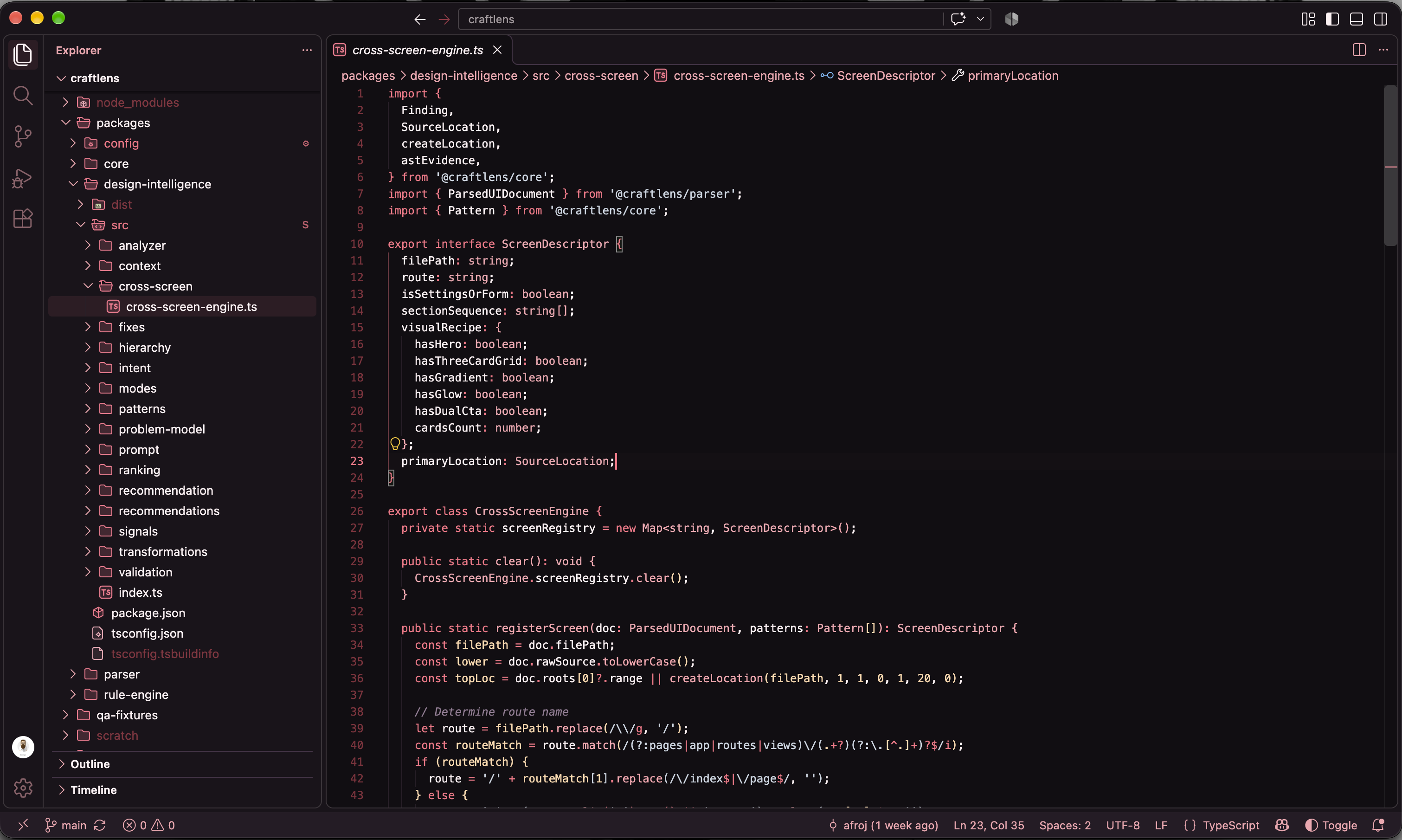
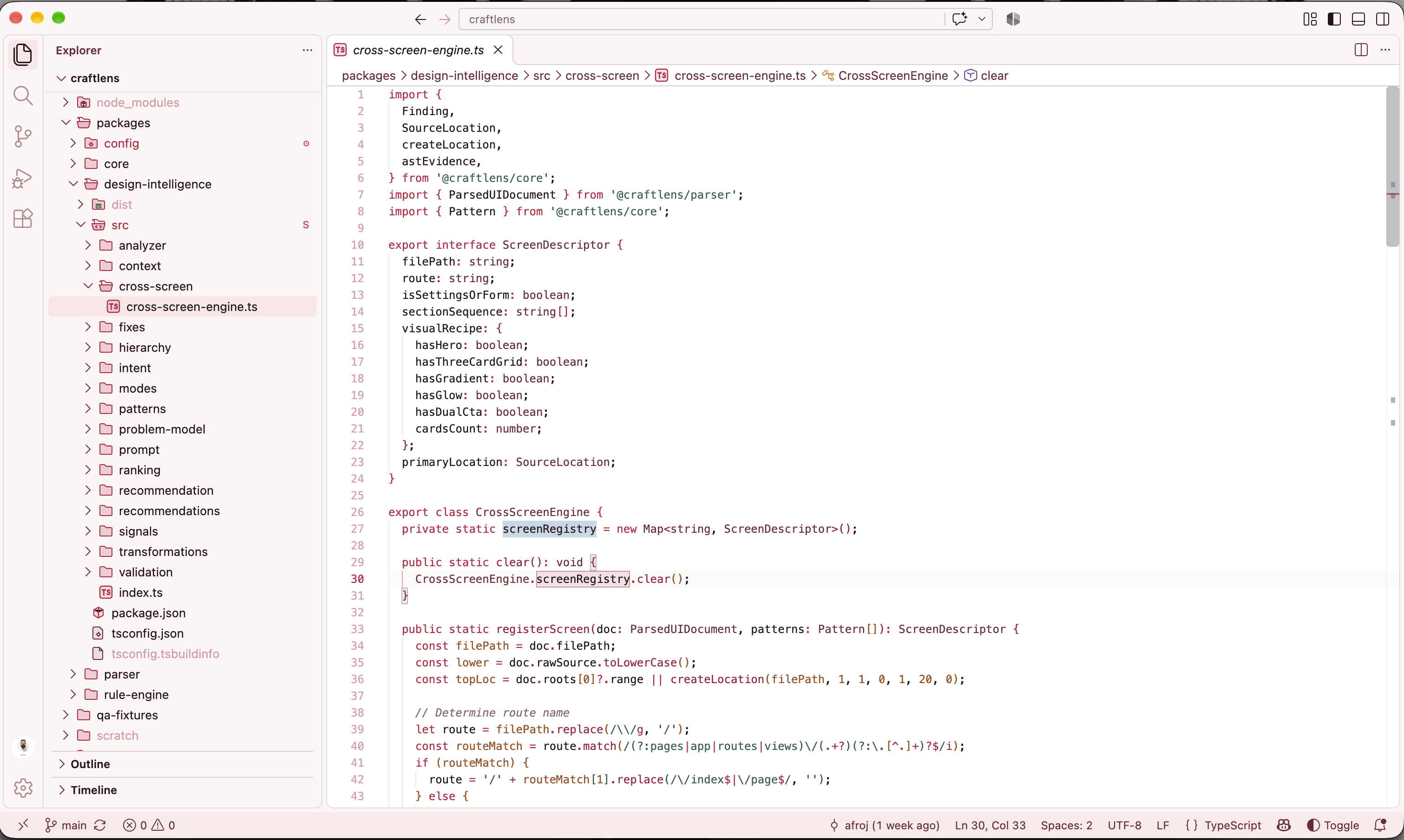
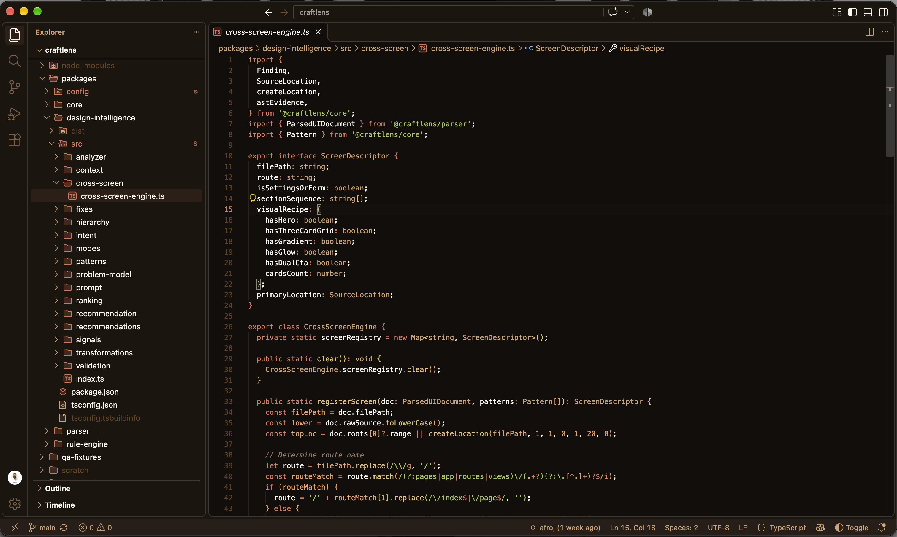
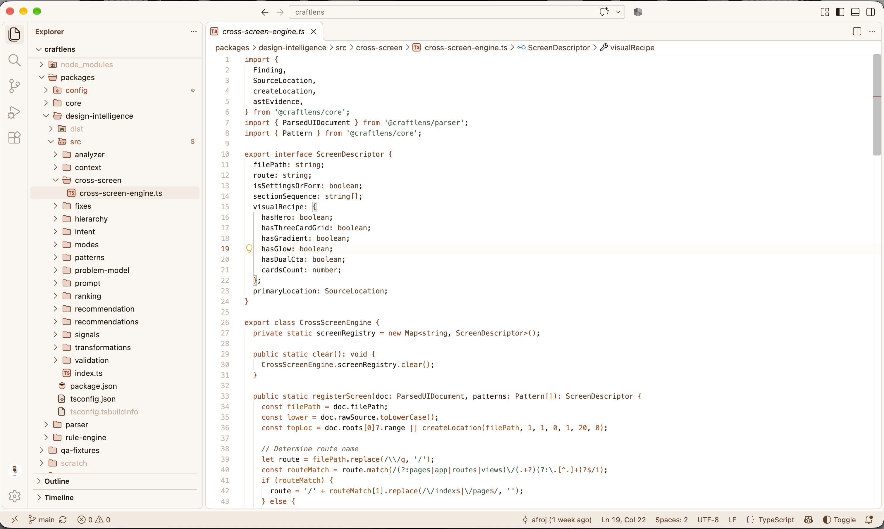
A thoughtfully curated collection of 22 dark and light themes and 22 matching themed file icon sets for Visual Studio Code across 11 distinct colour families. Minimal, design-focused, and engineered for extended daily coding comfort.
Zero configuration required: Choose any HUEFORM colour theme, and the matching file icon theme is applied automatically.
⚡ Installation
Install directly through the VS Code Extensions panel or via the command line:
ext install theaffy.hueform
Alternatively:
- Open Visual Studio Code.
- Press
Ctrl+P (macOS: Cmd+P).
- Paste
ext install theaffy.hueform and press Enter.
- Press
Ctrl+K Ctrl+T (macOS: Cmd+K Cmd+T) to open the Theme Picker and choose any HUEFORM theme.
✦ The Collection & Automatic Icon Mapping
When you select a HUEFORM colour theme, HUEFORM automatically activates its matching icon theme. You never need to manually configure file icons.
| Family |
HUEFORM Colour Theme |
Automatically Applied Icon Theme |
Appearance |
| 01. Abyss |
HUEFORM — Abyss Dark
HUEFORM — Abyss Light |
HUEFORM Abyss Icons Dark
HUEFORM Abyss Icons Light |
Oceanic cyan & deep slate
Clean crisp teal on cool slate paper |
| 02. Nocturne |
HUEFORM — Nocturne Dark
HUEFORM — Nocturne Light |
HUEFORM Nocturne Icons Dark
HUEFORM Nocturne Icons Light |
Ethereal violet & magenta
Rich royal purple on dusk mist |
| 03. Sakura |
HUEFORM — Sakura Dark
HUEFORM — Sakura Light |
HUEFORM Sakura Icons Dark
HUEFORM Sakura Icons Light |
Soft petal rose & crimson
Deep ruby rose on porcelain |
| 04. Umber |
HUEFORM — Umber Dark
HUEFORM — Umber Light |
HUEFORM Umber Icons Dark
HUEFORM Umber Icons Light |
Warm terracotta & amber
Grounded clay & sepia on linen |
| 05. Midnight |
HUEFORM — Midnight Dark
HUEFORM — Midnight Light |
HUEFORM Midnight Icons Dark
HUEFORM Midnight Icons Light |
Electric sky & nocturnal blue
Deep sapphire on canvas |
| 06. Forest |
HUEFORM — Forest Dark
HUEFORM — Forest Light |
HUEFORM Forest Icons Dark
HUEFORM Forest Icons Light |
Luminous emerald & moss
Deep forest botanical green |
| 07. Nebula |
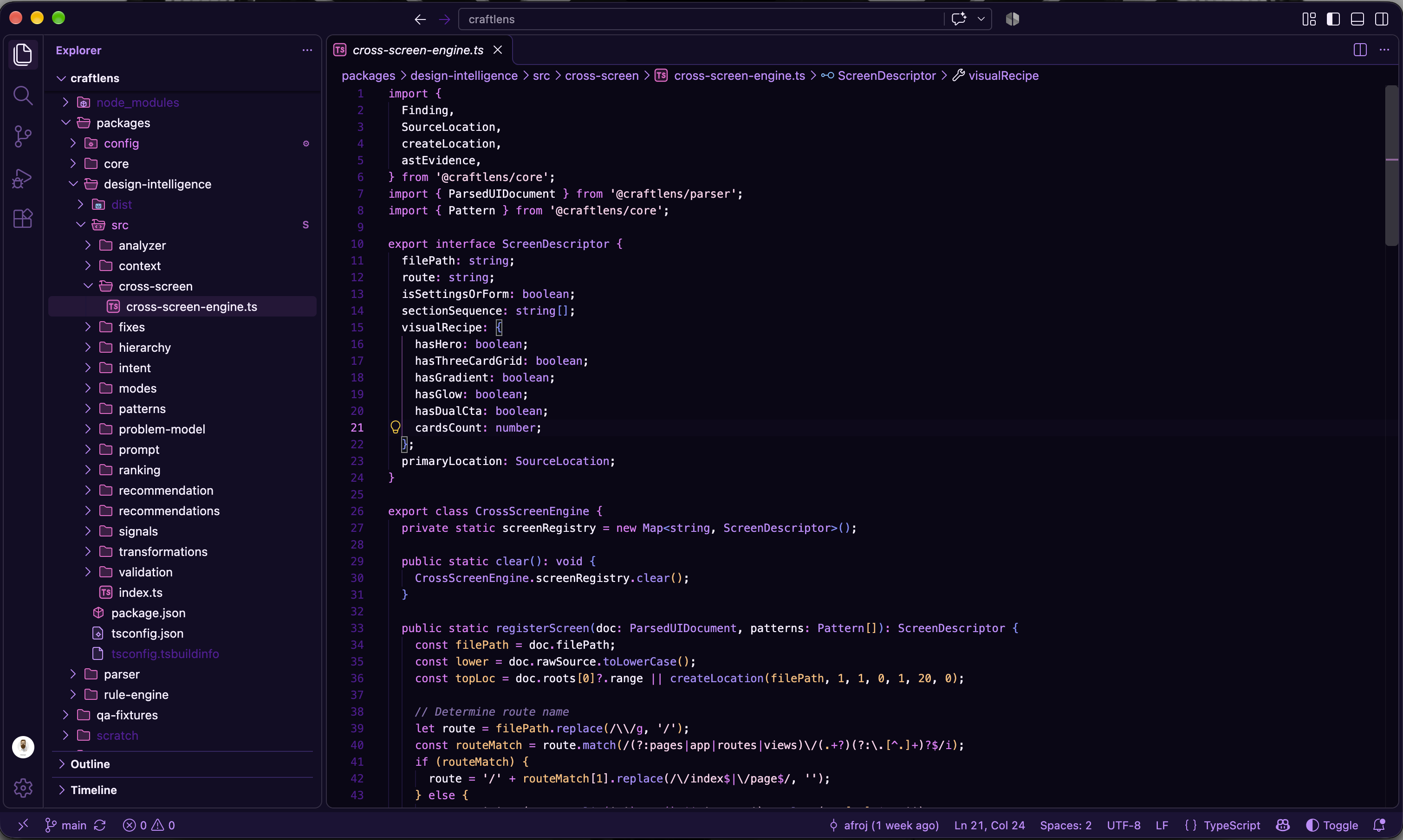
HUEFORM — Nebula Dark
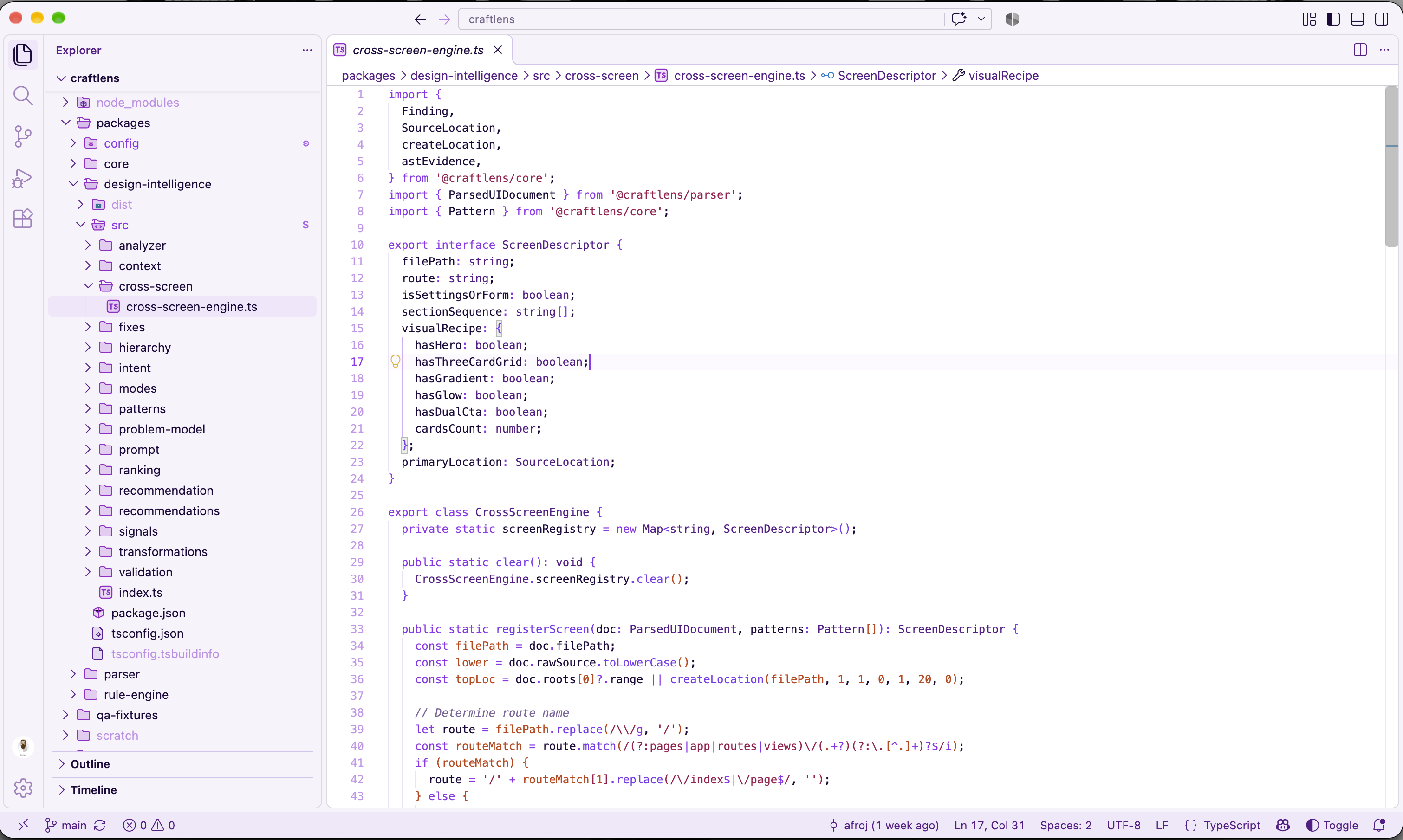
HUEFORM — Nebula Light |
HUEFORM Nebula Icons Dark
HUEFORM Nebula Icons Light |
Atmospheric neon magenta & violet
Vibrant ultraviolet on frost |
| 08. Ocean |
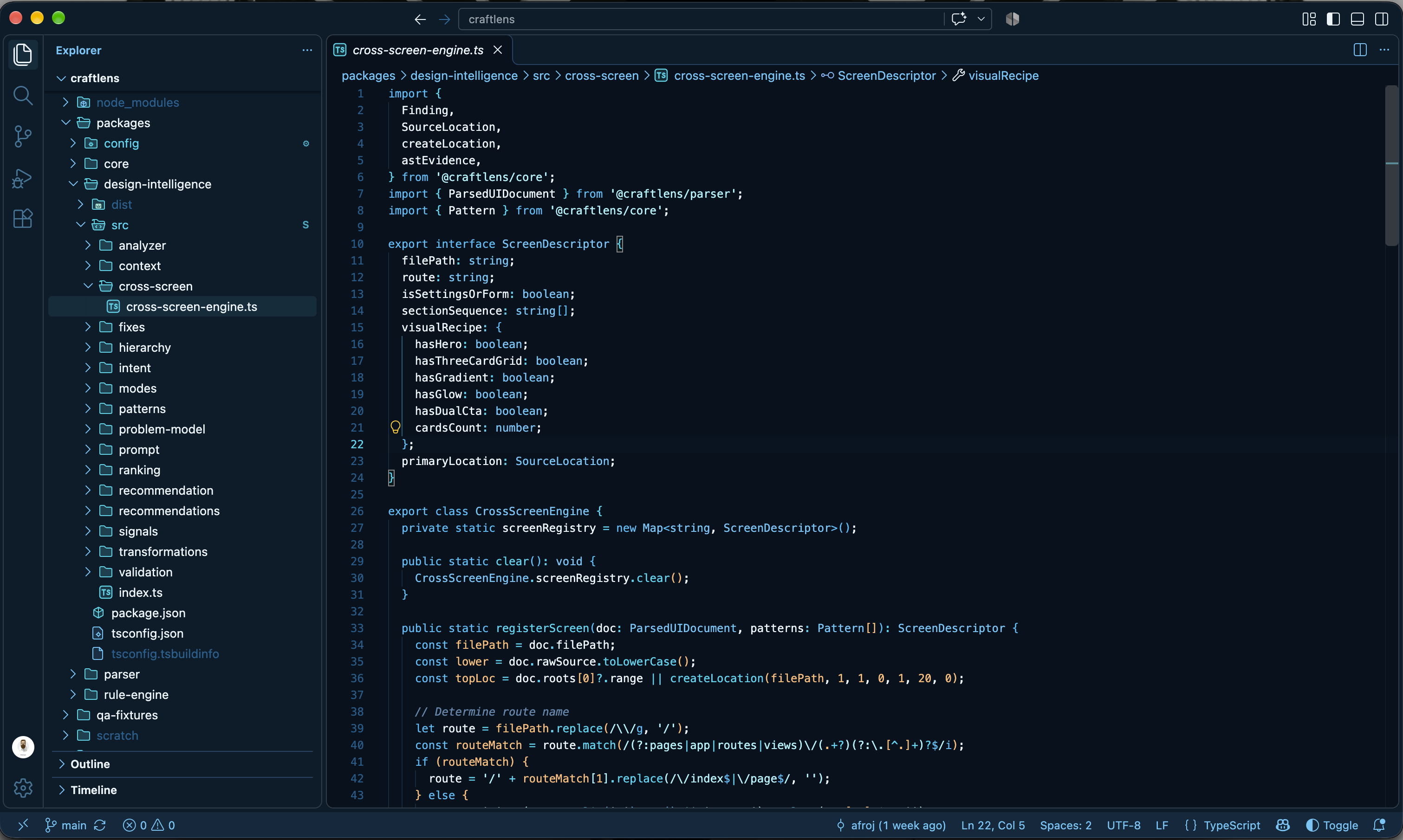
HUEFORM — Ocean Dark
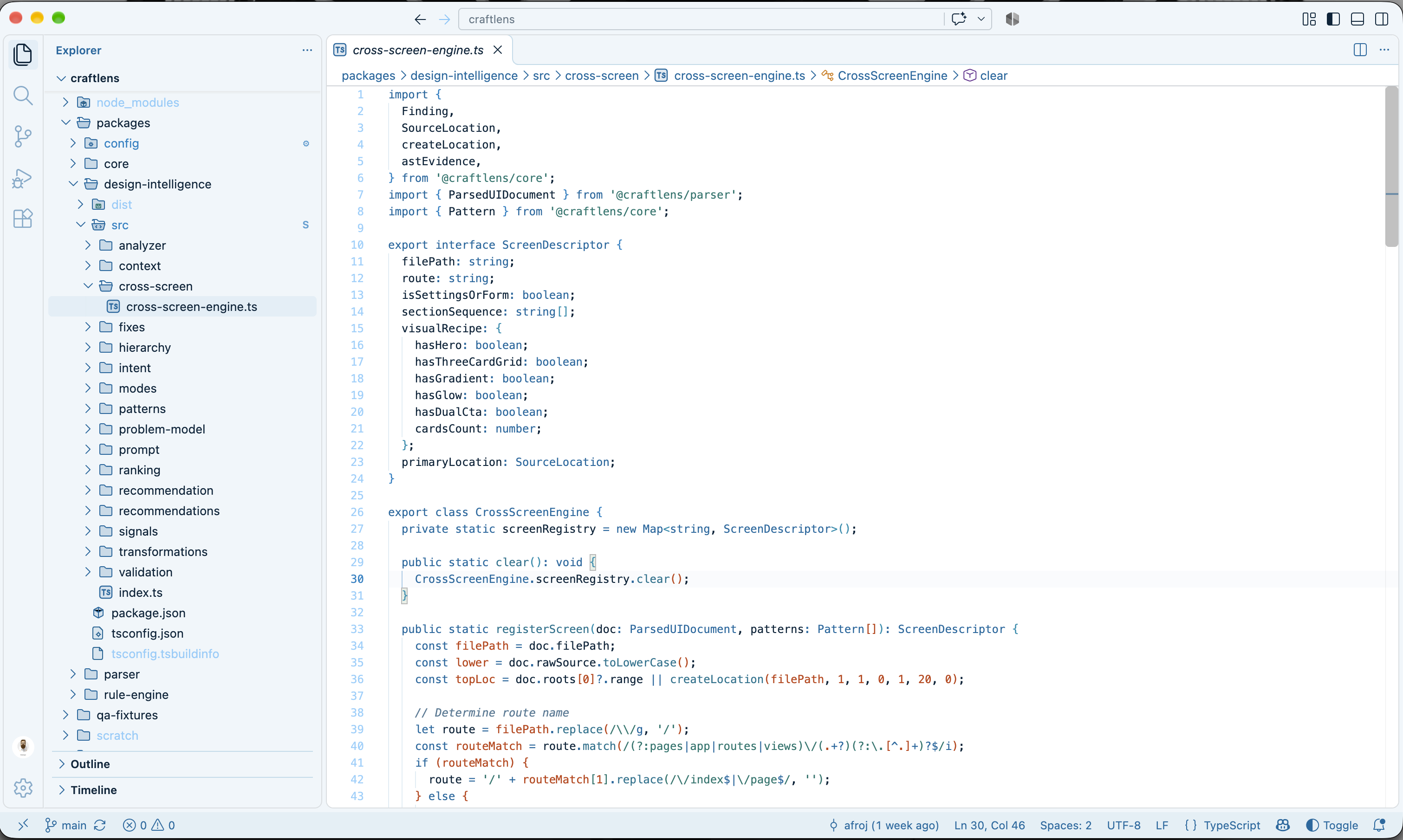
HUEFORM — Ocean Light |
HUEFORM Ocean Icons Dark
HUEFORM Ocean Icons Light |
Vivid cyan & marine turquoise
Deep marine cobalt on sea-spray |
| 09. Ember |
HUEFORM — Ember Dark
HUEFORM — Ember Light |
HUEFORM Ember Icons Dark
HUEFORM Ember Icons Light |
Warm blaze orange & gold
Deep burnt sienna & terracotta |
| 10. Lavender |
HUEFORM — Lavender Dark
HUEFORM — Lavender Light |
HUEFORM Lavender Icons Dark
HUEFORM Lavender Icons Light |
Gentle periwinkle & lilac
Deep royal violet on periwinkle-milk |
| 11. Blossom |
HUEFORM — Blossom Dark
HUEFORM — Blossom Light |
HUEFORM Blossom Icons Dark
HUEFORM Blossom Icons Light |
Playful blossom pink & raspberry
Deep fuchsia wine on porcelain |
🎨 Complete Visual Ecosystem
HUEFORM Colour Theme
        ↓
 ┌──────┼─────────┐
 ↓      ↓         ↓
Surfaces Accent  Syntax
        ↓
   ┌────┼─────┐
   ↓    ↓     ↓
Cursor Tabs Selection
        ↓
   Icon Theme
        ↓
Matching HUEFORM file icons
1. Themed File Icon Themes (Pierre Geometry)
- Minimalist & Geometric: Built upon the clean vector geometry of Pierre Icons (
vscode-icons), engineered on a crisp 16x16 pixel grid for razor-sharp legibility at standard sidebar scales.
- Harmonically Themed: Unlike traditional rainbow icon sets, HUEFORM file icons are strictly themed to match each palette family's chromatic DNA.
- 22 Dedicated Icon Themes: 11 families × 2 variants (Dark & Light) = 22 standalone icon themes registered directly in
package.json.
- Dark Icon Themes: Luminous, high-energy accents that pop cleanly against dark sidebar surfaces.
- Light Icon Themes: Deliberately adjusted darker, stronger variants of the family colors to ensure clear contrast and zero eye fatigue against light sidebar canvases.
- Semantic Hierarchy:
- Primary: Flagship family accent for core language files (TypeScript, Rust, React, Python, Go, etc.).
- Secondary: Complementary accent for web standards and scripts (JavaScript, HTML, CSS, Shell).
- Muted Neutral: Subtle base tone for documentation, markdown, and generic files.
- Themed Folders: Closed and open folder states with distinct badges for
src, components, pages, app, test, docs, config, api, lib, and assets.
2. Automatic Colour Theme → Icon Theme Synchronization
- One-Click Experience: Select
Preferences: Color Theme → HUEFORM — Ember Dark, and your file icons immediately switch to HUEFORM Ember Icons Dark.
- Intelligent Non-HUEFORM Protection: When you switch to a third-party or built-in theme (such as Default Dark Modern, GitHub Dark, or Dracula), HUEFORM immediately restores your previous non-HUEFORM icon theme and halts automatic icon switching.
- One-Way Direction & Anti-Looping: The colour theme is always the single source of truth. HUEFORM never alters your colour theme when an icon theme is changed.
- User Controllable: Toggle anytime via the setting
hueform.autoMatchIconTheme: true (or Command Palette: HUEFORM: Toggle Automatic Icon Theme Matching).
3. Subtle Themed Folder Highlights (Explorer Badges)
- Native & Cross-Platform: Implemented 100% natively via the official
vscode.FileDecorationProvider API.
- Zero Hacks: Works identically across macOS, Linux, and Windows with zero filesystem patching, zero security warnings, and zero performance impact.
- Subtle Identification: Prominent folders like
src, components, app, test, docs, and config receive subtle badges and theme-derived accents in the file explorer.
- Toggle Anytime:
Cmd+Shift+P → HUEFORM: Toggle Themed Folder Highlights.
4. Adaptive Theme Surface System
- Dark Themes: The deepest tone (
palette.darkest) becomes the primary editor.background. The sidebar takes the second-darkest tone (palette.deep), and the panel/status bar forms the third-darkest supporting layer (palette.surface).
- Light Themes: Clean, glare-free canvas tones (
palette.lightest) anchor the editor, while the sidebar and panels gently deepen in value.
- Dynamic Theme-Aware Tabs: Active tabs receive a subtle chromatic tint derived from the active theme's accent (
theme.accent), bordered with an elegant accent indicator (tab.activeBorderTop).
5. Subtle Neovide-Inspired Cursor Motion
- Smooth Caret Glide: When moving through code, the cursor smoothly springs and glides toward its new position with micro-motion easing rather than instantly teleporting.
- Theme-Synchronized Glow: Cursor and glide trail colors dynamically match the active HUEFORM theme's semantic accent.
- 100% Native & Safe: Built exclusively using official VS Code APIs (
TextEditor.setDecorations). Zero CSS injection, no Custom CSS/JS Loader, and zero file modification.
💻 Comprehensive Language & File Support
Extensively tested across contemporary languages, runtimes, and frameworks:
- TypeScript & JavaScript (including React JSX/TSX)
- HTML, XML, SVG
- CSS, SCSS, LESS
- Python (type hints, decorators, f-strings)
- Rust, Go, Java, Kotlin, C/C++, C#, PHP, Ruby, Swift
- JSON & JSONC, YAML, TOML
- Markdown, Dockerfile, Git, Shell scripts
- Vue, Svelte, GraphQL
🖼️ Theme Previews
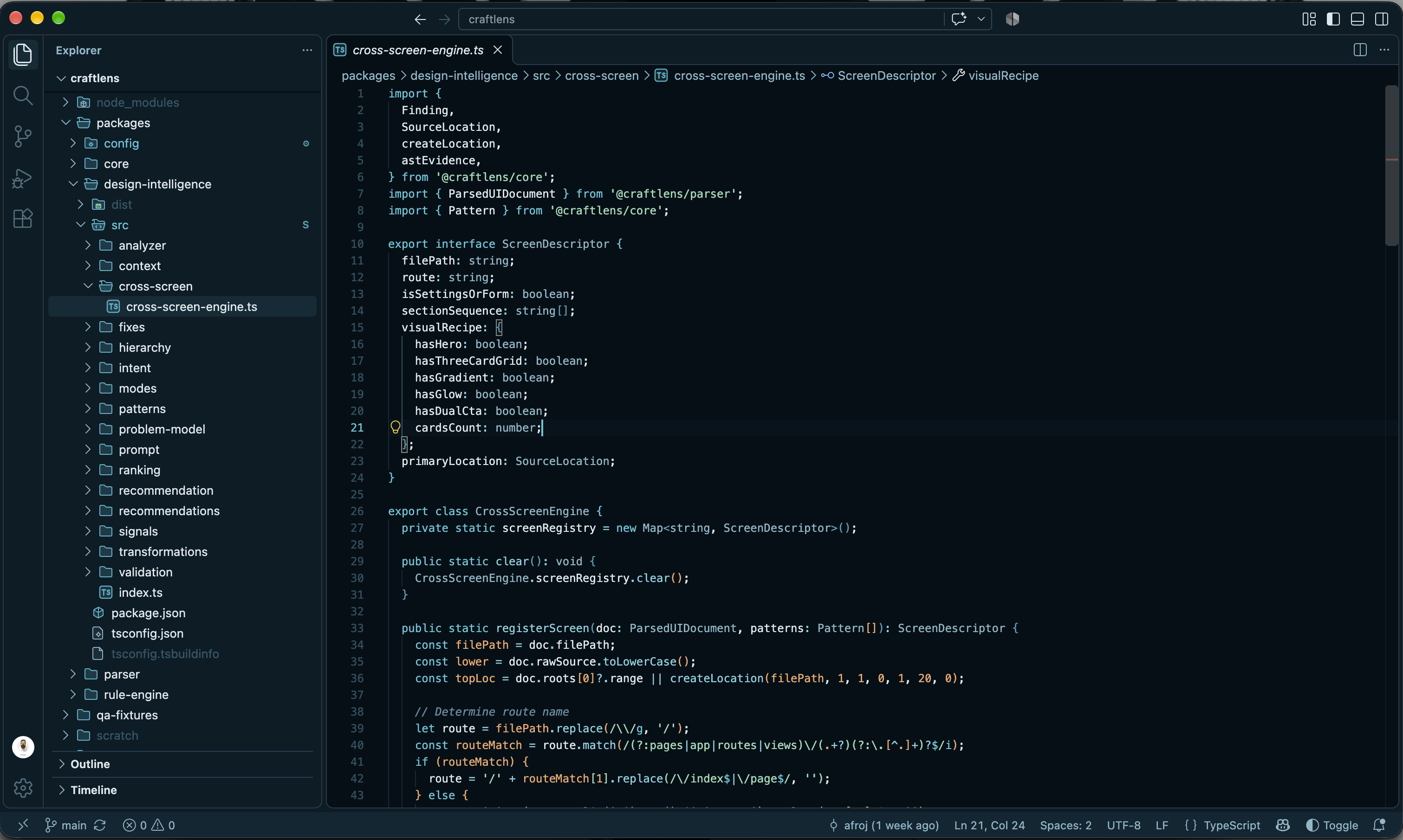
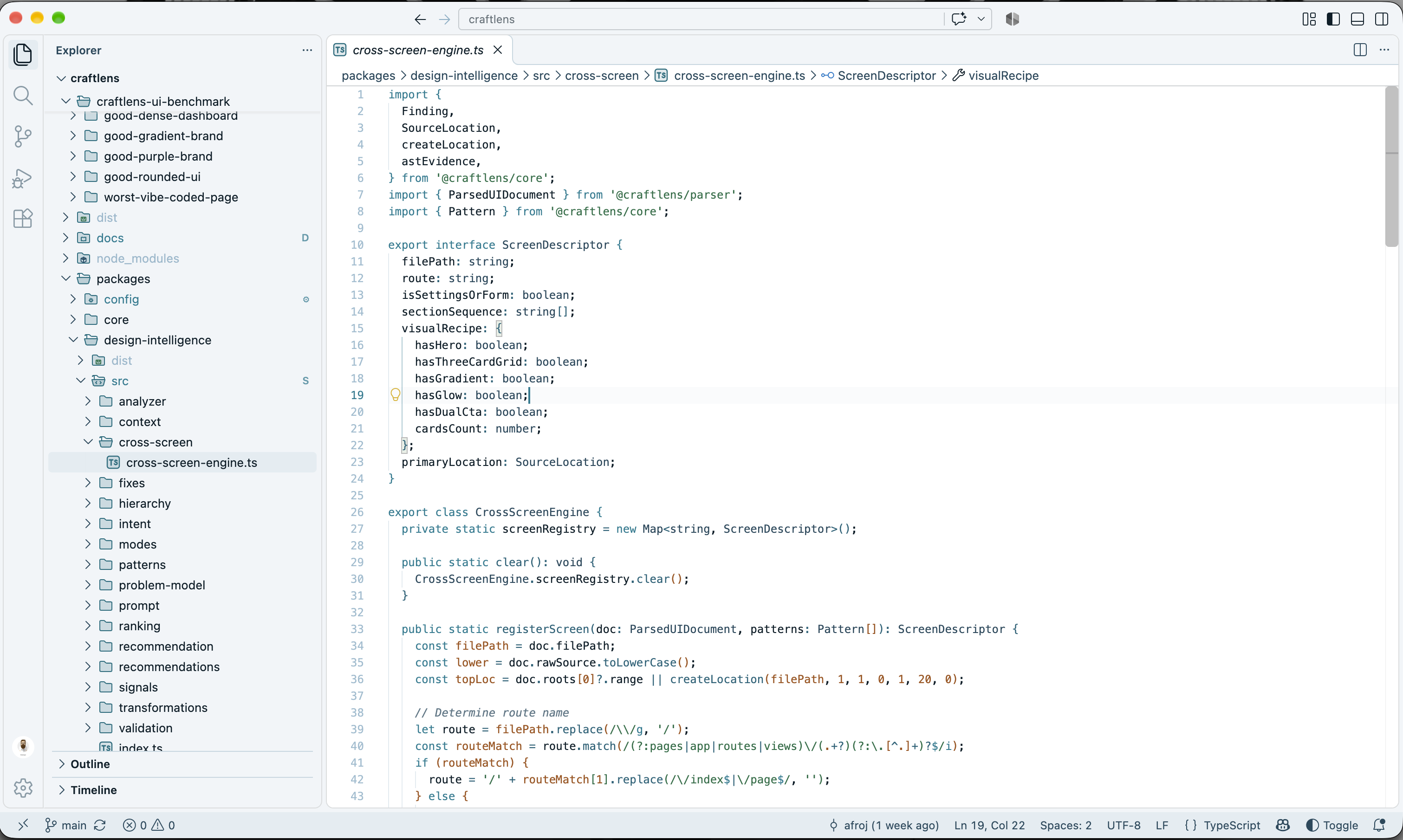
Abyss
| Dark |
Light |
 |
 |
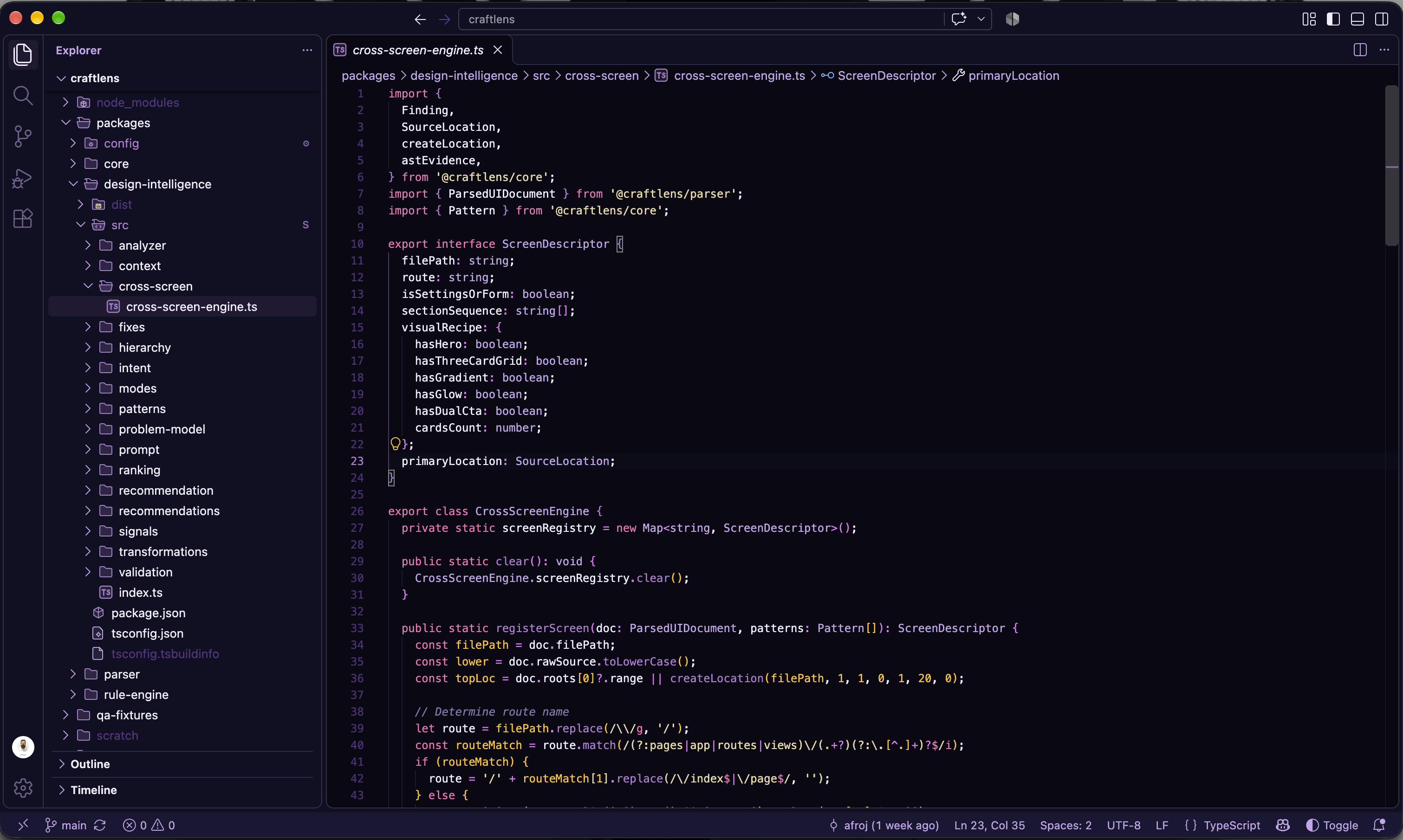
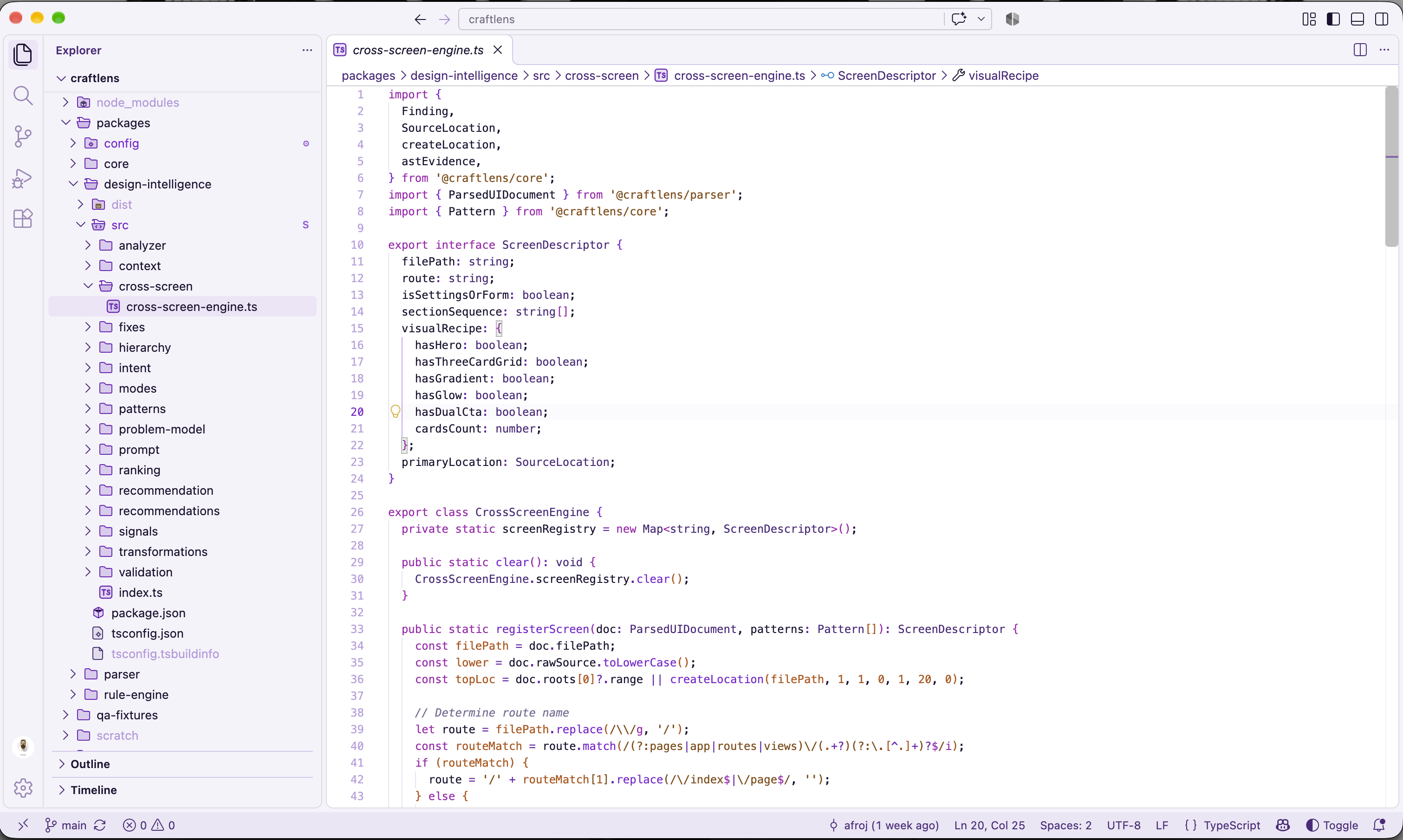
Nocturne
| Dark |
Light |
 |
 |
Sakura
| Dark |
Light |
 |
 |
Umber
| Dark |
Light |
 |
 |
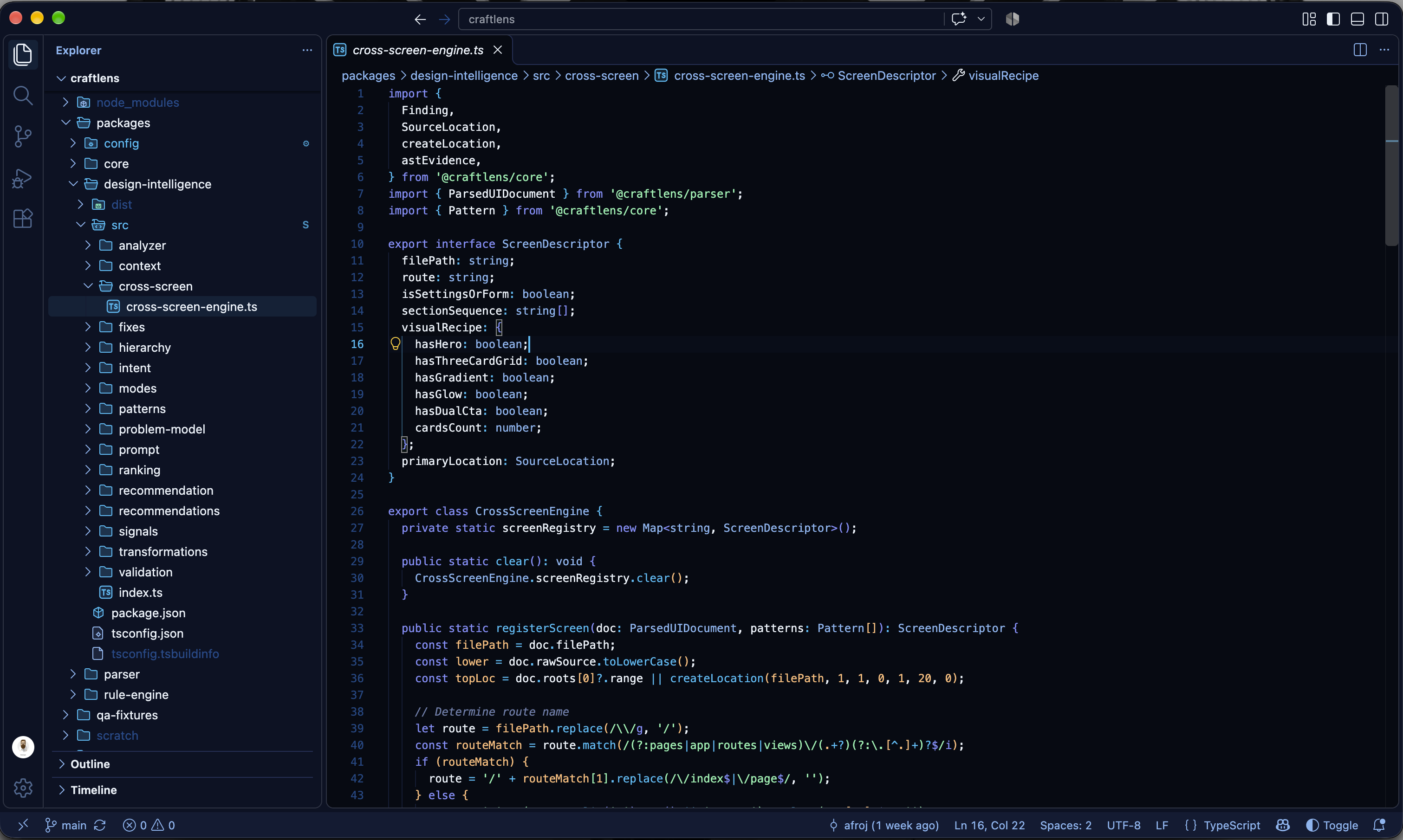
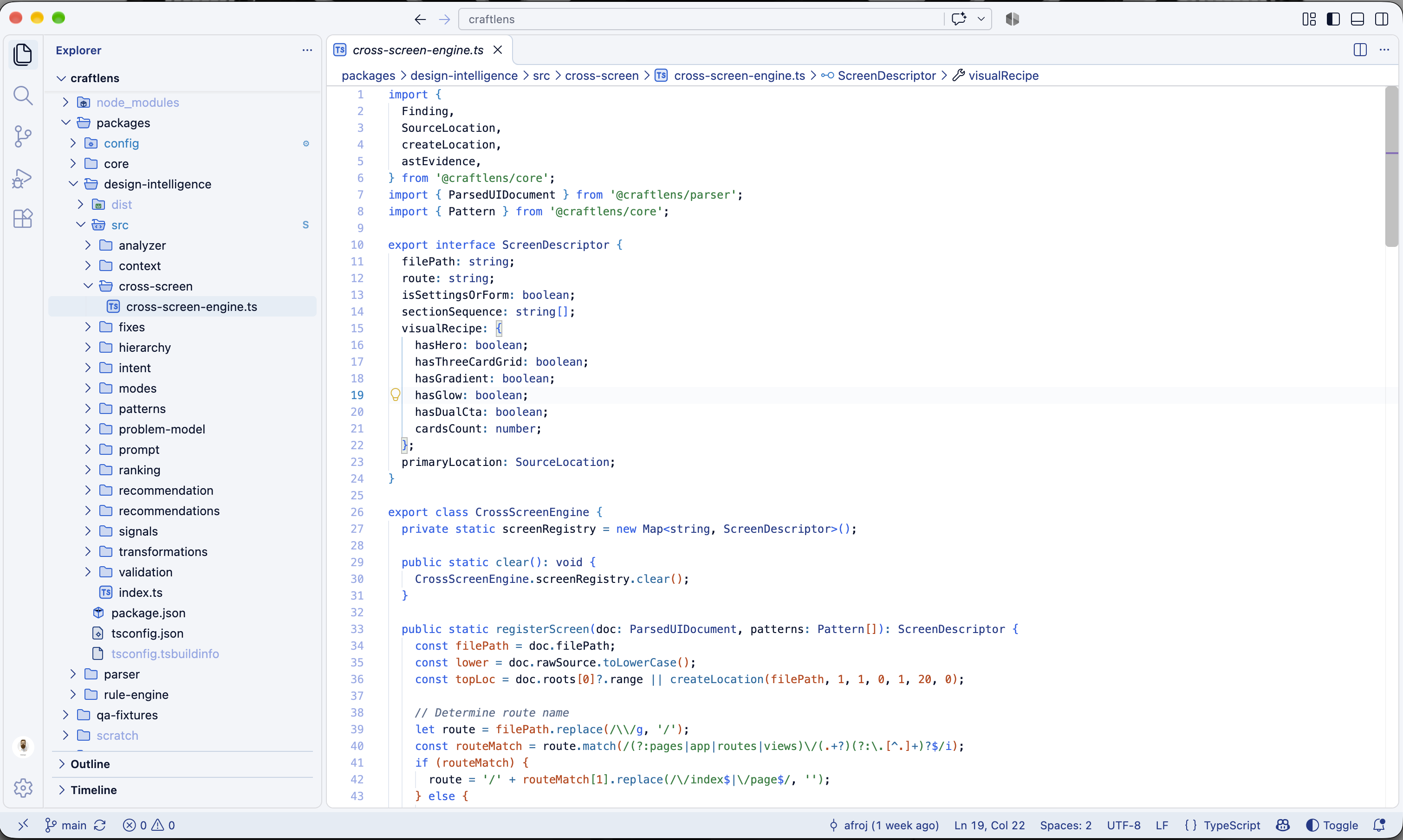
Midnight
| Dark |
Light |
 |
 |
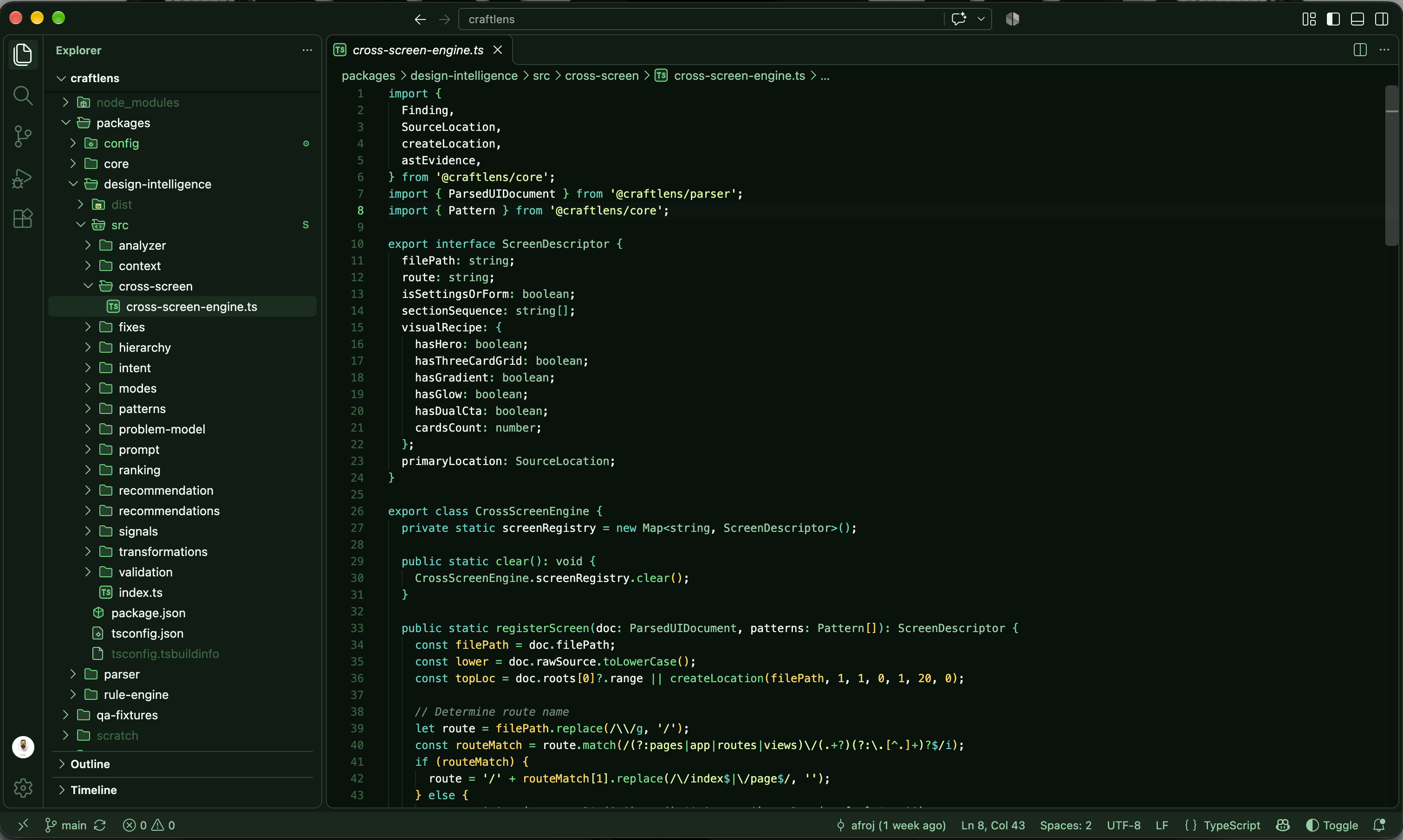
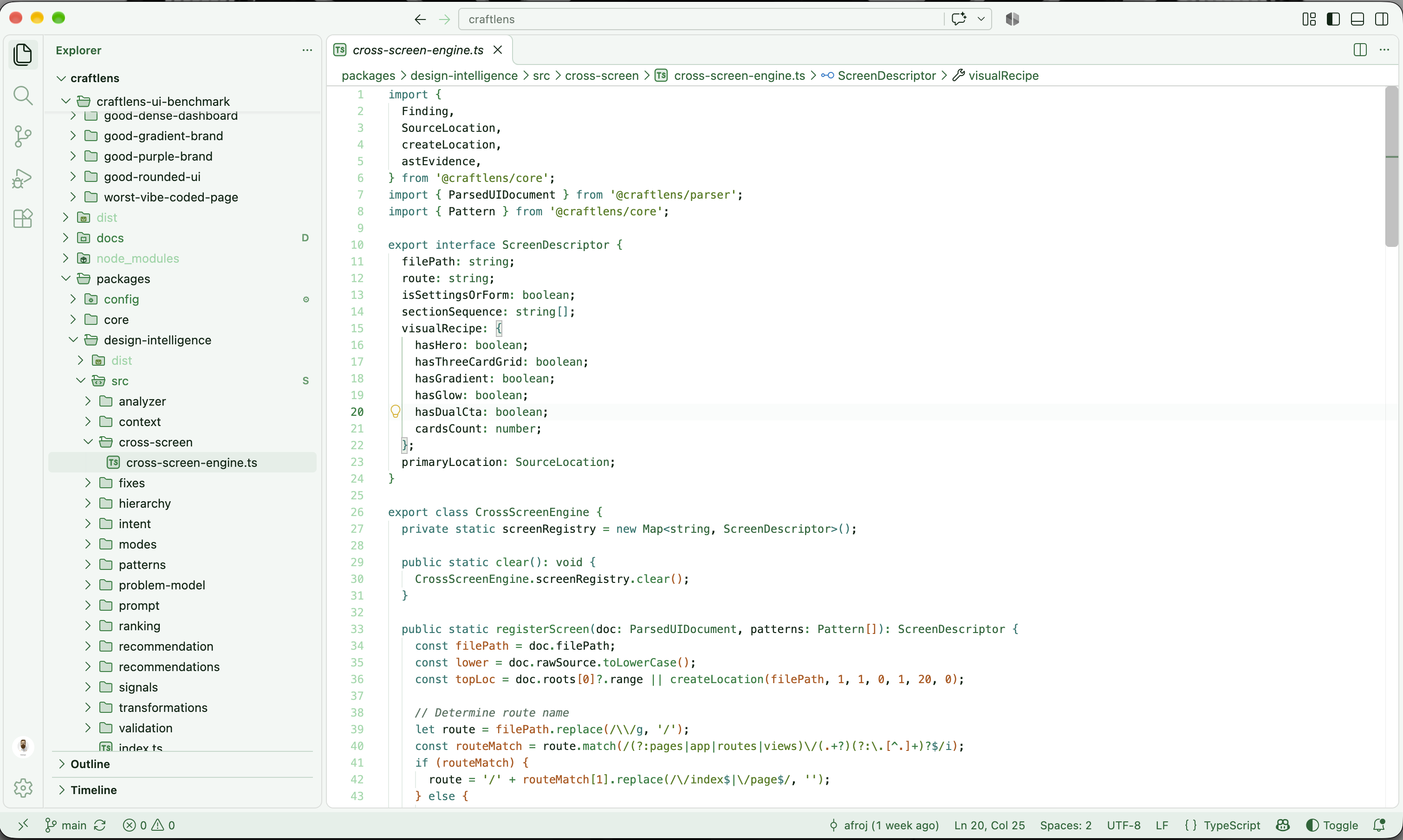
Forest
| Dark |
Light |
 |
 |
Nebula
| Dark |
Light |
 |
 |
Ocean
| Dark |
Light |
 |
 |
Ember
| Dark |
Light |
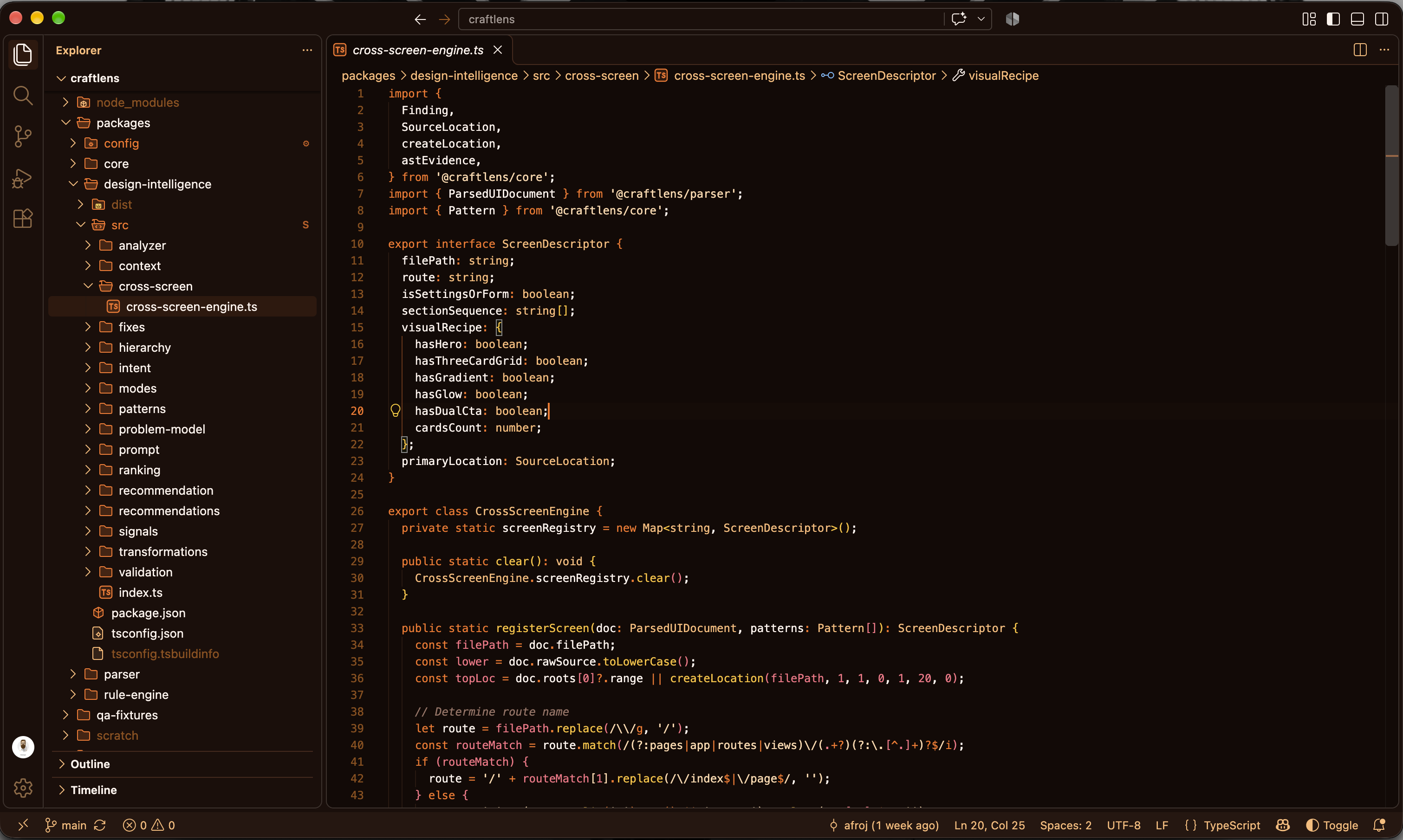 |
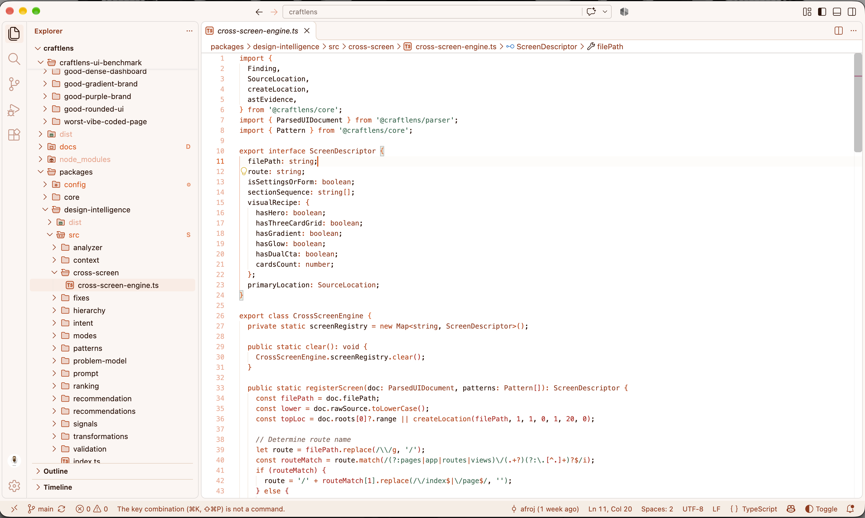 |
Lavender
| Dark |
Light |
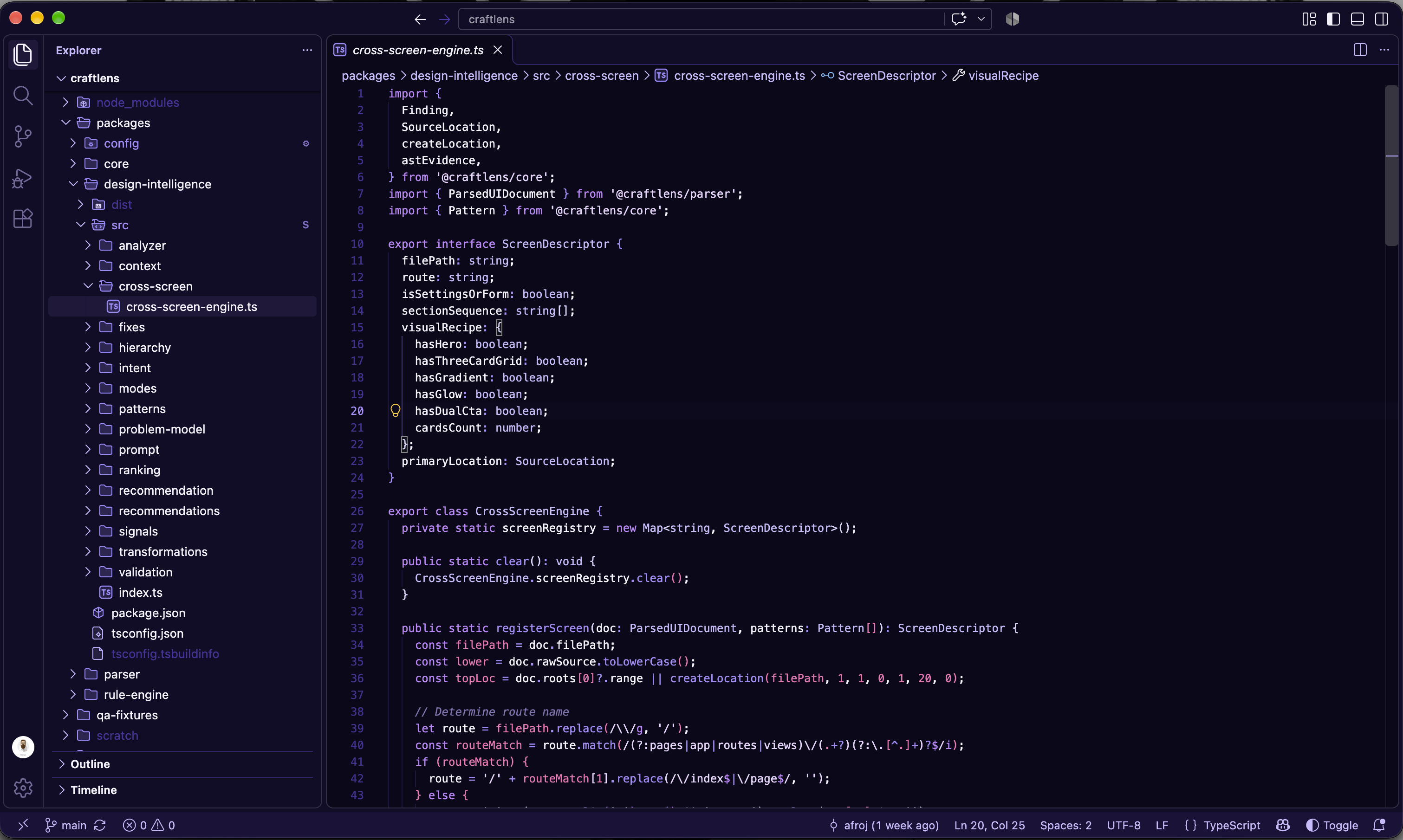 |
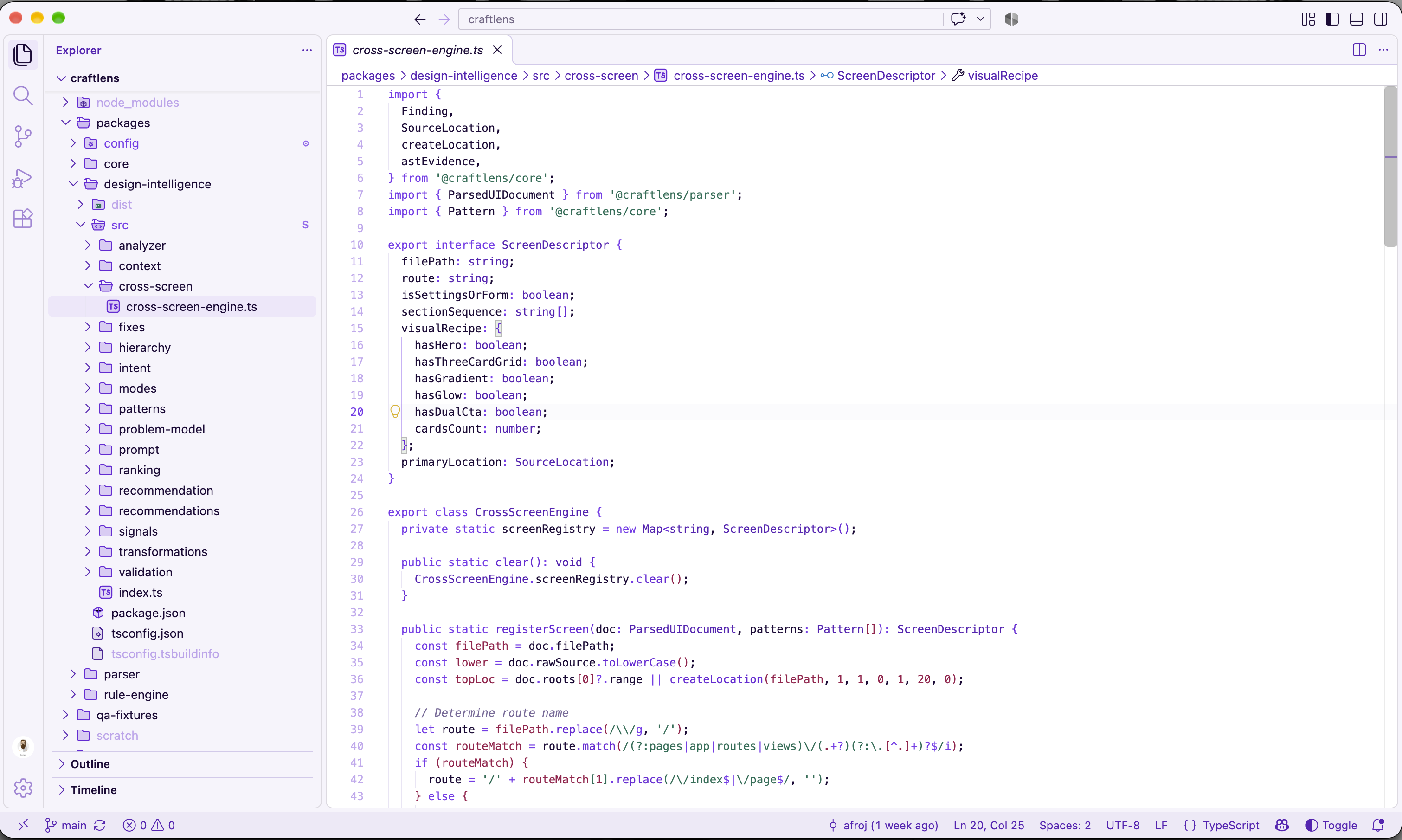 |
Blossom
| Dark |
Light |
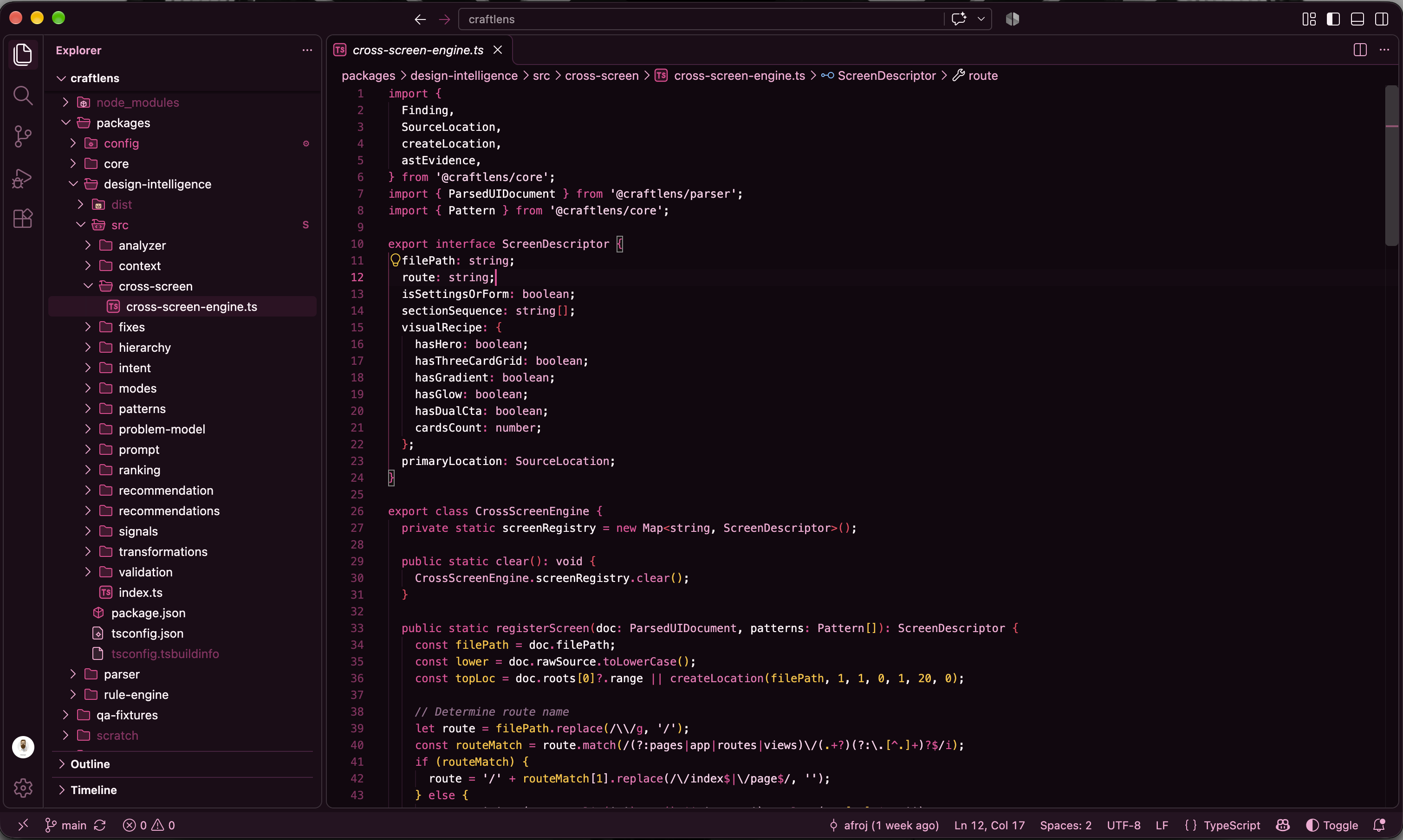 |
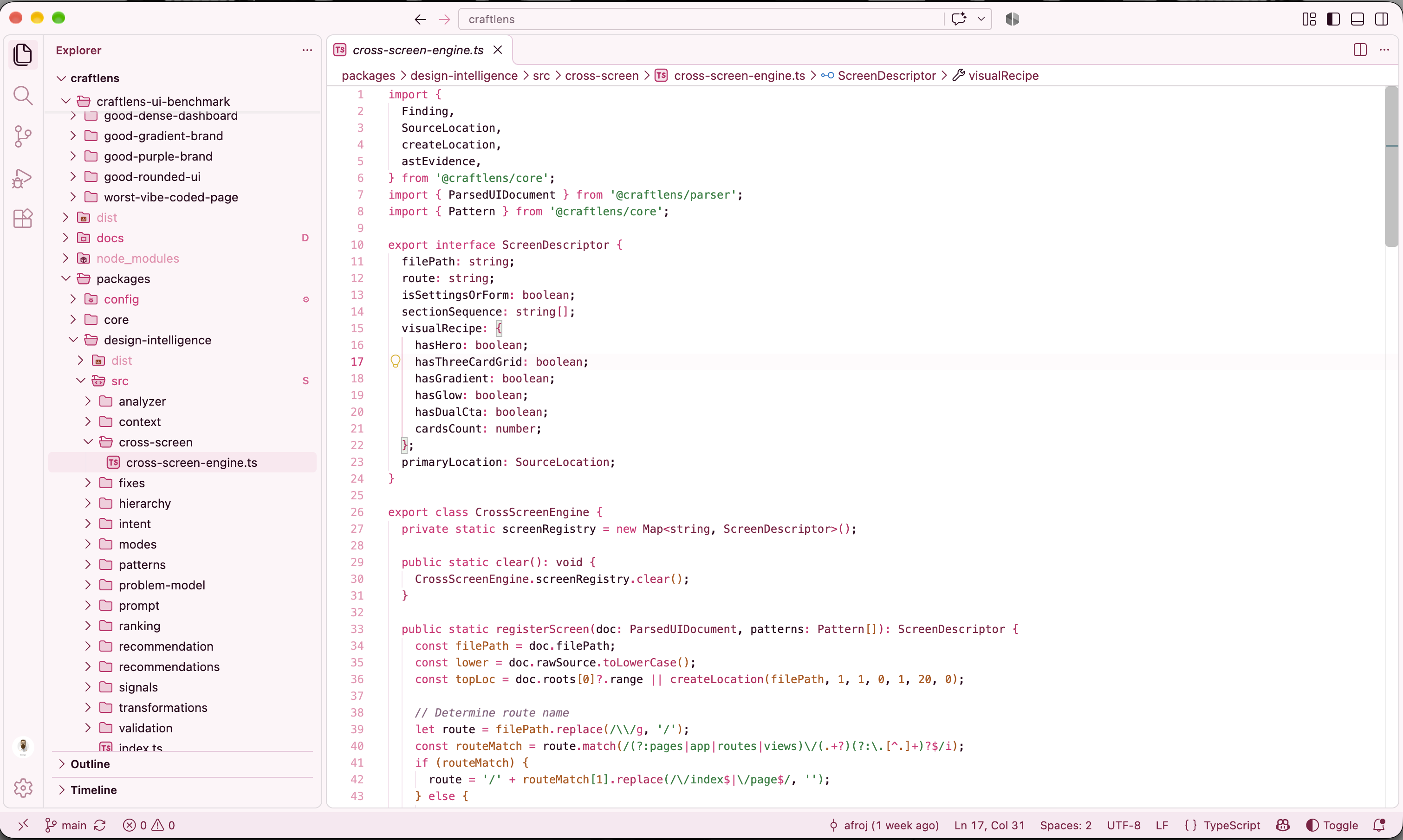 |
⚙️ Configuration Settings
| Setting |
Type |
Default |
Description |
hueform.autoMatchIconTheme |
boolean |
true |
Automatically matches the file icon theme with the active HUEFORM colour theme family and variant. |
hueform.folderHighlights.enabled |
boolean |
true |
Enables subtle themed folder badges (src, components, tests, docs) in the explorer tree. |
hueform.cursor.animation |
boolean |
true |
Enables smooth cursor glide motion matching the active HUEFORM theme's accent. |
Note: Existing installations using legacy sonder.* configurations will seamlessly fall back and migrate automatically.
🚀 Commands
Open the Command Palette (Ctrl+Shift+P / Cmd+Shift+P):
HUEFORM: Match File Icons to Active Color Theme — Manually synchronize icon theme to active color palette.HUEFORM: Toggle Automatic Icon Theme Matching — Turn automatic icon theme matching on/off.HUEFORM: Toggle Themed Folder Highlights — Turn explorer folder badges on/off.HUEFORM: Toggle Cursor Glide Animation — Turn smooth cursor motion on/off.
♿ Accessibility & Contrast
All 22 colour themes and 22 icon themes in the HUEFORM collection pass rigorous mathematical contrast checks against their respective surfaces to achieve 100% WCAG 2.2 AA / AAA compliance.
🤝 Contributing & Support
📄 License
MIT License — see LICENSE
| |