Skip to content
| Marketplace
Sign in
Visual Studio Code>Other>Launch ControlNew to Visual Studio Code? Get it now.
Launch Control

Launch Control

Artsiom Patotski

| (0) | Free
A configurable panel of buttons that run commands (e.g. cd + npm run dev) via VS Code's Tasks API.
Installation
Launch VS Code Quick Open (Ctrl+P), paste the following command, and press enter.
Copied to clipboard
More Info

Launch Control

A VS Code extension that shows a panel of configurable buttons. Each button runs a shell command — e.g. "go to frontend/, run npm run dev" — via VS Code's Tasks API, in its own task terminal.

Getting started

  1. Open a folder (or a multi-root workspace with several folders).
  2. Run Launch Control: Create Starter Config from the Command Palette (or click the Launch Control icon in the Activity Bar, then the config icon in the view's title bar). If more than one folder is open, you'll be asked which one. This creates that folder's .vscode/launch-control.json with one example button and opens it for editing.
  3. Edit the file — autocomplete and validation are wired up automatically. Save it and the Launch Control view updates immediately. Or skip the JSON entirely: click the "+" icon in the view's title bar to add a button through a short wizard instead — see "Adding, editing, and deleting buttons and groups visually" below.
  4. Click a button to run it. While it's running, its tree item shows a spinner and an inline stop icon appears; clicking the button again while it's still running does nothing (see "Running a button" below) — use the stop icon instead.
  5. Drag a button (or a whole group section) to reorder it, or drop it onto a different group — or the top level — to move it there. This edits the config file directly.

Configuration

Buttons are defined in .vscode/launch-control.json:

{
  "buttons": [
    {
      "label": "Start Dev Server",
      "command": "npm run dev",
      "cwd": "${workspaceFolder}/frontend",
      "icon": "rocket",
      "tooltip": "Runs the frontend dev server"
    },
    {
      "label": "Run Tests",
      "command": "npm test"
    },
    {
      "label": "Build and Start",
      "command": ["npm run build", "npm run start"]
    },
    {
      "label": "Stop",
      "command": "docker compose down",
      "icon": "stop-circle",
      "tree": { "iconColor": "terminal.ansiRed" },
      "confirm": "This stops all local containers. Continue?"
    },
    {
      "label": "Run with API Key",
      "command": "npm run dev",
      "env": { "NODE_ENV": "development", "PROJECT_ROOT": "${workspaceFolder}" }
    }
  ]
}

Each button supports:

Field Required Description
label yes Text shown on the button. Used as its execution identity and as the merge key against the global fallback (see below), so keep labels unique.
command usually A shell command, or an array of commands run in true sequence — each one runs as its own task and is allowed to fully finish (stopping the sequence early if a step exits non-zero) before the next starts. May reference ${workspaceFolder}. Only optional when this entry overrides or removes a same-labeled button from the global fallback and inherits its command from there instead — see "Global fallback".
remove no true to exclude the same-labeled button contributed by the other config source (workspace vs. launchControl.defaultButtons) — see "Global fallback". Other fields on a remove entry are ignored.
cwd no Folder to run the command in. Defaults to ${workspaceFolder}. May reference ${workspaceFolder}.
env no Environment variables to set for this button's command (an object of string values), applied on every run. Values may reference ${workspaceFolder}.
confirm no Show a confirmation prompt before running. true shows a generic "Run "
icon no A codicon id (without $()), e.g. "rocket". Defaults to "play".
shell no Shell executable name or path to run this button's command with, e.g. "pwsh" or "bash". Overrides launchControl.defaultShell. Applied on every run.
tooltip no Hover text.
webview no Style overrides used only by the custom webview renderer — { "baseColor": "#hex", "sx": { ... } }. Ignored by the default tree renderer.
tree no Style overrides used only by the default tree renderer — { "iconColor": "<theme color id>" }. Ignored by the webview renderer, which derives its coloring from webview.baseColor instead. iconColor is a VS Code theme color id, e.g. "charts.green", "terminal.ansiRed", "errorForeground" — not a hex/RGB value, since VS Code only supports tinting icons with a reference to a color the current theme defines, so the exact shade varies by theme (this is also why some codicons, like debug-start, already render in color by default while most don't — they're tied to a theme color internally). An unrecognized id is ignored gracefully rather than erroring.

A button has no field for which group it's in — that's determined by where it's listed. See "Groups" below.

Global fallback

launchControl.defaultButtons — the same field shape as above, configured like any other VS Code setting (User or Workspace) — is deep-merged into every open folder's own buttons, by label:

  • A folder button with the same label as a fallback button overrides it field-by-field: any field the folder button specifies wins, any field it omits is inherited from the fallback. env merges key-by-key (the folder's keys win, the fallback's other keys are kept); every other field is a full override-or-inherit.
  • A fallback button whose label the folder doesn't mention is still included, unchanged.
  • A folder button whose label isn't in the fallback is added as a new button.
  • Either side can exclude the other's same-labeled button with "remove": true.
// launchControl.defaultButtons (User settings)
[
  { "label": "Build", "command": "npm run build", "icon": "tools" },
  { "label": "Test", "command": "npm test" },
  { "label": "Deploy", "command": "npm run deploy" }
]
// .vscode/launch-control.json (this workspace)
{
  "buttons": [
    { "label": "Build", "icon": "rocket" },
    { "label": "Deploy", "remove": true },
    { "label": "Lint", "command": "npm run lint" }
  ]
}

Effective result for this workspace: Build (fallback's command, this folder's icon), Test (untouched, inherited from the fallback), Lint (new), and no Deploy (removed). An empty (or absent) config file means a folder inherits the fallback entirely; a config file that redefines every fallback button by label behaves like a full replacement, same as always. A button that wants to override or remove a fallback entry but gets its label wrong (no match on either side) is reported as a config error and excluded, rather than silently doing nothing or crashing.

Multi-root workspaces

Each open folder has its own .vscode/launch-control.json, and each merges independently against the same fallback, substituted against its own path. When more than one folder ends up with any buttons, the view groups them under one folder-icon node per folder, with each folder's own group sections nested underneath as usual. With a single folder (or a single-folder workspace), the view looks exactly like it always has — no extra nesting. Two buttons with the same label in different folders run independently of each other.

View placement

By default the buttons view appears in the Activity Bar sidebar. Set launchControl.placement to "panel" to show it in the bottom panel instead, alongside Terminal/Output/Problems. Switching the setting takes effect immediately, no reload needed.

Groups

A button's group is determined purely by where it's listed — there's no group field on a button itself. The top-level buttons array holds root (ungrouped) buttons, rendered with no section of their own; each entry in the config file's top-level groups object holds that group's own buttons, plus a mandatory label (its displayed name — the key is just its identity, for referencing/overriding it) and, optionally, an icon and webview-renderer colors:

{
  "groups": {
    "quality": {
      "label": "Quality",
      "icon": "beaker",
      "webview": { "baseColor": "#2dd4bf" },
      "buttons": [{ "label": "Run Tests", "command": "npm test" }]
    }
  },
  "buttons": [{ "label": "Start Dev Server", "command": "npm run dev" }]
}

launchControl.defaultGroups — configured like any other VS Code setting (User or Workspace) — is the same shape, and gives every group in it the same fallback-and-override behavior buttons already have: a workspace group with the same key overrides it field-by-field, and its own buttons merge with the fallback's by label (override-by-label, "remove": true) exactly like root buttons do. Unlike buttons, though, groups itself is a flat override, not a field-by-field merge: a folder's own groups entirely replaces launchControl.defaultGroups if it defines any groups at all; an empty or absent groups in the folder falls back to the global setting unchanged.

Migrating from an older config: earlier versions of this extension used a "group": "X" field on a flat-array button instead. Move each such button into groups.X.buttons (adding a label for X if it didn't have one) and drop the group field — it's no longer a valid button property.

A group with no buttons yet still renders as its own section (empty) — so "Launch Control: Add Group" is a genuine way to stake out a group before it has any buttons, and dragging a group's last button elsewhere doesn't make the group itself disappear. Root (ungrouped) buttons always render before any group, as a block; groups themselves always render in exactly the order they're declared in groups, whether or not they currently have any buttons — an empty group stays in its configured position rather than jumping to the end.

Custom webview renderer

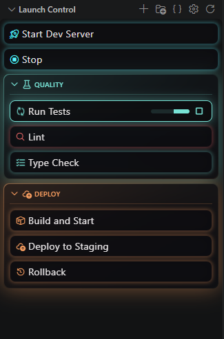
Set launchControl.renderer to "webview" to render buttons with a custom React-based view instead of the native VS Code tree — each button is a full-width row with a glass-panel background and a colored gradient border/glow, instead of a single theme-color icon tint. Run/stop behavior (confirmation prompts, one run at a time, the stop action) is identical to the tree renderer; while a button is running, it also shows an indeterminate progress bar next to its stop action, without changing the button's own height (so nothing below it shifts when a run starts or ends). Switching the setting takes effect immediately, no reload needed.

In a single-folder workspace, that folder's .vscode/launch-control.json may also declare a top-level "renderer": "tree" or "renderer": "webview", overriding the launchControl.renderer setting for everyone who opens that project — handy for pinning one renderer regardless of each contributor's own setting. In a multi-root workspace this field is ignored entirely (even if one of the folders declares it) and the launchControl.renderer setting always applies, since Launch Control renders one shared view aggregating every folder's buttons and there's no sane per-folder tie-break if two folders' files disagreed.

Colors are derived from a single seed base color rather than picked from a fixed palette — set it, and backgrounds, borders, icon tint, and glow are all computed from it (differently for light vs. dark VS Code themes). The cascade, most specific wins:

  1. A button's own webview.baseColor.
  2. Its group's webview.baseColor (from groups / launchControl.defaultGroups).
  3. launchControl.webview.baseColor (default #00dbe9).

For anything the derived colors don't cover, webview.sx on a button or group accepts raw Chakra UI style props, merged the same way — a button's sx keys win over its group's, other keys from each are kept:

{
  "groups": {
    "Frontend": {
      "label": "Frontend",
      "icon": "browser",
      "webview": { "baseColor": "#7c5cff" },
      "buttons": [
        {
          "label": "Start Dev Server",
          "command": "npm run dev",
          "webview": { "sx": { "borderRadius": "4px" } }
        }
      ]
    }
  },
  "buttons": [
    {
      "label": "Stop",
      "command": "docker compose down",
      "webview": { "baseColor": "#ff4d4d" }
    }
  ]
}

Click a group's header (or focus it and press Enter/Space) to collapse or expand it — a chevron shows its current state. Each group remembers its own collapsed/expanded state (per group, persisting across reloads); if a button inside a collapsed group is running, its header shows a small spinning indicator so it isn't silently hidden.

Drag a button tile or a group header to reorder/regroup it, exactly as in the tree renderer — see "Drag-and-drop reordering" below, which applies to both. Buttons render as full-width rows only (no grid/tiles layout). Hovering a button tile or a group's header (or moving keyboard focus into one) reveals small Edit/Delete icon actions at its right edge — clicking one triggers the exact same "Edit Button"/"Delete Button"/"Edit Group"/"Delete Group" wizard described below, exactly as if invoked from the tree view's context menu (a folder-root section, in a multi-root workspace, shows neither — it can't be edited or deleted, same as in the tree view). "Add Button"/"Add Group" already worked from the title bar in both renderers, since neither is tied to a specific row.

Choosing a shell

By default, buttons run in VS Code's own default shell. Set launchControl.defaultShell (e.g. "pwsh" or "bash") to use a different shell for every button, or set a button's own shell field to override it just for that one button.

Prefer an absolute path over a bare name (a bare "pwsh"/"bash" needs VS Code's own shell detection to resolve it, which can fail even when the executable exists — use the full path if a bare name doesn't work). If you use Git for Windows' bash as your shell path, point at <git-install>\bin\bash.exe, not <git-install>\usr\bin\bash.exe — only the former initializes its own PATH (uname/sed/dirname, etc.) correctly when launched directly by an external tool like VS Code; the latter expects to be launched from an already-initialized Git Bash session and will fail with confusing "command not found" errors for basic Unix utilities otherwise.

Running a button

Clicking a button runs each of its command lines as its own VS Code task, in true sequence — a multi-command button's steps run one at a time, each waiting for the previous one to actually finish before the next starts, and the sequence stops early if a step exits non-zero. cwd/env/shell apply directly to every step (not via a cd line), so a multi-step command that relies on state set by an earlier step's shell session (e.g. a locally exported variable) won't see it — use env instead.

Clicking a button again while it's still running does nothing — it won't start a second overlapping run, and it won't queue up to run again once the current run finishes. If you need to interact with a running command (answer an interactive prompt, etc.), click into its task's terminal panel directly and type — that still works exactly like a normal terminal.

While a button's command is running, its tree item shows a spinning icon and gets an inline stop action, both reverting automatically once it finishes. This works on every shell, including Windows PowerShell 5.1 (powershell.exe) and cmd.exe — it doesn't depend on VS Code's terminal shell integration. Clicking the stop icon terminates the button's currently running step directly (not by sending it an interrupt), and no further steps in its sequence run afterward.

Drag-and-drop reordering

Works the same way in both renderers. Drag a button and drop it on another button to reorder it within the same location (root or a group), or onto a different group's section (or the folder's top level) to move it there — it's removed from wherever it was and inserted into the target group's buttons (or the top-level buttons array for root). Drag a group section itself to reorder it relative to other group sections (dropping a group onto a bare button doesn't move it, since root buttons always render before every group section). Dropping an item back onto itself leaves it exactly where it was. This directly edits the workspace config file (the raw, unsubstituted version, so a ${workspaceFolder} reference in a moved button survives intact). In a multi-root workspace, dragging is scoped to one folder at a time — dropping a button from one folder's section onto a different folder's section is a no-op; moving a button between folders still means editing the JSON by hand.

In the webview renderer, dragging shows a live preview of the result: as you hover over different buttons, groups, or empty space, the whole list reflows to the exact order dropping right now would produce, with the dragged item itself shown dimmed with a dashed border at its predicted new position — not just left behind at its original spot. Everything snaps back to its original position and appearance if the drag ends without a drop (cancelled, or dropped outside any valid target). (The tree renderer relies on VS Code's own built-in drag feedback instead.)

Adding, editing, and deleting buttons and groups visually

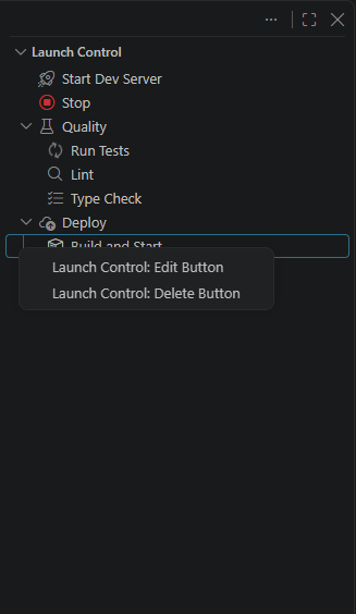
Six commands add a lightweight, prompt-driven alternative to hand-editing the JSON — three for buttons, three for groups. Add Button/Add Group work from the title bar regardless of renderer; Edit/Delete (button or group) are tree-view context-menu commands, and — in the webview renderer — hover/focus-reveal actions on the button tile or group header itself (see "Custom webview renderer" above):

  • "Launch Control: Add Button" (the "+" icon in the view's title bar) asks for a folder (if more than one is open), then where the button goes — Root, an existing group by name, or "Create new group…" (prompts for a label, and optionally an icon, on the spot). Choosing "Create new group…" saves the group immediately, then explicitly asks whether to add a button to it now or you're done — pick "Done" to stop right there with just the new, empty group, no button required. Continuing (either by picking an existing destination, or choosing to add a button after creating a group) asks for a label and a command, then lets you optionally set any other field — pick a field from a list, enter its value, repeat, and pick "Done" when you're finished (or just press Escape, which is treated the same as Done).
  • "Launch Control: Edit Button" (right-click a button → Edit Button in the tree view; hover or focus a button tile and click its Edit icon in the webview) opens the same field picker for that button, wherever it lives (root or any group), pre-filled with its current values. label itself isn't editable this way — delete and re-add instead if you need to rename one.
  • "Launch Control: Delete Button" (right-click a button → Delete Button in the tree view; hover or focus a button tile and click its Delete icon in the webview) asks for confirmation, then removes it from wherever it lives.
  • "Launch Control: Add Group" (the folder icon next to "+" in the title bar) asks for a folder, a label, and optionally an icon, then creates an empty group. Its groups key is derived from the label automatically — you never type it directly; hand-edit the JSON afterward if you want a specific one.
  • "Launch Control: Edit Group" (right-click a group's header → Edit Group in the tree view; hover or focus a group's header and click its Edit icon in the webview) lets you change its label and icon, pre-filled with their current values. Its buttons and any webview override are untouched.
  • "Launch Control: Delete Group" (right-click a group's header → Delete Group in the tree view; hover or focus a group's header and click its Delete icon in the webview) asks for confirmation — naming the group and how many buttons will be deleted with it, if it has any (deleting a group deletes its buttons too; move them out first, by drag-and-drop or by editing the JSON, if you want to keep them). Not available on a folder-root section in a multi-root workspace, in either renderer.

A multi-step command is entered as one line using ;; to separate steps, e.g. npm run build ;; npm run start; env is entered as KEY=VALUE, KEY2=VALUE2 on one line. Both are shown pre-filled in that same format when editing. Neither format handles every case (a command containing the literal substring ;;, for instance) — hand-edit the JSON directly for anything the wizard's simple formats can't express. None of the six commands can set a button's or group's webview style override — that stays a hand-edit-JSON-only field for both. Edit/Delete Button and Edit/Delete Group only work on something defined in its own folder's config file — a button shown only because it's inherited from launchControl.defaultButtons (see "Global fallback" above) has nothing there to edit or delete; add an override (or a "remove": true entry) for it instead.

Limitations

  • The default tree renderer has no custom colors/layout — switch launchControl.renderer to "webview" for that (see "Custom webview renderer" above). Drag-and-drop works in both renderers; the visual Edit/Delete commands (button and group) only work from the tree renderer's context menu for now — Add Button/Add Group work from the title bar regardless of renderer.

Installing

This extension isn't published to the Marketplace yet. See DEVELOPMENT.md for how to build and install a local .vsix.

License

Copyright (c) 2026 Artsiom Patotski. This extension is proprietary, closed-source software — see LICENSE.md for the exact terms of use. Third-party components bundled into the extension are listed in THIRD-PARTY-NOTICES.md.


Building from source, or contributing? See DEVELOPMENT.md.

  • Contact us
  • Jobs
  • Privacy
  • Manage cookies
  • Terms of use
  • Trademarks
© 2026 Microsoft