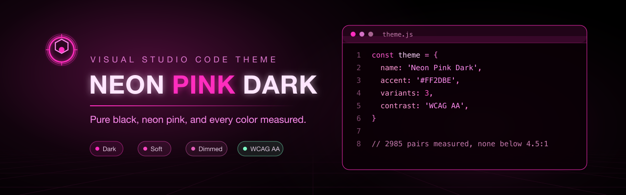
Transform your VS Code into a futuristic cyberpunk environment with pure black backgrounds and vibrant neon pink highlights. Perfect for developers who want their editor to match the aesthetic of late-night coding sessions in a neon-lit cityscape.
✨ Features
- 🎨 Pure Black Background -
#000000 gives the neon accents the highest possible contrast
- 💖 Neon Pink Accents -
#FF2DBE as the primary color across the editor and workbench
- 🌃 Cyberpunk / Future Neon - Inspired by neon signs in nighttime cityscapes
- 🎯 Layered Highlighting - 55 TextMate rules plus semantic tokens: generic scopes that apply to every language, with dedicated rules for Markdown, HTML, CSS, JSON and YAML on top
- 🎚️ Four Themes - The original plus Soft and Dimmed for OLED panels, bright rooms and long sessions, and Classic, the 0.0.1 palette kept for those who miss it. One install, four themes
- 🔧 Customizable - Easy to override colors through VS Code settings
Every surface is themed as of v0.3.0 — workbench UI, syntax, diagnostics, the diff editor and Git decorations — and every text color meets WCAG AA against the background it actually renders on. v0.4.0 adds the Soft and Dimmed variants, which hold that same guarantee. v1.0.0 is the first release where nothing on that list is outstanding: the theme is complete, measured, screenshotted, and every check that keeps it that way runs in CI. See Current Scope for what is covered, and the Roadmap for what's next.
📊 Current Scope
| Area |
Status |
| Editor background, foreground, cursor, selection, line numbers |
✅ Defined |
| Sidebar, status bar, activity bar, tabs, title bar, panel |
✅ Defined |
Generic syntax scopes — 23 rules covering keywords, storage, operators, constants, variables, parameters, properties, functions, types, decorators, escapes, regex and invalid |
✅ Defined |
| Lists, trees, inputs, buttons, dropdowns, checkboxes, focus rings, text links |
✅ Defined |
| Command Palette, IntelliSense, hovers, peek view, notifications, menus, breadcrumbs, scrollbars |
✅ Defined |
| Terminal — all 16 ANSI slots, cursor, selection |
✅ Defined |
| Search / word highlights, bracket pair colors, overview ruler and minimap markers |
✅ Defined |
| Error / warning / info diagnostics, Problems panel, marker navigation |
✅ Defined |
| Diff editor, merge conflicts, the 3-way merge editor |
✅ Defined |
| Git decorations — Explorer labels, gutter, minimap, overview ruler |
✅ Defined |
| Language-specific scopes (HTML/JSX, CSS, Markdown, JSON, YAML, shell, regex) |
✅ Defined |
Semantic highlighting (readonly, defaultLibrary, deprecated and the standard token types) |
✅ Enabled |
| Soft and Dimmed variants, generated from the base theme and measured like it |
✅ Defined |
| Screenshots of Neon Pink Dark, Soft and Dimmed, taken in a real VS Code window |
✅ In the README |
| Classic — the corrected 0.0.1 palette snapshot (#24) |
✅ Frozen and hash-checked |
CI — structure, staleness and contrast on every push and pull request; a v* tag publishes |
✅ Automated |
Accessibility note. Every text color in every modern variant meets WCAG AA (4.5:1) against the surface it actually renders on — not only the background, but also the selection, the current-line highlight and both sides of a diff, which raise the floor luminance and cost roughly 1.3× of the ratio. The tightest case is a keyword inside a diff or a selection: 4.63:1 in Neon Pink Dark, 4.58:1 in Soft, 4.57:1 in Dimmed. On the plain background the same keyword is 6.4:1, comments are 6.8:1, functions 7.7:1, strings 10.3:1 and body text 18.0:1. Classic is the deliberate exception: it preserves the corrected legacy palette from before this work existed, so none of these guarantees apply to it. Six of its pairs sit below AA — the line number at 3.89:1, an inactive tab at 3.01:1, a keyword inside a selection at 3.95:1, and comments at 3.64:1, 3.55:1 and 2.87:1 on the editor, the current line and a selection.
npm test runs scripts/check-contrast.js, which measures 995 pairs per modern theme — every syntax color against the twelve surfaces it can land on (editor, selection, current line, both sides of a diff at line and at word level, the three inline merge conflict regions and the 3-way merge editor), plus every workbench label against its own background — and fails if any of those three themes drops below threshold. Classic is measured too — 131 pairs, six of them below AA — and those six print on every run without failing the build. The workbench keys it never sets are counted apart from them rather than as failures: what renders there comes from VS Code's own defaults, which is the point of the theme rather than a gap in it. Run the script with --verbose to inspect every result. Colors carrying alpha are composited first, so the number is what reaches the eye rather than what the swatch suggests. Three decorations are exempt and say so in the output: whitespace markers, indent guides and the diff editor's diagonal fill are meant to stay faint.
🎚️ Variants
The extension contributes four themes. The first three are the same theme — same hues, same meanings, same rules — at three intensities, so switching is a comfort decision rather than a new theme to learn. The fourth is a corrected snapshot of the 0.0.1 palette.
| Theme |
Background |
Saturation |
Use it when |
| Neon Pink Dark |
#000000 |
100% |
You want maximum contrast and the full neon look |
| Neon Pink Dark Soft |
#12000A |
80% |
Your panel is OLED, or the pure-black edge feels harsh |
| Neon Pink Dimmed |
#0D0008 |
60% |
Long sessions, bright rooms, or you find full saturation tiring |
| Neon Pink Dark Classic |
#000000 |
— (snapshot) |
You miss the 0.0.1 look — a few pink accents over VS Code's own defaults |
Pick one with Ctrl+K Ctrl+T / Cmd+K Cmd+T — all four appear in the list after a single install.
The comparison below shows the three modern intensity variants; Classic does not yet have a dedicated screenshot.
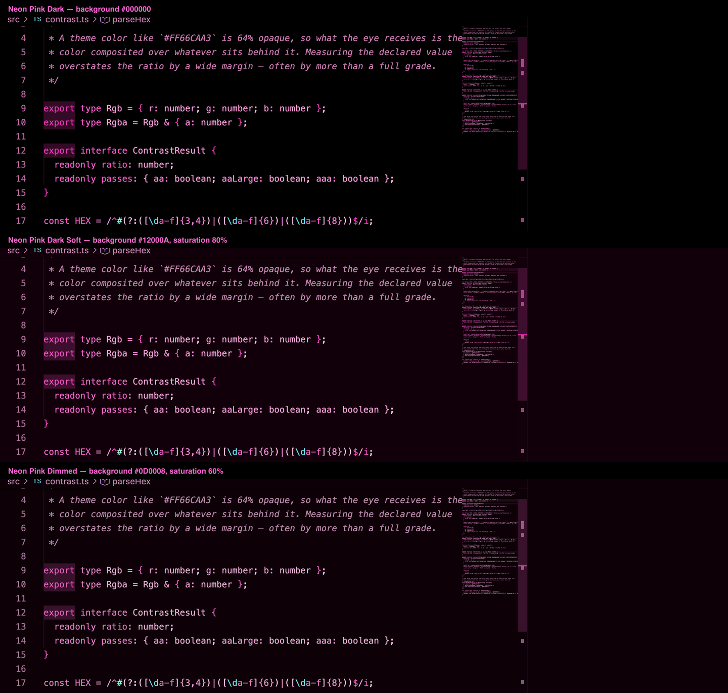
Why lift the background at all? High-saturation magenta on #000000 smears visibly while scrolling on OLED panels, because the pixels are switching fully off and back on. A background a few points above black keeps them lit and the smearing stops. It also stops the background from disappearing entirely in bright ambient light, where pure black reads as a hole rather than a surface.
How the variants are built. themes/neon-pink-dark-color-theme.json is the hand-maintained modern base. Soft and Dimmed are generated from it by scripts/build-themes.js and committed, so the extension stays dependency-free at install time while three copies of the palette cannot drift apart — npm test regenerates them and fails if what is on disk differs. Classic is maintained separately as the hash-checked snapshot described below. The transform is three steps:
- Desaturation at constant luminance. Each color is pulled toward the gray of its own lightness, then scaled back to the relative luminance it started with. Contrast depends on luminance alone, so this step cannot cost a single ratio.
- Background lift. Black becomes the variant's base tint, and the rest of the dark surface ramp is lifted by a decreasing amount. This is the step that costs contrast.
- Foreground gain. Every foreground gains back exactly the luminance the lifted background took — about 3%, invisible to the eye but enough to keep a token at the ratio it had on black.
What that leaves is the surfaces lifted more than the editor background, a selection or a changed word in a diff, which end up a few hundredths below where they started. That is why every variant is measured in full rather than assumed correct: 4.63:1 at the tightest in the base theme, 4.58:1 in Soft, 4.57:1 in Dimmed.
Classic is not a variant — it is a corrected snapshot. Requested in #24, it preserves the 0.0.1 palette under its own name, except for the old contrastBorder entry. VS Code ignores that key's alpha and rendered it as an opaque pink border around the workbench, so the already-diagnosed regression is not restored. Classic sets 24 workbench colors and leaves everything else to VS Code's stock Dark+ — the bright blue Commit button included — which is the subtle look people ask back for. Its file is hash-checked to prevent accidental edits. Contrast is audited and reported: six pairs fall below AA and stay there, because raising them would change the look the theme exists to preserve. That count is pinned in scripts/theme-config.js, so it cannot drift without the build saying so.
A light variant is deliberately not here. Neon pink on white is a different design problem — the accents have to become darker rather than calmer, and the five-hue palette exception would need re-deriving from scratch — so it belongs in its own milestone rather than bundled with a desaturation pass.
📦 Installation
From VS Code Marketplace (Recommended)
- Open Extensions view (
Ctrl+Shift+X or Cmd+Shift+X)
- Search for "Neon Pink Dark"
- Click Install
- Select theme (
Ctrl+K Ctrl+T or Cmd+K Cmd+T)
- Choose "Neon Pink Dark", "Neon Pink Dark Soft", "Neon Pink Dimmed" or "Neon Pink Dark Classic"
From Command Line
code --install-extension kpab.neon-pink-dark
Manual Installation (VSIX)
- Download the latest
.vsix file from Releases
- Open VS Code
- Run
Extensions: Install from VSIX... from Command Palette
- Select the downloaded file
For Development
git clone https://github.com/kpab/vscode-neon-pink-theme.git
cd vscode-neon-pink-theme
code .
# Press F5 to launch Extension Development Host
🎨 Color Palette
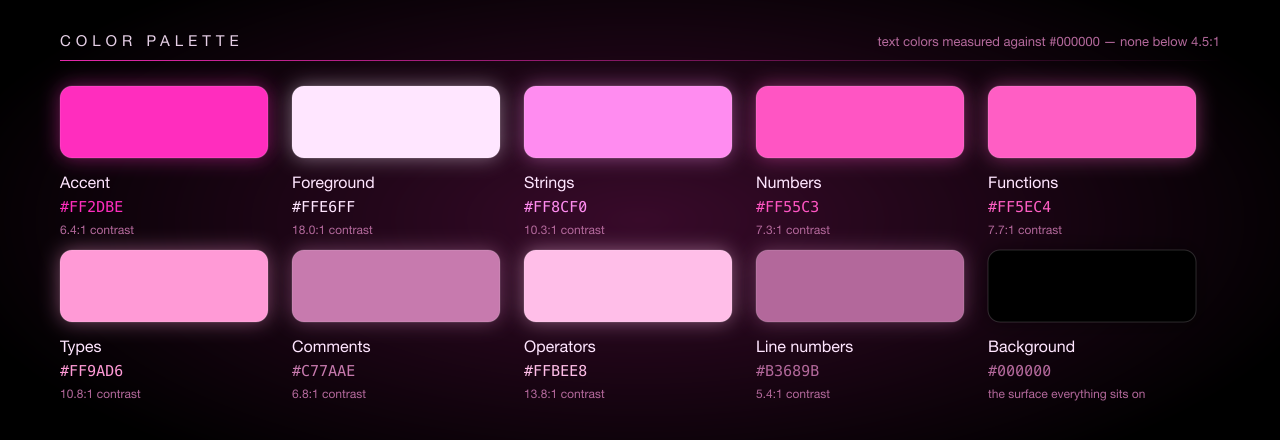
Every value below is opaque, so the code is what the color measures as — no alpha is composited away.
| Element |
Color Code |
On black |
Description |
| 🎯 Primary Accent |
#FF2DBE |
6.4:1 |
Neon pink (keywords, cursor, badges) |
| ⬛ Background |
#000000 |
— |
Pure black |
| 📝 Foreground |
#FFE6FF |
18.0:1 |
Light pink for regular text |
| 📜 Strings |
#FF8CF0 |
10.3:1 |
Bright pink for string literals |
| 🔢 Numbers |
#FF55C3 |
7.3:1 |
Vivid pink for numeric values |
| 💬 Comments |
#C77AAE |
6.8:1 |
Muted pink, italicized |
| 🔧 Functions |
#FF5EC4 |
7.7:1 |
Medium pink for function names |
| 📦 Types |
#FF9AD6 |
10.8:1 |
Light pink for type definitions |
| ⚙️ Operators |
#FFBEE8 |
13.8:1 |
Pale pink for punctuation |
| #️⃣ Line numbers |
#B3689B |
5.4:1 |
Dim pink, one step below comments |
The variants keep the hue and the ratio and only give up saturation — the accent is #F646C0 in Soft and #E25DB9 in Dimmed, comments #C082AC and #B487A6. Run node scripts/check-contrast.js --verbose for the full measured table of any of them.
🖼️ Screenshots
Every shot below is the extension running in VS Code, at a readable font size, on real files rather than a synthetic sample.
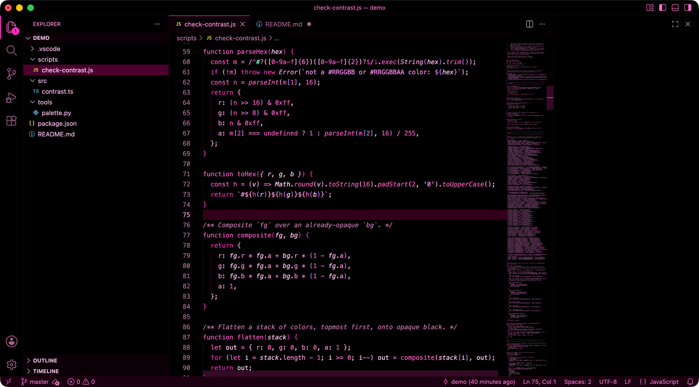
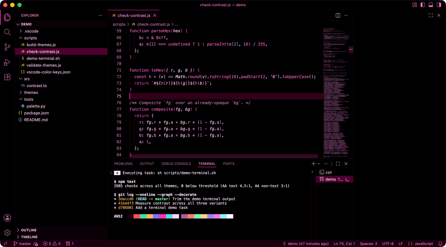
The whole window — activity bar, explorer, tabs, breadcrumbs, minimap, terminal and status bar. The terminal shows the 16 ANSI colors and a git log graph, both of which the theme defines rather than inherits.
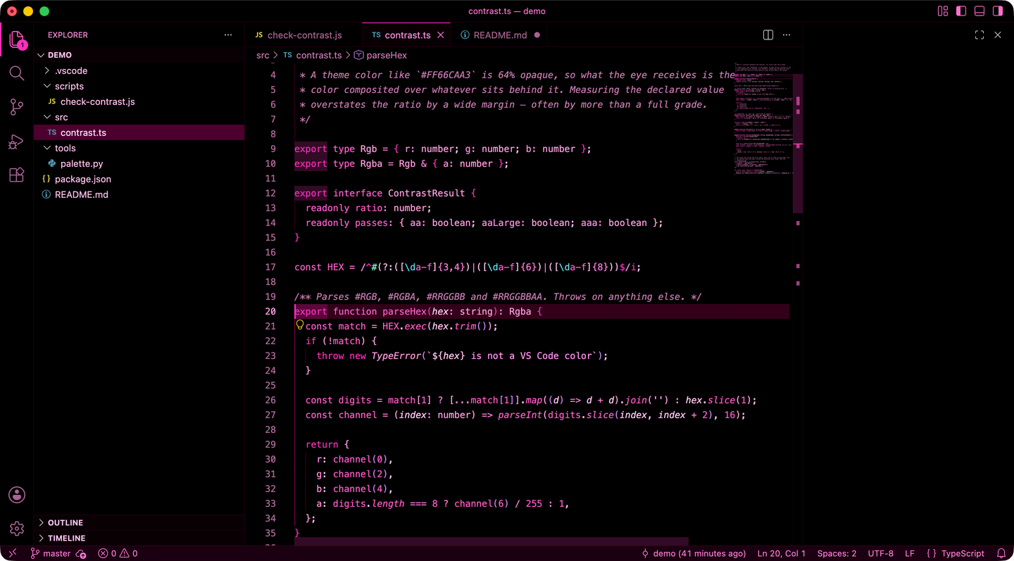
TypeScript — types, interfaces, regex literals and template strings.
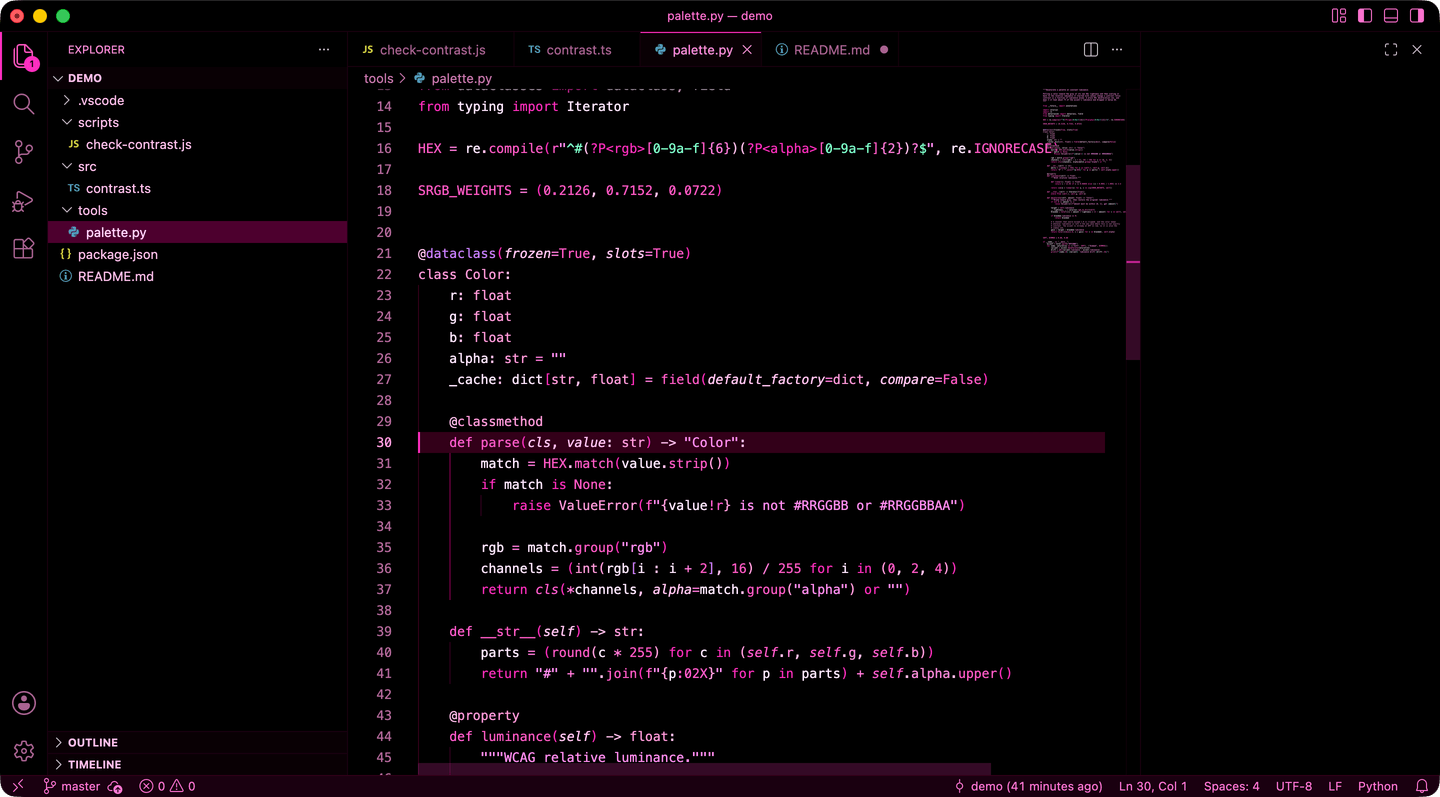
Python — decorators, dataclasses, docstrings and f-strings.
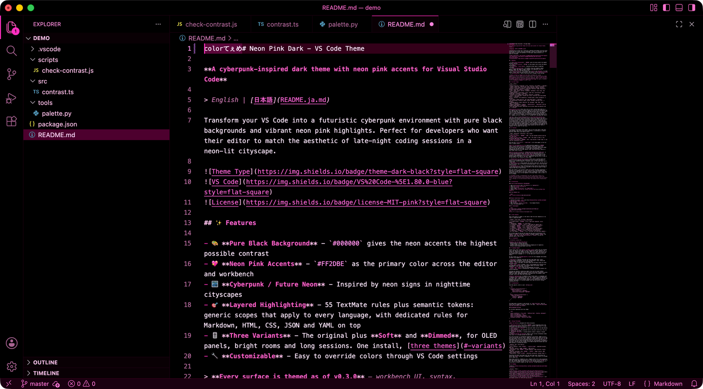
Markdown — headings, emphasis, inline code, links and blockquotes each get their own treatment.
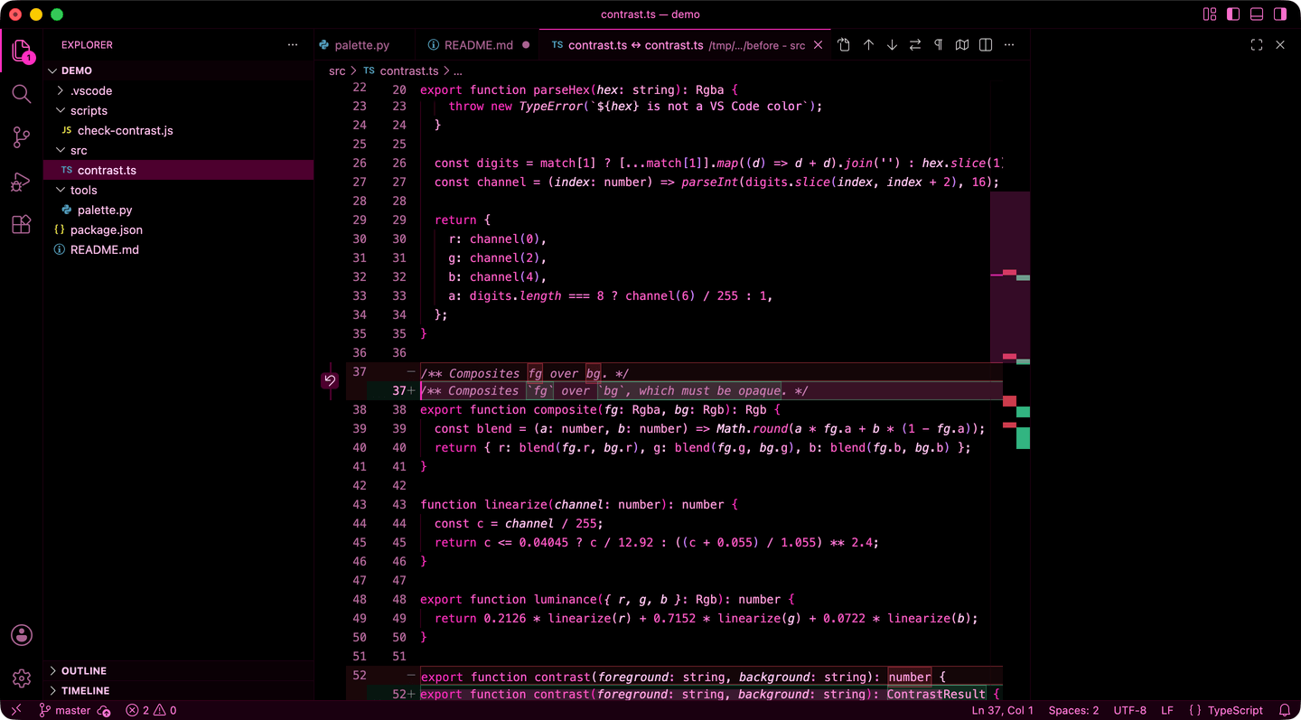
Diff — inserted and removed lines at both line and word level, with the word-level borders that mark where a change starts and ends.
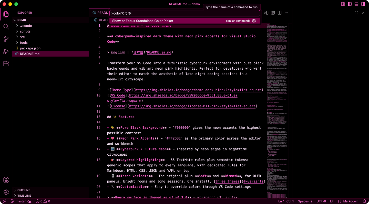
Command Palette — the overlay widgets are colored too: the palette, quick pick, IntelliSense, hovers and notifications.
🌐 Language Support
Syntax colors start from generic TextMate scopes rather than per-language rules. The same 23 rules apply to every language VS Code can tokenize, so JavaScript, TypeScript, Python, Go, Rust, Java, C/C++, Ruby, PHP and the rest all get consistent coloring out of the box — and the same concept keeps the same shade across languages, so if is the same pink in Rust as it is in Python.
On top of that sit language-specific rules for the languages that markup and data files depend on:
- Markdown — headings step down the pink ramp h1–h6; bold, italic, strikethrough, blockquotes, inline code, fenced blocks, links, tables and thematic breaks are each distinct from body text
- HTML / JSX — tag names, attribute names and attribute values are three different colors
- CSS / SCSS / LESS — element, class, id and pseudo-class selectors are distinguished from each other, and property names from values; custom properties (
--var) get their own color
- JSON / YAML / TOML — keys are distinguished from values
- Shell / SQL / regex — interpolation, character classes and anchors are colored separately
Coverage was checked by tokenizing sample files with the same TextMate grammars VS Code ships. What still falls back to the plain foreground is prose (HTML text nodes, Markdown paragraphs) and identifiers the grammars leave unscoped, such as SQL table and column names.
Semantic highlighting is enabled on top of both layers, so languages with a language server — TypeScript, Rust, C#, Java, Python — also get type-aware coloring: const reads differently from let, stdlib symbols are italic, and deprecated APIs are struck through. Semantic colors deliberately match their TextMate counterparts, so nothing changes color when the server finishes analysing the file.
⚙️ Customization
Override specific colors in your settings.json:
{
  "workbench.colorCustomizations": {
    "[Neon Pink Dark]": {
      "editor.background": "#0a0005",
      "editorCursor.foreground": "#FF00FF"
    }
  },
  "editor.tokenColorCustomizations": {
    "[Neon Pink Dark]": {
      "comments": "#FF99E6",
      "strings": "#FFB3E6"
    }
  }
}
The theme name in brackets is per-theme, so [Neon Pink Dark] does not affect Soft, Dimmed or Classic. To cover them all, list them: "[Neon Pink Dark][Neon Pink Dark Soft][Neon Pink Dimmed][Neon Pink Dark Classic]".
Recommended Settings
For the best experience with this theme:
{
  "editor.fontFamily": "'Fira Code', 'JetBrains Mono', Consolas, monospace",
  "editor.fontLigatures": true,
  "editor.cursorBlinking": "smooth",
  "editor.cursorSmoothCaretAnimation": "on",
  "workbench.iconTheme": "material-icon-theme"
}
🎯 Design Philosophy
Neon Pink Dark is designed with these principles:
- Maximum Contrast: Pure black (
#000000) gives foreground colors the highest possible contrast ratio — and where a variant trades some of it away for comfort, the floor still holds
- Consistent Color Language: The same pink shade carries the same meaning in every language
- Aesthetic First: The cyberpunk look is the point — but not at the cost of reading your own code
- Minimalist Approach: A limited palette creates a cohesive, focused experience
- Meaning Outranks the Palette: Where a color carries information rather than style, it is allowed outside the pink ramp
The fifth principle is a deliberate exception to the fourth, added in v0.3.0 along with the diff and Git colors. Added and removed lines cannot be the same hue, and neither can an error and a warning — at that point the color is the information, and a strictly pink palette would force you to read the text to learn what the color should already have told you. The exception is bounded to five hues, and each one was already in the theme through the bracket pair and ANSI palettes, so nothing new enters:
| Meaning |
Hue |
Also used by |
| Error, deletion |
Coral #FF4A5F |
invalid.illegal, unmatched brackets, ANSI red |
| Warning, conflict |
Amber #FFB05C |
ANSI yellow |
| Information |
Cyan #4DDDE8 |
Escape sequences, regex character classes, ANSI cyan |
| Addition, untracked |
Mint #3FE0A0 / #7DFFC6 |
Regex literals, ANSI green, bracket level 6 |
| Modification |
Violet #C77DFF |
Decorators and macros, bracket level 3 |
Everything the editor says about your own code stays pink. Everything the editor says about the code — a diagnostic, a diff, a Git status — is allowed one of these five.
Where these conflict, readability wins. Comments used to be a semi-transparent pink that looked right and measured 3.6:1; they are now a solid #C77AAE at 6.8:1. The rule the theme follows from v0.3.0 on: nothing ships below 4.5:1 on the surface it actually renders on, and npm test is what enforces it. Classic is the one theme outside that rule, because it is a snapshot of the theme from before the rule existed — it is measured and labelled rather than corrected.
🗺️ Roadmap
Tracked as GitHub milestones:
| Version |
Focus |
| v0.1.0 |
Complete workbench UI coverage — no more fallbacks to the built-in dark theme |
| v0.2.0 |
Syntax depth — language-specific scopes and semantic highlighting |
| v0.3.0 |
Accessibility — error/warning/diff colors and WCAG AA contrast |
| v0.4.0 |
Soft and Dimmed variants for OLED and long sessions |
| v1.0.0 |
Screenshots, CI and release automation |
A light variant is not on this list yet. See the note at the end of Variants for why it is a separate design problem rather than a fourth intensity.
⭐ Star the Repository
A theme ships with no telemetry and collects reviews slowly, so the star count is most of what the next person has to go on when they are deciding whether a pink theme is a gimmick or something they can read code in for eight hours. If this one earned a place on your screen, the button above is one click — the same one GitHub puts at the top of the repository page.
If it has not earned that yet, Issues is the more useful click: the color that reads wrong in your language, the surface the theme misses, the variant you want next.
🤝 Contributing
Contributions are welcome! Here's how you can help:
- 🐛 Report bugs via Issues
- 💡 Suggest new features or improvements
- 🎨 Submit color refinements for specific languages
- 📖 Improve documentation
- 🌍 Add translations
CONTRIBUTING.md has the full workflow. The short version:
npm install
npm run build   # regenerate the Soft and Dimmed variants
npm test        # structure, staleness and contrast — the same checks CI runs
- Fork, then branch from
main
- Edit only
themes/neon-pink-dark-color-theme.json — the Soft and Dimmed files are generated from it, and npm test fails if they are stale
- Test with
F5 in VS Code
- Add a
## [Unreleased] entry to the CHANGELOG
- Open a Pull Request
New colors have to clear WCAG AA on every surface they render on and stay on the pink ramp — see Design Philosophy for the exception. npm test measures it.
📝 Changelog
See CHANGELOG.md for release history.
📄 License
MIT License - see LICENSE file for details.
🙏 Acknowledgments
- Inspired by cyberpunk aesthetics and neon-lit cityscapes
- Color theory based on complementary pink/magenta palettes
- Community feedback and contributions
🔗 Links
🏷️ Keywords
dark theme neon pink magenta cyberpunk black theme color theme syntax highlighting vscode theme futuristic neon lights developer tools code editor theme

Enjoy coding in the neon 💖✨
Star it, share it, or tell me what to fix — all three help the theme find the people who want it.