Color Wheel 🎨


A theme for your ever-changing moods...
Color Wheel by eScape Technology LLC is a dynamically-updating algorithmic theme based on the Color Wheel. Lots of settings create tweakable and ever-changing colors for your IDE. If you tire of looking at the same colors every day, or constantly switch themes, this extension is for you!
You get THREE theme-based features in one extension:
- Base Theme - algorithmic VS Code theme, in
dark and light variants. Includes theme colors and syntax highlighting.
- Accent Theme - highlights "key" UI elements on a per-workspace basis. You can use this with any VS Code theme, even if Wheel is not your (current) theme! No need for a separate extension.
- Theme Generator - take your current colors and create a new VS Code theme extension from it!
Run in two different modes:
- Automatic updates on a timer.
- On-demand updates via
Command Palette commands. Always available, even with auto-update enabled.
Base and Accent themes update separately, each with their own settings. Accent theme requires you use a Workspace. See below for images.
For additional features (value sources), you should add your Geographic Location:
- Accurate sunrise/sunset calculations.
- Accurate weather forecast data.
- As of 0.7.0 Weather Status Bar Item.
⚠️ Since VS Code 1.42.0, automatically changing the theme based on OS appearance is enabled. To use this extension you may need to set "window.autoDetectColorScheme": false or set Wheel as one of your preferred themes.
Theme Gallery
A "complete" VS Code theme has literally hundreds of individual colors that can be configured.
The "dark" scheme is light text on a dark background. The "light" scheme is dark text on a light background. The Terminal window is always a black background, so ANSI colors always display with proper contrast.
Examples
The following images are examples of Wheel Dark with the different Scheme configurations. See the following sections for details.
|
|
|
|
|
| Analogous | Split Analogous | Tetradic (default) | Triadic | Split Compliment |
These images are examples of the Background Adjustment Factor setting, using the Tetradic scheme.
|
|
|
|
|
| Medium | High (default) | Higher | Maximum |
These images are examples of the Hue Spread setting, using the Analogous scheme.
|
|
|
| Small (default) | Medium | Large |
Syntax Highlighting
You can turn Syntax Highlighting on or off. When enabled, colors are allocated from the Base Theme.
Color Space
Color Wheel uses the HSL color space (technically a bi-conic solid) in its internal calculations:
- H
hue color "angle" [0..360)
- zero degrees is Red,
- Roy G Biv!
- S
saturation (relative chroma) is the "purity" of the color [0..100%]
- 0% is "no color" (or grey).
- 100% is "full color" (pure).
- is most effective at 50%
lightness (see below).
- L
lightness is the "shade" of the color [0..100%]
- 0% is "no lightness" (or black).
- 50% is where
saturation is fully expressed.
- 100% is "full lightness" (or white).
Color "syntax" is what is accepted for CSS:
- a "hex" RGBA color value
#rrggbbaa alpha is optional #rrggbb
- a color system value
hsl(180,60%,80%) or hsv(180,60%,80%)
Specifying color other than hsl eventually gets converted into hsl color system. Not using hsl can result in rounding errors.
Color Allocation (schemes)
These are the basic ways of allocating colors, called Schemes:
Monochrome is series of "shades" of the same hue.Analogous is series of adjacent hues.Split Analogous is two series of adjacent hues with a "gap" between them.Split Compliment uses the 180-degree opposite (and adjacent hues) as "secondary" colors.Triadic uses three equally-spaced hues.Tetradic uses two pairs of complimentary hues.
Color Wheel uses the convention that each scheme has one "primary" and three "secondary" colors, for a total of 4 colors.
Sub Schemes
There is advantage to segregating the color allocations into "sub-schemes" for further customization:
- core (foreground and background)
- ui elements
- error/info/warning indicators and text
- hover states
- selection states
- terminal (e.g. ANSI colors).
- etc.
The core scheme is configurable in settings.
Schemes with a semantic meaning use an "anchor" color, e.g. the error scheme always uses a red hue, but the S and L come from the algorithms (see below). These schemes use monochrome for simplicity and to avoid generating "off" colors.
Base Color
When the theme updates, the initial HSL is "calculated" via algorithms (e.g. H = time-of-day) or constant values (e.g. S = 1). This is the base color, from which most of the other colors are calculated, using different rules.
The base color becomes the primary color of the theme's Color Allocation. This color is the theme foreground. The secondary color is adjusted (darkened for dark or lightened for light) by the Background Adjustment Factor, and this becomes the theme background.
Calculating Base Color
Each "channel" of the base color HSL has an algorithm attached to it (see below), which evaluates in two stages:
- stage 1 calculates a normalized value in the range [0..1] from its sample value.
- stage 2 takes the normalized value and scales it to the appropriate range: [0..360) for hue, [0..100] otherwise.
Lightness is (stage 2) scaled to [40..100] for the dark variant and [0..60] for the light variant, to avoid low-contrast situations.
HSL Algorithms
You may choose one of several algorithms for varying each HSL component:
- Time-of-day - ratio of current time through a specified period (default 24). Use 12 to create two cycles per day, etc.
- Fixed - enter the value in
settings.
- Random - courtesy of our favorite PRNG
Math.random().
- Sundial - ratio that varies:
- [0..1] from dawn to high-noon,
- [1..0] from high-noon to dusk,
- zero otherwise.
- Lunar - ratio of current time through the lunar cycle, approximately 29.5 days.
- Temperature - current temperature in Celcius ranged in [-10..40] degrees.
- Humidity - current relative humidity in [0..100] percent.
- Workspace color - selects the HSL component of the workspace color (see below).
Sundial requires you have a valid location in settings (see below).
Weather requires a valid location in settings and Internet connectivity. Weather updates on the hour, or on startup if 30 minutes or more before the next hour.
The algorithms try to be "circular" where possible, to avoid jarring changes in HSL components because of "rollover".
A workspace color is automatically created based on hash of the folder path or workspace file (if available). You may override in Workspace settings.
Other Settings
Here are more details of the theme settings. See the image gallery above for visuals.
You can use Color Wheel as a "static" theme. Just adjust the fixedValue option in the settings to your favorite color, and disable auto-updates. If you perform adjustments with auto-update enabled, the theme adjusts as you tweak.
Schemes
- The default base scheme is
Tetradic. Each scheme allocates 4 colors. Successive colors are separated by maximum hue with respect to the remaining colors.
- Subschemes are
Monochrome and based on one of the colors in the base scheme, except for semantic colors like Error or Warning.
Terminal colors are always the same palette against a black background.
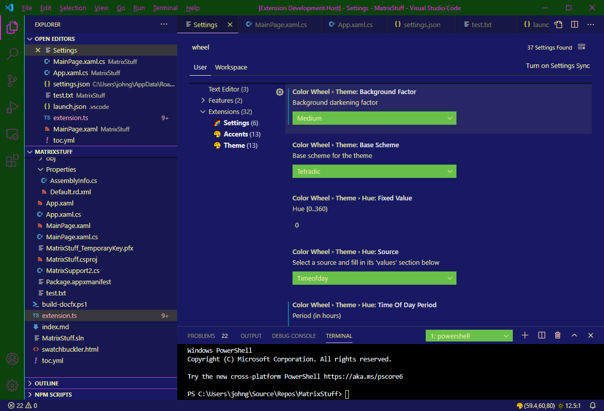
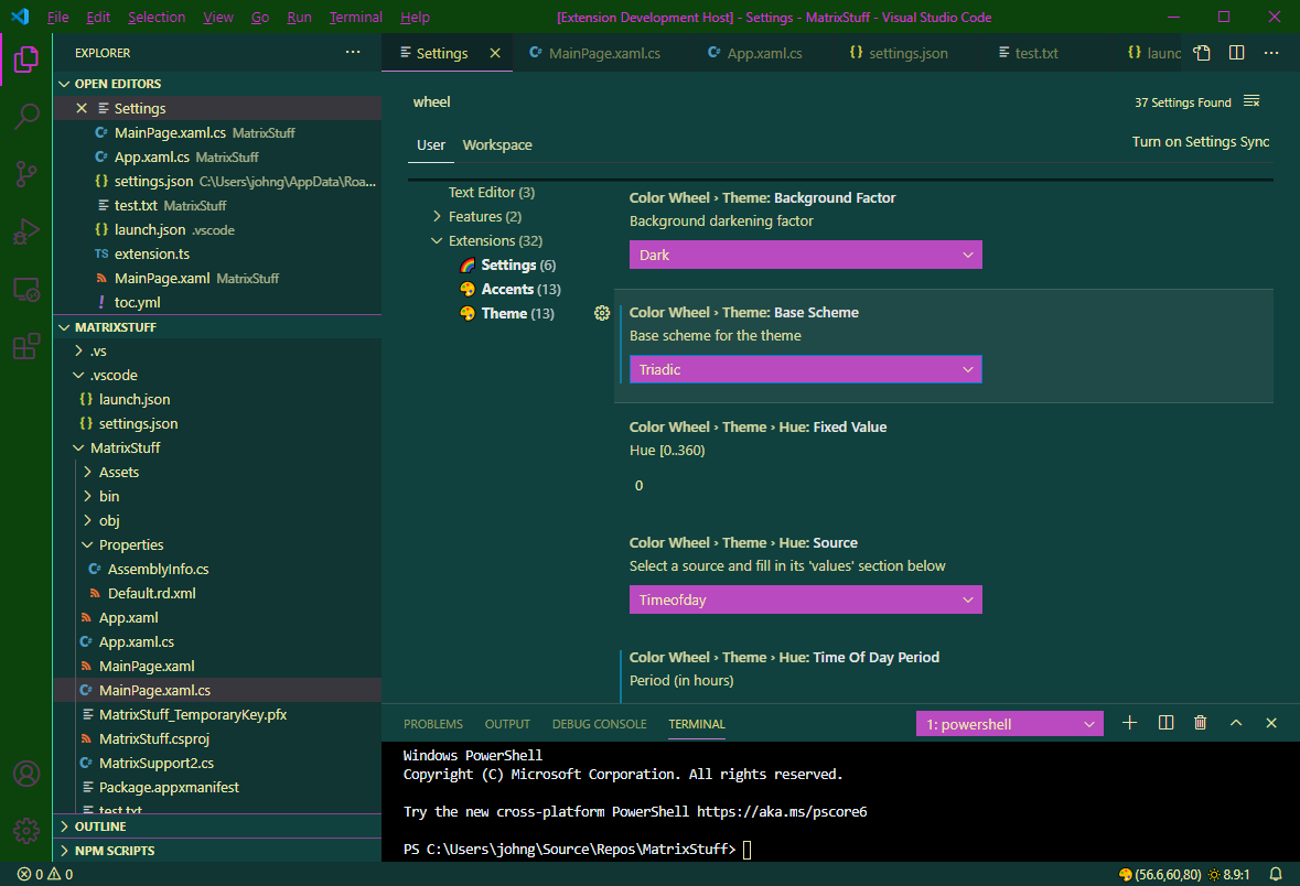
Background Adjustment Factor
Controls how "dark" or "light" the background is, compared to the Base Color. The background is the Number 2 color (complementary color when possible) of the scheme.
- Medium (.7)
- High (default .8)
- Higher (.9)
- Maximum (1)
Hue Spread
Within each scheme (except Triadic) you can specify how "far apart" adjacent hues are allocated. Actual amount depends on the scheme.
- Small (default)
- Medium
- Large
Defaults for each scheme (in degrees):
- Analogous: 20
- Split Analogous: 51
- Split Compliment: 20
- Tetradic: 45
Borders
As of 0.6.0, you control all of the theme's Border Colors from the settings. This replaces the bordered theme variant.
Borders are applied to different aspects of the UI (that define explicit borders):
general this applies borders to all the major UI elements exposing a "border" except as noted:
sash.borderColor is always applied.checkbox.borderColor is always applied.- borders from the other categories (below).
hover this applies borders to UI exposing a "hover state".selection this applies borders to UI exposing a "selection state".inputValidation this applies borders to the "input validation" UI elements.editor (as of 0.7.0) this applies borders to editor-specific UI elements.
editorSuggestWidget.bordereditor.lineHighlightBordereditorUnnecessaryCode.border
Timers
Timers drive the whole process. There are two timers:
- auto-update - runs once per minute.
- geo - runs once per hour.
The first "tick" of the timer is for clock-alignment purposes, so that the timers "tick" on exactly the hour/minute, e.g. if you start the IDE at 35 seconds past the minute, the first "tick" occurs in 25 seconds, then every 60 seconds afterwards. Also, if the time to the first tick is too long, a "phantom" tick is generated, just so data can be "fresh", e.g. if weather updates every 60 minutes, you don't want to wait that long to see the first update.
With that said, the timers calculate values on the interval, and these are fed into the calculations you have selected in Settings and watched for a threshold change in value, before recalculating the theme or accent colors. This prevents spurious updates where you wouldn't notice the color difference visually, and sometimes VS Code "lags" on the theme updates, which may cause a brief flash of content.
Theme Creation Support
You can use Wheel as a theme generation and creation tool! Use the following commands to customize and create your own themes for further customization outside of Wheel itself in VS Code.
As of 0.7.2 Theme Commands require you to Trust the Workspace since they create/modify files.
Generate Theme Extension
The Generate Theme command creates a new VS Code Extension (theme) project based on the current Wheel theme's JSON contents. This creates output like running yo code with the New Color Theme option and no TextMate option. Does not require you to install yeoman or the generator-code generator.
Simply adjust all the colors to your liking, and run the command!
You must correctly fill out a series of Quick Picks:
- Select an existing folder where
Generate Theme can create the VS Code extension folder and its contents. This should be inside a workspace folder for best results, but you can select any folder.
- Enter information needed for
package.json.
- Enter information needed for the
contributes.themes entry.
- Whether you want the
quickstart Markdown file created.
- This file gets ignored by everything, is not included in the extension, so you may not want it.
- Whether you want to include the
workbench.colorCustomizations colors from your workspace file.
- Currently acceses
user level settings (applied to all windows).
- Whether you want to include Syntax Highlight colors.
- You must have the corresponding option enabled in
settings so those colors are getting created.
- Whether to add this folder to your
workspace (if not already present).
The generated project includes everything you need to hit F5 and be on your way:
git control files (.gitignore, .gitattributes).vscode control file (.vscodeignore).package.json file.- Markdown files for
README, CHANGELOG, and quickstart (if enabled).
- A copy of the current Wheel theme JSON in the
themes folder.
- A
launch.json so you can launch the Extension Host with your new theme.
Update Theme Extension
Once you have a Theme Extension project in your workspace, you can use the Update Theme Extension to overwrite only the JSON color data.
You must correctly fill out a series of Quick Picks:
- Select the workspace folder containing your theme extension.
- If the
package.json is not detected the command fails.
- If the
package.json exists but has no contributes.themes array the command fails.
- Select the
contributes.themes entry you want to overwrite.
- Whether you want to include the
workbench.colorCustomizations colors from your workspace file.
- Currently acceses
user level settings (applied to all windows).
- Whether you want to include Syntax Highlight colors.
Reveal Color
With the vast number of colors a theme may contribute, sometimes it is difficult to figure out where any given color appears in the IDE. This is especially true if you are designing a theme (as we are here)!
The Reveal Color command lets you temporarily "highlight" a theme color for debugging purposes, or just to learn where the theme colors appear in the IDE. See the Swatchbuckler page or VS Code Theme color documentation for more information.
You must correctly fill out a series of Quick Picks:
- Select theme color token from the list.
- Enter color value
#rrggbbaa. Make sure to use a color that is easily distinguished!
When successful, the theme is updated with the given color. Now you must find it in the IDE!
The color change persists until the next theme update.
Customize Color
The Customize Color command lets you "override" a theme color via the workbench.colorCustomizations setting, without any manual editing of the settings.json file.
You must correctly fill out a series of Quick Picks:
- Select theme color token from the list.
- Enter color value
#rrggbbaa to set, or empty string (not escape) to revoke. Make sure to use a color that is easily distinguished!
When successful, the theme color is updated to your workspace settings.
The color change persists until you revoke it, unless you conflict with the Accent Theme (which uses the same mechanism to apply colors).
Location
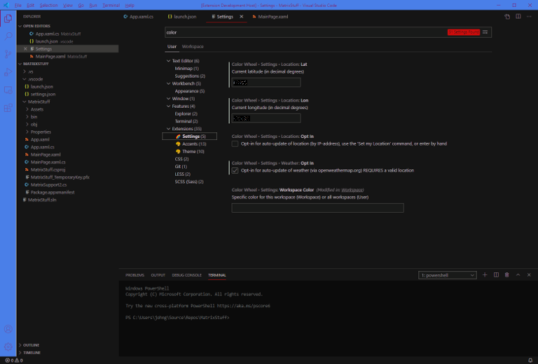
In order to use features Sundial and Weather your geo-location is required. You may fill in your location:
- enter coordinates in
settings,
- use the
Set My Location command (requires Internet),
- if you change location frequently, opt in for automatic updates (requires Internet).
Your location is obtained via your public IP address and 3rd-party service (see below). GPS is not used.
Accent Theme
Completely independent of the theme, are accents; colors saved in the workbench.colorCustomizations Workspace setting. Color Wheel lets you set up a selected set of UI elements to treat in this way, on a per-workspace basis:
- activity bar
- active title bar
- status bar
- window active/inactive border
You can customize the Base Scheme in settings.
As the name implies, the accent scheme's base color is applied to the background color (opposite of the main scheme). Workspace color is calculated based on the full path to your workspace file.
Accents will overwrite any changes you made manually to the corresponding workbench.colorCustomizations colors. You should disable the settings for those UI elements if you want to customize manually.
The Accent theme updates:
- on demand any time via
Update Accents Now command.
- when you enable the
Auto-Update setting.
If you use multiple workspaces in multiple instances of VS Code, each workspace can have different accents, to easily tell them apart.
⚠️ Remember: you must use a Workspace file (xxx.code-workspace) for this to function correctly.
Swatchbuckler
To help you visualize the current theme colors, this Web View displays color swatches of each defined theme component.
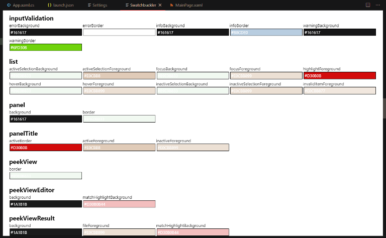
The color schemes are also displayed (not shown in screen shot).
Status Bar
To help you track the current base color, a Status Bar item displays:
- current color HSL
- fg/bg contrast ratio
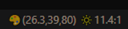
You can click on it to open the Swatchbuckler web view to view the theme color palette.
Weather Status Bar
As of 0.7.0, you can enable this status bar to display weather information:
- If you have a valid
Location.
- If you have enabled
Weather opt-in.
The Weather Status Bar shows the following information (see settings for more info):
- Conditions icon (sun, rain, cloudy, etc.).
- Temperature and "feels like" temperature.
- Relative Humidity.
- Barometric Pressure.
- Wind direction, speed, and gust.

If you enable the Show Trend setting, an up or down arrow is displayed next to the value (except for wind).
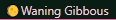
Lunar Status Bar
As of 0.7.0, you can enable this status bar to display lunar phase.
To avoid having a valid Location, you must specify the hemisphere; lunar phase is "opposite" in each hemisphere.
The Lunar Status Bar shows the following information (see settings for more info):
- Lunar Phase icon (full, new, etc.).
- Lunar Phase text.
Callouts
Aside from massive ensemble cast of packages making up VS Code, these NPM packages are put to good use in this extension:
- Color throughout in color calculations.
- Handlebars in the theme template engine,
Generate Theme command, and Swatchbuckler HTML.
- Suncalc in
Sundial feature.
- Lunarphase-js in
Lunar feature.
These third-party web services are used:
- The IP API web service is free and used for Geo-location in
Location feature.
- The openweathermap.org web service is free and used for Weather forecast data in
Weather feature.
These other VS Code extensions and theme sources provided inspiration and techniques adapted for this extension.
Donate
If you feel generous and want to support our ongoing freeware and open-source software efforts on multiple platforms and languages:
Please visit the PP link below.

