Auric Artisan Theme
Twenty-four themes, and an engine to make the twenty-fifth yours.
The auricartisan.com design system, ported to VS Code in full.

Install and pick a theme
- Install Auric Artisan Theme from the Marketplace.
- Press Ctrl+K then Ctrl+T (⌘+K ⌘+T on macOS).
- Type Auric and choose one of the twenty-four.
That is the whole setup. Everything below is optional.
Prefer a menu? Auric Theme: Switch Variant… in the Command Palette lists them
with their canvas and polarity. Ctrl+Alt+' cycles.
One accent, the whole workbench
The accent is a key, not a coat of paint. Every wash, border, selection, focus ring
and cursor is derived from it — rotated in OKLCH at fixed lightness and chroma, so a
sapphire lands with the same weight the gold had instead of turning to mud.

That is also how the twenty-four shipped variants are built: one family of neutrals, one
accent, everything else derived.

The variants
Thirteen dark

Eleven light

| Family |
Canvas |
Character |
| Obsidian |
#0C0C0E |
Warm charcoal — the site's own surface ramp. Eight accents. |
| Midnight |
#050505 |
Near-black, for OLED panels and dark rooms. Four accents. |
| Parchment |
#FFFCF7 |
Warm cream. Carries the warm accents. Four. |
| Porcelain |
#FBFCFD |
Cool white. Blue, violet, teal and grey sit badly on cream; they sit here. Six. |
| High contrast |
#000000 / #FFFFFF |
hc-black and hc-light, with gold borders on every control. |
All twenty-four, with their exact values
| Family |
Accent |
Id |
uiTheme |
Canvas |
Accent |
| Obsidian |
Gold |
obsidian-gold |
vs-dark |
#0C0C0E |
#D3AF37 |
| Obsidian |
Sapphire |
obsidian-sapphire |
vs-dark |
#0C0C0E |
#6BA3E8 |
| Obsidian |
Rose |
obsidian-rose |
vs-dark |
#0C0C0E |
#E08AA0 |
| Obsidian |
Amethyst |
obsidian-amethyst |
vs-dark |
#0C0C0E |
#B48AE6 |
| Obsidian |
Patina |
obsidian-patina |
vs-dark |
#0C0C0E |
#5CC9B4 |
| Obsidian |
Emerald |
obsidian-emerald |
vs-dark |
#0C0C0E |
#5CC489 |
| Obsidian |
Ember |
obsidian-ember |
vs-dark |
#0C0C0E |
#E0764A |
| Obsidian |
Crimson |
obsidian-crimson |
vs-dark |
#0C0C0E |
#E06A6A |
| Midnight |
Gold |
midnight-gold |
vs-dark |
#050505 |
#D3AF37 |
| Midnight |
Sapphire |
midnight-sapphire |
vs-dark |
#050505 |
#6BA3E8 |
| Midnight |
Rose |
midnight-rose |
vs-dark |
#050505 |
#E08AA0 |
| Midnight |
Iris |
midnight-iris |
vs-dark |
#050505 |
#8E9BF0 |
| Parchment |
Gold |
parchment-gold |
vs |
#FFFCF7 |
#876C00 |
| Parchment |
Rose |
parchment-rose |
vs |
#FFFCF7 |
#A3536A |
| Parchment |
Ember |
parchment-ember |
vs |
#FFFCF7 |
#B54F20 |
| Parchment |
Emerald |
parchment-emerald |
vs |
#FFFCF7 |
#00804B |
| Porcelain |
Sapphire |
porcelain-sapphire |
vs |
#FBFCFD |
#376DAE |
| Porcelain |
Amethyst |
porcelain-amethyst |
vs |
#FBFCFD |
#8259B0 |
| Porcelain |
Patina |
porcelain-patina |
vs |
#FBFCFD |
#007D6C |
| Porcelain |
Rose |
porcelain-rose |
vs |
#FBFCFD |
#A3536A |
| Porcelain |
Iris |
porcelain-iris |
vs |
#FBFCFD |
#5B65B5 |
| Porcelain |
Graphite |
porcelain-graphite |
vs |
#FBFCFD |
#6B6B6B |
| High contrast |
Gold |
obsidian-gold-high-contrast |
hc-black |
#000000 |
#D3AF37 |
| High contrast |
Gold |
porcelain-gold-high-contrast |
hc-light |
#FFFFFF |
#8C7100 |
Light accents are darkened automatically until they clear AA against the side bar —
the lighter of the two surfaces an accent has to read on — which is why the light values
differ from the dark ones. #E08AA0 on parchment is a 2.1:1 colour; #A3536A is the
same rose you can actually read.
How to customise it
Open the Studio with Ctrl+Alt+;, or click the paintcan
in the status bar, or run Auric Theme: Open Theme Studio.
Nothing you do here needs a reload. Every change is written as a theme-scoped
override and applies instantly.
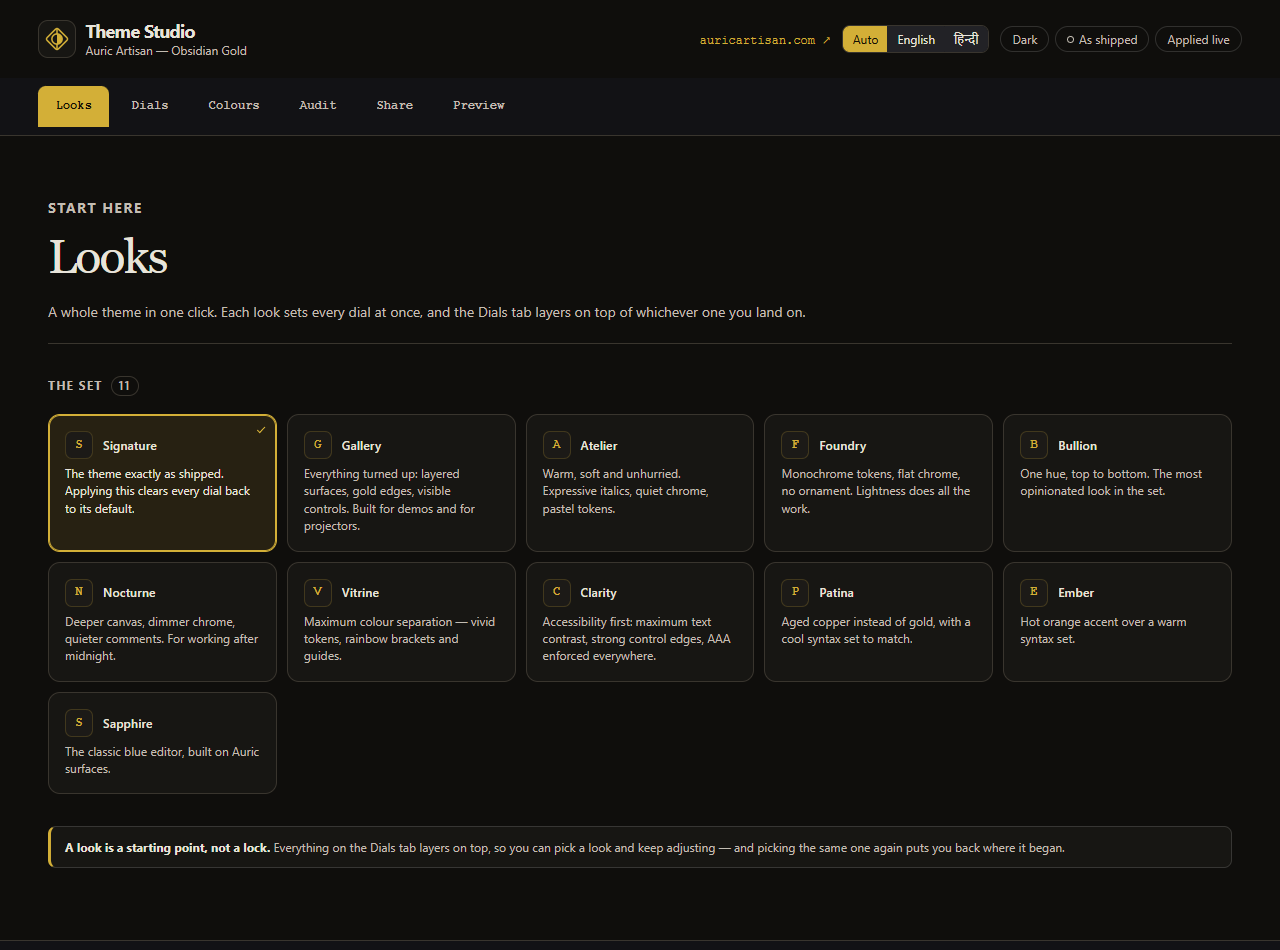
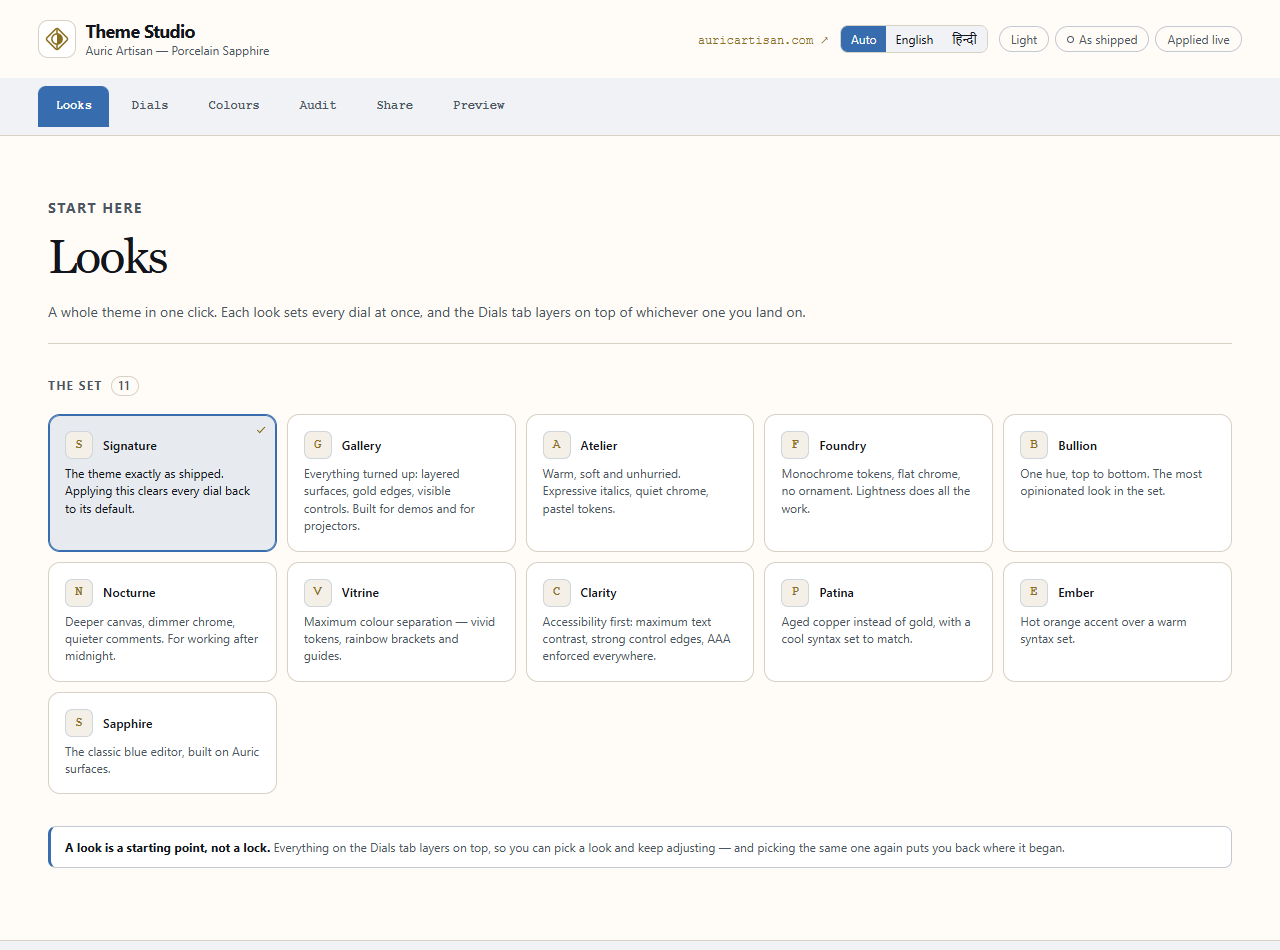
1 · Start from a look

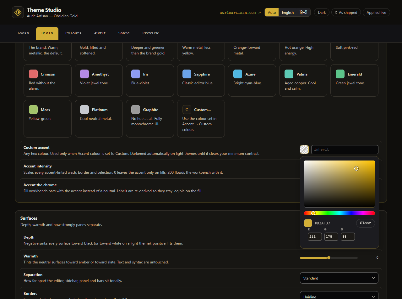
Eleven named starting points. A look is a layer, not a reset — it sets a batch of
dials, and anything you change afterwards still wins.
Gallery turns everything up for a projector. Nocturne deepens the canvas and quiets
the comments. Foundry goes monochrome. Clarity pushes contrast to AAA.
2 · Turn the dials

Thirty-seven of them, grouped: surface depth, warmth and separation · border weight ·
text contrast · comment emphasis · syntax palette, saturation, italics and bold · cursor
· selection strength · current line · bracket pairs · indent guides · whitespace · inlay
hints · sticky scroll · tab style · every bar · the ANSI palette · shadows · focus ring.
A gold dot marks anything you have changed, with a one-click revert beside it.
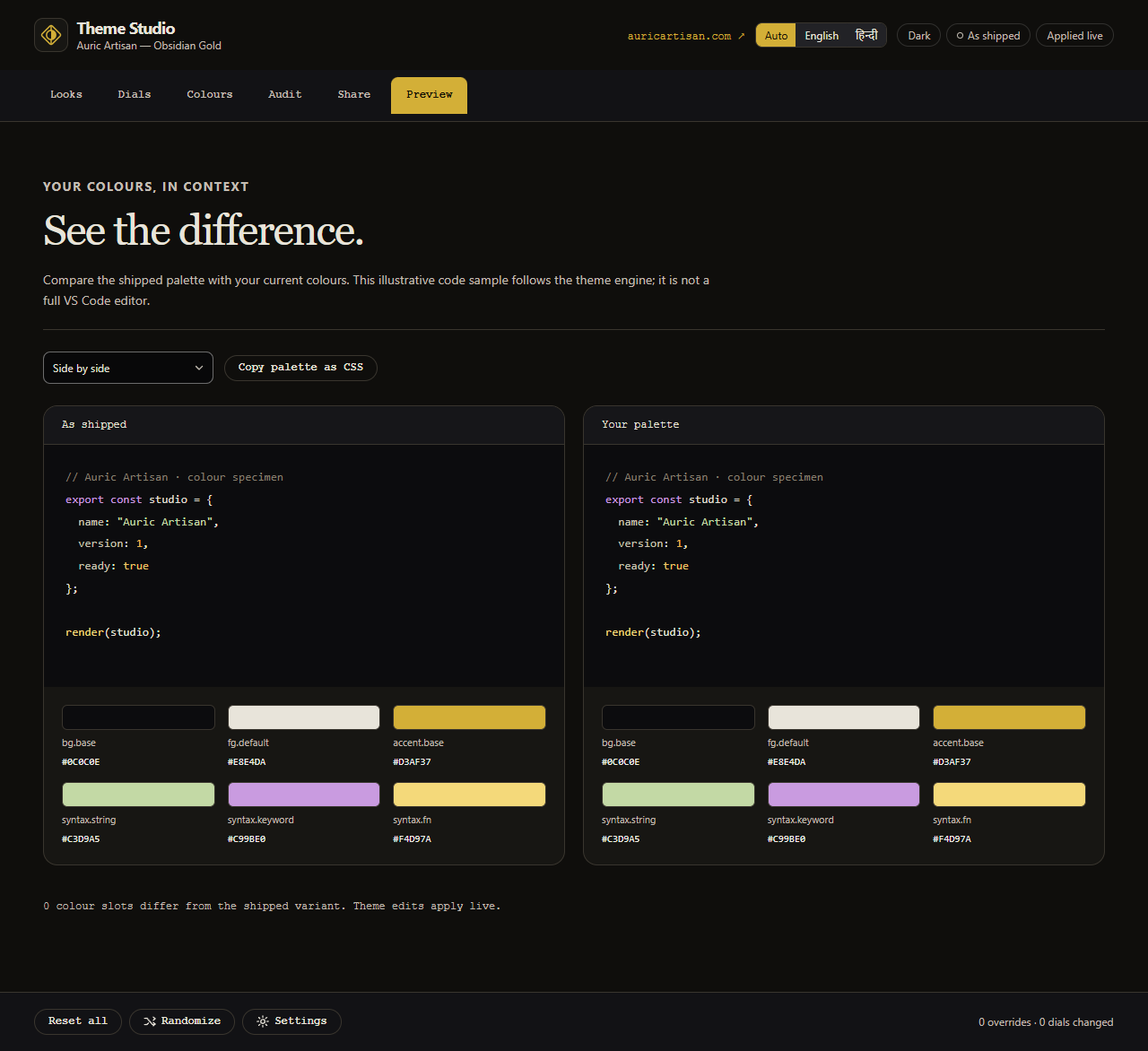
3 · Or go straight to the colours

All 107 slots the theme is built from — surfaces, the foreground ramp, lines, accent,
states, selection, semantics, the ANSI set, git decorations and all 26 syntax roles.
Search, expand a group, pick a colour. A hand-picked value beats every dial above it.
4 · Check it is still readable

Eighty-one contrast pairs, live, with WCAG ratios and APCA Lc. Failures sort to the top.
5 · Keep it, or share it

Save a named preset, copy your customisation to the clipboard as JSON, paste someone
else's, or export a standalone *-color-theme.json.
Exports store your dials and overrides, not resolved colours — so a theme you share
today picks up engine fixes shipped tomorrow.
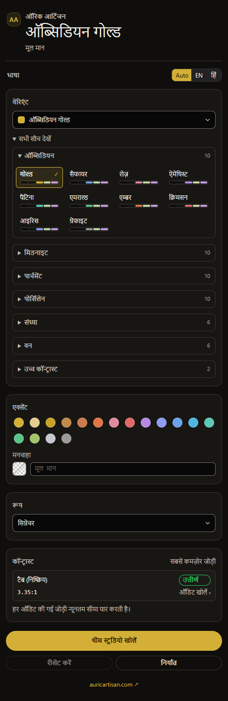
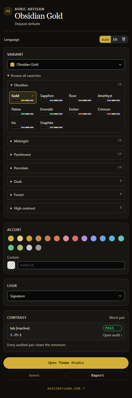
For the things you want without opening a panel:
- Variants, grouped by family, each with a live five-colour preview strip.
- Accent as a swatch grid — one click re-keys the whole workbench.
- Look picker.
- Contrast — the worst pair in your current theme and whether it passes. Click it to
open the Audit tab.
- Open Theme Studio, Reset, Export.
It holds its layout down to 200px, so it works in a narrow side panel.
Settings
Every dial is a real setting under auricTheme.*, so a team can commit a house style to
.vscode/settings.json and everyone gets the same editor.
{
// Re-key the theme onto any hue. `inherit` keeps the variant's own accent.
"auricTheme.accent.preset": "patina",
"auricTheme.accent.custom": "#5CC9B4",
"auricTheme.accent.intensity": 120,
// Syntax
"auricTheme.syntax.palette": "cool", // jewel · vivid · pastel · mono · bullion
// classic · warm · cool · duotone
"auricTheme.syntax.italics": "off",
"auricTheme.syntax.saturation": 90,
// Surfaces
"auricTheme.surface.depth": -1,
"auricTheme.surface.warmth": 20,
"auricTheme.surface.separation": "layered",
// Guard rails
"auricTheme.a11y.enforceContrast": true,
"auricTheme.a11y.minContrast": 4.5 // 4.5 = AA, 7 = AAA
}
Commands
| Command |
Does |
Auric Theme: Open Theme Studio |
The full panel. Ctrl+Alt+; |
Auric Theme: Switch Variant… |
Pick from the twenty-four |
Auric Theme: Cycle Variant |
Ctrl+Alt+' |
Auric Theme: Choose Accent Colour… |
Re-key from a quick pick |
Auric Theme: Choose Look… / Choose Syntax Palette… |
|
Auric Theme: Toggle Italics |
|
Auric Theme: Surprise Me |
A tasteful randomiser — curated accents and palettes only |
Auric Theme: Show Contrast Report |
The full audit as a document |
Auric Theme: Save / Load Preset… |
|
Auric Theme: Copy / Apply Customisation |
Share via the clipboard |
Auric Theme: Export as Theme File… |
A standalone theme JSON |
Auric Theme: Reset Everything |
Back to the shipped theme |
Accessibility is enforced, not claimed
Every colour the engine emits passes a contrast guard before it reaches your editor.
Anything below your minimum is pushed along its OKLCH lightness axis until it clears,
keeping hue and chroma intact.
The guard runs after your hand-picked colours, not before. A colour you chose is a
strong preference; it is not a licence to make comments invisible.
The build audits 81 pairs per theme — 1,944 in total: editor text, all 26 syntax
roles, the 14 text-bearing ANSI colours, git decorations, and the text and borders of
every dropdown, input, checkbox, radio, button, badge, menu and quick pick. Form-control
borders are held to WCAG 1.4.11's 3:1 against the fill they enclose, and that is checked
rather than asserted. A missing colour is a failure, not a skip.
Turn the guard off if you want the freedom. The audit still reports.
Two consequences worth knowing:
- On parchment the published
#D3AF37 measures 2.9:1 — it is a tint, not text. The
light variants derive a working gold instead, and keep the brand chip for washes and
hairlines.
fg.faint — disabled controls, ghost text, the watermark — is deliberately not
guarded. WCAG exempts disabled controls, and forcing it up would make ghost text
compete with real code.
How it works
There is no supported way to register a colour theme at runtime, so customisation writes
theme-scoped overrides into three settings:
workbench.colorCustomizations → ["obsidian-gold"] { … }
editor.tokenColorCustomizations → ["obsidian-gold"] { textMateRules: […] }
editor.semanticTokenColorCustomizations → ["obsidian-gold"] { enabled: true, rules: {…} }
They apply instantly, apply only while an Auric theme is active, and disappear cleanly
when removed. Blocks belonging to other themes, and your own unscoped customisations, are
never touched.
With every dial at its default the engine reproduces each shipped theme byte-for-byte
— and the build fails if it doesn't. An untouched install writes nothing to your
settings.json.
Building
The theme files are generated. Editing themes/*-color-theme.json directly will be
overwritten.
npm run build regenerate themes/ and package.json, fail on any error
npm run check validate only
npm run report the full contrast table, per variant, with APCA
npm test the engine suite plus the shipping gate
npm run preview render both webviews and screenshot them
npm run assets regenerate the README art
npm run logo redraw the brand mark
lib/ is the engine — OKLCH colour maths, the palette, the 107-slot schema, the 37
dials, the composer, the workbench and token maps, the audit. build/ is tooling and
never ships. Zero runtime dependencies, no bundler, no network.
© 2026 Auric Artisan · Licence: see LICENSE.txt in the extension · auricartisan.com