Santi020k Theme



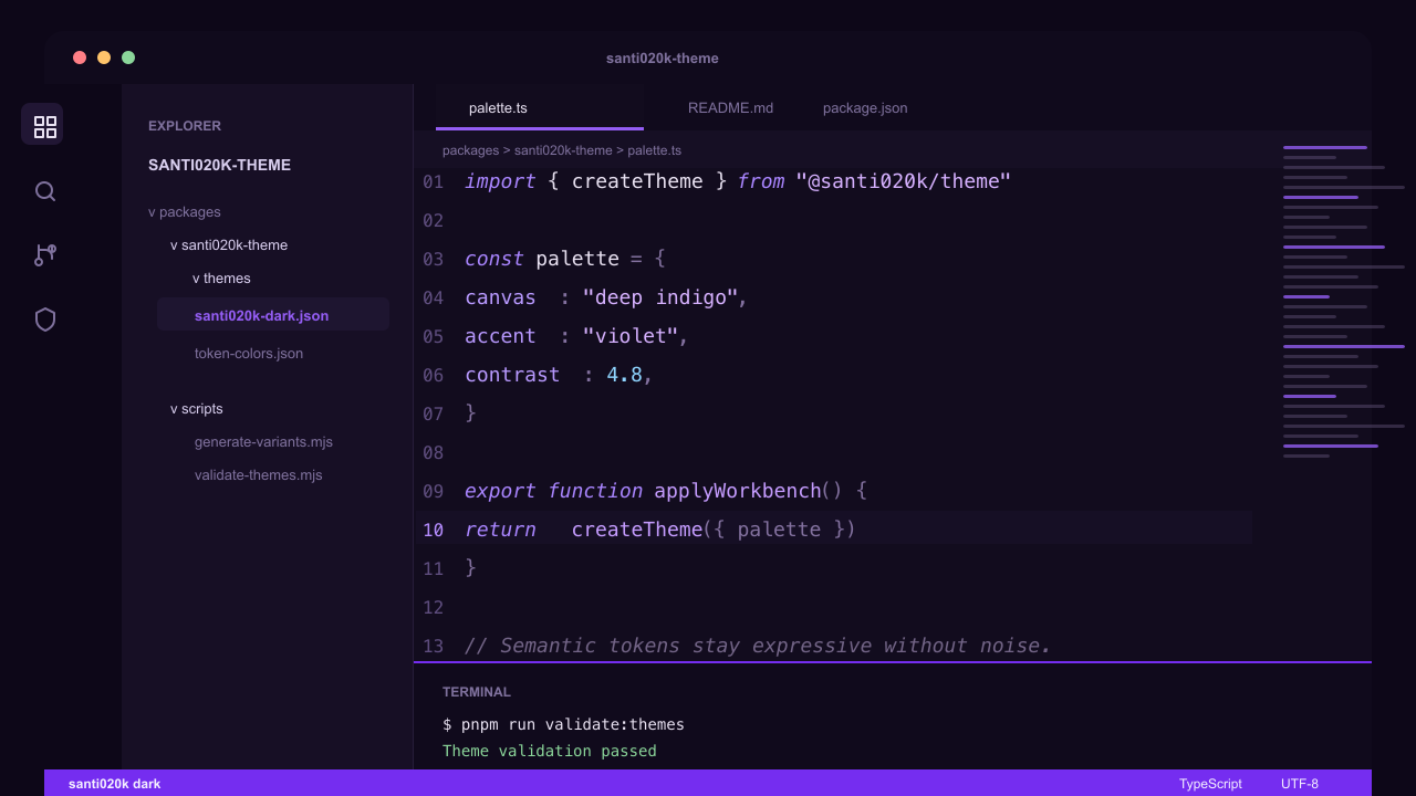
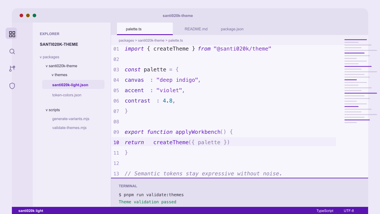
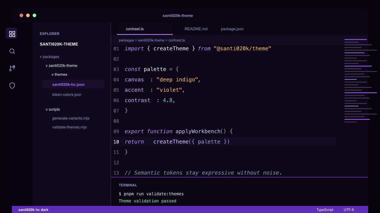
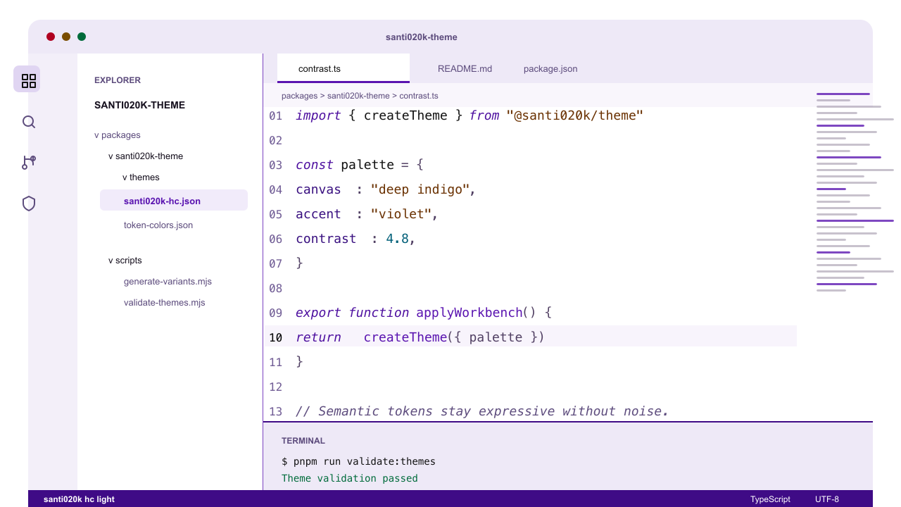
A coordinated VS Code theme family with deep indigo-black dark variants, purple-tinted light variants, high-contrast siblings, and optional bold or italic syntax styles. It is built for long technical sessions: calm contrast, semantic highlighting, and one consistent violet color language.
Website: vscode.santi020k.com
Highlights
- 12 shipped variants across dark, light, high-contrast dark, and high-contrast light profiles.
- Base, bold, and italic styles for different typography preferences.
- Purple-forward accents without neon noise.
- Semantic highlighting enabled for richer editor intelligence.
- Validated theme JSON and marketplace metadata in CI.
- Compatible with VS Code, Cursor, Windsurf, VSCodium, GitHub Codespaces, and other VS Code extension hosts.
Install
Visual Studio Marketplace
- Open Extensions in VS Code.
- Search for Santi020k Theme.
- Install the extension from publisher
santi020k.
- Open the theme picker and choose a variant such as
santi020k dark, santi020k light bold, or santi020k hc light italic.
Marketplace listing: marketplace.visualstudio.com/items?itemName=santi020k.santi020k-theme
Open VSX
Use Open VSX for VSCodium and editors that do not install from the Visual Studio Marketplace.
Open VSX listing: open-vsx.org/extension/santi020k/santi020k-theme
Variants
| Variant |
UI theme |
Notes |
santi020k dark |
Dark |
Deep indigo-black canvas with muted violet accents |
santi020k light |
Light |
Purple-tinted whites with a stronger violet interaction color |
santi020k hc dark |
High contrast dark |
Stronger borders and clearer separation on near-black surfaces |
santi020k hc light |
High contrast light |
White canvas, black structure, saturated syntax accents |
santi020k dark bold |
Dark |
Dark palette with bold syntax tokens |
santi020k light bold |
Light |
Light palette with bold syntax tokens |
santi020k hc dark bold |
High contrast dark |
High-contrast dark palette with bold syntax tokens |
santi020k hc light bold |
High contrast light |
High-contrast light palette with bold syntax tokens |
santi020k dark italic |
Dark |
Dark palette with broader italic syntax styling |
santi020k light italic |
Light |
Light palette with broader italic syntax styling |
santi020k hc dark italic |
High contrast dark |
High-contrast dark palette with broader italic syntax styling |
santi020k hc light italic |
High contrast light |
High-contrast light palette with broader italic syntax styling |
Preview Settings
The screenshots use a ligature-ready editor setup. To get a similar look:
{
  "editor.fontFamily": "'Fira Code', 'Montserrat', monospace",
  "editor.fontLigatures": true,
  "editor.fontWeight": "500",
  "editor.lineHeight": 1.9,
  "editor.letterSpacing": -0.2
}
The theme works with any font. These settings only tune the preview style.
Development
Run commands from the repository root unless you are intentionally working inside this package.
| Command |
What it does |
pnpm --filter santi020k-theme run build |
Generates base, high-contrast, bold, and italic theme files |
pnpm --filter santi020k-theme run validate:themes |
Parses and validates the theme files |
pnpm --filter santi020k-theme run validate:marketplace |
Checks extension metadata and packaging readiness |
pnpm --filter santi020k-theme run package |
Builds a local VSIX with vsce package --no-dependencies |
pnpm run validate:themes |
Runs the root theme validation shortcut |
pnpm run validate |
Runs the full monorepo validation suite |
Generated variants come from scripts in scripts/. Avoid hand-editing generated VSIX files or build artifacts.
Release
Releases are managed by Changesets and published to both the Visual Studio Marketplace and Open VSX.
- Add a patch changeset for fixes and docs.
- Add a minor changeset for new theme coverage or significant capability additions.
- Required publish secrets are
VSCE_PAT and OVSX_PAT.
- The release script is expected to skip versions that are already published.
@santi020k/theme provides shared assets, design tokens, and Chrome color mapping helpers.@santi020k/theme-core provides shared token, asset, and website helper functions.santi020k-chrome-theme ships the matching Chrome browser theme.
Support
If this theme makes your editor a nicer place to work, you can support ongoing maintenance through GitHub Sponsors.
License
MIT. See the repository LICENSE.