zlui-viewer README
Brief Description
zlUI is a simple scripted ui system that with a single zlUI.ts file.
Update History
F2 show/hide Inspector
About the Extension
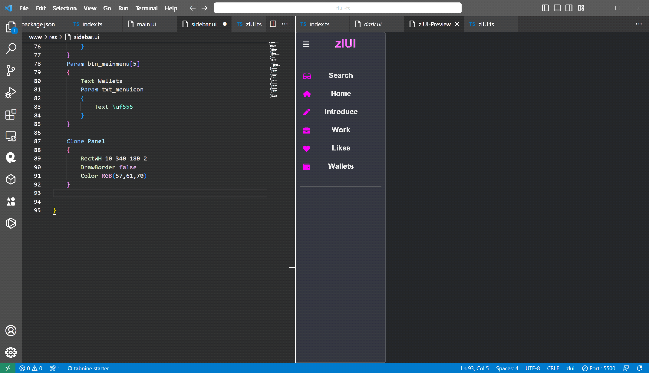
Preview zlUI, default file ext: *.ui
Requirements
zlUI system rendering base on @zhobo63\imgui-ts
////////////////////////////////
// global function
////////////////////////////////

DefaultScreenSize width height

/*
color:  RGB(r,g,b) with alpha=255, r,g,b value range=0~255
        RGBA(r,g,b,a)
        0xff000000 with hex abgr
*/
DefaultPanelColor color

//file.txt format see #Pack Image format
//there can be multiple pack image files
LoadPackImage file1.txt
LoadPackImage file2.txt

include file.ui

/*
When combo popup, you can select default combo popup theme,
Menu must be Slider Object
Item must be Button Object
*/
DefaultComboMenu name
DefaultComboItem name

/*
we can create custom fontName from url like:
document.fonts.add(fontFace);
*/
CreateFont fontName url

/*
define font id:
Font 0 Arial 16 bold
Font 1 Arial 24 bold
when in panel, you can
Object Panel
{
    Font 0  //for arial 16
    Text i am a panel
}
Object Panel
{
    Font 1  //for arial 24
    Text i am a panel
}
*/
Font id fontName fontSize style

/*
merge font to previously font id,
when codeStart<=charcode<=codeEnd, this font is used:
MergeFont 0 \uf000 \uffff Fontawesome 16 normal
*/
MergeFont id codeStart codeEnd fontName fontSize style

/*
name: TrackGroup name
loop: -1 for loop
      >0 for play times
*/
PlayTrack name loop

////////////////////////////////
// Structure
////////////////////////////////

Object Panel
{
    // child object
    Object Button
    {
        Name btn_ok

        Object Panel
        {
            Name pnl_icon
        }
    }

    // clone previous object by name
    Clone btn_ok
    {

        // set child parameter by name
        Param pnl_icon
        {

        }
    }

    // object array
    Object[3] Panel
    {
        // create 3 panels names: pnl[0], pnl[1], pnl[2]
        Name pnl

        +X number   //
        +Y number   //
    }

    // clone array by name
    Clone[3] pnl_icon
    {
        // clone 3 panels from pnl_icon
        // name: pnl_header[0], pnl_header[1], pnl_header[2]
        Name pnl_header
    }
}
////////////////////////////////
// Object Type
////////////////////////////////

// Win

Object Win
{
    //parameter
    Name win_name

    RectWH x y width height
    Top y
    Y y

    Left x
    X x

    Width w
    W w

    Height h
    H h

    /*
    mode: none, left, top, right, down, center
        centerW,
        centerH,
        centerTop,
        centerDown,
        centerLeft,
        centerRight,
        rightTop, rightDown, leftTop, leftDown,
        parentWidth,
        parentHeight,
        textWidth,
        textHeight,
        textSize
    */
    Align mode

    /*
    bool: true yes 1
          false no 0
    */
    Visible bool

    Notify bool

    Drag bool

    /*
    used in Object[] Clone[]
    */
    +X
    +Y

    //auto set size width/height to contain all children
    //mode: width|height|all
    Autosize mode

    //equal to Autosize Height
    AutoHeight

    //child's ahchor,dock start with parent's padding
    Padding number

    /*
    auto adjust x or y to parent's size(inside padding),
    for x: value is 0~1 means 0:left, 1:right, 0.5:center
    for y: value is 0~1 means 0:top, 1:down, 0.5:center
    mode: x, y, xy, all
    xy=all
    */
    Anchor mode x y

    /*
    auto adjust rect to parent's size(inside padding)
    mode: left, top, right, down, all
    can use | to combin, ex:left|right
    */
    Dock mode left top right bottom

    /*
    offset x or y in px to anchor position
    */
    Offset x y

    /*
    when true children can only drawing inside parent.
    */
    Clip bool

    /*
    arrange children position
    direction: horizon, vertical
    mode: item, content
    item mode:
    content mode:
    */
    Arrange direction mode

    //TODO
    Hint

    /*
    Drag Drop
    only DragType match DropType
    */
    DragDrop bool
    DragType number
    DropType number

    /*
    when arrange children, next child start with margin space
    */
    Margin x y

    // if ui contain name do the command
    if name do

    // if ui not contain name do the command
    ifnot name do
}

// Image extend Win

Object Image
{
    //name: SubImage name, see #Pack Image
    Image name

    Color color
}

// Panel extend Image

Object Panel
{
    //is draw background panel
    DrawClient bool

    //is draw border frame
    DrawBorder bool

    BorderWidth number

    BorderColor color

    HoverColor color

    //rounding corner radius
    Rounding number

    /*
    mode: none, topLeft, topRight, downLeft, downRight,
        top, down, left, right, all
    */
    RoundingCorner mode

    Text string

    /*
    mode: left, right, center
    */
    TextAlignW mode

    /*
    mode: top, down, center
    */
    TextAlignH mode

    TextColor color
    TextColorHover color

    //default id is 0
    Font id

    /*
    9-grid rendering
    image: SubImage name see #Pack Image
    */
    Board x1 y1 x2 y2 image

    Multiline bool

    /*
    text position in panel
    mode: x, y, xy
    x: float 0~1
    y: float 0~1
    */
    TextAnchor mode x y

    //text offset in px from TextAnchor
    TextOffset x y
}

// Edit extend Panel

Object Edit
{
    Password char

    MaxLength number
}

// Button extend Panel

Object Button
{
    BoardDown

    Board

    BoardUp

    BoardHover

    Color color

    ColorDown color

    ColorHover color

    ColorDisable color

    TextColor color

    TextColorDown color

    TextColorUp color

    Image name

    ImageDown name

    ImageHover name

    //if not DrawButton only draw text
    DrawButton bool
}

// Check extend Button

Object Check
{
    //is draw default check mark
    DrawCheck bool

    //if is checked use string1 or use string2
    CheckText string1 string2
}

// Combo extend Button

Object Combo
{
    //default combo items
    ComboItems string1 string2 ...

    //default combo value
    ComboValue number
}

// Slider extend Panel

Object Slider
{
    /*
    type: horizon, vertical, both
    */
    Direction type

    /*
    if ItemMode, slider will not change position of children
    else slider will change positions of children
    */
    ItemMode bool

    //default 20
    MouseWheelSpeed number
}

//ImageText extend Win
Object ImageText
{
    //TODO
    ImageList
    ImageW
    ImageH
    Text
    Ascii
    TextAlignW
    TextAlignH
    FontSpace number
}
////////////////////////////////
// Track Animation System
////////////////////////////////

// Structure

TrackGroup name
{
    //name: must be the name of ui object
    Track name
    {
        /*
        time1,time2 unit is 1/30 second
        so time=30 equal to 1 second

        command with only time1:
        the command is fired when the time1 reached

        command with time1 and time2:
        the command is take effect between time1 and time2
        */

        SetPos time1 x y
        SetRect time1 left top right buttom
        SetWidth time1 width
        SetHeight time1 height
        Move time1 time2 x y
        MoveLerp time1 time2 x y speed

        /*
        bezier control points must be 4 coordinates on one set
        4, 8, 16,... is valid coordinates count
        */
        MoveBezier time1 time2 (x,y) (x,y) (x,y) (x,y)

        SetX time1 x
        MoveX time1 time2 x
        MoveXLerp time1 time2 x speed
        SetY time1 y
        MoveY time1 time2 y
        MoveYLerp time1 time2 y speed

        SetScale time1 scale
        Scale time1 time2 scale
        ScaleLerp time1 time2 scale speed

        Image time1 name

        //TODO
        SetAlpha time1 alpha
        Alpha time1 time2 alpha
        AlphaLerp time1 time2 alpha speed

        Hide time1
        Show time1
        FlipW time1
        FlipH time1

        //TODO
        SetRotate time1 rotate
        Rotate time1 time2 rotate
        RotateLerp time1 time2 rotate speed

        //TODO
        SetColor time1 color
        Color time1 time2 color
        ColorLerp time1 time2 color speed

        Width time1 time2 width
        WidthLerp time1 time2 width speed

        Height time1 time2 height
        HeightLerp time1 time2 height speed

        StopAni time1
        PlayAni time1
        AniSpeed time1
        AniStartEnd time1

        PlaySound
        SoundFade
        Volume

        SetImageClip
        ImageClip
        ImageClipLerp

        //name: TrackGroup name
        PlayTrack time1 name loop

        //name: TrackGroup name
        StopTrack time1 name

        Enable time1
        Disable time1

        Text time1 string
    }
}
////////////////////////////////
// packimage.txt
////////////////////////////////

//file: (url)
Image file

//there can be more than one SubImage in the pack image
//
SubImage name left top right buttom