Ugougo Moji
Wobbling, retro-TV style text in the built-in Markdown preview.
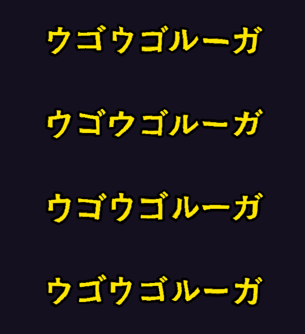
The look comes from Ugougo Lhuga (ウゴウゴルーガ), a Japanese children's
television programme from the early 1990s whose Amiga-rendered captions never
quite sat still. Write a ugougo code block and the text inside it boils the
same way.
```ugougo
うにょうにょ
```
Unofficial. This is a personal project. It is not affiliated with,
sponsored by, or endorsed by Fuji Television Network, Inc. or the creators of
Ugougo Lhuga. The programme is named only to describe the visual effect
being reproduced.
Options
Options go in the block body, separated from the text by ---:
```ugougo
color: #5eff9b
size: 64
wobble: 16
fps: 6
---
おはよう
みんなげんき?
```
Point font at a monospace family and code wobbles too:
```ugougo
font: Courier New
size: 44
color: #5eff9b
---
printf('ウゴウゴ');
```
| Key |
Default |
Range |
What it does |
color |
#ffe600 |
CSS colour |
Fill colour of the glyphs |
stroke |
#000000 |
CSS colour |
Outline colour |
strokeWidth |
0.17 |
0–0.6 |
Outline thickness, as a fraction of the font size |
size |
56 |
8–240 |
Font size |
wobble |
12 |
0–30 |
How far the outline is pushed around |
freq |
0.015 |
0.002–0.09 |
Distortion detail: low is a long wave, high is a crumpled edge |
fps |
8 |
1–30 |
Frames per second. Low values look hand-drawn |
frames |
4 |
2–12 |
How many distinct distortions are cycled through |
jitter |
1 |
0–8 |
Extra wobble applied to each glyph on its own |
align |
center |
left/center/right |
Horizontal alignment |
font |
rounded gothic stack |
font stack |
Typeface used for the glyphs |
animate |
true |
true/false |
false renders a single static frame |
Key names ignore case and hyphens, so strokeWidth, strokewidth and
stroke-width all mean the same thing. Out-of-range numbers are clamped and
values that cannot be read fall back to the default, so a typo degrades the
block rather than breaking the preview.
Keep wobble around 9–16 and freq around 0.010–0.025. Past roughly 20 and
0.05 the glyphs shred into confetti — which is available to you, but rarely what
you wanted.
Settings
Defaults for every option live under Settings → Extensions → Ugougo Moji
(ugougoMoji.*). Options written in a block always win over the settings.
Settings are read each time a block is drawn, so changing one takes effect when
the preview refreshes — no window reload.
Notes
- Blocks render as inline SVG and CSS with no JavaScript, which is what lets
them work under the preview's Content-Security-Policy.
- Each block carries
role="img" and an aria-label holding its text, so
screen readers read the words rather than skipping the graphic.
- The
@keyframes driving the per-glyph jitter honour
prefers-reduced-motion. Constantly moving text is a genuine accessibility
problem; set animate: false on a block, or turn ugougoMoji.animate off, if
a still frame is the better choice.
- A rounded gothic typeface gets closest to the original. Installing
M PLUS Rounded 1c is
the easiest way to get one.
The same blocks elsewhere
The renderer is shared, so the identical syntax also works in
Obsidian and in
Marp slide decks.
License
MIT — see LICENSE.
ウゴウゴ文字(日本語)
VS Code の標準 Markdown プレビューで、文字をうにょうにょ揺らします。
1990年代前半の子供番組「ウゴウゴルーガ」で、画面の文字がずっと落ち着かなく
動いていた、あの質感の再現です。ugougo コードブロックに書いた文字が同じように
沸き立ちます。
```ugougo
うにょうにょ
```
非公式プロジェクトです。
本拡張は個人によるもので、株式会社フジテレビジョンおよび「ウゴウゴルーガ」の
制作者・権利者とは一切関係がありません。番組名は、再現しようとしている視覚効果を
説明する目的でのみ言及しています。
オプション
オプションはブロックの本文に書き、--- で表示テキストと区切ります。
```ugougo
color: #5eff9b
size: 64
wobble: 16
fps: 6
---
おはよう
みんなげんき?
```
font に等幅フォントを指定すれば、コードを動かすこともできます。
```ugougo
font: Courier New
size: 44
color: #5eff9b
---
printf('ウゴウゴ');
```
| キー |
既定値 |
範囲 |
説明 |
color |
#ffe600 |
CSS の色 |
文字の塗りの色 |
stroke |
#000000 |
CSS の色 |
輪郭の色 |
strokeWidth |
0.17 |
0–0.6 |
輪郭の太さ(フォントサイズに対する比) |
size |
56 |
8–240 |
フォントサイズ |
wobble |
12 |
0–30 |
揺れの強さ |
freq |
0.015 |
0.002–0.09 |
歪みの細かさ。小さいと大きくうねり、大きいとギザギザに |
fps |
8 |
1–30 |
1秒あたりのコマ数。少ないほど手描きアニメ風 |
frames |
4 |
2–12 |
巡回するコマの枚数 |
jitter |
1 |
0–8 |
一文字ごとの揺れ幅(px)。0 で無効 |
align |
center |
left/center/right |
配置 |
font |
丸ゴシック系 |
フォントスタック |
フォント指定 |
animate |
true |
true/false |
false で静止した1コマになる |
キー名は大文字小文字とハイフンを無視します(strokeWidth / strokewidth /
stroke-width はすべて同じ)。範囲外の数値は自動で丸められ、解釈できない値は
既定値のまま無視されるので、タイポはそのブロックが劣化するだけで済みます。
wobble は 9〜16、freq は 0.010〜0.025 に収めてください。
おおよそ 20 と 0.05 を超えると文字が紙吹雪になります。狙ってやる分には自由です。
設定
設定 → 拡張機能 → Ugougo Moji(設定 ID は ugougoMoji.*)で、
すべてのオプションの既定値を変更できます。ブロックに書いたオプションが常に優先されます。
設定はブロックを描画するたびに読み直すので、変更後はプレビューを更新するだけで
反映されます。ウィンドウの再読み込みは不要です。
注意点
- 描画はインライン SVG と CSS だけで、JavaScript を使いません。
プレビューの Content-Security-Policy を素通りできるのはこのためです。
- 各ブロックに
role="img" と aria-label(元のテキスト)が付くので、
スクリーンリーダーは図として飛ばさず、文字として読み上げます。
- 一文字ジッターの
@keyframes は prefers-reduced-motion に従います。
常に動く文字は実際に負担になるので、静止させたいときはブロックに
animate: false を指定するか、ugougoMoji.animate をオフにしてください。
- 丸ゴシック体がいちばん原典に近くなります。
M PLUS Rounded 1c の
導入が手軽です。
同じ記法が他でも動きます
描画部分を共有しているため、まったく同じ書き方が
Obsidian と
Marp スライド
でも使えます。