Atom Material Icons Plugin for VSCode

Atom Material File Icons for VSCode
This plugin is a port of the Atom File Icons for VSCode.
It replaces the icons and folder icons with better suited icons, related to the file type, framework or language.
This plugin is inspired by the Material Icon Theme
and Atom Material Icons for JetBrains.
Features
- Replaces file icons with their relevant logo icons
- According to their extension (
.java, .php, .ruby...)
- According to the framework (Android, NPM, RSpec...)
- According to the program used in conjonction (Babel, Docker, CircleCI...)
- According to the parent directory (
.github/*, .vscode/*...)
- And others...
- Replaces folder icons:
- From common patterns:
src, main, app, img, docs...
- From specific use cases:
node_modules, .vscode, .git...
- Provides it's own Product Icons from the Material Design Icons.
Associations
The icons follow what PyCharm shows with the Atom Material Icons plugin for JetBrains IDEs:
for every file and folder name the JetBrains plugin knows and VS Code can express (a file name, an extension, a folder
name), the theme uses the icon the JetBrains plugin picks. Names the JetBrains plugin does not know keep the icons of
this extension.
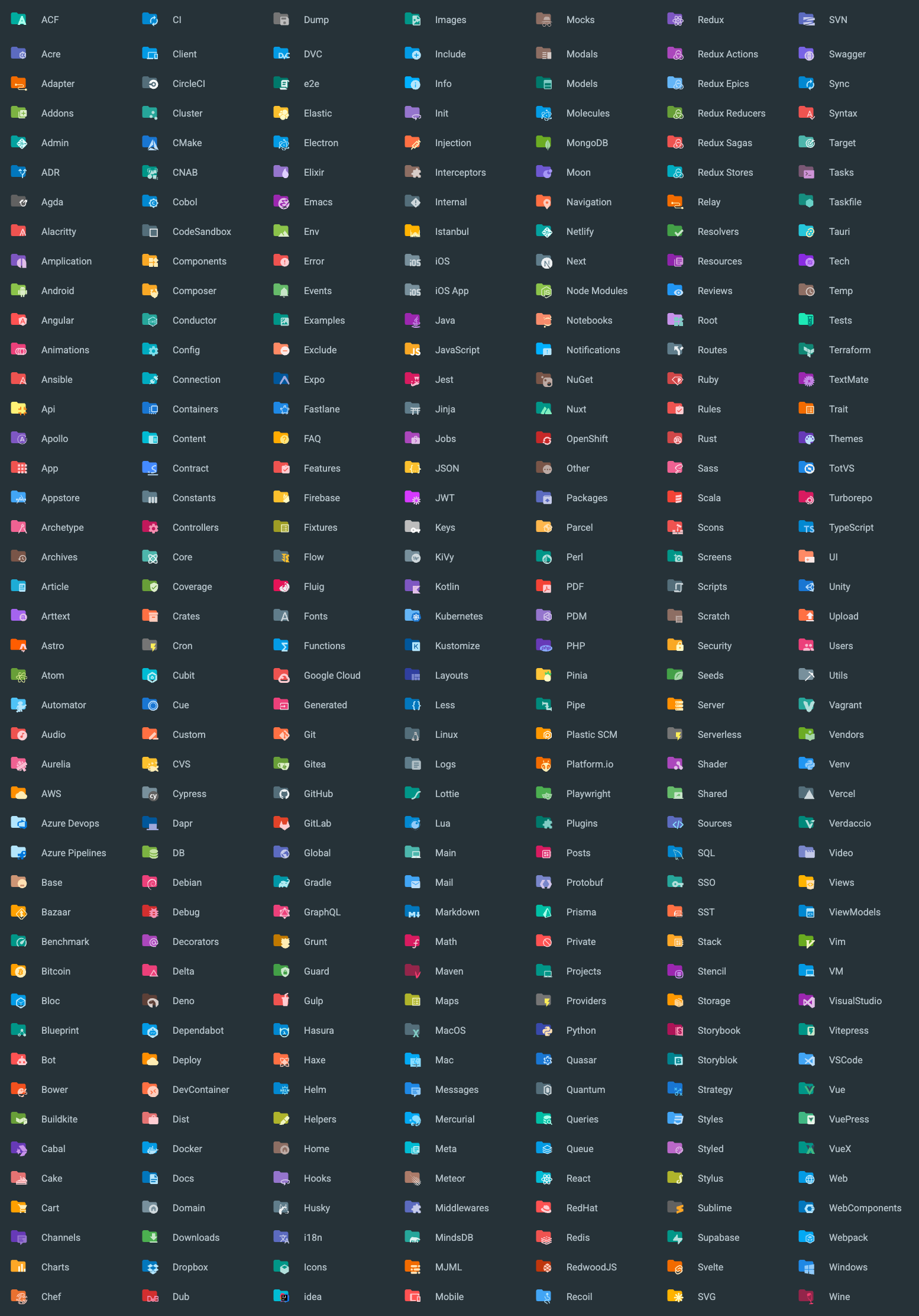
You can find a list of all the available associations in the following links:
File Icons

Folder Icons
Usage
Since this extension is based off the
original Material Icon Theme,
you can find most of the original settings here as well.
Therefore, this extension exposes a bunch of commands that you can invoke via the command palette:

Just type Atom Material in order to see the commands that are available.
Settings
You can customize many aspects of the extension, either via the VSCode settings or by invoking the commands via the
command palette.
When setting the option via the Preferences, they will affect all projects, whereas the commands only
affect the current workspace.
Icon Packs
While this extension contains a lot of icons, there are some icons that overlap with each other. For example, Angular,
and NestJS use similar icon filename patterns. If you are working with an angular project you wouldn't want to see
NestJS icons and vice-versa.
This command will allow you to decide which pack(s) to enable for the current workspace.
By default the packs of the JetBrains plugin are enabled (Angular 2, Nest, Next, NgRx, Rails, Recoil, Redux, Tests), plus
pycharm. AngularJS (angular) is disabled, as in the JetBrains plugin.
As in the JetBrains plugin, two packs do not belong to a framework:
- tests (enabled by default):
*.test.ts, *.spec.py... use the test icon of their language.
- css (disabled by default):
.css files use the alternative CSS icon. It is enabled in the JetBrains plugin, but
its icon loses against the regular CSS icon there, so PyCharm shows the regular one.
- pycharm (enabled by default): Python files look like in PyCharm. Every
.py, .pyi and .pyw file, whatever its
name (manage.py, __init__.py, test_app.py...), uses the two-tone Python icon of PyCharm instead of the Atom icons.

Note: Since you can enable multiple packs, there is still a way to enable both overlapping icon packs. It's
recommended to not do as such as it would return unexpected results.
Arrow Styles
You can customize the look of the arrows in the tree view using the command palette:

or via user settings:
{
  "a-file-icon-vscode.arrowTheme": "material"
}
The available options are:
material: Material Design arrows (chevrons)triangle: Triangle arrowsplusMinus: Plus and minus signsarrow: Simple Arrowsnone: No arrows
Note: This setting affects not only arrows from the tree view, but also arrows that you can find in many other places,
such as the collapsible sections, code folding, etc.
Another note: Arrows in the tree view work differently than arrows in the other places, as they are currently rotated
from
the "down arrow". As a result, some styles will display "weird results", such as the "Plus-Minus" style, that only
displays the minus sign, but rotated. This could be solved via custom CSS in the future.
Custom Folder Color
You can customize the color of the default folder icon using the command palette:

or via user settings:
{
  "a-file-icon-vscode.folderColor": "#ef5350"
}
Folder Theme
You can change the style of the folder icons using the command palette:

or via user settings:
{
  "a-file-icon-vscode.folderTheme": "specific"
}
The available options are:
specific: Replace specific folders, such as src, main, app, img, docs, etc.classic: Replace all folders with the default folder iconnone: No folder icons
Custom icons' opacity
You can customize the opacity of the icons, between totally opaque to completely gone.
You can either choose a predefined opacity or enter your own opacity via the command palette:

or via user settings:
{
  "a-file-icon-vscode.opacity": 0.5
}
Custom icons' saturation
You can customize the saturation of the icons. The less saturated they are, the more grayscale they will appear.
You can either choose a predefined saturation or enter your own saturation via the command palette:

or via user settings:
{
  "a-file-icon-vscode.saturation": 0.5
}
Monochrome icons
Display every file and folder icon in shades of a single color, like the Monochrome icons option of the JetBrains
plugin. Use the Toggle Monochrome Icons and Change Monochrome Color commands, or the settings:
{
  "a-file-icon-vscode.monochrome": true,
  "a-file-icon-vscode.monochromeColor": "#90a4ae"
}
Hide file icons
Remove the file icons and keep the folder icons ("a-file-icon-vscode.folderTheme": "none" does the opposite):
{
  "a-file-icon-vscode.hideFileIcons": true
}
Mixing icon themes
VS Code uses a single file icon theme at a time. This theme follows the JetBrains plugin, which focuses on the languages
of the JetBrains IDEs: the files and folders it does not know get the default icon. Other installed icon themes can be
mixed in, without selecting them as the icon theme. Each one is a layer, given by its id (the value of
workbench.iconTheme when it is selected):
{
  "a-file-icon-vscode.iconThemeLayers": [
    "material-icon-theme",
    { "theme": "vscode-icons", "files": "override", "folders": "off" }
  ]
}
A layer mixes in one of three ways, for files and for folders separately (a plain id is fill for both):
fill: only for the names left with the default file or folder icon;override: its icon wins for every name it gives an icon to, and its default file or folder icon too;off: not used.
From the strongest to the weakest:
iconThemeByName (below);- the
override layers, the first listed wins. Your own filesAssociations, languagesAssociations and
foldersAssociations keep their icon;
- this theme;
- the
fill layers, the first listed wins.
The default is ["material-icon-theme"]: install the
Material Icon Theme and its icons fill
the gaps. An empty list uses this theme only.
One name from another theme
iconThemeByName gives a file name, an extension (*.ext) or a folder name (ending with /) the icon another installed
theme shows for it, or that theme's default icon when it has none. It wins over everything else:
{
  "a-file-icon-vscode.iconThemeByName": {
    "*.svelte": "material-icon-theme",
    "package.json": "vscode-icons",
    "src/": "material-icon-theme"
  }
}
Like *.ext in filesAssociations, an extension does not replace the icon of the specific file names this theme knows
with that extension.
The icons of the other themes get the opacity, saturation and monochrome filters of this theme, and are updated when
those themes or their settings change. Folders only come from other themes with the specific folder theme, and files
not at all with hideFileIcons.
Themes made of font glyphs, like the built-in Seti theme (vs-seti), can be mixed in too: their glyphs come with their
font, and their colors get the saturation and monochrome filters. The opacity does not apply to them, since VS Code
takes no transparency in the color of a glyph. PNG icons are skipped.
Themes drawn with the color of the text (usesCurrentColor, like the built-in VS Code Modern theme) get the text color
of the default dark themes (#cccccc), and of the default light themes (#3b3b3b) in light color themes: VS Code only
paints the icons of the selected theme with the text color.
Mix Icon Themes page
The Mix Icon Themes (with Preview) command opens a page to edit both settings without writing json: add, order and
remove the layers and choose their mode for files and folders, and give single names their own theme. Its preview
lists sample names (the default ones, the files and folders at the top of the workspace, or your own) with the icon of
the result and the icon of each installed theme. Click the icon of a theme to use it for that name (iconThemeByName),
click it again to stop.
Product Theme
In addition to file, folder and language icons, this extension also modifies the IDE's product icons to match the icons
of the JetBrains's equivalent extension and the Material Design Icons.


Custom associations
You can customize the icon associations directly in the user settings. The value is the name of one of the bundled
icons (the file name without .svg in iconGenerator/assets/icons/files or .../folders).
File associations
With the *.[extension] pattern you can define custom file icon associations. For example you could define an icon
for *.sample and every file that ends with .sample will have the defined icon. However, not all files with the same
file extension always have the same icon. For some specific file names there is a special icon. In order to overwrite
all the specific file icons as well, two asterisks must be set instead of one, i.e. **.[extension].
If there's no leading * it will be automatically configured as filename and not as file extension.
{
  "a-file-icon-vscode.filesAssociations": {
    "*.ts": "typescript",
    "**.json": "json",
    "fileName.ts": "angular"
  }
}
Custom SVG icons
Instead of a bundled icon name, the value can be the path of your own SVG file. Use an absolute path, or a path starting
with ~ for your home directory:
{
  "a-file-icon-vscode.filesAssociations": {
    "*.foo": "~/icons/foo.svg",
    "fileName.ts": "C:/icons/sample.svg"
  },
  "a-file-icon-vscode.foldersAssociations": {
    "recipes": "~/icons/recipes.svg"
  }
}
The file is copied into the extension when the theme is regenerated, with the same opacity, saturation and monochrome
filters as the bundled icons. For a folder, a recipes-open.svg (or recipes_open.svg) next to it is used for the
expanded state, otherwise the same icon is used. A path that does not exist is ignored.
Note: the icon is copied when the settings change. After editing the SVG file itself, change any setting (or remove and
add the association again) to pick up the new version.
Folder associations
The following configuration can customize the folder icons. It is also possible to overwrite existing associations and
create nice combinations. For example you could change the folder theme to "classic" and define icons only for the
folder names you like.
{
  "a-file-icon-vscode.foldersAssociations": {
    "customFolderName": "src",
    "sample": "dist"
  }
}
Custom SVG folder icons
See Custom SVG icons: the same paths work in foldersAssociations.
Language associations
With the following configuration you can customize the language icons. It is also possible to overwrite existing
associations.
{
  "a-file-icon-vscode.languagesAssociations": {
    "languageId": "iconName",
    "json": "json",
    "mylang": "~/icons/mylang.svg"
  }
}
The key is a language identifier (case-sensitive). VS Code
uses it only for files whose name and extension have no icon. The value is a bundled icon name or the path of a custom
SVG file, as for the file associations.
Commands
Here's a list of the available commands:
| Command |
Description |
| Arrows Style |
Change the style of the arrows in the project tree. |
| Change Folder Color |
Change the color of the folder icons. |
| Change Folder Theme |
Change the design of the folder icons. |
| Change Monochrome Color |
Pick the color of the monochrome icons (and enable them). |
| Change Opacity |
Change the opacity of the icons. |
| Change Saturation |
Change the saturation value of the icons. |
| Icon Packs |
Select icon packs that enable additional icons (e.g. for Angular, React, Ngrx...). |
| Mix Icon Themes (with Preview) |
Mix other installed icon themes, with a preview of their icons and of the result. |
| Restore Default Configuration |
Reset the default configurations of the icon theme. |
| Toggle Monochrome Icons |
Switch between colored and monochrome icons. |
Differences with the JetBrains plugin
Some options of the JetBrains plugin cannot be built with the VS Code icon theme API:
- Hollow folders (folders that contain open files): an icon theme does not know which files are open.
- Accent color: it colors UI icons, and VS Code product icons are a font that takes the color of the theme.
- Icon size and row height, PSI icons (icons based on the file content), and icons of the whole IDE UI.
- Associations based on the parent folder (
tests/*.ts): VS Code matches only file names and extensions.
Credits
This is an unofficial fork of AtomMaterialUI/a-file-icon-vscode,
not affiliated with or endorsed by its authors or JetBrains. Product names and logos shown in the icons belong to their
owners. All licenses and sources are listed in THIRD-PARTY-NOTICES.md.
Special credits to: