Snippets for Material Design 3 (@material/web) Web Components in Visual Studio Code.
Features
- HTML snippets (361): type
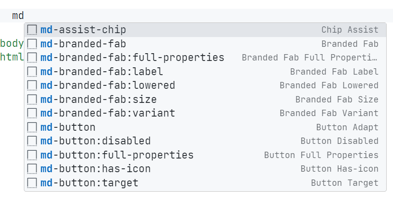
md- to insert a component, e.g. md-filled-button → <md-filled-button></md-filled-button>.
- Attribute variants (302):
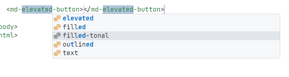
md-<component>:<attr> inserts the component with that attribute, e.g. md-button:disabled. Variant families (button, icon-button, text-field, select) let you pick elevated / filled / outlined / … with Tab.
- Full index:
md-components lists every available component.
- Tag + attribute IntelliSense: 54 tags / 405 attributes via HTML custom data (tag hover docs and attribute suggestions in HTML files).
- Completion docs: every snippet shows a description in the completion list, and
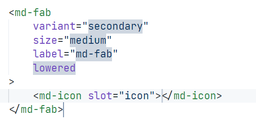
:full-properties inserts all attributes of a component at once.
| Properties |
Pick a variant |
Full components |
 |
 |
 |
Usage
| Prefix |
Expands to |
md-filled-button |
<md-filled-button></md-filled-button> |
md-button:disabled |
variant picker + disabled attribute |
md-text-field:type |
text-field with type="…" |
md-components |
index of all components |
Supported languages: html, javascriptreact (JSX), typescriptreact (TSX).
Note: tag / attribute IntelliSense (custom data) only works in HTML files; in JSX/TSX the md-* snippets still work, but attribute suggestions do not.
Support status
Coverage follows the installed @material/web version; only attributes users actually write are included (readonly markers and @deprecated aliases are excluded).
| Family |
Example tags |
Snippet |
Custom data |
| Badge |
md-badge |
✅ |
✅ |
| Button |
md-filled-button, md-outlined-button, … |
✅ |
✅ |
| Card |
md-elevated-card, md-filled-card, … |
✅ |
✅ |
| Checkbox |
md-checkbox |
✅ |
✅ |
| Chips |
md-chip-set, md-assist-chip, … |
✅ |
✅ |
| Dialog |
md-dialog |
✅ |
✅ |
| Divider |
md-divider |
✅ |
✅ |
| Elevation |
md-elevation |
✅ |
✅ |
| Fab |
md-fab, md-branded-fab |
✅ |
✅ |
| Field |
md-filled-field, md-outlined-field |
✅ |
✅ |
| Focus Ring |
md-focus-ring |
✅ |
✅ |
| Icon |
md-icon |
✅ |
✅ |
| Icon Button |
md-icon-button, md-filled-icon-button, … |
✅ |
✅ |
| Item |
md-item |
✅ |
✅ |
| List |
md-list, md-list-item |
✅ |
✅ |
| Menu |
md-menu, md-menu-item, md-sub-menu |
✅ |
✅ |
| Navigation Bar |
md-navigation-bar |
✅ |
✅ |
| Navigation Drawer |
md-navigation-drawer, md-navigation-drawer-modal |
✅ |
✅ |
| Navigation Tab |
md-navigation-tab |
✅ |
✅ |
| Progress |
md-circular-progress, md-linear-progress |
✅ |
✅ |
| Radio |
md-radio |
✅ |
✅ |
| Ripple |
md-ripple |
✅ |
✅ |
| Segmented Button |
md-outlined-segmented-button, …-set |
✅ |
✅ |
| Select |
md-filled-select, md-select-option, … |
✅ |
✅ |
| Slider |
md-slider |
✅ |
✅ |
| Switch |
md-switch |
✅ |
✅ |
| Tabs |
md-tabs, md-primary-tab, md-secondary-tab |
✅ |
✅ |
| Text Field |
md-filled-text-field, md-outlined-text-field |
✅ |
✅ |
Requirements
- VS Code
^1.82.0
- To render the components, install
@material/web in your own project; this extension only provides snippets.
Contributing
Snippets are generated from schema/ in this package — never edit the generated files by hand.
npm run generate        # regenerate snippets + custom data
npm run generate:check  # fail on drift
npm run verify          # validate generated files
Release Notes / License
See CHANGELOG.md.
MIT
| |