Table of Contents
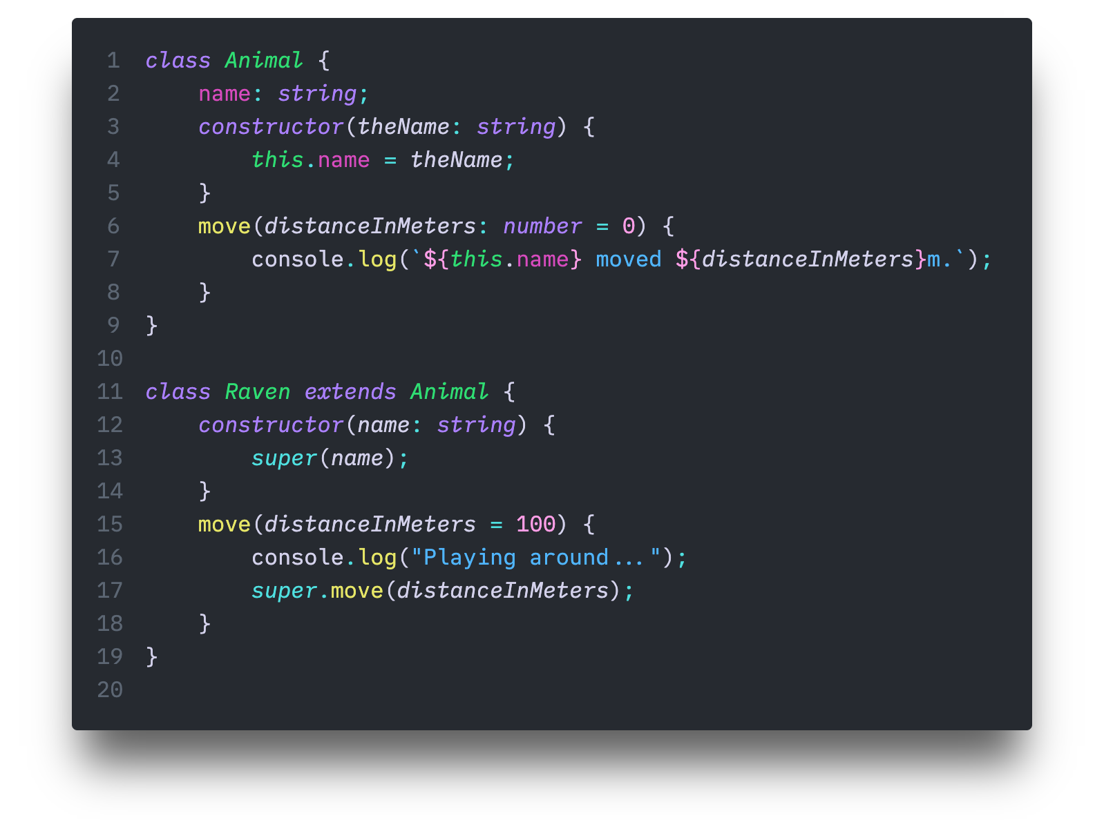
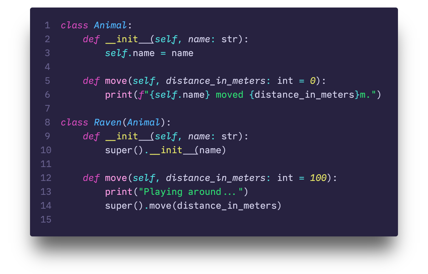
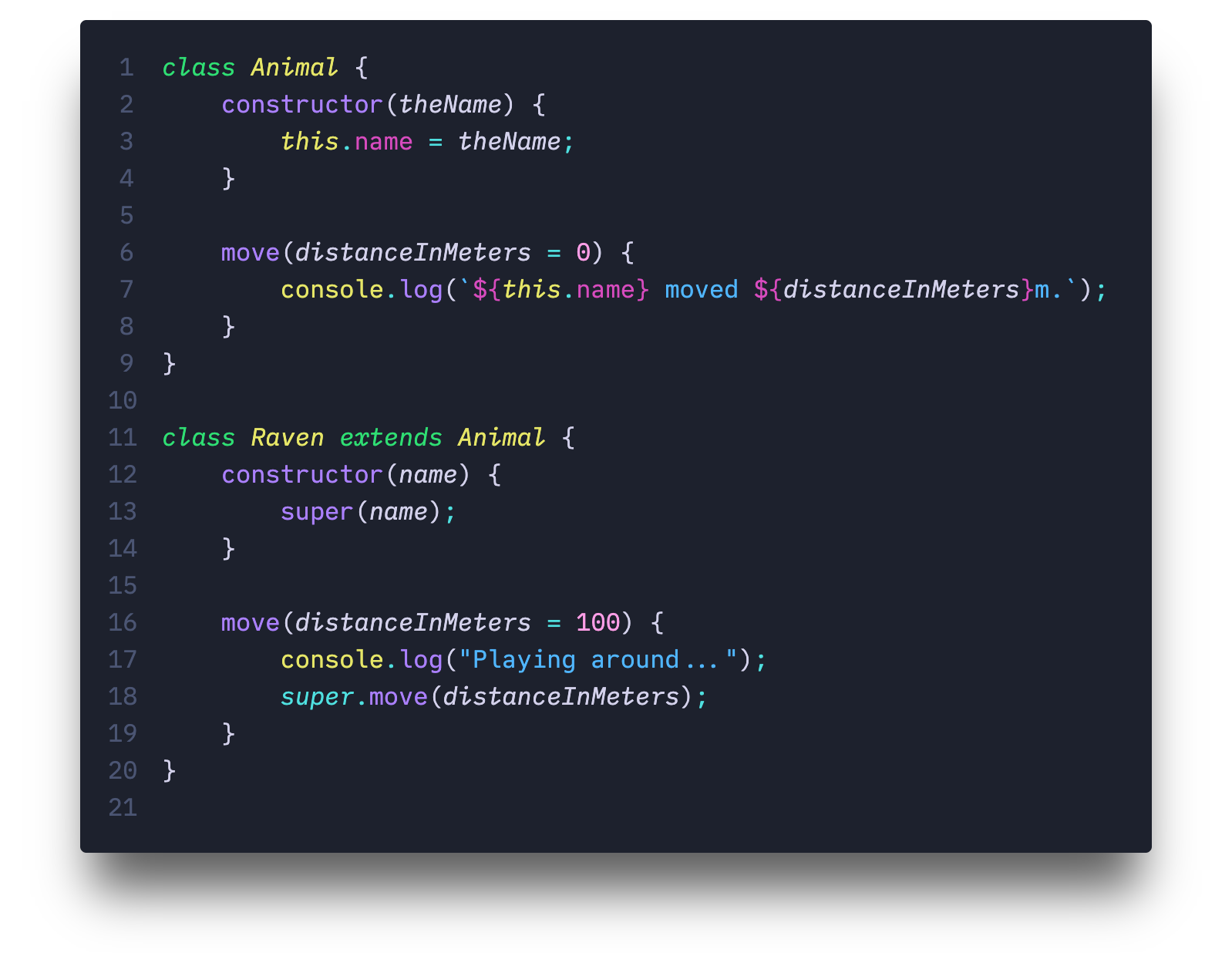
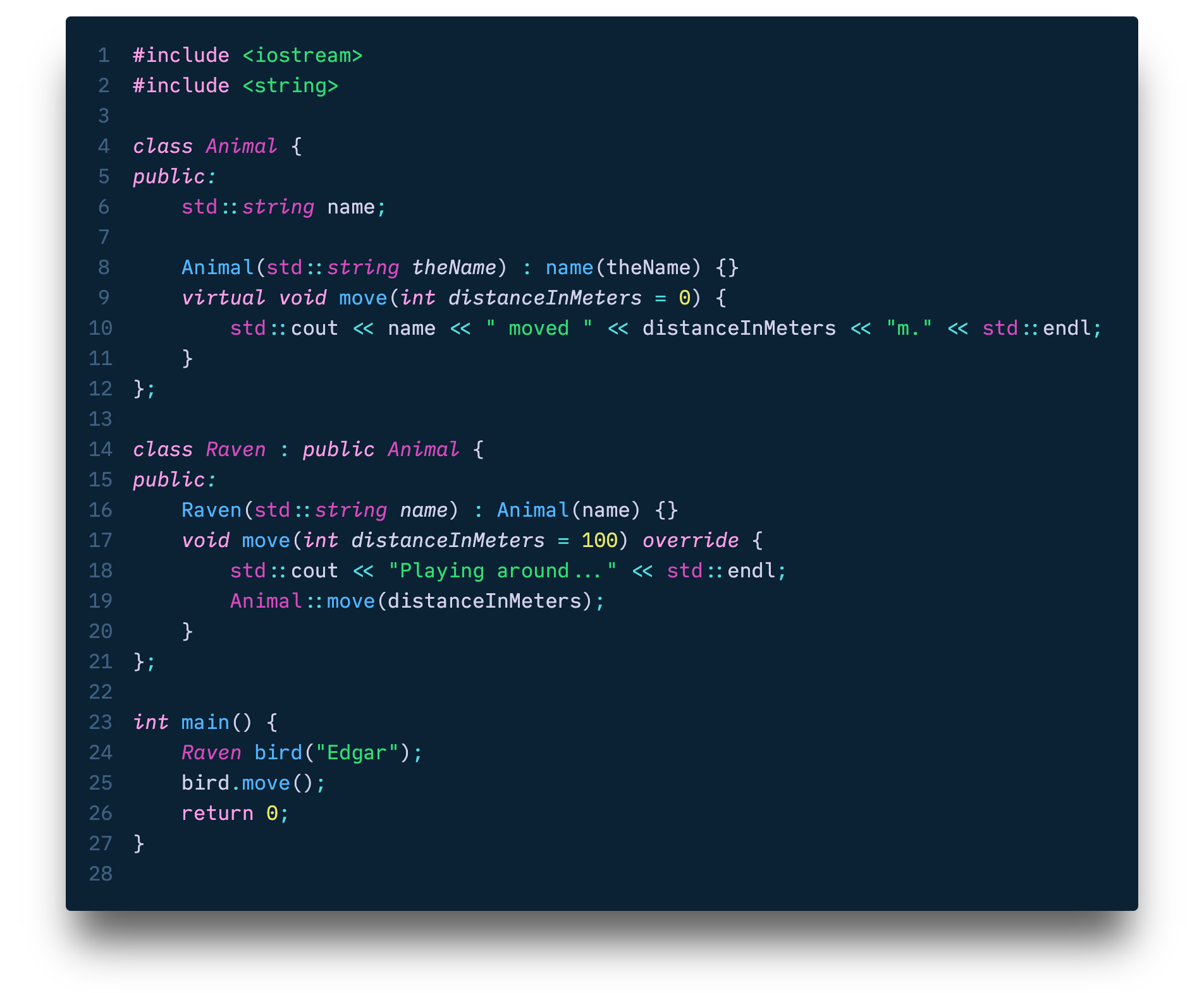
DescriptionOni (鬼) is a type of ogre youkai and Nebula Oni Theme has colors from outer space! This theme has a lot of different options for the main color, background, syntax options and more! You can customize everything and add your own flair through the extension's menu in VSCode's Settings! psudoFont Liga MonoIf by any chance you are also looking for a programming font that matches the theme, I have one for you! It's a loooong story but just like this color theme I ended up creating my own font. It's based on both Menlo/Meslo and IBM Plex Mono/Lilex, and it's called psudoFont Liga Mono. It started as a Frankenstein font but then it became its own font family with its own identity. It supports ligatures and it's free to use! Give it a try! Nebula Oni Theme examples
Nebula Oni ThemeThis started as a simple Atom's One Dark Syntax customization by someone that had just finished his first programming course, had no idea how to change syntax colors and started tweaking the
Spread Nebula Oni Theme across the Outer SpaceIf you liked this theme and you want to support it, you can do simple things like:
There are several ways to help and support it!
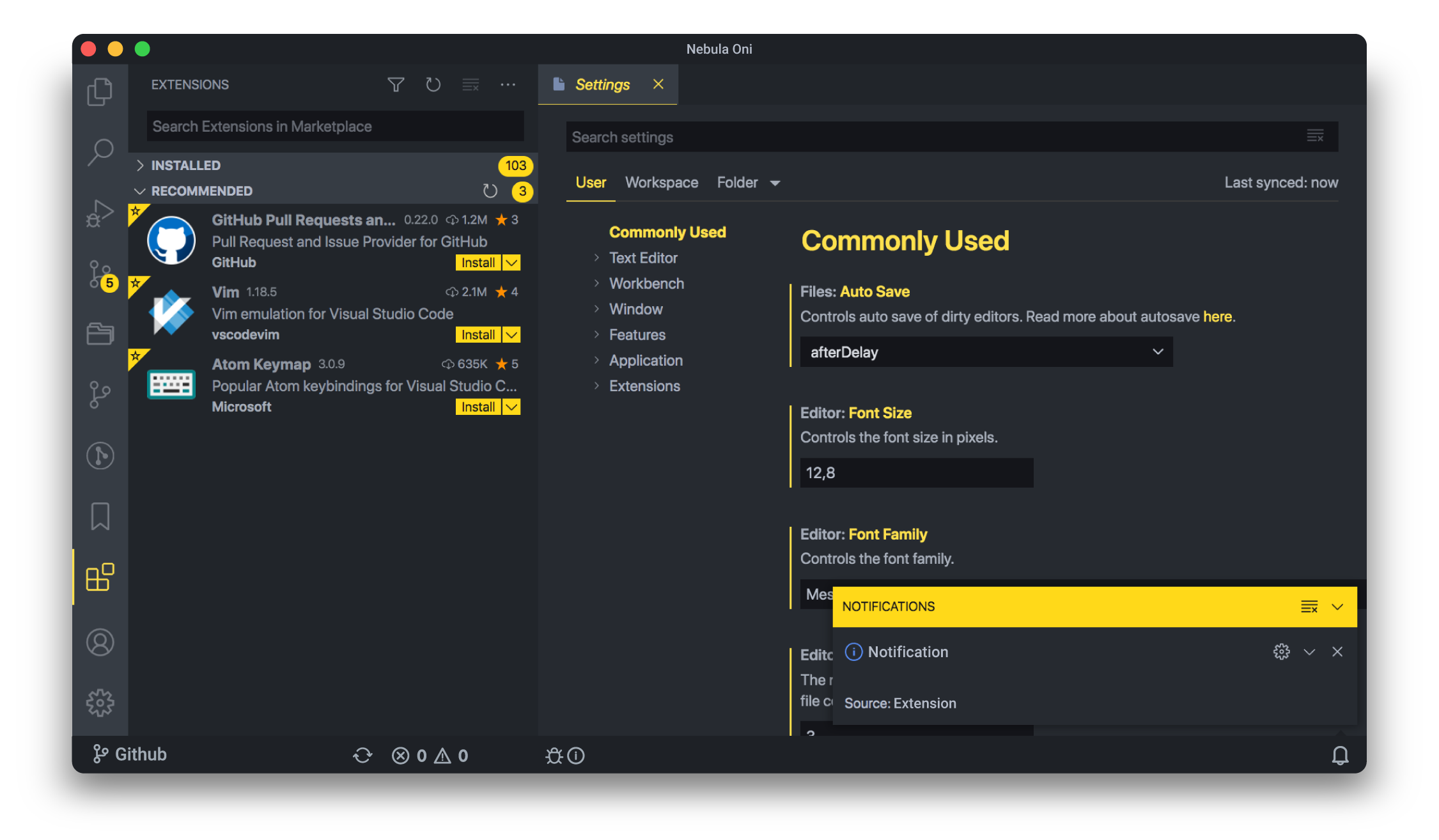
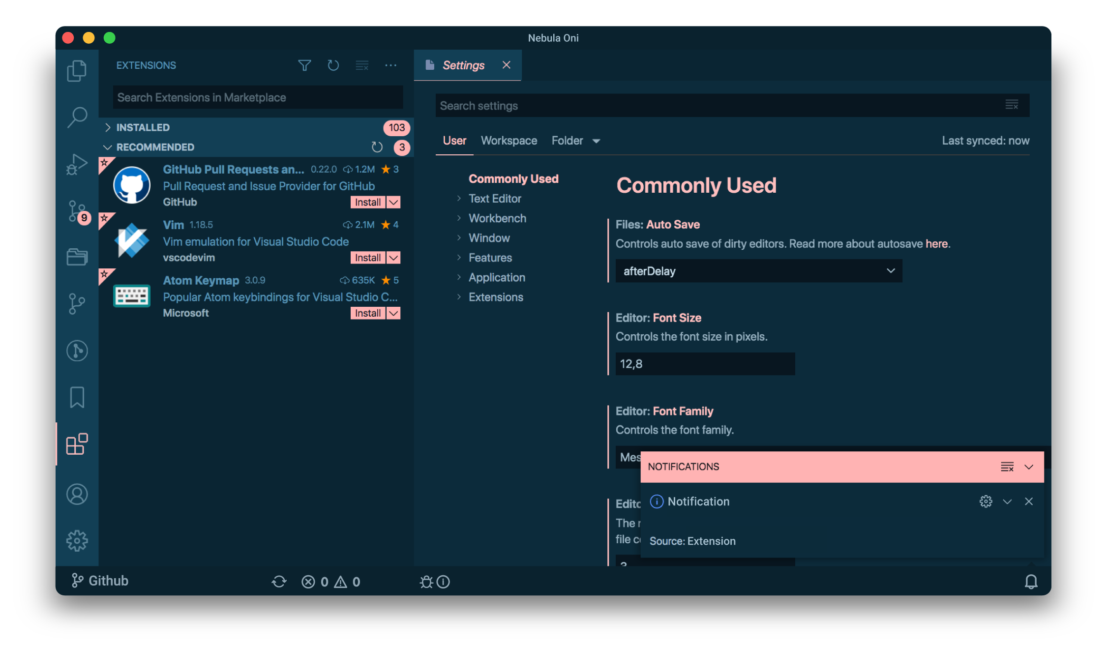
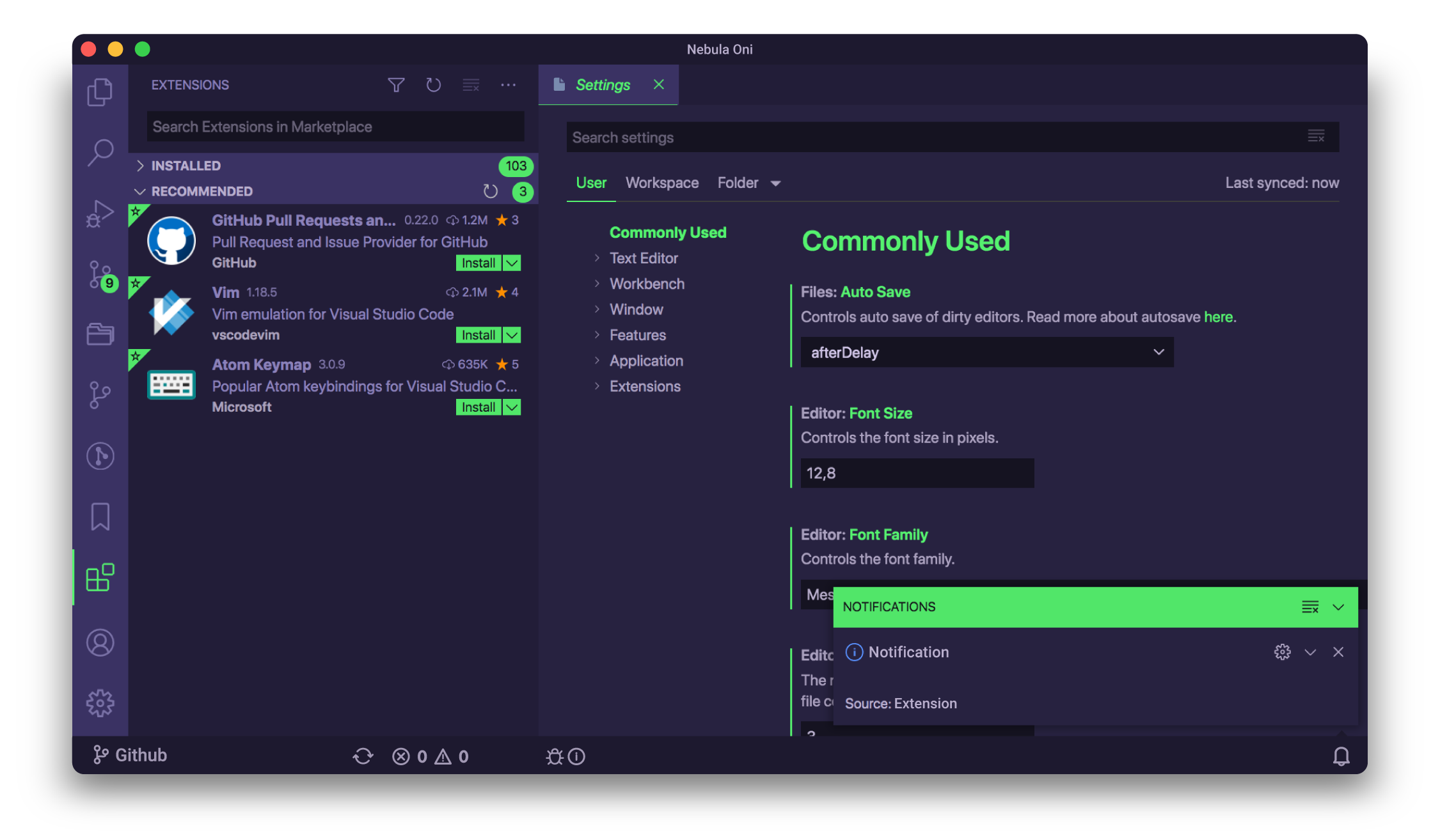
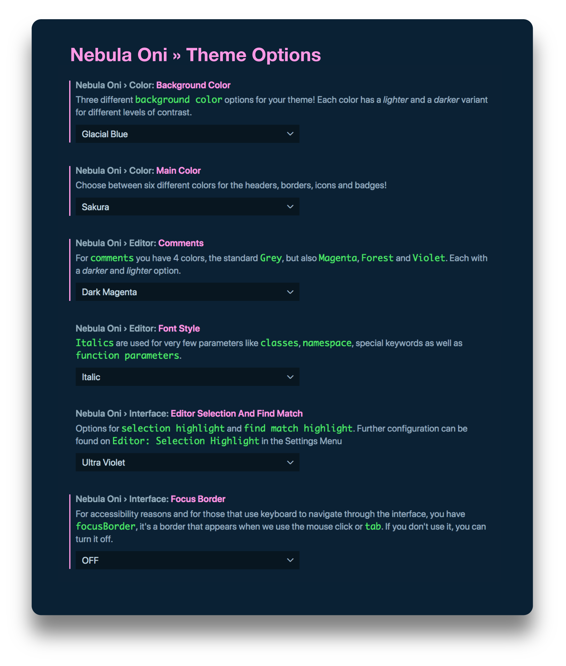
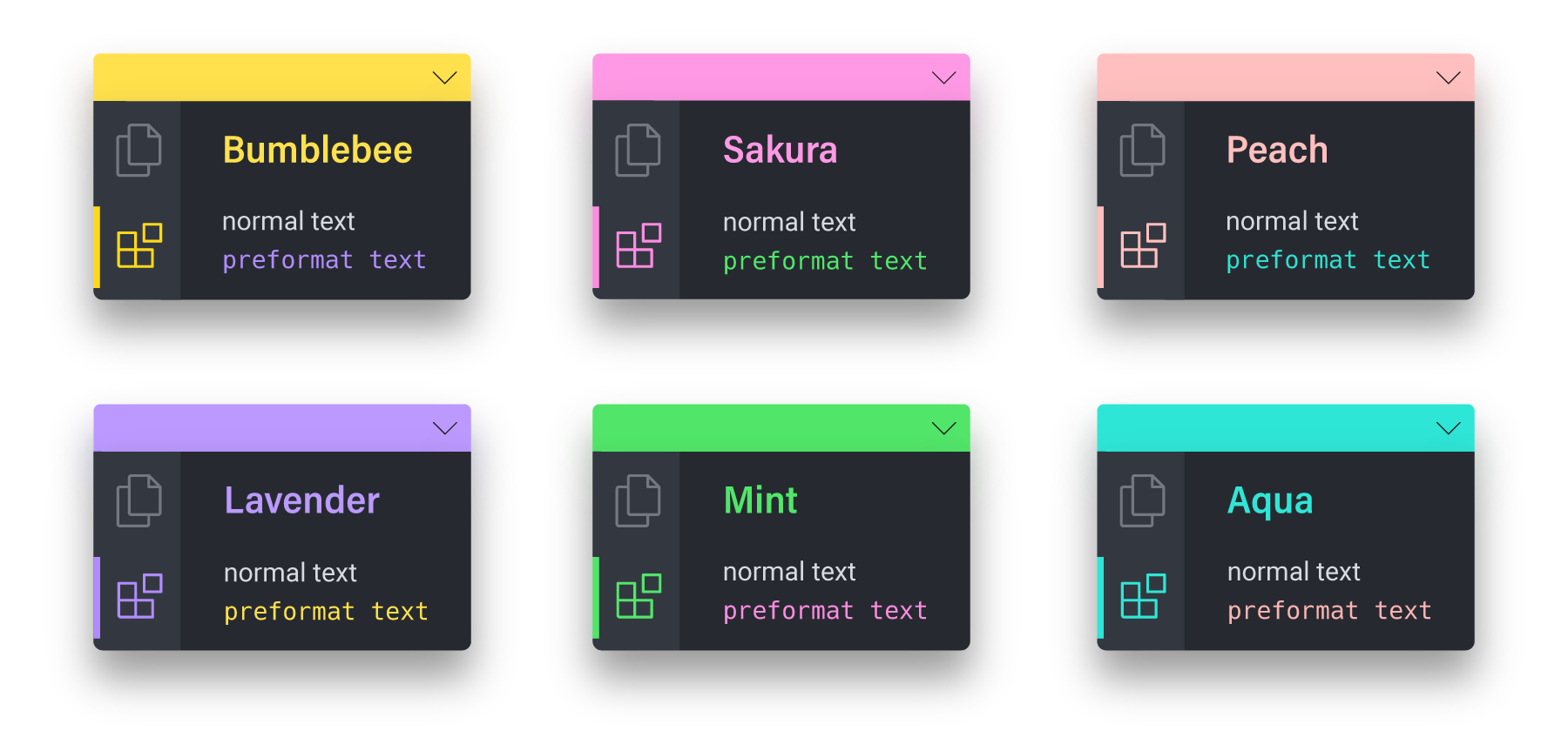
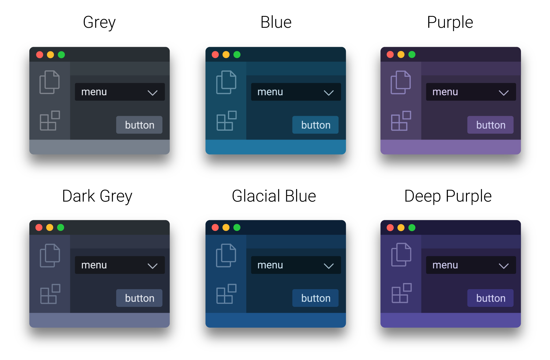
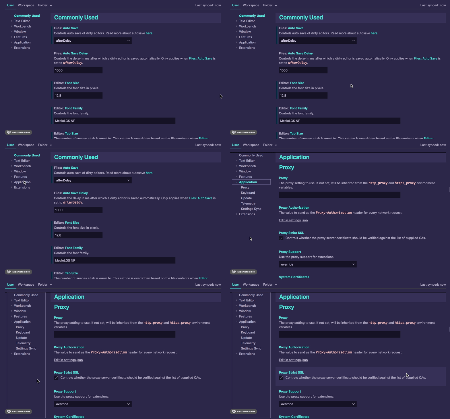
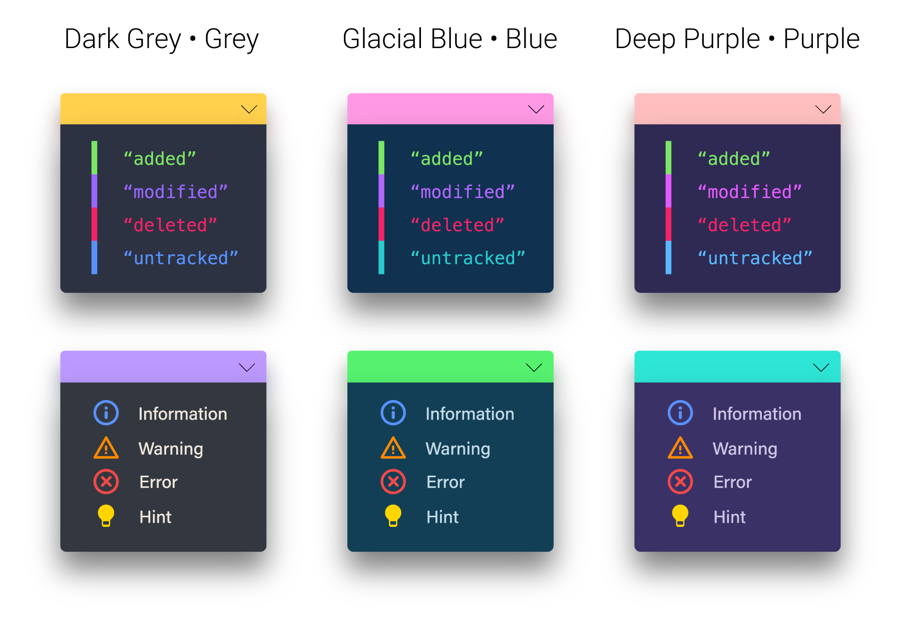
Nebula Oni » Theme OptionsFor Oni UI there are six options for the Main Color and six different colors for Background, and you can combine the two in any way you prefer! You also have options for italic, different colors for comments, selection highlight and more! And it's all easily customizable through the Nebula Oni Menu!
Oni UIThere are a lot of small details and visual hints that can make your life a lot easier when interacting with an interface. So I've tried my best to combine them together and enhance the UX/UI of the Visual Studio Code. I hope you like it and give it a try! For more info, check Oni UI's page Main Colors
Background Colors
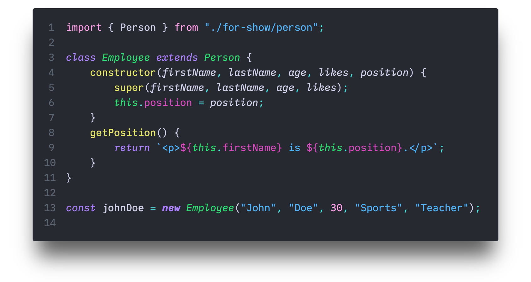
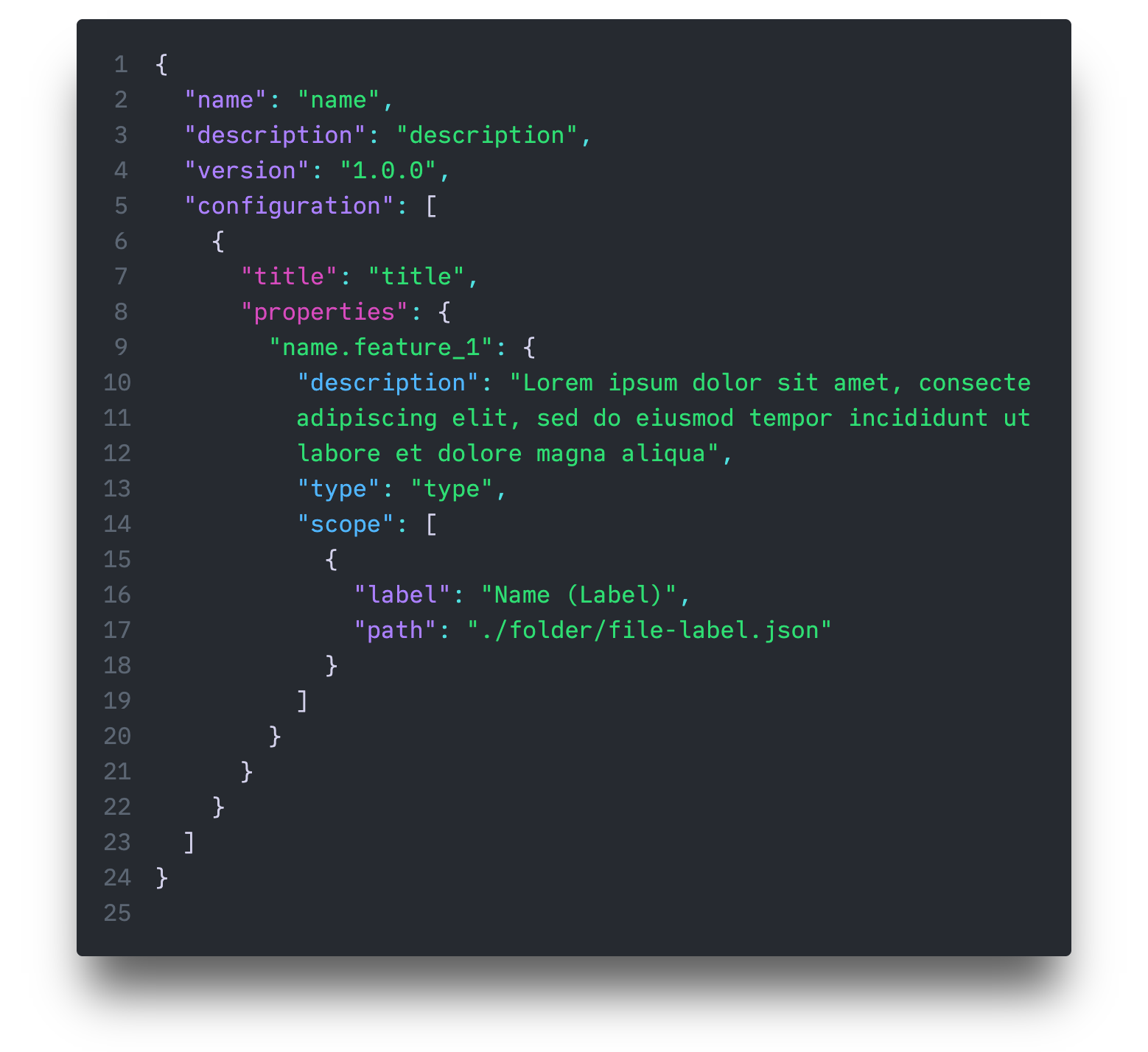
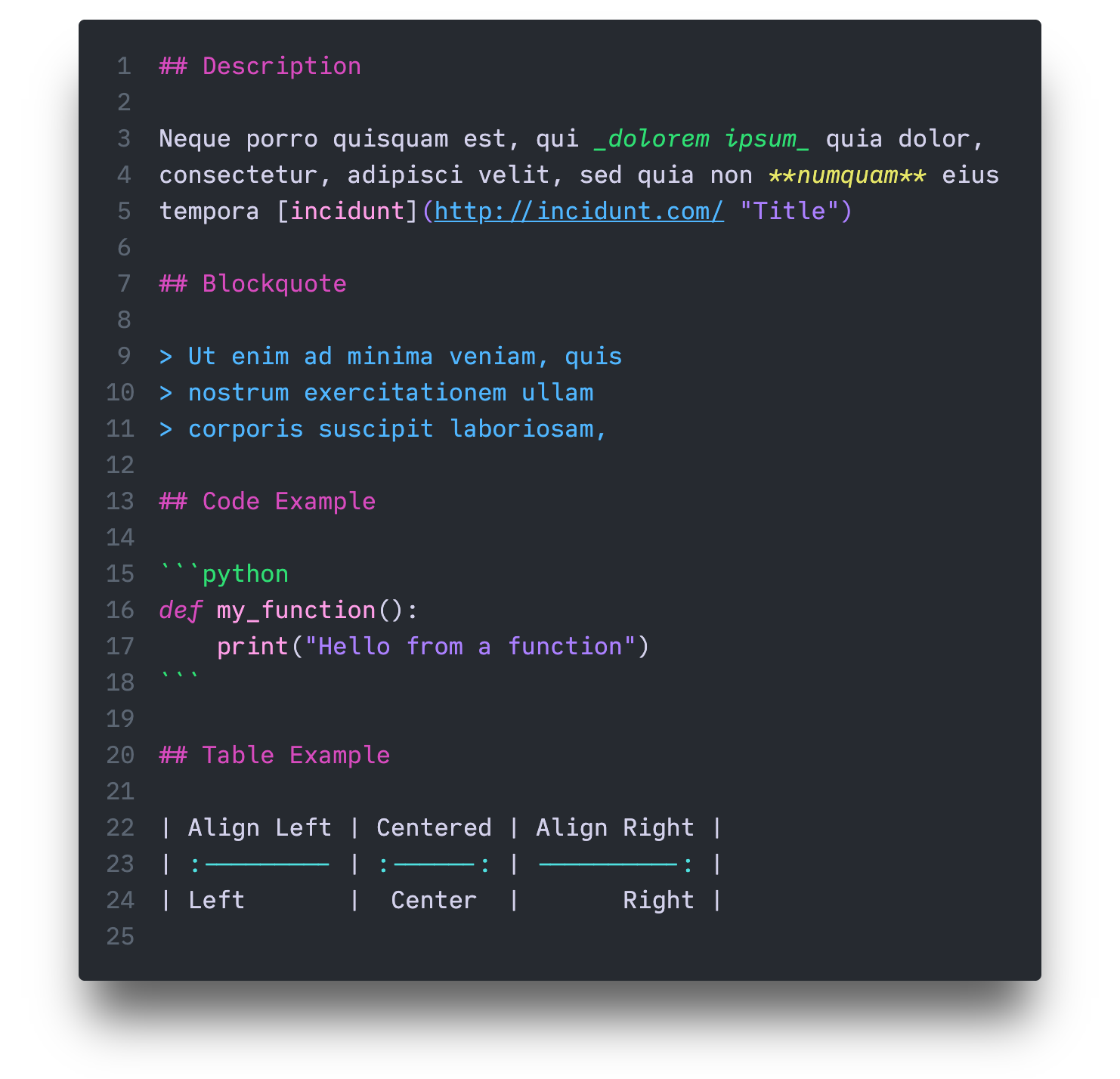
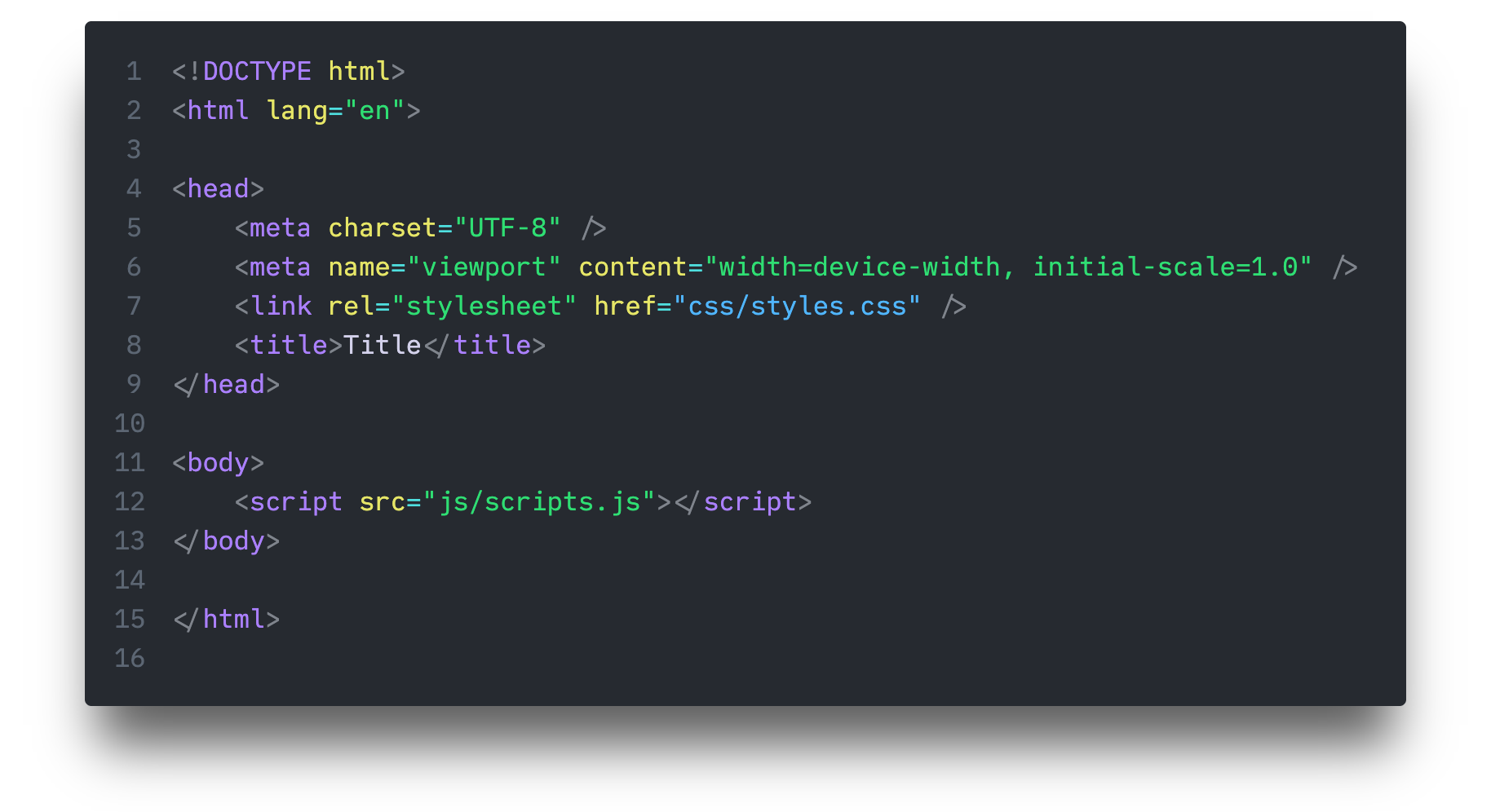
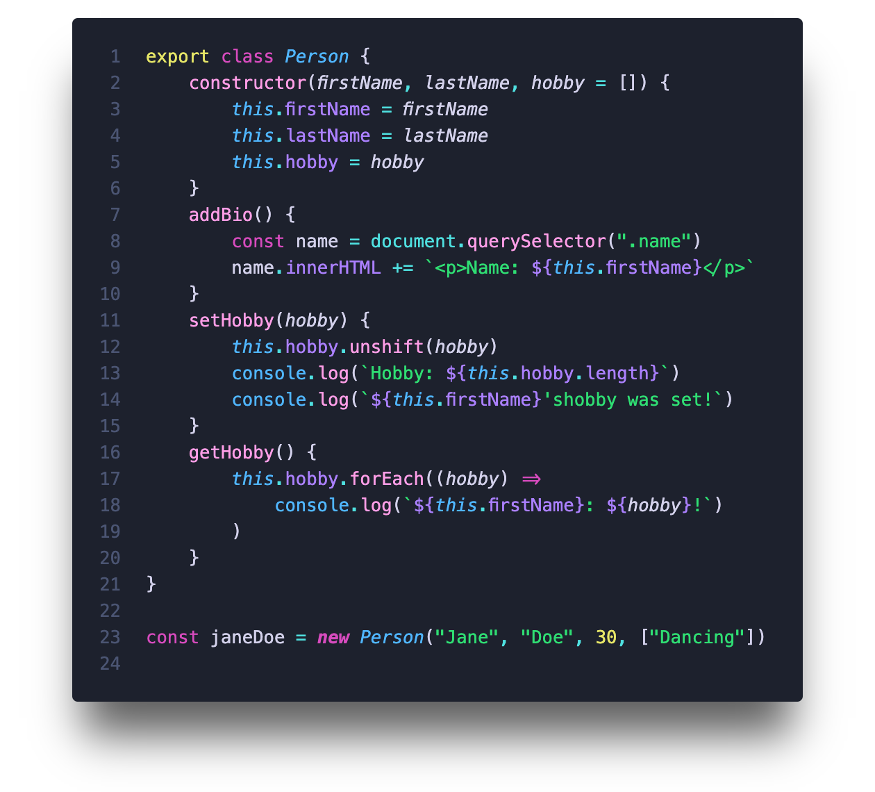
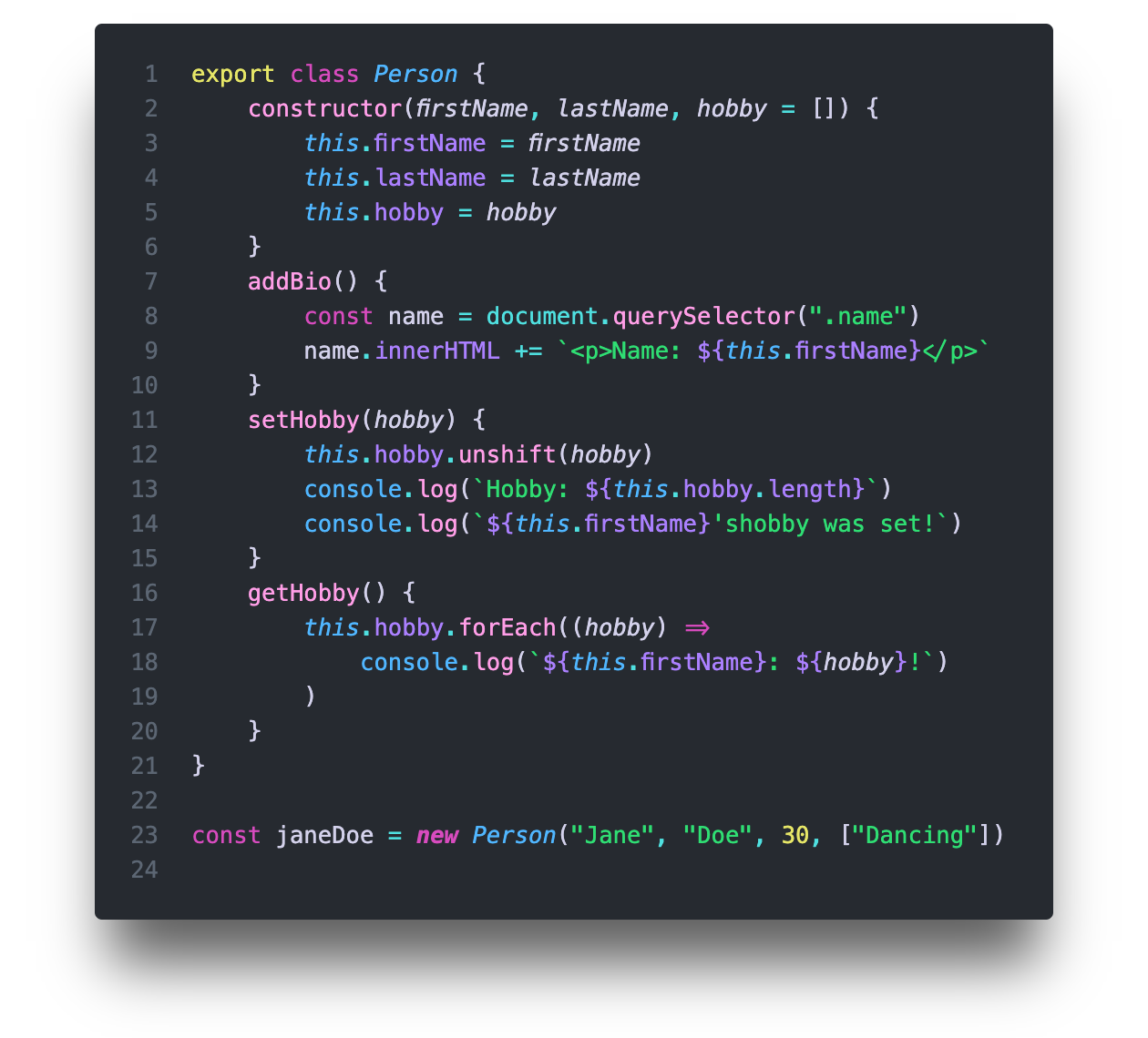
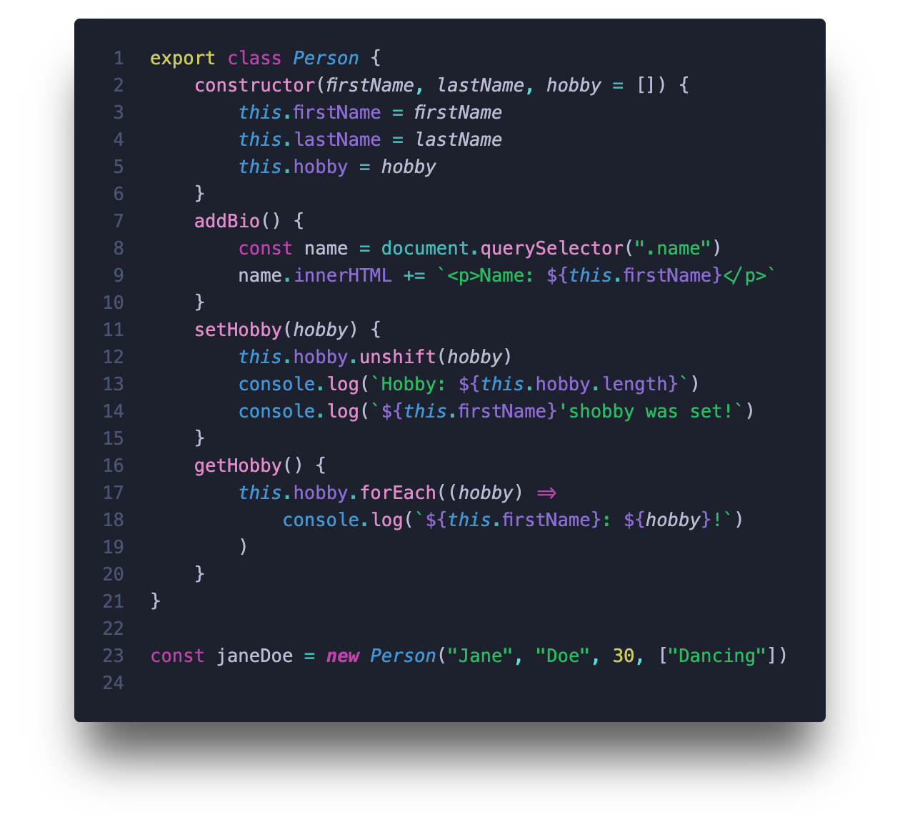
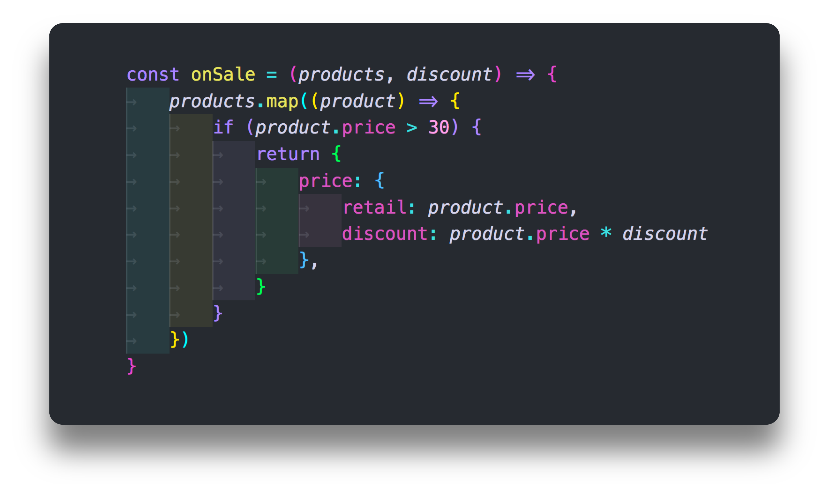
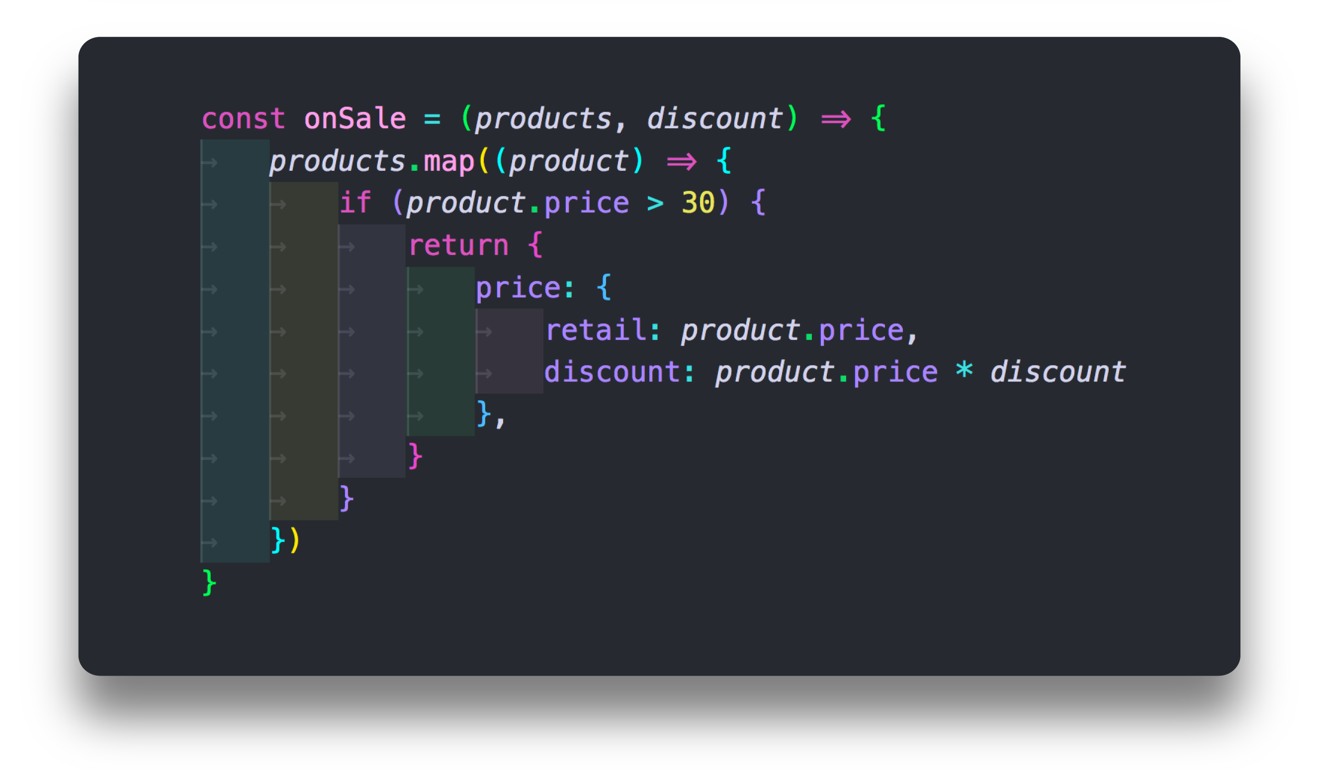
Nebula SyntaxThere are four different color schemes for Nebula Syntax. Each one has a different feel because of some unique color combinations that are different from each other, some are common for all four and some just for each pair (Hourglass/Spirograph and Pegasus/Cerberus). ExamplesHourglass (Javascript)
Pegasus (JSON)*Color Schemes for JSON are split into pairs (Hourglass/Spirograph and Pegasus/Cerberus)
Spirograph (Markdown)*Markdown is the same for all Color Schemes
Cerberus (HTML)
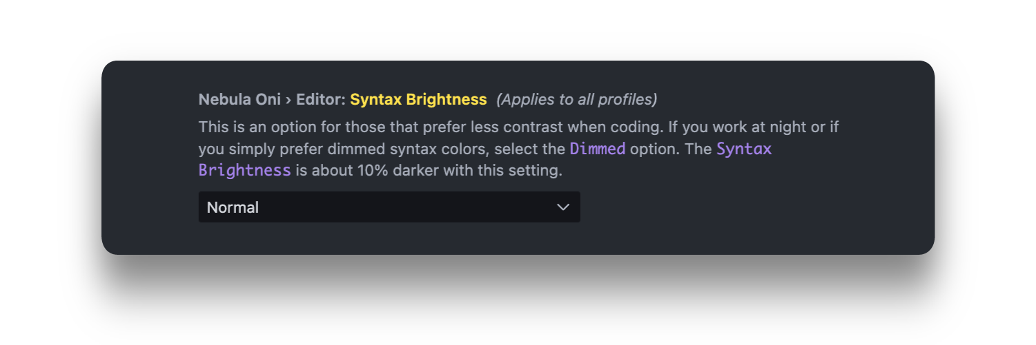
Syntax Brightness
Nebula Oni Color Theme also has If you work at night or if you simply prefer dimmed syntax colors, select the If you mix-and-match the Syntax Brightness with the Background Color, you've got 4 different contrast options. Darker Background with Normal Syntax Brightness for high-contrast settings.
Normal Background and Normal Syntax Brightness or Darker Background with Dimmed Syntax Brightness for a middle of the pack contrast level.
And for low-contrast, just combine Dimmed Syntax Brightness with Normal Background Color.
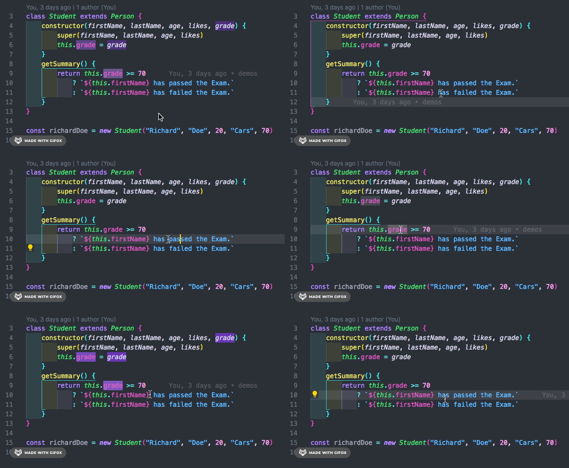
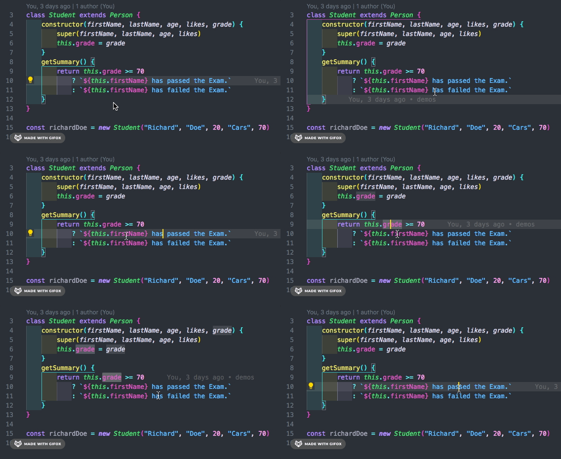
Theme FeaturesSelection Highlight and Find Match HighlightWhen you make a selection, the matching text will be highlighted in Violet, so it's easier to find other instances of the same word. With Find Match, the matched word in focus will have a border that matches the Oni UI color and the other selections will be highlighted in Violet. For those that might not be onboard with the Violet selection, there is a Clear, standard option, with something more neutral. Ultra Violet
Clear
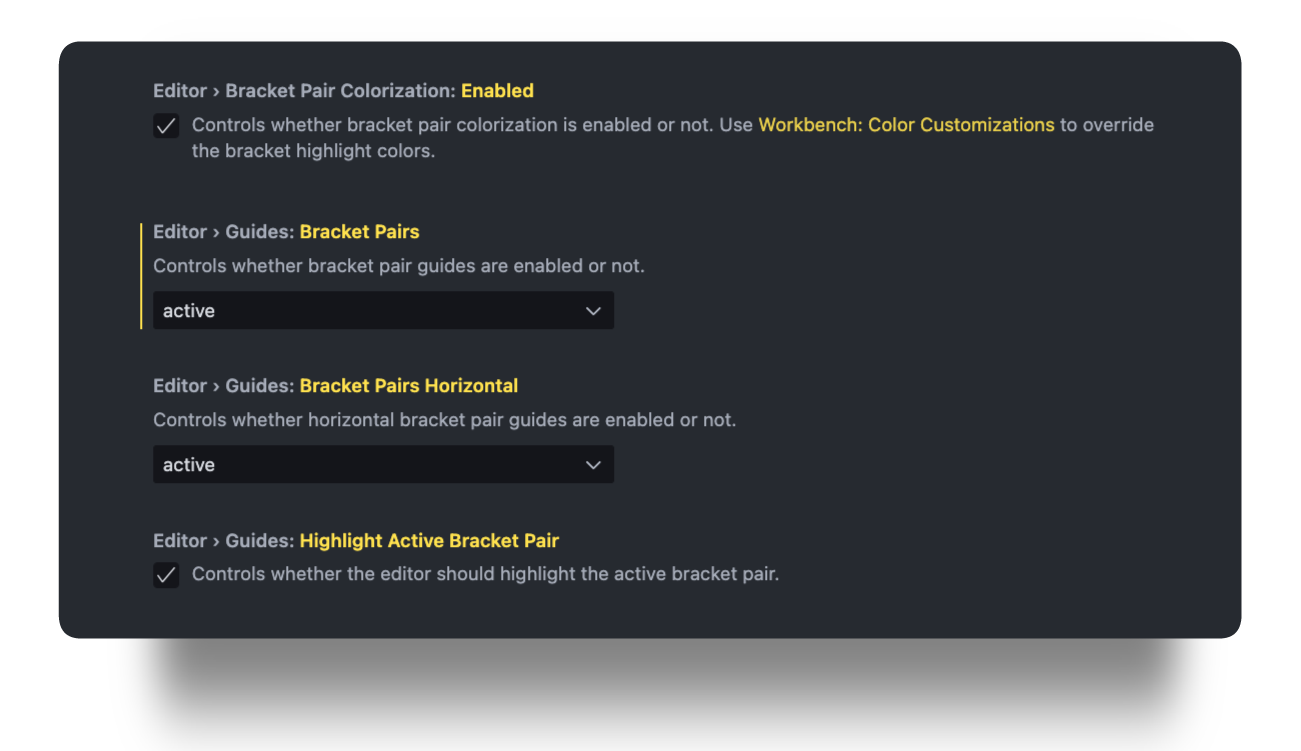
VSCode Native Bracket Pair ColorizationFor now, first you need to enable the settings. Go to Settings > Editor > Bracket Pair Colorization.
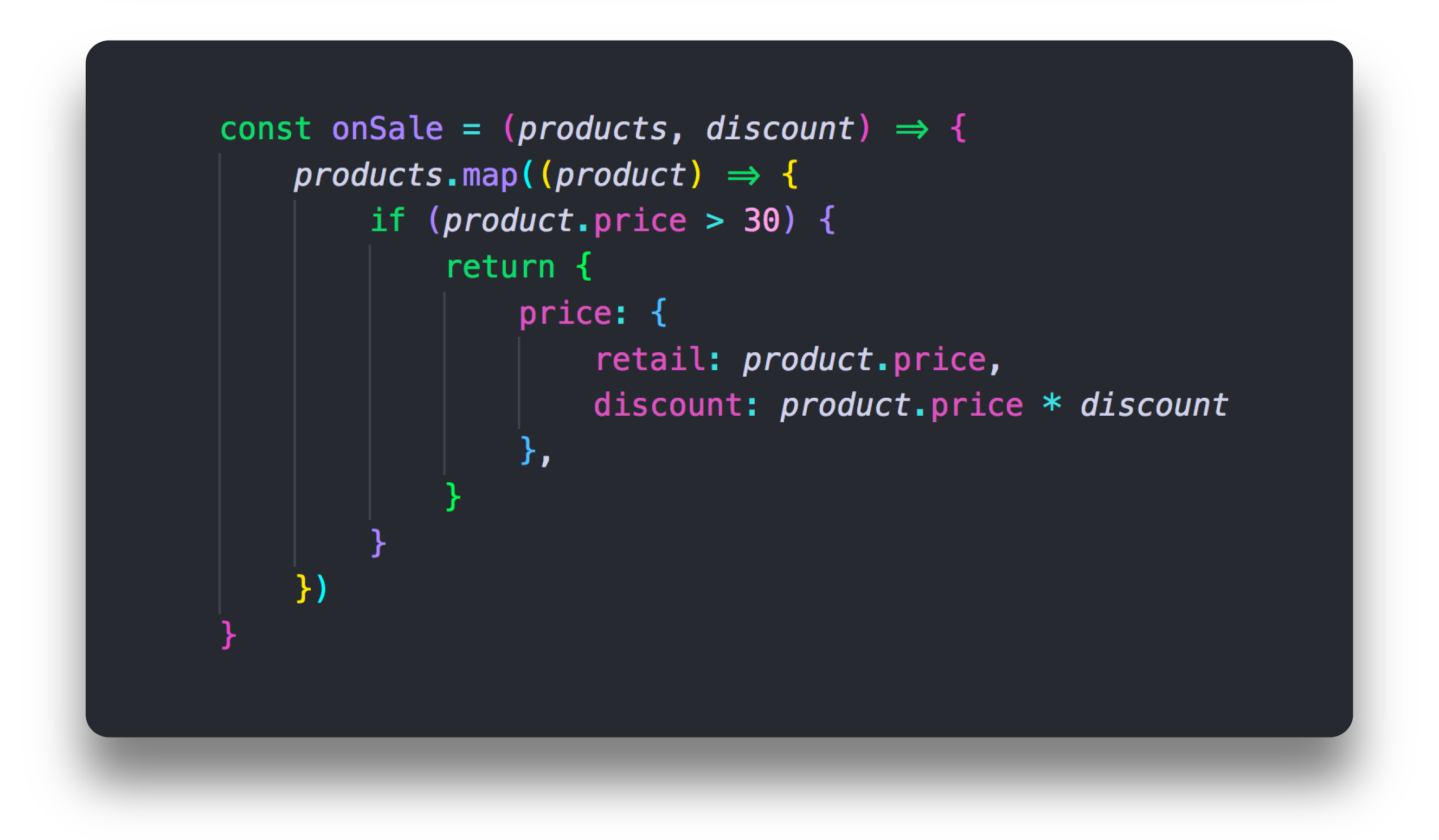
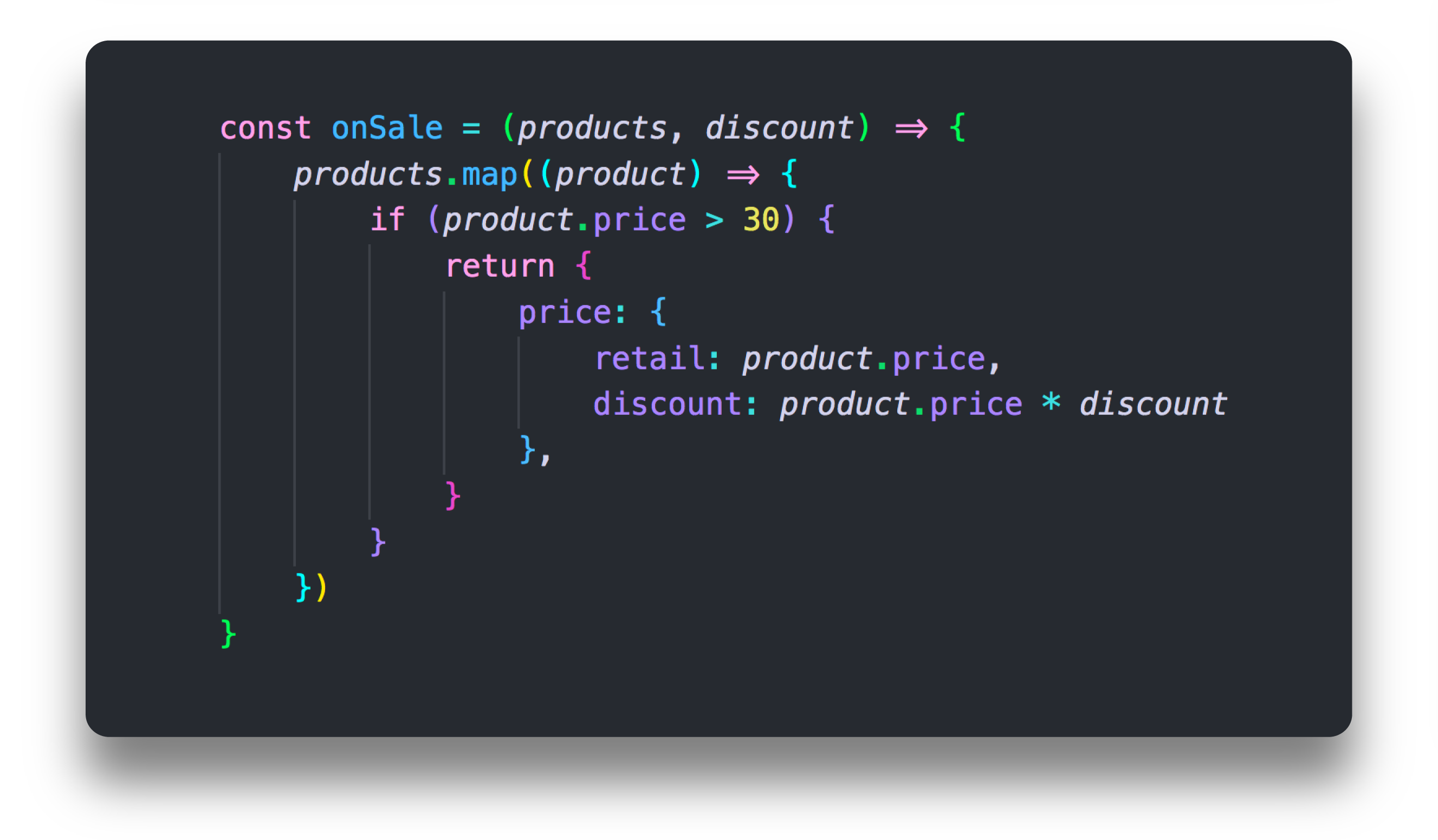
Since now VSCode has its built-in Bracket Pair Colorization, I've basically used the same colors I've created for the extension but now it's here natively. I made a different color combination for each pair of Color Schemes, that way you have similar colors matching less frequently.
Focus BorderIt's a border that appears on mouse clicks and through keyboard navigation. If you don't need it, there is the option to disable it.
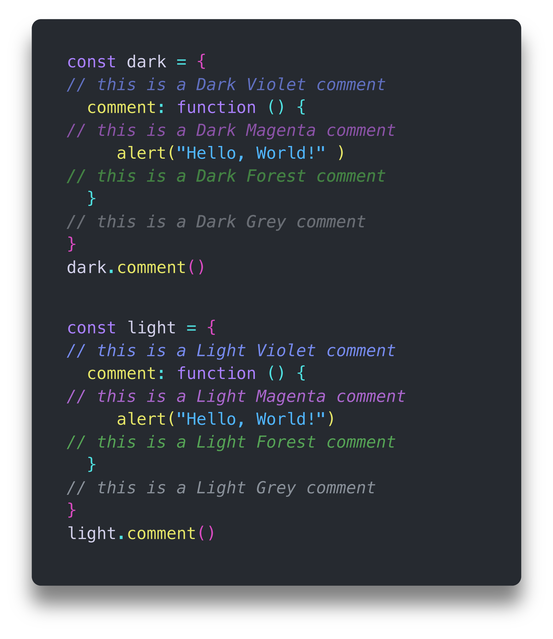
ItalicItalic is basically used for For now you have less fine tuning with Semantic Highlight, but it helps you identify things much faster when coding, so I ended up dropping all the work I've done on textmate scope and started from scratch to make the theme compatible with Semantic Highlight. CommentsThere are 4 colors for comments, the standard grey, but also violet, magenta and forest, each of the colors have a lighter and a darker version, for a total of 8 options.
Side Bar and Activity BarThe background and foreground colors help you easily find which file is open, what is selected and what is in focus. Hovering over the items will highlight the text with the same color as the Oni UI Main Color. The selection in focus is a bright white text so it doesn't interfere with Git Decorations or Errors colors when using the file Explorer.
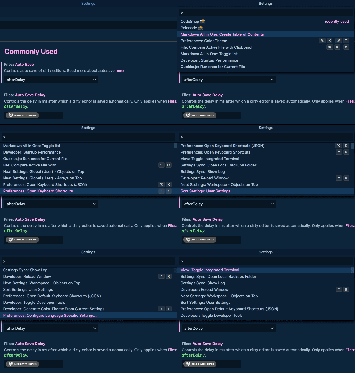
Command Palette
Color InformationThese colors are used across the mini map, editor gutter, notifications, git decorations and warnings so users can easily identify what's going on in a glimpse.
TabsThe Tabs have different background colors, border and text so it's easier for you to identify which one is open or what is in focus.
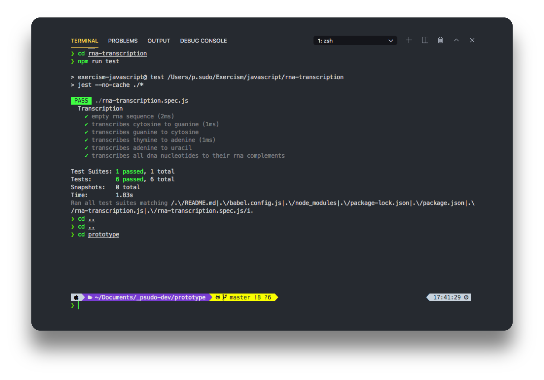
Panel and TerminalI tried to select colors that are easy to read but it's still compatible with terminal customizations like ZSH shell. For more information on how to customized it, check VSCode Customization's page.
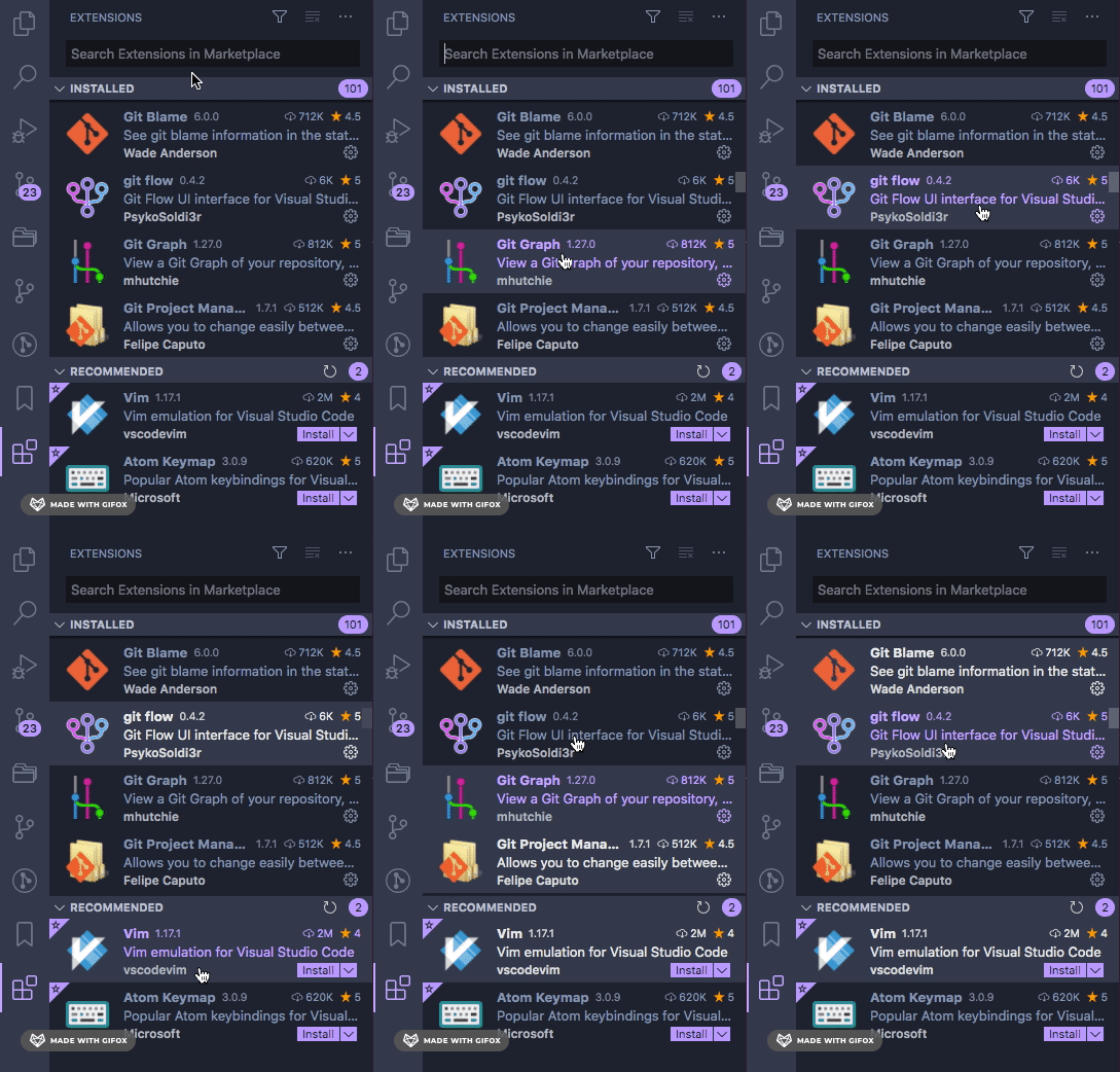
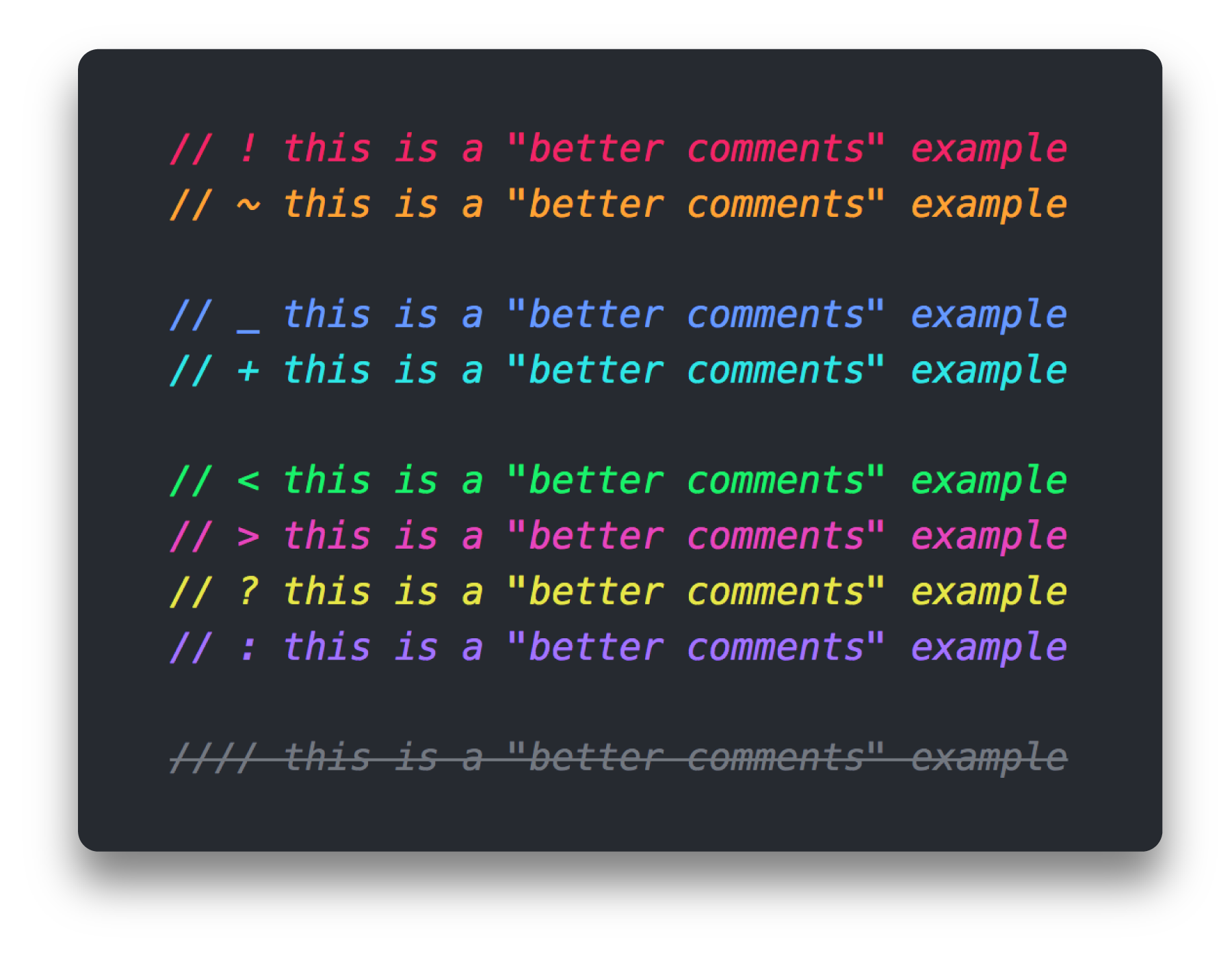
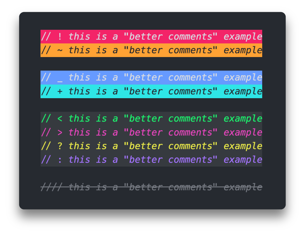
ExtensionsI've customized extensions that are color-related, so if someone would like colors that match the Better Comments
Bracket Pair Colorizer and Indent Rainbow
VSCode CustomizationIf you want more information on how to customize your Oni UI and Nebula Syntax, I made this quick guide with the basics to customize the workbench and the syntax. More InfoRelease HistoryIssues and SuggestionsReferences and Links
AuthorI'm just getting into programming. This project was supposed to be something very simple but it got bigger and bigger and instead of just a few days or weeks, it ended up taking months. I've probably have one or two more themes I might publish - that once upon a time were just a single Color Theme - but I'm also considering creating Icons, who knows? If you want to support this theme, would you consider:
And if you really liked this theme, would you consider buying me a coffee? Thanks, [ psudo-dev ] License |


