Redsea
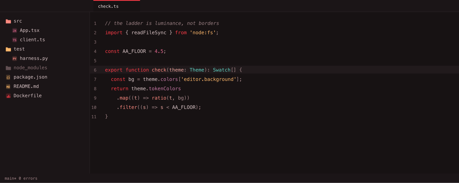
A black-and-red dark theme for VS Code, with a matching file icon theme.
Red is the spine: it owns the cursor, the active borders, keywords, and errors. Syntax
fans out into red's warm neighbours — amber, coral, rose — with a single cool teal for
types. That one cool note is what keeps the theme legible instead of collapsing into a
red smear.
Install
Download the .vsix from the latest release,
then:
code --install-extension redsea-1.0.0.vsix
Or in VS Code: Extensions view → ... menu → Install from VSIX…
Then:
Cmd+K Cmd+T → RedseaCmd+Shift+P → File Icon Theme → Redsea Icons
Icons
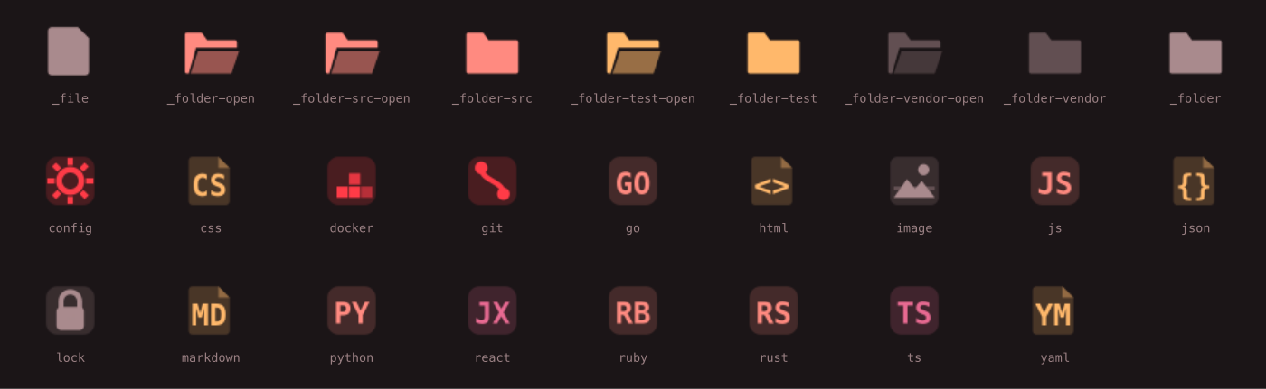
Silhouette carries the family — a chip for code, a folded page for data, a hexagon for
infra — and a drawn glyph replaces the label wherever a shape says it better. Every
label is two characters, so nothing turns to mush at 16 px. src, test, and vendor
folders get their own icons, so the folder you live in and the ones you never open
don't look alike.
Palette
Every foreground clears WCAG AA (4.5:1) against the #171213 background.
| Role |
Hex |
Contrast |
| Background |
#171213 |
— |
| Default text |
#EDE0E0 |
14.4:1 |
| Keyword |
#FF3B47 |
5.3:1 |
| String |
#FFB86B |
10.9:1 |
| Function |
#FF8A80 |
8.1:1 |
| Number / constant |
#E86A92 |
6.1:1 |
| Type / class |
#5FD3C4 |
10.2:1 |
| Variable |
#D8C3C5 |
11.1:1 |
| Parameter |
#F0A7A0 |
9.5:1 |
| Attribute |
#C97BA8 |
6.1:1 |
| Operator / punctuation |
#A98A8D |
5.9:1 |
| Comment |
#9A8083 |
5.1:1 |
Panels separate by luminance step rather than by border lines: editor #171213 →
sidebar #1B1517 → panel #1F181A. Selection is a red wash you can still read
through.
Known limitations
The git gutter is not colourblind-safe. Git status colours are added #A8D9B2,
modified #E8A87C, deleted #FF3B47. Under simulated deuteranopia, added vs.
modified measures roughly 1.19:1 — effectively indistinguishable. This is a known,
accepted limitation rather than an oversight: colourblindness strips hue and leaves
only lightness, and deleted's fixed crimson sits in the middle of the luminance range,
which boxes modified in. Every alternative was tested (dark orange, teal, burgundy) and
each one fixed one pair by breaking another. VS Code's Explorer shows A/M/D letter
badges, which carry the status as text; the editor gutter bar is the one surface with
no such fallback. The full analysis is in
the design spec.
Keywords and tags share one red. In JSX, return and <div> render identically.
Deliberate — red is the spine — but worth knowing before you live in a React file.
Development
npm test
Runs the colour-maths unit tests, then measures all 29 foreground colours — including
semanticTokenColors (what actually renders for TS/Python/Go/Rust, since
semanticHighlighting is on) and editor.foreground — against the WCAG AA floor.
A colour below 4.5:1 fails the build. A theme has no other failure signal: a bad
colour doesn't throw, doesn't fail a type check, and doesn't break a render — it just
quietly makes the editor worse. This check is the test suite.
npm run package    # build the .vsix
npm run publish    # push to the Marketplace
License
MIT © Olayemii Garuba