装修组件文档
文档参考
新组件
针对settings配置的变量,前台买家端可以通过{{sections.settings.xxx}}获取到对应的配置参数, xxx表示在settings中配置的变量,该变量与decoration_settings.json中组件的id一一对应
针对blocks配置的变量,可以通过{{settings.lists}}中遍历获取,每个对象中包含type字段,该字段用来区分配置的每一个块
decoration_settings.json 这个文件描述了这套模板的装修展示
开发者可以通过XShoppy提供的开发者工具下载模板获取到这两个配置文件并进行修改
更多数据配置请参考
装修配置代码片段
{
    "collection": {
        "moduleChild": [
            {
                    "name": "x-product",
                    "id": "collection_product",
                    "label": {
                        "zh-CN": "点击选择商品"
                    }
                }
            ],
            "max_blocks": 5,
            "blocks": [
                {
                    "type": "aaa",
                    "max_blocks": 2,
                    "label": {
                        "zh-CN":"aaa"
                    },
                    "moduleChild": [
                        {
                            "name": "x-text",
                            "id": "aaa_title",
                            "label": {
                                "zh-CN": "aaa标题"
                            }
                        },
                        {
                            "name": "x-textarea",
                            "id": "aaa_textarea",
                            "label": {
                                "zh-CN": "aaa文本"
                            }
                        }
                    ]
                },
                {
                    "type": "bbb",
                    "label": {
                        "zh-CN":"bbb"
                    },
                    "moduleChild": [
                        {
                            "name": "x-text",
                            "id": "bbb_title",
                            "label": {
                                "zh-CN": "bbb标题"
                            }
                        },
                        {
                            "name": "x-textarea",
                            "id": "bbb_textarea",
                            "label": {
                                "zh-CN": "bbb文本"
                            }
                        },
                        {
                            "name": "x-color",
                            "eleGroups": [
                                {
                                    "id": "ccc",
                                    "label": {
                                        "zh-CN": "ccc"
                                    },
                                    "default": "#000345"
                                },
                                {
                                    "id": "ddd",
                                    "label": {
                                        "zh-CN": "ddd"
                                    },
                                    "default": "#eeeeee"
                                }
                            ]
                        }
                    ]
                }
            ]
    }
}
常见属性
备注: XShoppy后台支持中英文,中文简码 zh-CN 英文简码: en
{
	"type": "header",
	"content": {
		"zh-CN": "页头标题"
	}
}

基础组件
x-text 文本
文本用于输入短字符串,例如URL,社交媒体用户名,销售标语文本等。
{
    "name": "x-text",
    "id": "header_title",
    "label": {
        "zh-CN": "头部标题"
    }
}

x-textarea 文本域
多行文本用于属于一段文本描述内容
{
    "name": "x-textarea",
    "id": "header_description",
    "label": {
        "zh-CN": "页头描述"
    },
    "sub_label": {
        "zh-CN": "请输入英文"
    }
}

x-radio 单选
单选用于设置互斥条件,常用于如图片对齐方式
| 属性 |
类型 |
描述 |
默认值 |
必填? |
| id |
string |
绑定值 |
|
Y |
| label |
object |
关联元素的标题(zh-CN\en) |
|
|
| options |
array |
单选框属性 |
|
Y |
{
    name: "x-radio",
    id: "display_type",
    label: {
        "zh-CN": "系列选择"
    },
    default: "all",
    options: [
        {
            value: "all",
            label: {
                "zh-CN": "全部"
            }
        },
        {
            value: "part",
            label: {
                "zh-CN": "部分"
            }
        }
    ]
}

x-checkbox 勾选开关
勾选☑️开关用于配置开关,比如控制元素在页面上的显示、隐藏
| 属性 |
类型 |
描述 |
默认值 |
必填? |
| id |
string |
绑定值 |
|
Y |
| eleGroups |
array |
勾选开关属性 |
|
Y |
{
    "name": "x-checkbox",
    "eleGroups": [
        {
            "id": "header_search",
            "label": {
                "zh-CN": "页头搜索"
            },
            "default": true
        },
        {
            "id": "only_index",
            "label": {
                "zh-CN": "仅在主页显示"
            },
            "default": false
        }
    ]
}

x-select 下拉框
下拉框用于展示向卖家展示很多数据选项,比如在商品列表页面配置每页显示商品的数量
{
    "name": "x-select",
    "id": "ad_position_1",
    "label": {
        "zh-CN": "位置"
    },
    options: [
        {
            value: "front",
            label: {
                "zh-CN": "最前"
            }
        },
        {
            value: "front",
            label: {
                "zh-CN": "最后"
            }
        }
    ]
}

x-range 滑块
通过拖动滑块在一个固定区间内进行选择,比如设置遮罩透明度
要设置滑块,需要配置一下几个选项:
step 步长
min 区间最小值
max 区间最大值
unit 滑块显示单位 ,如 s`px`
| 属性 |
类型 |
描述 |
默认值 |
必填? |
| id |
string |
绑定值 |
|
Y |
| max |
number |
最大值 |
|
Y |
| min |
number |
最小值 |
|
Y |
| step |
number |
步长 |
|
|
| unit |
string |
单位 |
|
|
{
      name: 'x-range',
      id: "delay",
      label: {
          "zh-CN": "播放间隔"
      },
      max: 15,
      min: 2,
      unit: '秒'
  }

增强组件
x-color 颜色选择
提供颜色选择,如配置公告栏背景色
颜色通常几个一组,因此每个独立的颜色选择器配置放置到 eleGroups中
| 属性 |
类型 |
描述 |
默认值 |
必填? |
| id |
string |
绑定值 |
|
Y |
| eleGroups |
array |
颜色属性 |
|
Y |
{
  "name": "x-color",
  "eleGroups": [
      {
          "id": "text_color",
          "label": {
              "zh-CN": "文本色"
          },
          "default": "#000345"
      },
      {
          "id": "bg_color",
          "label": {
              "zh-CN": "背景色"
          },
          "default": "#eeeeee"
      }
  ]
}

x-collection 分类选择
提供分类选择, 如配置精选商品
maxLength 设置分类最多选择个数,不设置则不限制个数(多选有效)
multi 是否支持多选,默认多选
{
      name: "x-collection",
      id: "header_collection",
      maxLength: 9,
      multi: false,
      label: {
          "zh-CN": "点击添加页头分类"
      }
  }

x-product 商品选择
提供商品选择,如配置单个商品
| 属性 |
类型 |
描述 |
默认值 |
必填? |
| id |
string |
绑定值 |
|
Y |
| multi |
boolean |
是否多选 |
|
|
| title |
string |
弹窗标题 |
选择商品 |
|
| label |
object |
绑定文本 |
|
|
{
    name: 'x-product',
    id: "header_product",
    label: {
        "zh-CN": "点击选择商品"
    }
}

x-link 链接选择
提供链接选择,如配置按钮链接
| 属性 |
类型 |
描述 |
默认值 |
必填? |
| id |
string |
绑定值 |
|
Y |
| label |
object |
绑定文本 |
|
|
{
    "name": "x-link",
    "id": "ad_link_1",
    "label": {
        "zh-CN": "选择需要跳转的链接"
    }
}

提供菜单选择,如配置页头菜单
| 属性 |
类型 |
描述 |
默认值 |
必填? |
| id |
string |
绑定值 |
|
Y |
| label |
object |
绑定文本 |
|
|
{
    "name": "x-menu",
    "id": "header_menu",
    "label": {
        "zh-CN": "菜单栏"
    }
}

x-image 图片上传
提供图片上传,如配置移动端图片上传
| 属性 |
类型 |
描述 |
默认值 |
必填? |
| id |
string |
绑定值 |
|
Y |
| label |
object |
绑定文本 |
|
|
| size |
string |
建议图片上传宽高 |
1920 * 1080 |
|
| maxSize |
number |
建议图片上传大小 |
1024 * 8 |
|
{
    "name": "x-image",
    "id": "ad_image_2",
    "label": {
        "zh-CN": "广告位图片2"
    }
}

x-tag 标签选择
提供标签选择,如配置商品列表页按标签搜索
| 属性 |
类型 |
描述 |
默认值 |
必填? |
| id |
string |
绑定值 |
|
Y |
| label |
object |
绑定文本 |
|
|
{
    "name": "x-tag",
    "id": "tag_list",
    "label": {
        "zh-CN": "添加标签"
    }
}

菜单栏广告位
提供菜单栏广告位,如在菜单栏配置广告图片
is_ad_menu 将这个属性配置到x-select配置文件中,表示该下拉框数据来源于菜单栏数据(正常情况下,菜单栏广告位是一组元素的组合)
示例代码
{
    "name": "x-select",
    "is_ad_menu": true,
    "id": "ad_target",
    "label": {
        "zh-CN": "触发广告位"
    }
}

特殊组件-blocks
为支持丰富的多组件组合,XShoppy提供了一个blocks组件,通过该组件,开发者可实现多组件复合使用
is_ad_menu 在block obj对象中配置is_ad_menu: true, 表示显示菜单栏广告位,级联 x-select: {is_ad_menu: true}下拉框实现菜单栏关联
max_block 表示最多支持添加的块, 配置与 blocks平级,则表示整个块最多可添加的个数,如果max_block 在blocks里,则表示该块最多可添加个数
在blocks中可以配置多个不同的块,每个块通过 type字段进行区分
attr
blocks
示例代码
{
    "max_blocks": 5,
    "blocks": [
        {
            "type": "aaa",
            "max_blocks": 2,
            "label": {
                "zh-CN": "aaa"
            },
            "moduleChild": [
                {
                    "name": "x-text",
                    "id": "aaa_title",
                    "label": {
                        "zh-CN": "aaa标题"
                    }
                },
                {
                    "name": "x-textarea",
                    "id": "aaa_textarea",
                    "label": {
                        "zh-CN": "aaa文本"
                    }
                }
            ]
        },
        {
            "type": "bbb",
            "label": {
                "zh-CN": "bbb"
            },
            "moduleChild": [
                {
                    "name": "x-text",
                    "id": "bbb_title",
                    "label": {
                        "zh-CN": "bbb标题"
                    }
                },
                {
                    "name": "x-textarea",
                    "id": "bbb_textarea",
                    "label": {
                        "zh-CN": "bbb文本"
                    }
                },
                {
                    "name": "x-color",
                    "eleGroups": [
                        {
                            "id": "ccc",
                            "label": {
                                "zh-CN": "ccc"
                            },
                            "default": "#000345"
                        },
                        {
                            "id": "ddd",
                            "label": {
                                "zh-CN": "ddd"
                            },
                            "default": "#eeeeee"
                        }
                    ]
                }
            ]
        }
    ]
}
输出

旧模板组件(Deprecated)
示例以布鲁克林模板为例, 示例中包含 ”//xxx“ 注释,仅为提示,请勿在配置文件中增加注释
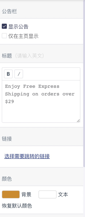
公告栏 sl-note-com
props
| Name |
类型 |
描述 |
默认值 |
| flexColor |
boolean |
颜色布局方式 false-横向 true-纵向 |
false |
| maxLength |
number |
公告栏标题最长可输入字符 |
1000 |
| is_text_hover_color |
boolean |
鼠标悬浮颜色 |
false |
配置示例
{
	name: 'sl-note-com'
}
数据字段
| Name |
类型 |
描述 |
默认值 |
| note.display |
string |
显示公告 1-显示 2-仅在主页显示 |
|
| note.title |
string |
标题 |
|
| note.align |
string |
文字对齐方式 |
|
| note.href |
object |
跳转链接 |
|
| note.background_color |
string |
背景色 |
|
| note.text_color |
string |
文本色 |
|
| note.text_hover_color |
string |
鼠标悬浮颜色 |
|
| note.default_background_color |
string |
默认背景色 |
|
| note.default_text_color |
string |
默认文本色 |
|
| note.default_text_hover_color |
string |
默认鼠标悬浮色 |
|
| note.restore_default_color |
boolean |
是否默认 |
|
数据示例
{
	"note": {
          "background_color": "rgba(34,35,35,1)",
          "default_background_color": "rgba(34,35,35,1)",
          "default_text_color": "rgba(255,255,255,1)",
          "display": "1",
          "display_on_index": "1",
          "href": {
              "handler": "",
              "keyword": "",
              "type": "1"
          },
          "restore_default_color": true,
          "text_color": "rgba(255,255,255,1)",
          "title": "Enjoy Free Express Shipping on orders over $29"
      }
}

数据字段
| Name |
类型 |
描述 |
默认值 |
| background_color |
string |
背景颜色 |
|
| text_color |
string |
文本颜色 |
|
| default_background_color |
string |
默认背景颜色 |
|
| default_text_color |
string |
默认文本颜色 |
|
| restore_default_color |
boolean |
是否默认 |
true |
| text_content |
array |
文本内容 |
|
数据示例
{
    "background_color": "rgba(227, 46, 0, 1)",
    "text_color": "rgba(255, 255, 255, 1)",
    "default_background_color": "rgba(227, 46, 0, 1)",
    "default_text_color": "rgba(255, 255, 255, 1)",
    "restore_default_color": true,
    "text_content": [
        {
            "type": "text",
            "description": "Add a promotion or highlight specials",
            "open": true
        },
        {
            "type": "text",
            "description": "Add a promotion or highlight specials",
            "open": false
        }
    ]
}
购物车图标 sl-cart-icon数据字段
| Name |
类型 |
支持配置 |
描述 |
初始值(可自定义) |
| cart_icon |
string |
bag-购物袋cart-购物车 |
设置购物车图标 |
|
数据示例
{
	"cart_icon": "cart"
}
logo sl-logo-com

props
| Name |
类型 |
描述 |
默认值 |
| is_max_width |
boolean |
显示最大宽度配置 |
false |
配置示例
{name: 'sl-logo-com'}
数据字段
| Name |
类型 |
描述 |
初始值(可自定义) |
| logo.image |
number |
承载插件存放图片id |
|
| logo.image_url |
string |
logo地址 |
|
| logo.max_width |
number |
logo显示最大宽度(50-250) |
|
数据示例
{
    "logo": {
        "image": "",
        "image_url": "",
        "max_width": 130
    }
}

props
| Name |
类型 |
描述 |
默认值 |
| displayCheckbox |
boolean |
显示菜单栏 |
false |
| is_font_size |
boolean |
文字大小 |
false |
| is_align |
boolean |
水平位置 |
false |
配置示例
{name: 'sl-menu-com'}
数据字段
| Name |
类型 |
描述 |
初始值(可自定义) |
| menu.display |
boolean |
显示菜单栏 |
|
| menu.source |
object |
菜单 |
|
| menu.font_size |
number |
文字大小 |
|
| menu.align |
string |
水平对齐 |
|

数据示例
{
    "menu": {
        "source": "Main menu",
        "font_size": 14,
        "align": "right"
    }
}
布局 sl-layout-com

props
| Name |
类型 |
描述 |
默认值 |
| layout_type |
string |
布局方式(参考‘支持的布局’) |
|
支持的布局
1. 二列   三列    detail_col_2_3
2. 二栏    三栏    layout_col_2_3
3. 三栏    四栏   layout_col_3_4
4. 有背景图     无背景图    layout_bg_img
5. 叠加    平铺   layout_display_type
6. 左图右文    左文右图   text_around_img
7. 左图   右图    layout_img_align
8. 横向滚动     固定   layout_img_status
9. 纵向滚动    固定    layout_img_status_vertical
配置示例
{
    name: 'sl-layout-com',
    layout_type: 'layout_col_3_4'
}
数据字段
| Name |
类型 |
描述 |
初始值(可自定义) |
| set.column |
number/string |
默认布局 |
|
数据示例
//////数据配置不统一,建议增加新的模块,统一格式
1. 二列   三列    detail_col_2_3
2. 二栏    三栏    layout_col_2_3
3. 三栏    四栏   layout_col_3_4
4. 有背景图     无背景图    layout_bg_img
5. 叠加    平铺   layout_display_type
6. 左图右文    左文右图   text_around_img
7. 左图   右图    layout_img_align
8. 横向滚动     固定   layout_img_status
9. 纵向滚动    固定    layout_img_status_vertical
特色推荐 sl-hot-products

props
| Name |
类型 |
描述 |
默认值 |
| attr |
object |
属性配置 |
|
| show_set |
boolean |
显示设置 |
false |
| productLength |
number |
可添加个数 |
8 |
| deleteText |
string |
删除文本 |
删除特色推荐 |
| aligns |
array |
自定义文字对齐方式 |
[] |
数据字段
| Name |
类型 |
描述 |
初始值(可自定义) |
| title |
string |
标题 |
|
| text_align |
string |
文字对齐方式 |
|
| images |
array |
特色推荐内容 |
|
数据示例
{
    "name": "特色推荐",
    "type": "hot-products",
    "hide": true,
    "title": "Mosaic",
    "text_align": "text-top-left",
    "images": [
        {
            "open": false,
            "title": "Mosaic",
            "desc": "Use this section to welcome customers to your store, say a bit about your brand, or share news.",
            "image": "",
            "opacity": 75,
            "button": {
                "title": "",
                "href": {
                    "handler": "",
                    "keyword": ""
                }
            }
        }
    ]
}
轮播图项目 sl-drag-banner

props
| Name |
类型 |
描述 |
默认值 |
| is_textalign |
boolean |
显示文字对齐方式 |
true |
| is_img_upload |
boolean |
显示图片上传 |
true |
| is_title |
boolean |
显示标题 |
true |
| is_desc |
boolean |
显示文本描述 |
true |
| is_opacity |
boolean |
显示遮罩透明度 |
false |
| is_link |
boolean |
显示链接 |
false |
| is_display_btn |
boolean |
显示按钮 |
false |
| btn_switch |
boolean |
按钮显示radio |
true |
| aligns |
array |
自定义文字对齐方式 |
[] |
| is_mobUpload |
boolean |
显示移动端图片上传 |
false |
| is_layout_color |
boolean |
显示图片遮罩颜色 |
false |
| is_width |
boolean |
显示占比 |
false |
配置示例
{
    name: 'sl-drag-banner',
    is_opacity: true,
    is_display_btn: true,
    btn_switch: false
}
数据字段
| Name |
类型 |
描述 |
初始值(可自定义) |
| images |
array |
轮播图内容项 |
|
| images_config |
object |
第一张图片宽高 |
|
数据示例
{
    "images_config": {
        "hight": 684,
        "width": 1920
    },
    "images": [
        {
            "image": "",
            "title": "<div style=\"font-weight: bold;\">Slideshow with text</div>",
            "subtitle": "Display large images and promotional text",
            "description": "",
            "align": "center",
            "opacity": 0,
            "width": 66,
            "position": "center",
            "layout_color": "",
            "button": {
                "title": "Button",
                "href": {
                    "handler": "",
                    "keyword": ""
                }
            }
        }
    ]
}
时间间隔 sl-delay-com

配置示例
{name: 'sl-delay-com'}
数据字段
| Name |
类型 |
描述 |
初始值(可自定义) |
| delay |
number |
时间间隔 (5-10之间) |
|
数据示例
{
	"delay": 5
}
按钮 sl-display-btn

props
| Name |
类型 |
描述 |
默认值 |
| btn_switch |
boolean |
按钮显示开关 |
true |
| is_widgets |
boolean |
独立组件,不包含标题 |
false |
配置示例
{
    name: 'sl-display-btn',
    btn_switch: true
}
数据字段
| Name |
类型 |
描述 |
初始值(可自定义) |
| button.display |
boolean |
是否显示按钮 true false |
|
| button.title |
string |
按钮标题 |
|
| button.href |
object |
按钮链接 |
|
数据示例
{
    "button": {
        "href": {
            "handler": "",
            "keyword": ""
        }
    }
}
商品数量选择 sl-number-com

props
| Name |
类型 |
描述 |
默认值 |
| title |
string |
标题 |
商品数量 |
| min_length |
number |
最小可选择 |
0 |
| max_length |
number |
最多可选择 |
24 |
| step |
number |
选择步长 |
1 |
配置示例
{
    name: 'sl-number-com'
}
数据字段
| Name |
类型 |
描述 |
初始值(可自定义) |
| limit |
number |
商品数量 |
|
数据示例
{
    "limit": 10
}
轮播图尺寸设置 sl-banner-size-com

配置示例
{
	name: 'sl-banner-size-com'
}
数据字段
| Name |
类型 |
描述 |
初始值(可自定义) |
| images_config.same_size_first |
boolean |
轮播图尺寸设置 |
|
数据示例
{
    "images_config": {
        "same_size_first": false,
    }
}
图片文章内容项 sl-blog-posts

配置示例
{
	name: 'sl-blog-posts'
}
数据字段
| Name |
类型 |
描述 |
初始值(可自定义) |
| images |
array |
图片文章内容项 |
|
数据示例
{
    "images": [
        {
            "description": "Default Description",  //文本
            "href": {       //链接
                "handler": "",
                "keyword": "",
                "type": 1
            },
            "image": "",   //图片id
            "image_href": "",  //图片链接
            "open": false,   //是否展开
            "title": "Your blog's name"  //标题
        }
    ]
}

props
| Name |
类型 |
描述 |
默认值 |
| show_title |
boolean |
显示标题 |
true |
| attr |
object |
可配置属性 |
|
配置示例
{
      name: 'sl-drag-menu',
      attr: {
          is_subscribe: true
      }
 }
以上配置,表示可以配置 关于我们、菜单栏、订阅
数据字段
| Name |
类型 |
描述 |
初始值(可自定义) |
| background_color |
string |
背景色 |
|
| settings |
array |
页脚内容项 |
|
数据示例
{
    "background_color": "light_gray",
    "setting": [
        {
            "type": "footmenu",
            "source": "Main menu",
            "name": "菜单栏",
            "align": "left",
            "width": 25
        },
        {
            "title": "Text",
            "description": "Show custom content to provide a brand overview, the story behind the business or other creative ideas.",
            "type": "about",
            "name": "文本介绍",
            "align": "left",
            "width": 25
        },
        {
            "title": "Social media",
            "description": "Show a newsletter sign up and social icons",
            "type": "subscribe",
            "name": "订阅",
            "align": "left",
            "width": 25
        }
    ]
}
文本输入 sl-text-com

props
| Name |
类型 |
描述 |
默认值 |
| keyName |
string |
显示字段(开发者自定义key值) |
- |
| placeholder |
string |
输入框提示文案 |
请输入内容 |
| maxLength |
number |
输入框可输入长度 |
Infinity 不限制 |
| title |
string |
标题 |
标题 |
| titleDesc |
string |
副标题 |
请输入英文 |
| isModelWhite |
boolean |
显示标题 |
true |
配置示例
{
    name: 'sl-text-com',
    title: '标题',
    keyName: 'title'
}
文本域输入 sl-textarea-com

props
| Name |
类型 |
描述 |
默认值 |
| keyName |
string |
显示字段 |
- |
| placeholder |
string |
输入框提示文案 |
请输入内容 |
| maxLength |
number |
输入框可输入长度 |
Infinity 不限制 |
| border |
boolean |
标题大小 true-h2 false-h3 |
false |
| attr |
|
|
|
{
    name: 'sl-textarea-com',
    keyName: 'description',
    title: '文本'
}
列表设置 sl-collection-settings

props
| Name |
类型 |
描述 |
默认值 |
| attr |
object |
属性对象 |
- |
配置示例
{
	name: 'sl-collection-settings'
}
数据字段
| Name |
类型 |
描述 |
初始值(可自定义) |
| page_size |
number |
默认显示商品数量(24,36, 48) |
|
| set.show_bread_crumbs |
boolean |
显示面包屑 |
|
| set.sort |
boolean |
启用排序 |
|
| set.discount_tag |
boolean |
显示折扣标签 |
|
| set.layout |
string |
默认显示的布局(网格-grid, 列表-list) |
|
数据示例
{
    "page_size": 24,
    "set": {
        "sort": true,
        "discount_tag": true,
        "layout": "grid",
        "show_bread_crumbs": true
    }
}
列表筛选器sl-collection-filter

配置示例
{
	name: 'sl-collection-filter'
}
数据字段
| Name |
类型 |
描述 |
初始值(可自定义) |
| filter |
boolean |
|
|
| filter_config |
array |
|
|
数据示例
{
    "filter": false,
    "filter_config": [
        {
            "source": "",
            "title": ""
        }
    ]
}

配置示例
{
	name: 'sl-header-search'
}
数据字段
| Name |
类型 |
描述 |
初始值(可自定义) |
| search.search_option |
number |
搜索选项(常规-1,按分类-2,按标签-3) |
|
| search.fast_link |
string |
快捷链接 |
|
| search.search_bar_mobile |
boolean |
在移动端显示搜索栏 |
|
数据示例
{
    "search": {
        "fast_link": "",
        "search_bar_mobile": true,
        "search_option": 2
    }
}
轮播图设置sl-banner-settings

配置示例
{
	name: 'sl-banner-settings'
}
props
| Name |
类型 |
描述 |
默认值 |
| full_screen |
boolean |
全屏宽度 |
false |
| slider_height |
boolean |
轮播图高度 |
false |
| select_height |
boolean |
显示高度 |
false |
数据字段
| Name |
类型 |
描述 |
初始值(可自定义) |
| auto_play |
boolean |
轮播图滚动 |
|
| delay |
number |
时间间隔 |
|
| is_full_width |
boolean |
全屏宽度 |
|
| banner_height |
number |
高度 |
|
数据示例
{
    "auto_play": true,
    "delay": 7,
    "banner_height": 55,
    "is_full_width": true
}

配置示例
{
	name: 'sl-ad-menu-com'
}
数据字段
| Name |
类型 |
描述 |
初始值(可自定义) |
| menu_advert |
array |
菜单栏广告位 |
|
数据示例
{
    "menu_advert": [
        {
            "images": [   //一个广告位最多放两张图片
                {
                    "href": {
                        "handler": "",
                        "keyword": ""
                    },
                    "image": 0,
                    "position": "later",
                    "title": ""
                },
                {
                    "href": {
                        "handler": "",
                        "keyword": ""
                    },
                    "image": 0,
                    "position": "later",
                    "title": ""
                }
            ],
            "target": ""
        }
    ]
}

配置示例
{
	name: 'sl-promotion-com'
}
数据字段
| Name |
类型 |
描述 |
初始值(可自定义) |
| sale_icon.icon |
string |
促销图标 |
|
| sale_icon.title |
string |
促销标题 |
|
| sale_icon.desc |
string |
促销描述 |
|
{
    "sale_icon": {
        "desc": "on all orders over $29",
        "icon": "icon-L_wuliu",
        "title": "Free Shipping"
    }
}
最近浏览 sl-recentview-com

配置示例
{
	name: 'sl-recentview-com'
}
数据字段
| Name |
类型 |
描述 |
初始值(可自定义) |
| display |
boolean |
|
|
数据示例
{
	"display": true
}
快速结账 sl-quick-buy-com

配置示例
{
	name: 'sl-quick-buy-com'
}
数据字段
| Name |
类型 |
描述 |
初始值(可自定义) |
| set.is_show_buy_it_now |
boolean |
显示动态结账按钮 |
|
数据示例
{
	"set": {
		"is_show_buy_it_now": true
	}
}
商品库存 sl-stock-com

props
| Name |
类型 |
描述 |
默认值 |
| inventory_threshold |
boolean |
按钮库存警戒值 |
false |
配置示例
{
	name: 'sl-stock-com'
}
数据字段
| Name |
类型 |
描述 |
初始值(可自定义) |
| set.show_inventory_quantity |
boolean |
显示商品库存 |
|
| set.inventory_threshold_num |
number |
库存警戒值 |
|
数据示例
{
    "set": {
        "show_inventory_quantity": true,
        "inventory_threshold_num": 15,
    }
}
加购后动作 sl-add-cart-action

props
| Name |
类型 |
描述 |
默认值 |
| is_current_page |
boolean |
下拉框可选择当前页 |
false |
配置示例
{
	name: 'sl-add-cart-action'
}
数据字段
| Name |
类型 |
描述 |
初始值(可自定义) |
| add_to_cart_action |
string |
加购动作 |
|
数据示例
{
	"add_to_cart_action": "current-page"    // pop - 弹窗 , redirect - 重定向到购物车 , current-page - 当前页
}
查看图片 sl-view-img

配置示例
{
	name: 'sl-view-img'
}
数据字段
| Name |
类型 |
描述 |
初始值(可自定义) |
| set.mouse_on_detail |
boolean |
鼠标悬浮查看图片细节 |
|
| set.image_zooming |
boolean |
点击放大图片 |
|
数据示例
{
    "set": {
        "mouse_on_detail": true,
        "image_zooming": true
    }
}
标签内容配置 sl-tab-content

props
| Name |
类型 |
描述 |
默认值 |
| is_drag_icons |
boolean |
显示图标配置 |
false |
| multi_module |
boolean |
可添加多个不同类型标签(图标、内容标签、文本) |
false |
| single_module |
boolean |
只能添加标签内容 |
true |
single_module 与 > multi_module 互斥
配置示例
{
	name: 'sl-tab-content'
}
数据字段
| Name |
类型 |
描述 |
初始值(可自定义) |
| icons |
array |
|
|
| tag_pages |
array |
|
|
数据示例
single_module 只添加内容标签
{
	"tag_pages": [
		{
				"page_id": "",
				"open": true
		}
	]
}
multi_module 添加多个类型标签
{
    "icons": [
        {
            "type": "icon",
            "icon": "icon-L_liwu",
            "icon_color": "",
            "desc": "Trust Icon",
            "image": "",
            "open": false
        }
    ],
    "tag_pages": [
        {
            "type": "tag",
            "title": "Page Tab",
            "page_id": "",
            "open": false
        },
        {
            "type": "text",
            "title": "Text Tab",
            "description": "Add custom text to promote products, specials or offers",
            "open": false
        }
    ]
}
分类页分类选择方式 sl-category-com

配置示例
{
	name: 'sl-category-com'
}
如果需要自定义分类,配置分类的数据格式如下:
{
		"is_multi_category": true,  //多选分类
		"list": [],  //如果需要展示已选择的分类,可以增加这个字段
		"source": "",  //分类ID
}
数据字段
| Name |
类型 |
描述 |
初始值(可自定义) |
| [set.category-type] |
number |
0-显示全部分类 1-显示指定分类 |
|
| set.source |
string |
选择的分类ID |
|
数据示例
{
    "set": {
        "category-type": 0,
        "source": ""
    }
}
购物车 sl-cart-com

props
| Name |
类型 |
描述 |
默认值 |
| isComment |
boolean |
留言框 |
true |
| isDiscountCode |
boolean |
优惠码 |
true |
| isShipCalc |
boolean |
运费计算器 |
false |
| isContent |
boolean |
内容 |
false |
| show_settings |
boolean |
购物车设置 |
false |
配置示例
{name: 'sl-cart-com'}
数据字段
| Name |
类型 |
描述 |
初始值(可自定义) |
| [set.display-comment] |
number |
留言框 |
|
| [set.display-discount-code] |
boolean |
折扣标签 |
|
| set.is_full_width |
boolean |
全屏高度 |
|
| set.background_color |
string |
背景色 |
|
| shipCalc |
boolean |
运费计算器 |
|
数据示例
{
    "set": {
        "display-comment": 1,
        "display-discount-code": true,
        "is_full_width": true,
        "background_color": "dark_gray"
    },
    "shipCalc": true
}
移动端商品图 sl-mobile-img

配置示例
{
	name: 'sl-mobile-img'
}
数据字段
| Name |
类型 |
描述 |
初始值(可自定义) |
| set.mobile_product_image |
string |
移动端商品图 |
|
数据示例
{
    "set": {
        "mobile_product_image": "turn"  //turn-翻页标签   zooming-缩略图
    }
}
商品图显示方式 sl-product-display-type

配置示例
{
	name: 'sl-product-display-type'
}
数据字段
| Name |
类型 |
描述 |
初始值(可自定义) |
| set.image_show_type |
string |
显示方式 |
|
数据示例
{
    "set": {
        "image_show_type": "tile"   // tile-平铺   breviary-缩略图
    }
}
图标声明颜色sl-icon-declare-com

配置示例
{
	name: 'sl-icon-declare-com'
}
数据字段
| Name |
类型 |
描述 |
初始值(可自定义) |
| icon_color |
string |
图标颜色 |
|
| text_color |
string |
文本颜色 |
|
| background_color |
string |
背景颜色 |
|
| default_icon_color |
string |
默认图标颜色 |
|
| default_text_color |
string |
默认文本颜色 |
|
| default_background_color |
string |
默认背景颜色 |
|
| restore_default_color |
boolean |
恢复默认颜色状态 |
|
| icons |
array |
图标声明 |
|
数据示例
{
    "icon": [
        {
            "icon": "icon-L_wuliu",  //图标
            "title": "Free Shipping",  //标题
            "desc": "When you spend $29+",  //文本
            "open": true,   //是否展开
            "href": {       //跳转链接
                "handler": "",
                "keyword": ""
            }
        }
    ],
    "icon_color": "",
    "text_color": "",
    "background_color": "",
    "default_icon_color": "",
    "default_text_color": "",
    "default_background_color": "",
    "restore_default_color": true
}
特色推荐sl-hot-products

props
| Name |
类型 |
描述 |
默认值 |
| attr |
object |
属性配置 |
|
| show_set |
boolean |
显示设置 |
false |
| productLength |
number |
支持推荐个数 |
8 |
| deleteText |
string |
删除按钮文案 |
删除特色推荐 |
| aligns |
array |
配置对齐方式 |
|
配置示例
{
      name: 'sl-hot-products',
      show_set: true,
      attr: {
          mobile_pack_up: false,
          is_textarea_title: true,
          is_desc: true,
          is_display_btn: true,

      }
  }
数据字段
| Name |
类型 |
描述 |
初始值(可自定义) |
| title |
string |
标题 |
|
| text_align |
string |
文字对齐方式 |
|
| mobile_pack_up |
boolean |
在移动端收起 |
|
| images |
array |
|
|
数据示例
{
    "images": [
        {
            "button": {
                "href": {
                    "handler": "",
                    "keyword": ""
                },
                "title": ""
            },
            "desc": "",
            "image": "",
            "opacity": 25,
            "open": false,
            "title": "Mosaic"
        }
    ],
    "mobile_pack_up": true,
    "text_align": "text-top-left",
    "title": "Mosaic"
}
分类图sl-category-img

props
| Name |
类型 |
描述 |
默认值 |
| is_position |
boolean |
显示位置 |
true |
| is_title |
boolean |
显示标题 |
true |
| is_small_title |
boolean |
显示副标题 |
true |
| is_opacity |
boolean |
显示透明度 |
true |
配置示例
{
	name: 'sl-category-img'
}
数据字段
| Name |
类型 |
描述 |
初始值(可自定义) |
| category_position |
string |
分类图位置 |
|
| category_title |
string |
分类图标题 |
|
| category_small_title |
string |
分类图副标题 |
|
| opacity |
number |
遮罩透明度 |
|
数据示例
{
    "category_position": "later",   front-最前    after-最后
    "category_small_title": "VIEW ALL",
    "category_title": "Collection",
    "opacity": 25,
}
视频比例 sl-video-ratio

配置示例
{
	name: 'sl-video-ratio'
}
数据字段
| Name |
类型 |
描述 |
初始值(可自定义) |
| window_ratio |
string |
视频比例 |
|
数据示例
{
	"window_ratio": ""   //sixteen_nine - 16:9    twentyone_nine - 21:9
}
其他 sl-other-com

props
| Name |
类型 |
描述 |
默认值 |
| attr |
object |
属性配置 |
|
配置示例
配置的数据与 attr属性 一一对应
{
    name: 'sl-other-com',
    attr: {
        is_sort: true,     //启用排序
        is_discount_tag: true   //显示折扣标签
    }
}
数据字段
| Name |
类型 |
描述 |
初始值(可自定义) |
| other.currency |
boolean |
货币转换 |
|
| fix_menu_top |
boolean |
固定菜单栏到顶部 |
|
| set.image_zooming |
boolean |
启用图像缩放 |
|
| set.display_num_selection |
boolean |
显示数量选择器 |
|
| set.is_show_buy_it_now |
boolean |
显示动态结账按钮 |
|
| widescreen.is_show |
boolean |
宽屏显示 |
|
| set.sort |
boolean |
启用排序 |
|
| is_show_quick_to_buy |
boolean |
启用快捷加购 |
|
| search_show |
boolean |
显示搜索 |
|
| payment.display |
boolean |
显示支付渠道图标 |
|
| btn.display |
boolean |
分类商品快捷入口 |
|
| cart_btn.display |
boolean |
显示购物车按钮 |
|
| set.discount_tag |
boolean |
显示折扣标签 |
|
| price_tag.display |
boolean |
显示折扣标签 |
|
| auto_play |
boolean |
自动播放 |
|
| page_size |
number |
单页展示数量 |
|
| image_fit |
boolean |
尺寸设置 |
|
| set.is_share |
boolean |
显示社交分享按钮 |
|
| set.show_bread_crumbs |
boolean |
显示面包屑 |
|
数据示例
{
    "set": {
        "discount_tag": true,  //显示折扣标签
        "sort": true  //启用排序
    }
}
遮罩透明度 sl-opacity-com


props
| Name |
类型 |
描述 |
默认值 |
| border |
boolean |
是否内嵌透明度 |
true-内嵌透明度 |
配置示例
{
	name: 'sl-opacity-com'
}
数据字段
| Name |
类型 |
描述 |
初始值(可自定义) |
| opacity |
number |
透明度 |
|
数据示例
{
	"opacity": 40    // 0-100
}
商品分类选择 sl-category-selector
props
| Name |
类型 |
描述 |
默认值 |
| barTitle |
string |
模块标题 |
分类 |
| text |
string |
点击链接 |
点击添加商品分类 |
| title |
string |
弹框标题 |
商品分类 |
| maxLength |
number |
支持选择个数 |
Infinity 不限制 |
| show_all_category |
boolean |
显示全部商品分类 |
false |
配置示例
{
	name: 'sl-category-selector',
	maxLength: 9
}
数据字段
| Name |
类型 |
描述 |
初始值(可自定义) |
| btn.display |
boolean |
显示全部分类 |
|
| source_image |
string |
分类图片(单个分类) |
|
| source_title |
string |
分类标题(单个分类) |
|
| list.source_title |
string |
分类标题(选择多个分类) |
|
| list.source_image |
string |
分类图片(选择多个分类) |
|
数据示例
{
    "list": [
        {
            "source_title": "",
            "source_image": ""
        }
    ]
}
商品选择 sl-product-selector
props
| Name |
类型 |
描述 |
默认值 |
| barTitle |
string |
模块标题 |
商品 |
| text |
string |
点击链接 |
点击选择商品 |
| title |
string |
弹框标题 |
选择商品 |
配置示例
{
	name: 'sl-product-selector'
}
数据字段
| Name |
类型 |
描述 |
初始值(可自定义) |
| source |
string |
商品ID |
|
| source_title |
string |
商品标题 |
|
| source_image |
string |
商品图片 |
|
数据示例
{
	source: "",
	source_title: "",
	source_image: ""
}
属性选择方式 sl-attr-select

配置示例
{
	name: 'sl-attr-select'
}
数据字段
| Name |
类型 |
描述 |
初始值(可自定义) |
| set.render_type |
string |
属性选择方式 |
|
{
	"set": {
			"render_type": ""  //select - 下拉框   tag - 标签
	}
}
栅格分类 sl-category-grid

配置示例
{
	name: 'sl-category-grid'
}
数据字段
| Name |
类型 |
描述 |
初始值(可自定义) |
| image |
number |
背景图片id |
|
| image_url |
string |
背景图片地址 |
|
| layout_color |
string |
图片遮罩颜色 |
|
| opacity |
number |
遮罩透明度 |
|
| show_image |
string |
显示分类图片 |
|
| height |
number |
高度 |
|
| background_color |
string |
背景色 |
|
| is_full_width |
boolean |
全屏宽度 |
|
| title |
string |
标题 |
|
| subtitle |
string |
副标题 |
|
| align |
string |
文字对齐方式 |
|
| list |
array |
分类 |
|
| image_fit |
string |
尺寸设置 |
|
数据示例
{
    "title": "<div style=\"font-weight: bold;\">Collection grid</div>",
    "subtitle": "Group similar collections to share a story about the products",
    "align": "center",
    "image": "",
    "show_image": true,
    "is_full_width": true,
    "height": 25,
    "layout_color": "",
    "opacity": 0,
    "background_color": "none",   // dark_gray - 深灰 ,  light_gray - 浅灰 ,  none -  无
    "image_fit": "fit-space",  // fit-space - 适应空间 ,  fill-space - 填充空间
    "list": [
        {
            "source": "",
            "source_title": "",
            "source_image": "",
            "description": "Use custom text to relate how the collection fits into the story line",
            "button": "Shop",
            "open": false
        }
    ]
}
Logo表 sl-logo-list

配置示例
{
	name: "sl-logo-list"
}
数据字段
| Name |
类型 |
描述 |
初始值(可自定义) |
| title |
string |
标题 |
|
| subtitle |
string |
副标题 |
|
| align |
string |
文字对齐方式 |
|
| background_color |
string |
背景色 |
|
| is_full_width |
boolean |
全屏宽度 |
|
| content |
array |
logo内容 |
|
数据示例
{
    "title": "<div style=\"font-weight: bold;\">Logo list</div>",
    "subtitle": "Highlight brands, certifications or sponsors",
    "align": "center",
    "background_color": "dark_gray", //dark_gray - 深灰 ,  light_gray - 浅灰 ,  none -  无
    "is_full_width": true,
    "content": [
        {
            "type": "image",
            "image": "",
            "title": "",
            "href": "",
            "open": false
        }
    ]
}
占比 sl-width

{
	name: "sl-width"
}
数据字段
| Name |
类型 |
描述 |
初始值(可自定义) |
| width |
number |
占比 |
|
数据示例
{
	"width": 66
}
背景色 sl-background-color

数据字段
| Name | 类型 | 描述 | 初始值(可自定义) |
| background_color | string | 背景色 | |
| :--- | :--- | :--- | --- |
独立文本模块 sl-text-settings

配置示例
{
	name: "sl-text-settings"
}
数据字段
| Name |
类型 |
描述 |
初始值(可自定义) |
| background_color |
string |
背景色 |
|
| Name |
类型 |
描述 |
初始值(可自定义) |
| title |
string |
标题 |
|
| subtitle |
string |
副标题 |
|
| description |
string |
文本 |
|
| button |
object |
按钮 |
|
| align |
string |
文字对齐方式 |
|
| width |
number |
占比 |
|
| background_color |
string |
背景色 |
|
| is_full_width |
boolean |
全屏宽度 |
|
| height |
number |
高度 |
|
数据示例
{
    "title": "Rich text",
    "subtitle": "Highlight promotions, certifications, or the latest news",
    "description": "",
    "button": {
        "title": "Button",
        "href": {
            "handler": "",
            "keyword": ""
        }
    },
    "align": "center",
    "width": 66,
    "background_color": "none",
    "is_full_width": true,
    "height": 25
}
通用设置 sl-common-settings

props
| Name |
类型 |
描述 |
默认值 |
| is_img_upload |
boolean |
图片上传 |
true |
| is_layout_color |
boolean |
图片遮罩 |
true |
| is_opacity |
boolean |
遮罩透明度 |
true |
| is_show_image |
boolean |
显示图片 |
true |
| is_full_width |
boolean |
全屏宽度 |
true |
| is_show_background |
boolean |
显示背景 |
true |
| is_show_text |
boolean |
显示文字 |
false |
| is_white_text |
boolean |
白色文字 |
false |
配置示例
{
	name: 'sl-common-settings'
}
文本图片 sl-image-with-text

配置示例
{
	name: 'sl-image-with-text'
}
数据字段
| Name |
类型 |
描述 |
初始值(可自定义) |
| background_color |
|
背景色 |
|
| is_full_width |
|
全屏宽度 |
|
| position |
|
垂直位置 |
|
| content |
|
|
|
数据示例
{
    "background_color": "none",
    "is_full_width": true,
    "position": "center",
    "content": [{
            "type": "image",
            "image": "",
            "image_fit": "fit-space",
            "title": "",
            "href": "",
            "width": 33,    // 33, 50, 66, 75
            "open": false
        },
        {
            "type": "text",
            "title": "Image with text",
            "subtitle": " ",
            "description": "Show custom content to provide an overview of the image and heading",
            "button": {
                "title": "Button",
                "href": {
                    "handler": "",
                    "keyword": ""
                }
            },
            "align": "left",
            "width": 33,
            "open": false
        }
    ]
}
订阅 sl-subscribe-com

配置示例
{
	name: 'sl-subscribe-com'
}
数据字段
| Name |
类型 |
描述 |
初始值(可自定义) |
| title |
string |
标题 |
|
| subtitle |
string |
副标题 |
|
| description |
string |
文本 |
|
| align |
string |
文字对齐方式 |
|
| background_color |
string |
背景色 |
|
| is_full_width |
boolean |
全屏宽度 |
|
数据示例
{
    "title": "Newsletter",
    "subtitle": "Offer incentives for customers to sign up",
    "description": "",
    "align": "center",
    "background_color": "none",
    "is_full_width": true
}
标签设置-标签选择方式 sl-filter-select

配置示例
{
	name: "sl-filter-select"
}
数据字段
| Name |
类型 |
描述 |
初始值(可自定义) |
| filter_type |
string |
标签选择方式 |
|
数据示例
{
	"filter_type": "tag"  //tag-标签  ,  select - 下拉
}
新组件
开发者可以通过自定义配置JSON文件实现店铺装修功能
关于配置文件
**settings.json **这个文件描述了这套模板的基础数据
示例代码
{
    "settings": {
        "header_collection": "4370070,4370069",
        "header_jiaf": true,
        "header_logo": "",
        "header_menu": "",
        "header_product": "",
        "tag_list": ""
    },
    "blocks": [
        {
            "settings": {
                "ad_image_1": "",
                "ad_image_2": "",
                "ad_link_1": "",
                "ad_link_2": "",
                "ad_position_1": "",
                "ad_position_2": "",
                "ad_target": "",
                "ad_title_1": "",
                "ad_title_2": ""
            },
            "type": "sl_ad_menu"
        }
    ]
}