Auto Width Height Rem
自动从背景图片生成 width、height 和 background-size 的 VSCode 插件。
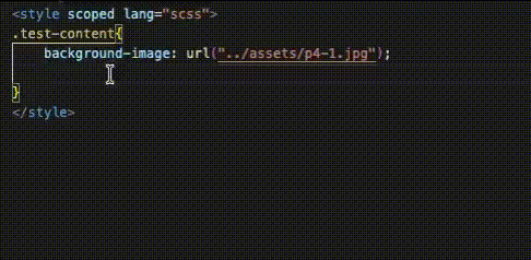
🎬 效果预览
✨ 功能特性
- 🖼️ 自动检测图片尺寸 - 读取 background-image 中图片的宽度和高度
- 📐 自动转换单位 - 将 px 转换为 rem(基于配置的 font-size)
- 🎯 居中定位计算 - 自动生成 left/top: calc(50% - width/2)
- 🖼️ Background-size - 支持生成 background-size 属性
- ⚡ 高效触发 - 输入
wh 开头即触发补全
- 🌐 多框架支持 - Vue3、React、Angular、Svelte 等
📦 安装
在 VSCode 扩展商店搜索 Auto Width Height Rem 并安装。
⚡ 快捷指令
尺寸指令(width / height)
| 指令 |
功能 |
单位 |
示例(750×300px, font-size=100) |
whr |
width + height |
rem |
width: 7.5rem; height: 3rem; |
whrw |
width only |
rem |
width: 7.5rem; |
whrh |
height only |
rem |
height: 3rem; |
whpx |
width + height |
px |
width: 750px; height: 300px; |
whpxw |
width only |
px |
width: 750px; |
whpxh |
height only |
px |
height: 300px; |
居中定位指令
| 指令 |
功能 |
单位 |
示例 |
whlc |
left 居中 |
rem |
left: calc(50% - 3.75rem); |
whtc |
top 居中 |
rem |
top: calc(50% - 1.5rem); |
whcc |
完全居中 |
rem |
left + top |
whlcpx |
left 居中 |
px |
left: calc(50% - 375px); |
whtcpx |
top 居中 |
px |
top: calc(50% - 150px); |
whccpx |
完全居中 |
px |
left + top |
Background-size 指令
| 指令 |
功能 |
单位 |
示例 |
whbs |
background-size |
rem |
background-size: 7.5rem 3rem; |
whbsw |
bg-size width |
rem |
background-size: 7.5rem auto; |
whbsp |
background-size |
px |
background-size: 750px 300px; |
whbspw |
bg-size width |
px |
background-size: 750px auto; |
whbsc |
cover |
- |
background-size: cover; |
whbct |
contain |
- |
background-size: contain; |
组合指令
| 指令 |
功能 |
单位 |
whall |
width + height + background-size |
rem |
whallpx |
width + height + background-size |
px |
📝 使用方法
1. 添加背景图片
.banner {
  background-image: url('./images/banner.png');
}
2. 输入快捷指令
在背景图片属性下方输入快捷指令(如 whr),然后按 Tab 或 Space 触发补全。
3. 自动生成代码
.banner {
  background-image: url('./images/banner.png');
  width: 7.5rem;
  height: 3rem;
}
⚙️ 配置
设置 font-size
打开 VSCode 设置(Cmd + , 或 Ctrl + ,),搜索 autoWidthHeightRem,配置 font-size:
{
  "autoWidthHeightRem.fontSize": 100
}
font-size 说明
| 场景 |
fontSize |
750px 转换结果 |
| 移动端适配(设计稿 750px) |
100 |
7.5rem |
| 移动端适配(设计稿 375px) |
50 |
15rem |
| 桌面端(浏览器默认) |
16 |
46.875rem |
计算公式: rem = px ÷ font-size
🌐 支持的语言
- CSS
- SCSS / Sass
- Less
- Vue(
<style> 块)
- React(CSS Modules)
- Angular
- Svelte
🖼️ 支持的图片格式
PNG, JPEG/JPG, GIF, WebP, BMP, ICO, TIFF 等
📖 示例
基础用法
.card {
  background-image: url('./images/card.png');
  /* 输入 whr 并按 Tab */
  width: 7.5rem;
  height: 3rem;
}
居中定位
.box {
  background-image: url('./images/box.png');
  /* 输入 whcc 并按 Tab */
  left: calc(50% - 3.75rem);
  top: calc(50% - 1.5rem);
}
Vue3 用法
<template>
  <div class="banner"></div>
</template>

<style lang="scss" scoped>
.banner {
  background-image: url('@/assets/banner.png');
  /* 输入 whr 并按 Tab */
  width: 7.5rem;
  height: 3rem;
}
</style>
❓ 常见问题
输入 whr 没有反应?
按 Ctrl + Space(Mac: Ctrl + Space)手动触发补全。
图片路径找不到?
确保使用相对路径(如 ./images/bg.png)或 @/ 别名(如 @/assets/bg.png)。
rem 计算不正确?
检查 autoWidthHeightRem.fontSize 设置是否正确。默认是 100,即 1rem = 100px。
被 GitHub Copilot / CodeGeex 等 AI 补全工具干扰?
AI 代码补全工具(如 GitHub Copilot、CodeGeex、Tabnine 等)会干扰本插件的提示:
- 问题现象:输入
whr 后没有弹出补全列表,AI 直接建议补全内容
- 原因:AI 工具优先级更高,一旦预测了代码,
Ctrl + Space / Cmd + Space 手动触发也无效
- 解决方法:编写样式时,建议暂时关掉 AI 代码补全工具
⚠️ 重要:AI 工具不知道图片的真实尺寸,生成的 width/height 值几乎都是错的。本插件会读取图片实际尺寸并精确计算,所以请务必使用本插件的补全结果。
📄 License
MIT
Auto Width Height Rem
VSCode extension that automatically generates width, height, and background-size from background images.
🎬 Demo
✨ Features
- 🖼️ Auto-detect image size - Read width and height from background-image
- 📐 Auto unit conversion - Convert px to rem (based on configured font-size)
- 🎯 Center positioning - Auto-generate left/top: calc(50% - width/2)
- 🖼️ Background-size - Generate background-size property
- ⚡ Fast trigger - Start typing
wh to trigger autocomplete
- 🌐 Multi-framework support - Vue3, React, Angular, Svelte, etc.
📦 Installation
Search for Auto Width Height Rem in the VSCode extension marketplace and install.
⚡ Shortcuts
Size Commands (width / height)
| Command |
Function |
Unit |
Example (750×300px, font-size=100) |
whr |
width + height |
rem |
width: 7.5rem; height: 3rem; |
whrw |
width only |
rem |
width: 7.5rem; |
whrh |
height only |
rem |
height: 3rem; |
whpx |
width + height |
px |
width: 750px; height: 300px; |
whpxw |
width only |
px |
width: 750px; |
whpxh |
height only |
px |
height: 300px; |
Center Positioning Commands
| Command |
Function |
Unit |
Example |
whlc |
left center |
rem |
left: calc(50% - 3.75rem); |
whtc |
top center |
rem |
top: calc(50% - 1.5rem); |
whcc |
full center |
rem |
left + top |
whlcpx |
left center |
px |
left: calc(50% - 375px); |
whtcpx |
top center |
px |
top: calc(50% - 150px); |
whccpx |
full center |
px |
left + top |
Background-size Commands
| Command |
Function |
Unit |
Example |
whbs |
background-size |
rem |
background-size: 7.5rem 3rem; |
whbsw |
bg-size width |
rem |
background-size: 7.5rem auto; |
whbsp |
background-size |
px |
background-size: 750px 300px; |
whbspw |
bg-size width |
px |
background-size: 750px auto; |
whbsc |
cover |
- |
background-size: cover; |
whbct |
contain |
- |
background-size: contain; |
Combo Commands
| Command |
Function |
Unit |
whall |
width + height + background-size |
rem |
whallpx |
width + height + background-size |
px |
📝 Usage
1. Add a background image
.banner {
  background-image: url('./images/banner.png');
}
2. Type a shortcut
Type a shortcut (e.g., whr) below the background image property, then press Tab or Space to trigger autocomplete.
3. Code is generated
.banner {
  background-image: url('./images/banner.png');
  width: 7.5rem;
  height: 3rem;
}
⚙️ Configuration
Set font-size
Open VSCode settings (Cmd + , or Ctrl + ,), search for autoWidthHeightRem, and configure font-size:
{
  "autoWidthHeightRem.fontSize": 100
}
Font-size Guide
| Scenario |
fontSize |
750px Result |
| Mobile (design 750px) |
100 |
7.5rem |
| Mobile (design 375px) |
50 |
15rem |
| Desktop (browser default) |
16 |
46.875rem |
Formula: rem = px ÷ font-size
🌐 Supported Languages
- CSS
- SCSS / Sass
- Less
- Vue (
<style> blocks)
- React (CSS Modules)
- Angular
- Svelte
PNG, JPEG/JPG, GIF, WebP, BMP, ICO, TIFF, etc.
📖 Examples
Basic Usage
.card {
  background-image: url('./images/card.png');
  /* Type whr and press Tab */
  width: 7.5rem;
  height: 3rem;
}
Center Positioning
.box {
  background-image: url('./images/box.png');
  /* Type whcc and press Tab */
  left: calc(50% - 3.75rem);
  top: calc(50% - 1.5rem);
}
Vue3 Usage
<template>
  <div class="banner"></div>
</template>

<style lang="scss" scoped>
.banner {
  background-image: url('@/assets/banner.png');
  /* Type whr and press Tab */
  width: 7.5rem;
  height: 3rem;
}
</style>
❓ FAQ
whr doesn't trigger?
Press Ctrl + Space to manually trigger autocomplete.
Image path not found?
Make sure to use relative paths (e.g., ./images/bg.png) or @/ aliases (e.g., @/assets/bg.png).
Rem calculation incorrect?
Check if autoWidthHeightRem.fontSize is set correctly. Default is 100, meaning 1rem = 100px.
AI code completion tools (such as GitHub Copilot, CodeGeex, Tabnine, etc.) will interfere with this extension's suggestions:
- Symptom: After typing
whr, no completion list appears, AI directly suggests completion content
- Cause: AI tools have higher priority. Once they predict code,
Ctrl + Space / Cmd + Space manual trigger is also ineffective
- Solution: Temporarily disable AI code completion tools when writing styles
⚠️ Important: AI tools don't know the actual image dimensions, so the generated width/height values are almost always wrong. This extension reads the actual image size and calculates precisely, so please make sure to use this extension's completion results.
📄 License
MIT