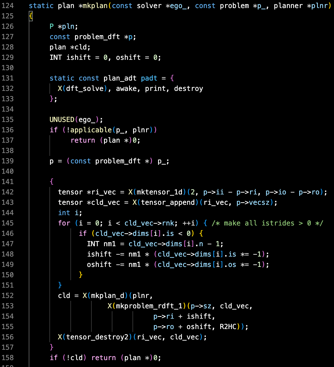
Dark+ Contrast ThemeThe default Dark+ Visual Studio Code with pure black background and colors made lighter. I like the default theme, it was just annoying to switch from my clearly-looking black terminal to the faded, poor-contrast Code. I felt like I have a vision problem. Code editors shouldn't be gray! More contrast also makes it possible to work outside. 
Enjoy! |

