Skip to content
| Marketplace
Sign in
Visual Studio Code>Themes>Dark 2026 GreenNew to Visual Studio Code? Get it now.
Dark 2026 Green

Dark 2026 Green

华散

|
3 installs
| (0) | Free
Dark 2026 with a luminance-matched green accent.
Installation
Launch VS Code Quick Open (Ctrl+P), paste the following command, and press enter.
Copied to clipboard
More Info

Dark 2026 Green

Dark 2026 with a luminance-matched green accent.

Dark 2026 Green is VS Code's built-in Dark 2026 theme with its UI accent colour rotated from blue to green — at identical perceived brightness. Syntax highlighting is untouched.

Same light, different hue. That is the whole idea.


Screenshots

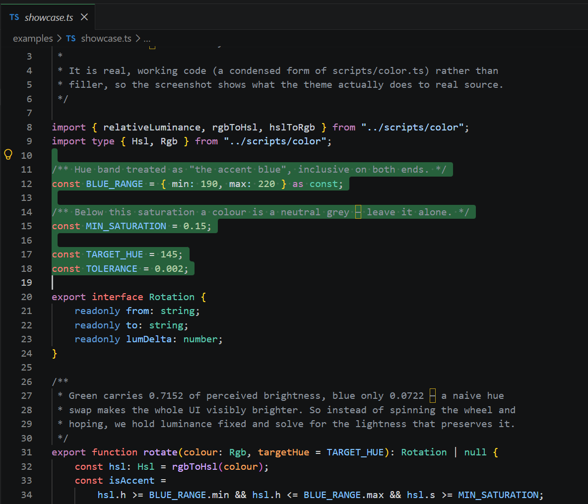
Dark 2026 Green — a selection in the theme's own colour code, showing the green selection highlight against Dark 2026's untouched syntax colours

The green behind the selected lines is editor.selectionBackground — one of the 61 rotated UI colours. Everything carrying syntax colour (const red, strings blue, types teal) is Dark 2026, untouched. That contrast is the whole point.

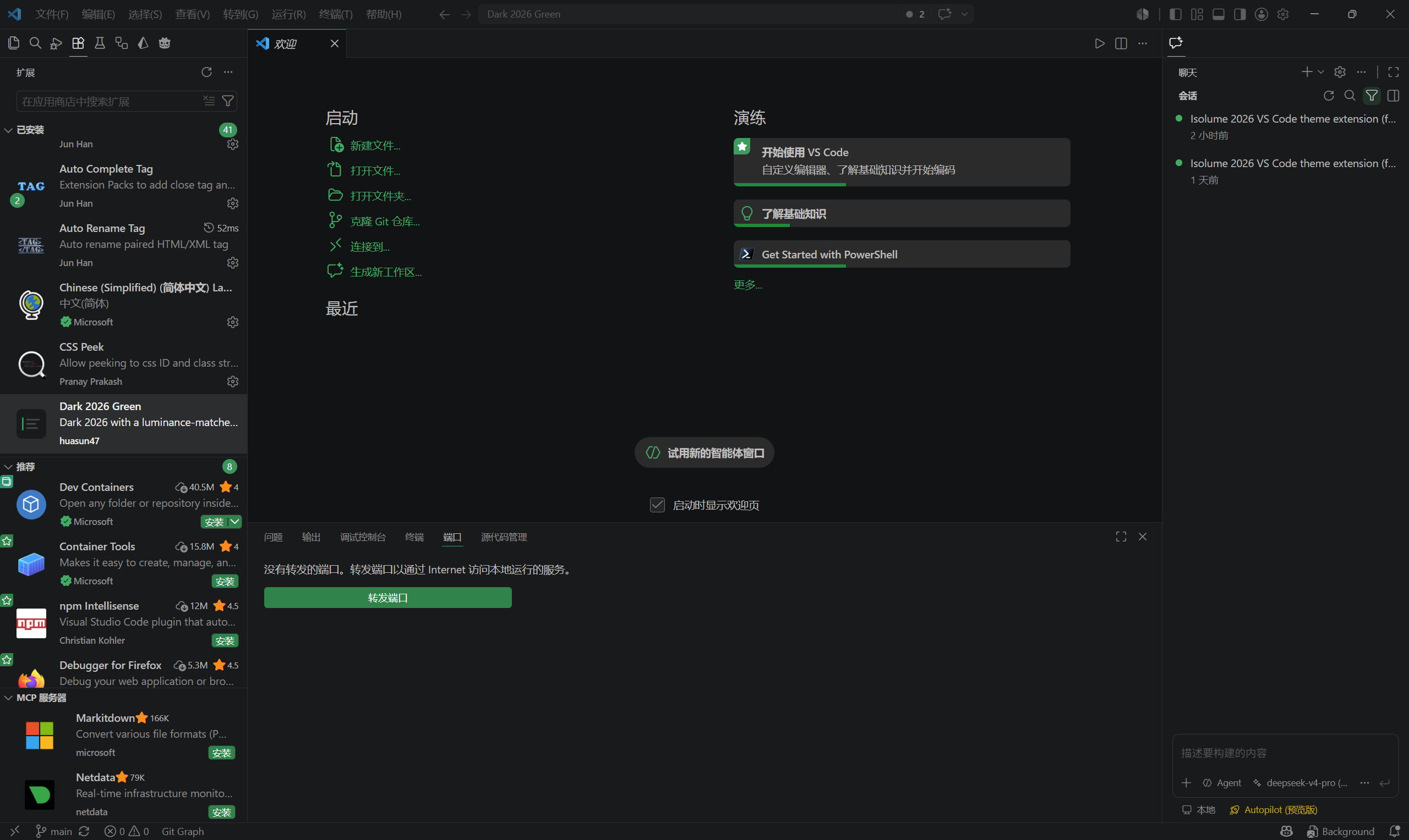
Dark 2026 Green across the full workbench — green buttons, progress bars and badges against unchanged neutral chrome

Across the workbench the accent turns up on other rungs of the same ladder. The buttons (button.background) sit at 60% saturation; the welcome-page progress bars (welcomePage.progress.foreground) at 100%; the selection above, at 54%. One hue, several saturations — that ladder is Microsoft's hierarchy, rotated over intact rather than rebuilt. Meanwhile the greys, the panel chrome and the editor background are exactly as Dark 2026 ships them.


What this theme changes

UI accent colours Rotated blue → green, brightness preserved
Syntax highlighting Unchanged — byte-for-byte identical to Dark 2026
Terminal ANSI colours Unchanged — terminal programs rely on standard colour semantics
Error / warning colours Unchanged — the colour is the meaning
Chart palette (charts.blue etc.) Unchanged — a swatch named "blue" should be blue
Neutral greys Unchanged

61 of the theme's 324 UI colours were rotated. Everything else is Dark 2026 exactly as Microsoft shipped it.


Why not just swap blue for green?

Because your eye does not weight colour channels equally, and a naive hue swap would make the whole UI visibly brighter.

The WCAG relative-luminance formula weights the channels like this:

L = 0.2126·R + 0.7152·G + 0.0722·B    (on linearised channels)

Green carries 0.7152 of perceived brightness. Blue carries 0.0722 — roughly 10× less. So if you take Dark 2026's accent blue and simply spin the hue wheel round to green while keeping the same HSL lightness, you don't get "the same colour, but green." You get a substantially brighter interface. Buttons jump forward, borders that were meant to whisper start shouting, and the carefully tuned visual hierarchy collapses.

This theme inverts the problem. For every accent colour it:

  1. Measures the original's relative luminance.
  2. Rotates hue to 145° and keeps saturation exactly as-is.
  3. Binary-searches the new lightness until the result's relative luminance matches the original to within 0.002.

Saturation is left strictly alone because saturation is what carries the hierarchy. Microsoft builds Dark 2026's UI depth by pulling several saturation steps off a single hue — a 59% step for buttons, 53% for badges and borders, 41% for comment ranges. Touch saturation and you flatten the ladder. This theme rotates the whole ladder into green and leaves every rung exactly where it was.

The result: measured against the originals, all 61 rotated colours land within 0.00177 relative luminance — below the threshold at which a difference is perceivable.

The anchor case

Dark 2026's button.border:

Hex Hue Saturation HSL lightness Relative luminance
Original #377B9F 201° 49% 42% 0.1748
Rotated #2D8351 145° 49% 35% 0.1738

Same saturation, same brightness, different hue. Note that HSL lightness had to drop by 7 points to hold perceived brightness constant — that drop is precisely the correction a naive hue swap omits.


Install

From a .vsix:

code --install-extension dark-2026-green-0.0.1.vsix

Then Ctrl+K Ctrl+T → Dark 2026 Green.

If the theme looks wrong, check settings.json for an existing workbench.colorCustomizations block. Those overrides sit on top of any theme and will mask what this one actually does. Remove or comment them out.


Building from source

The theme JSON is generated, not hand-edited. Regenerating it needs a local VS Code install to read the built-in themes from.

bun install
bun run test      # colour maths, incl. the #377B9F -> #2D8351 anchor
bun run build     # flatten Dark 2026's include chain, rotate, emit theme + report
bun run verify    # assert only the intended colours moved
bun run package   # -> dark-2026-green-0.0.1.vsix

bun run build also writes baseline.json — the flattened but untransformed Dark 2026 — so the output can be diffed against its source.

Why flatten? 2026-dark.json reaches its final colour set through a chain of include directives (2026-dark → dark_modern → dark_plus → dark_vs). Inside an extension, include can only resolve to paths within the package, so the chain must be resolved at build time into one self-contained file.


Credits & licence

Derived from the Dark 2026 theme built into Visual Studio Code, © Microsoft Corporation, MIT licensed. All syntax-highlighting rules and the great majority of UI colours are Microsoft's work, reproduced under the MIT licence.

This derivative work is likewise MIT licensed. See LICENSE.

Dark 2026 Green is an independent derivative work. It is not affiliated with, authored by, or endorsed by Microsoft. The name describes what it is — Microsoft's Dark 2026, recoloured green — and is not a Microsoft product name.

  • Contact us
  • Jobs
  • Privacy
  • Manage cookies
  • Terms of use
  • Trademarks
© 2026 Microsoft