ds_retro
devShakib Retro — a CRT theme for VS Code, built from the palette of the
devShakib portfolio.
devshakib.jumyn.com · github.com/devShakib015
Two variants:
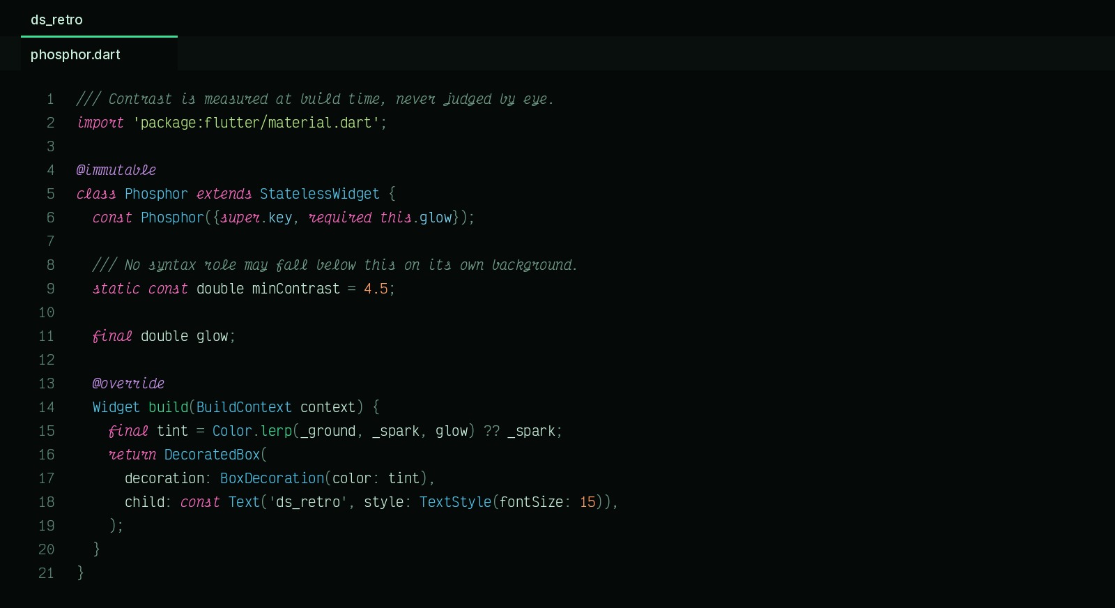
- ds_retro — green-dominant with retro colour sparks. This is the one.
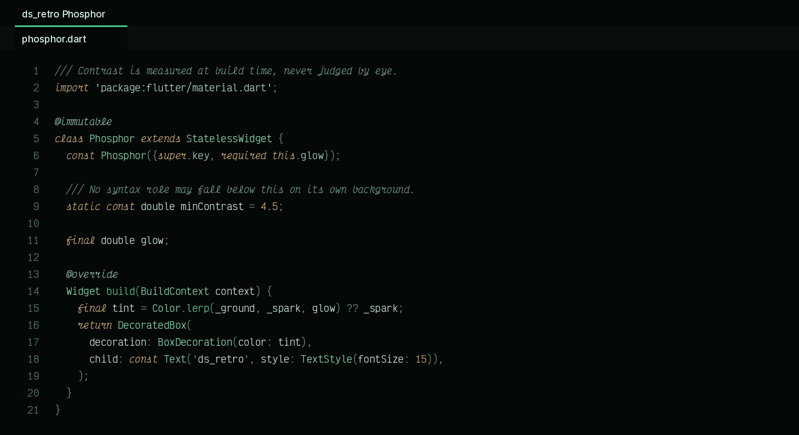
- ds_retro Phosphor — near-monochrome green, for when the sparks are too
much for a long session.
The idea
The screen should read green at a glance, the way a terminal does. So green
carries the bulk of any file — the ground, ordinary identifiers, function names,
parameters — and the other hues are sparks on top of it, spent only where two
things must never be confused:
| role |
colour |
|
keyword, storage, this |
#FF6AC1 |
hot pink, italic — the one hue no green screen ever had |
| function, method |
#3DDC97 |
mint, the site accent |
| type, class, interface |
#4FC3E8 |
cyan |
| string |
#B8E986 |
lime |
| number, constant |
#FF9E64 |
orange |
| property |
#7BD4F0 |
sky |
| annotation, decorator |
#C792EA |
violet, italic |
| variable |
#C9F0DC |
phosphor white-green |
| parameter |
#8FC4AC |
italic |
| comment |
#5A8574 |
italic |
Seven distinct hues, and the impression is still green, because the tokens that
appear most often are the green ones.
Italics are structural rather than decorative: comments, keywords, storage,
this, parameters, annotations and attributes are all things you either skim
past or read as scaffolding, and slanting them separates them without spending
another hue.
Selection inverts to a solid block instead of a translucent wash, which is the
single most terminal-feeling thing an editor can do.
Contrast
Measured at build time, not judged by eye — tool/build_themes.py refuses to
emit a theme with any syntax role below 4.5:1 on its own background. The
worst in either variant is the comment colour at 4.79:1; everything else clears
AAA.
Font
A theme cannot set your font — editor.fontFamily is a user setting. This
theme is designed around Victor Mono, whose italics are cursive: comments,
keywords, this, parameters and annotations are all italic here, so the
typeface is doing half the work.
"editor.fontFamily": "Victor Mono, JetBrains Mono, monospace",
"editor.fontSize": 15,
"editor.lineHeight": 1.7,
"editor.fontLigatures": false
Other faces that suit it, in descending order of how retro they read:
| font |
|
| IBM 3270 |
the literal mainframe terminal — blocky and unmistakable |
| Departure Mono |
pixel/CRT, Regular only so bold is synthesised |
| Share Tech Mono |
narrow, retro-futurist |
| Anonymous Pro |
classic terminal, softer, easy for long sessions |
| IBM Plex Mono |
most readable, mildest retro signal |
tool/install-fonts.sh          # Victor Mono, the recommended one
tool/install-fonts.sh --all    # every candidate above
tool/font.sh                   # list them; tool/font.sh 3270 to switch
Settings Sync does not carry fonts. VS Code syncs editor.fontFamily but
the typeface itself is an OS install, so a synced machine renders the fallback
until tool/install-fonts.sh has been run there too. tool/font.sh switches
between the installed faces and backs up your settings each time.
The family
ds_retro is the first of six. Each is a different screen or medium, built the
same way: one palette, contrast measured at build time, nothing below 4.5:1.
| theme |
|
| ds_retro |
green CRT with colour sparks — this one |
| ds_amber |
amber phosphor, warm and blue-free |
| ds_synthwave |
neon on deep indigo |
| ds_paper |
ink on warm paper — the light one |
| ds_blueprint |
chalk lines on a navy drawing sheet |
| ds_noir |
silver greys, one red, one gold |
Building
python3 tool/build_themes.py
Both variants come from one spec, so a change lands in both rather than drifting
between hand-edited files.
By
devShakib — devshakib.jumyn.com ·
github.com/devShakib015 ·
pub.dev/publishers/jumyn.com
Licence
MIT.