Auric Color — Picker, Palettes & Contrast
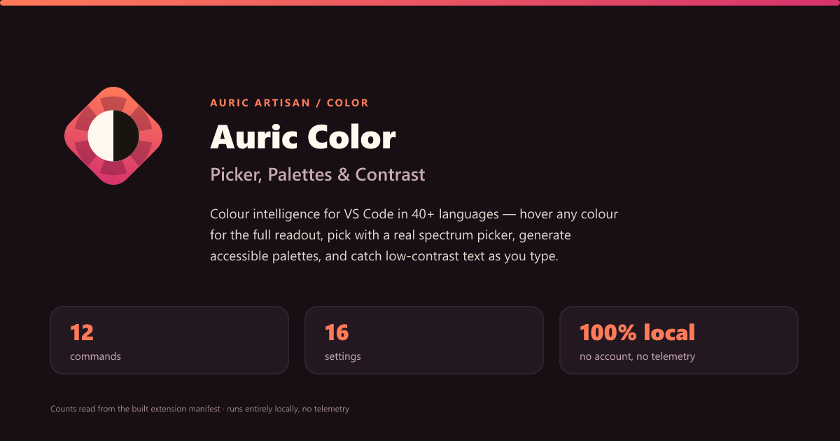
Colour intelligence for VS Code, in 40+ languages — hover any colour for the full
readout, pick with a real spectrum picker, generate accessible palettes, and catch
low-contrast text as you type. Entirely local.
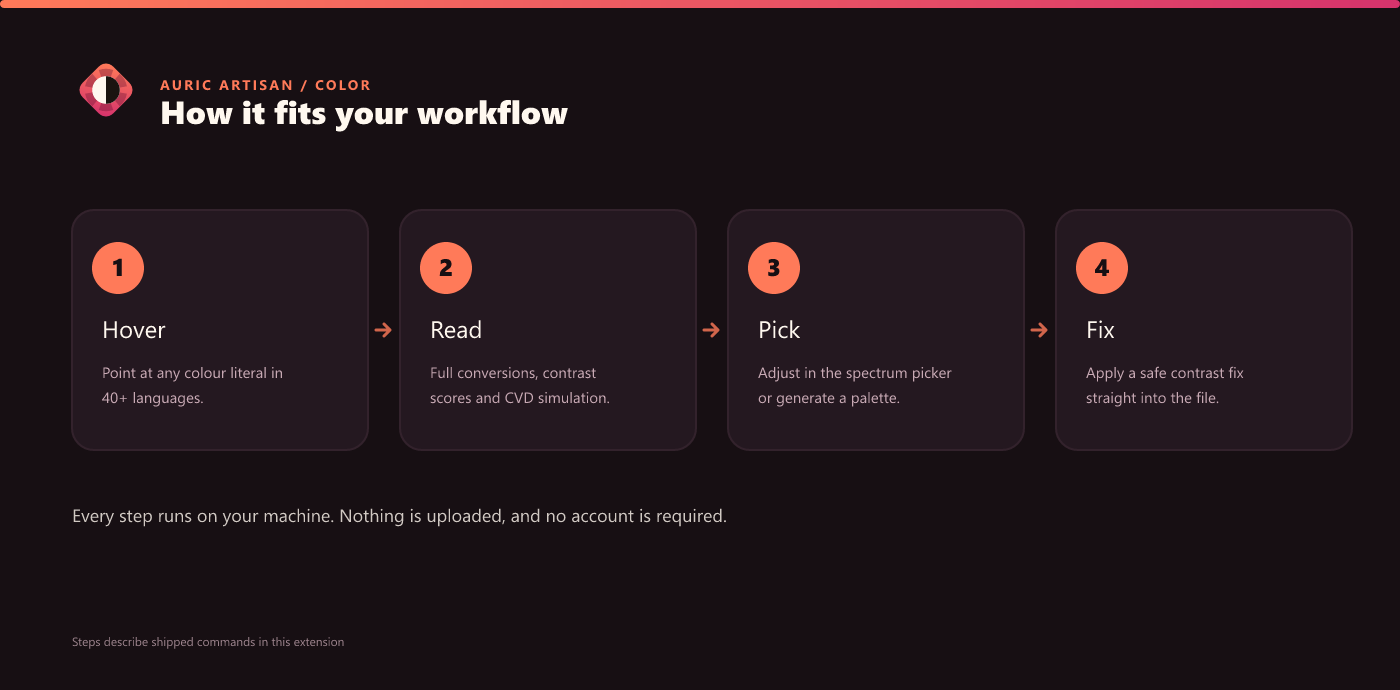
Auric Color turns every colour literal in your code into something you can read,
understand, and fix in place — in CSS, SCSS, LESS, JS/TS, JSX/TSX, HTML, Vue,
Svelte, Astro, PHP, JSON, Markdown, and dozens of general-purpose languages like
Python, Go, Rust, Java, C#, Swift, Kotlin, Dart, YAML, and TOML. It is powered by a
single dependency-free colour engine (color-core) — the same one that runs in the
CLI and the rest of the Auric Artisan suite.
Features
Hover any colour — the rich readout
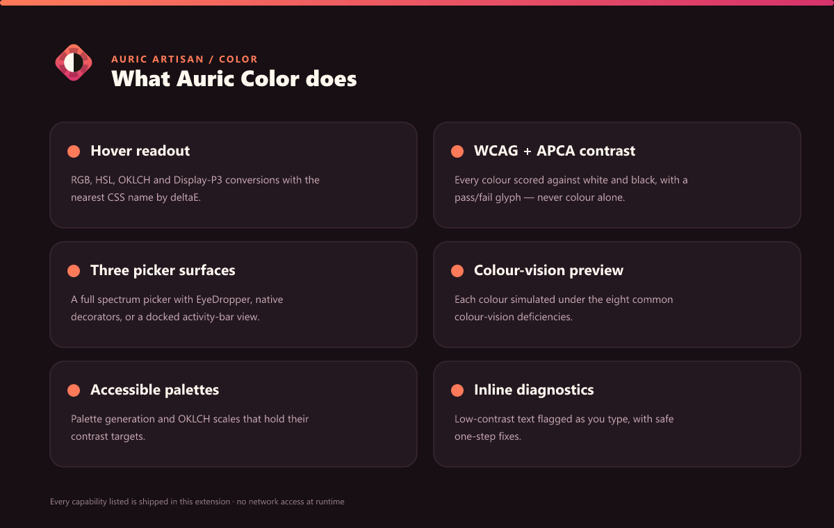
Hover a colour token to see a themed card with:
- RGB · HSL · OKLCH · Display-P3 conversions and the nearest CSS name (by ΔE).
- WCAG 2.x and experimental APCA contrast against white and black, each with a
pass/fail glyph — never colour alone.
- A colour-vision (CVD) row simulating how the colour reads under the eight
common deficiencies.
- Shades and Brand swatch strips, and an Open in Studio link.
Three picker surfaces, your choice
- Auric picker (default) — a full custom picker: a saturation/value spectrum,
hue and alpha rails, an EyeDropper, brand and recent swatches, and inline
WCAG/APCA specs. Open it beside the editor, or dock it in the collapsible
Color Picker view in the activity bar.
- Native decorators — keep VS Code's own draggable inline picker and let Auric
layer its detected colours and HEX/RGB/HSL/OKLCH presentations on top.
- Switch any time with Choose Color Picker Mode (
auricColor.colorPicker.mode).
VS Code offers no API to replace its built-in hover picker UI, so auric mode
disables the native colour decorators (a supported setting) rather than patching
internals — a documented, reversible tradeoff. Restore native color picker
hands the whole experience back to VS Code in one step.
Inline contrast diagnostics and safe fixes
Statically resolvable color + background[-color] pairs are graded against your
threshold — in stylesheets, <style> blocks, inline style=, and across
CSS-in-JS and frameworks (styled-components / Emotion / Linaria tagged
templates, style={{…}} / sx={{…}} / css={{…}} object props, and Vue/Angular
style bindings). It resolves CSS custom properties — color: var(--ink) over
background: var(--bg) — by following each var() chain and fallback, and can grade
a color-only rule against the page background declared by body/html/:root.
Failing pairs get an underline and a Fix contrast → quick-fix that nudges the
text colour along its perceptual lightness axis to the nearest passing value — hue
and chroma preserved. Fix All Contrast Issues in File previews every
before → after rewrite, asks first, and applies them as a single undoable edit.
Pairs that pass for typical vision but collapse under colour blindness are flagged as
CVD risk.
Palettes, shades & vision (the Studio)
Open Color Studio for live tools:
- Palette — harmony-based palettes whose swatches are generated to meet your
target contrast on the chosen background; export to CSS / JSON / Tailwind.
- Shades — a perceptually even 50–950 tonal scale in OKLCH with
role-legibility checks.
- Vision — simulate the eight common colour-vision deficiencies for a single
colour or a whole palette.
- Plus Contrast and Brand audit tabs, on real rendered text.
Intentional branding, not a loophole
Mark a colour finding as intentional brand identity with
auric-brand-line / -next-line / -file, or the Mark Line as Intentional
Branding command. Marked contrast/APCA/CVD findings move to a dedicated Branding
lane (♥ icon + label + border — never colour alone) and are excluded from the score.
Retheme everything
Change Accent Color (auricColor.appearance.accent) rethemes the whole Auric
surface — 13 premium presets or any custom hex — mirroring
auricartisan.com.
Brand governance + the unified Icon Studio
Search the local Rulebook for token provenance, accessible-brand guardrails, and
reviewed exception policy, or generate a workspace knowledge.json + rulebook.md.
The same Home also discovers installed Auric icon providers and opens their elected
combined Icon Studio, so Modern, Drawn, and Playful stay one library.
In practice
Commands
| Title |
Command id |
Keybinding |
| Open Color Studio |
auricColor.openStudio |
|
| Workstation: Command Center |
auricColor.commandCenter |
Ctrl+Alt+. (Cmd+Alt+.) |
| Open Rulebook & Knowledge Database |
auricColor.openKnowledgeBase |
|
| Build Workspace Knowledge Database (JSON + Markdown) |
auricColor.writeKnowledgeDatabase |
|
| Open Unified Icon Studio |
auricColor.openIconStudio |
|
| Generate Accessible Palette |
auricColor.generatePalette |
|
| Check Contrast of Selection |
auricColor.checkContrast |
|
| Fix All Contrast Issues in File |
auricColor.fixAllContrast |
|
| Pick / edit color |
auricColor.pickColor |
Ctrl+Alt+C (Cmd+Alt+C) |
| Choose Color Picker Mode |
auricColor.chooseColorPickerMode |
|
| Disable native color picker |
auricColor.disableNativeColorPicker |
|
| Restore native color picker |
auricColor.restoreNativeColorPicker |
|
| Refresh Contrast Diagnostics |
auricColor.refreshDiagnostics |
|
| Change Accent Color |
auricColor.chooseAccent |
|
| Mark Line as Intentional Branding (Toggle) |
auricColor.markBranding |
|
All commands are listed in the palette under the Auric Artisan category.
Keybindings
| Keybinding |
Command |
Ctrl+Alt+. / Cmd+Alt+. |
Workstation: Command Center — a native QuickPick with Suggested actions, colour tools, recent colours, and workspace artifacts. |
Ctrl+Alt+C / Cmd+Alt+C |
Pick / edit color — open the Auric picker for the colour under the cursor. |
Settings
A representative subset — there are 16 settings under the auricColor. namespace
(open Settings and search auricColor).
| Setting |
Default |
Description |
auricColor.appearance.accent |
gold |
System accent — a preset name or any hex. |
auricColor.colorPicker.mode |
auric |
Auric hover-first picker (auric) or VS Code's native decorators. |
auricColor.colorPicker.nativeHoverPicker |
false |
Show VS Code's draggable picker inside the Auric hover. |
auricColor.contrast.standard |
wcag2 |
wcag2, experimental apca, or both. |
auricColor.contrast.threshold |
4.5 |
Minimum WCAG 2.x ratio (4.5 AA, 7 AAA, 3 UI/large). |
auricColor.contrast.flagCvdRisk |
true |
Flag pairs that pass normally but fail under colour blindness. |
auricColor.contrast.checkPageBackground |
true |
Also grade color-only rules against the page background. |
auricColor.branding.enabled |
true |
Enable the Branding classification lane. |
Part of the Auric Artisan Workstation
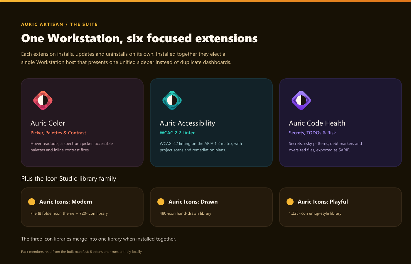
Installed on its own, Auric Color is a complete, standalone product with its own
activity-bar container (an Overview home + a docked Color Picker view).
Install it alongside Auric Accessibility and/or Auric Code Health and the
three cooperate automatically: the suite elects a single Workstation host
(priority Accessibility → Color → Code Health) that presents one unified sidebar — a
capability-aware Command Center and a union Studio — instead of three duplicate
dashboards. Colour tools appear in that shared host, Auric Color hides its own
duplicate views, and the election updates live as you install or remove siblings (no
reload). Nothing collides: there is exactly one owner of the colour UI.
Privacy
Everything runs locally. Auric Color sends no source code, colours, or telemetry
to any server — the no-network guarantee is mechanically enforced against the shipped
build. Workspace data lives only in the .auric-artisan/ folder; the accent colour
lives in your VS Code user settings. No account, no API key, no paid tier.
Requirements
- VS Code 1.74 or newer. Works in single-folder and multi-root workspaces.
By Auric Artisan · auricartisan.com