shadcn-ui-snippets
[DEPRACTION WARNING] - This extension has been deprecated as the project has been moved to shadcn/next
Please install the shadcn/next for the latest updates and features.
What is this?
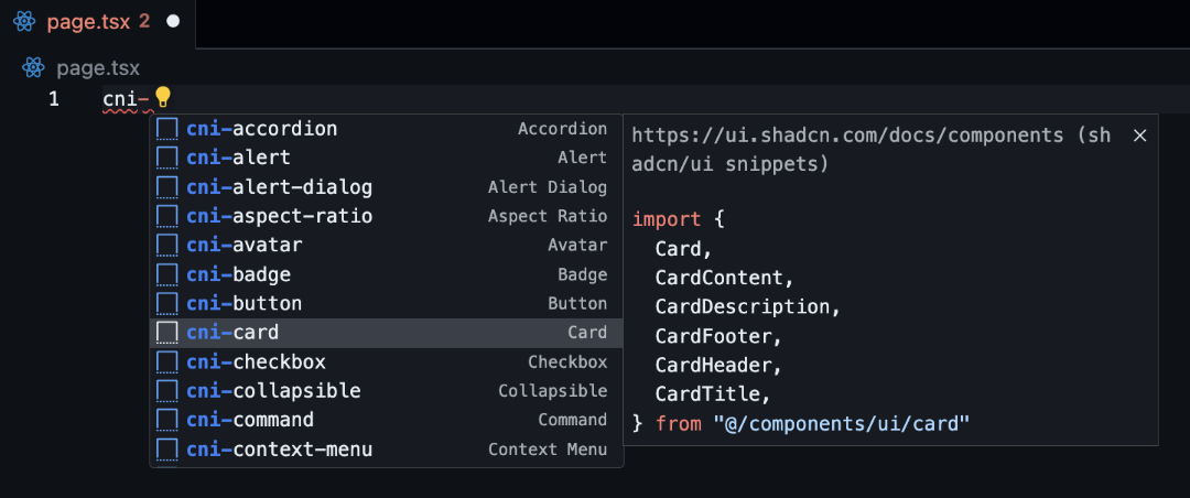
Install the extension given below and easily import and use shadcn-ui components with ease using snippets within VSCode. Just type cn or shadcn in you jsx/tsx file and you will get a list of all the components to choose from.
https://marketplace.visualstudio.com/items?itemName=nrjdalal.shadcn-ui-next
How it works
| Snippet |
Description |
cn-help |
How to use shadcn/ui snippets |
cni-[component] |
Adds imports for the component |
cnx-[component] |
Adds jsx/tsx for the component |
cnp-[component] |
Adds page based components like 'form' |
How to use?
- Components
For Alert component, type cni-alert to add imports in your jsx/tsx file, and to use the component, use cnx-alert.
Similarly, for any other component, use cni-[component] to add imports and cnx-[component] to use.
// cni-alert
import { Alert, AlertDescription, AlertTitle } from "@/components/ui/alert"

// cnx-alert
;<Alert>
  <AlertTitle>Heads up!</AlertTitle>
  <AlertDescription>
    You can add components and dependencies to your app using the cli.
  </AlertDescription>
</Alert>
- Page based components
Some compenents are page specific and can be imported using cnp-[component], modular parts to be added later.
// cnp-form
"use client"

import { zodResolver } from "@hookform/resolvers/zod"
import { useForm } from "react-hook-form"
import * as z from "zod"

import { Button } from "@/components/ui/button"
import {
  Form,
  FormControl,
  FormDescription,
  FormField,
  FormItem,
  FormLabel,
  FormMessage,
} from "@/components/ui/form"
import { Input } from "@/components/ui/input"

const formSchema = z.object({
  username: z.string().min(2, {
    message: "Username must be at least 2 characters.",
  }),
})

export default function Page() {
  const form = useForm<z.infer<typeof formSchema>>({
    resolver: zodResolver(formSchema),
    defaultValues: {
      username: "",
    },
  })

  const onSubmit = (values: z.infer<typeof formSchema>) => {
    console.log(values)
  }

  return (
    <Form {...form}>
      <form onSubmit={form.handleSubmit(onSubmit)} className="space-y-5 p-5">
        <FormField
          control={form.control}
          name="username"
          render={({ field }) => (
            <FormItem>
              <FormLabel>Username</FormLabel>
              <FormControl>
                <Input placeholder="shadcn" {...field} />
              </FormControl>
              <FormDescription>
                This is your public display name.
              </FormDescription>
              <FormMessage />
            </FormItem>
          )}
        />
        <Button type="submit">Submit</Button>
      </form>
    </Form>
  )
}
To be added later
Some components require useState, etc to also be used, so they will be added later.
- Calendar
- Combobox
- Data Table
- Date Picker
- Toast
How to contribute?
e.g. for Alert component
- add
alert.md file in src/components folder
- add imports, default and variants (e.g. destructive) as shown below
- do not forget to seperate each snippet with
---
- run
bun run generate to generate the snippets
- for multiword components like Hover Card, use
hover-card.md as the file name
- for edits, find the component file and make changes accordingly
import -

```jsx
import { Alert, AlertDescription, AlertTitle } from "@/components/ui/alert"
```

---

default -

```jsx
<Alert>
  <AlertTitle>Heads up!</AlertTitle>
  <AlertDescription>
    You can add components to your app using the cli.
  </AlertDescription>
</Alert>
```

---

destructive -

```jsx
<Alert variant="destructive">
  <AlertTitle>Error</AlertTitle>
  <AlertDescription>
    Your session has expired. Please log in again.
  </AlertDescription>
</Alert>
```
Template for new components - src/components/component-name.md
- remove variant and preceding '---' if no variant is available
import -

```jsx
// paste the import statement here
```

---

default -

```jsx
// paste the default usage code here
```

---

variant -

```jsx
// paste the variant usage code here
```
