Storybook View for VSCode


Preview React components with Storybook directly in VSCode.
Features
- One-click preview from editor toolbar
- Auto-start/stop Storybook server with configurable idle timeout
- Hot Module Replacement (HMR)
- Access all Storybook features and addons
Quick Start
Requires Storybook in your project:
npx storybook@latest init
- Open a
.stories.tsx or .stories.jsx file
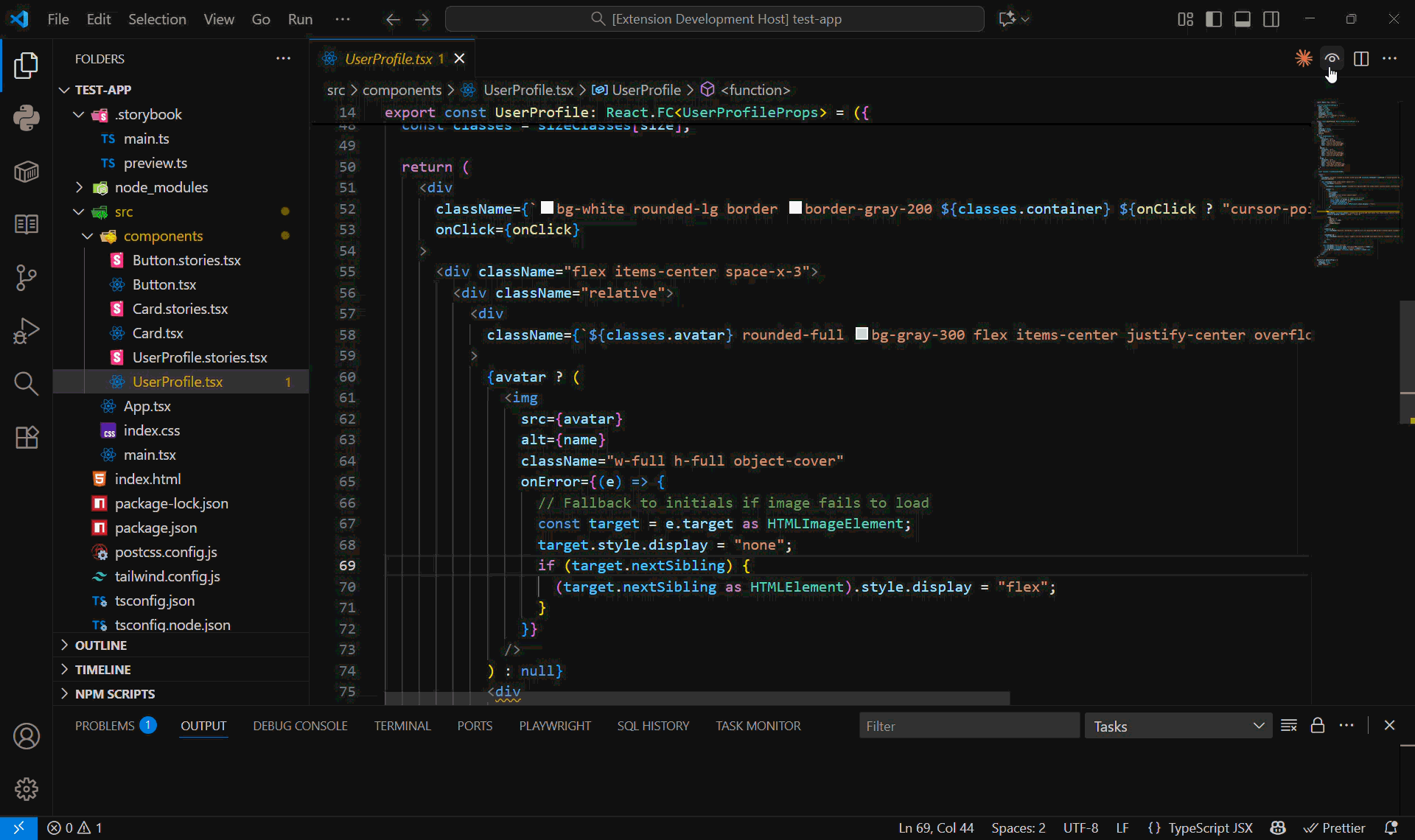
- Click the eye icon in the editor toolbar
- Preview opens with all component stories
Creating Stories
// Button.stories.tsx
import type { Meta, StoryObj } from "@storybook/react";
import { Button } from "./Button";

const meta = {
  title: "Components/Button",
  component: Button,
  tags: ["autodocs"]
} satisfies Meta<typeof Button>;

export default meta;
type Story = StoryObj<typeof meta>;

export const Primary: Story = {
  args: { variant: "primary", children: "Click me" }
};
Commands
- Start Storybook Server - Manually start Storybook
- Stop Storybook Server - Stop the server
- Open Storybook in Browser - Open in external browser
Configuration
{
  "storybookview.storybookPath": "",     // Path to Storybook (leave empty for workspace root)
  "storybookview.port": 6006,            // Storybook server port
  "storybookview.inactivityTimeout": 5   // Auto-stop server after N minutes of inactivity (1-60)
}
Idle Timeout Behavior
The Storybook server automatically stops after a period of inactivity to save system resources. The default is 5 minutes, but you can configure this from 1-60 minutes.
The inactivity timer resets when you:
- Open a new component preview
- Edit a component file being previewed
- Interact with the preview panel
Manual control:
- Stop server manually via Command Palette: "Storybook View: Stop Storybook Server"
- Restart server: "Storybook View: Start Storybook Server"
- Server auto-starts when you open a preview
Troubleshooting
Storybook won't start:
- Check the "Storybook" output channel (View > Output > Storybook) for detailed logs
- Try running manually:
cd your-project && npx storybook dev
- Verify Storybook works:
npm run storybook
- Check the configured port is available
".storybook directory not found" error:
- Initialize Storybook:
npx storybook@latest init
- Or update the
storybookview.storybookPath setting to point to the correct directory
- The path should be relative to your workspace root
- Leave empty if Storybook is in the workspace root
Component not showing:
- Ensure
.stories.tsx file exists
- Restart Storybook via Command Palette
Requirements
- VSCode 1.74.0+
- Node.js 16+
- Storybook 7+
License
MIT © Seth Carney