Snapds (VS Code Extension)
Snapds is a powerful VS Code extension designed for React monorepos. It introspects your packages, extracts component metadata using react-docgen-typescript, and provides a seamless webview gallery for visually exploring and drag-and-dropping JSX components directly into your code.
See it in action
| Drop a component, imports handled |
Export an agent-ready skill |
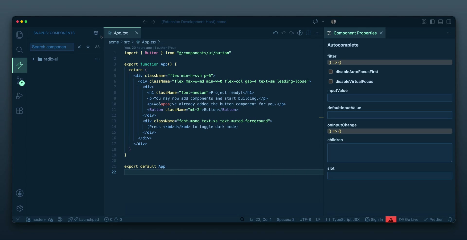 |
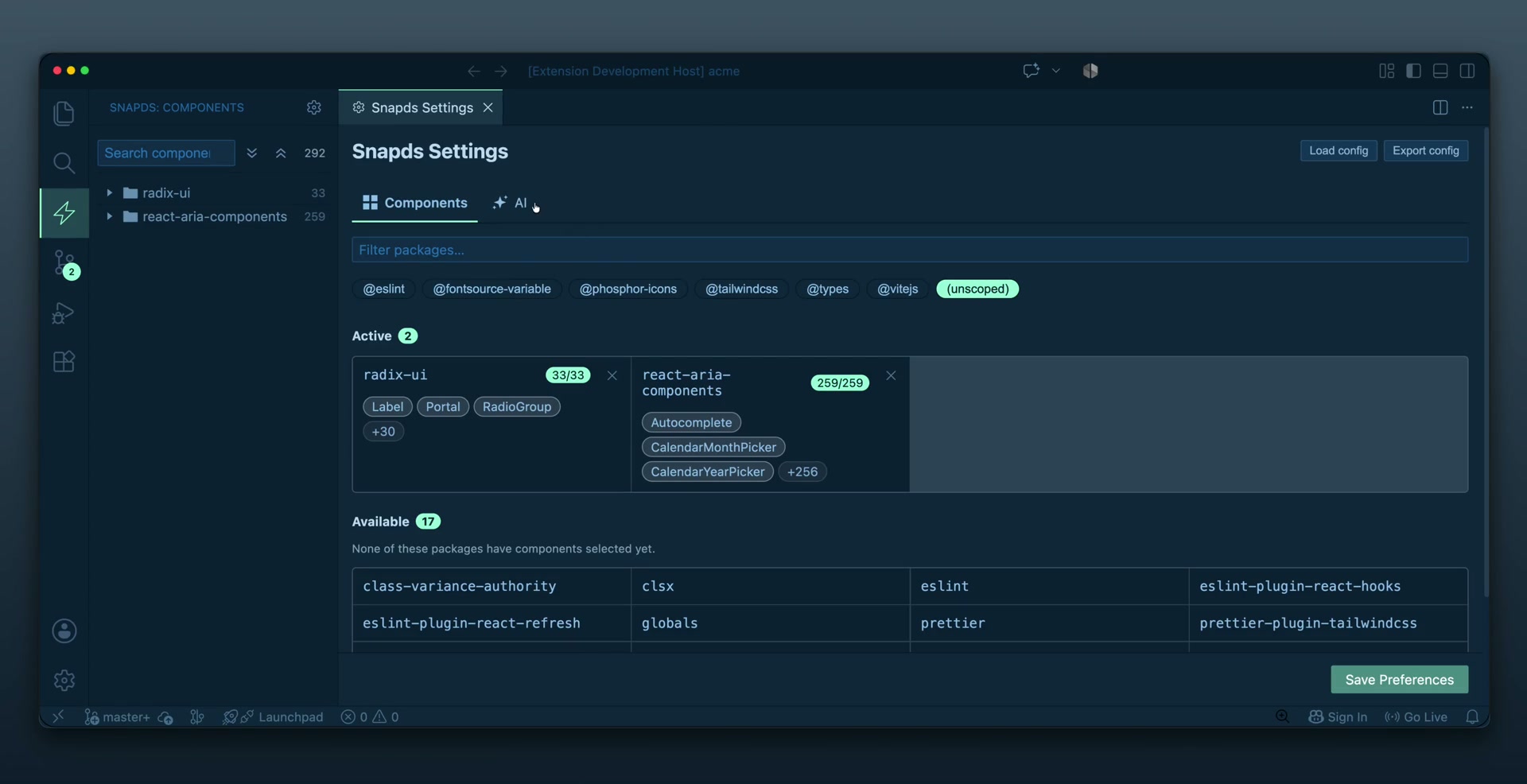 |
| Pull a component from the gallery into your file — Snapds writes the JSX and merges the import automatically. |
Turn a component package into a skill your AI agent can use, straight from the editor. |
▶ Watch both demos on snap-ds.com (click a thumbnail above to play the clip).
Table of contents
Requirements
- VS Code
1.85.0 or newer.
- A workspace containing a React project whose component packages expose TypeScript types (
.d.ts or source .tsx). Snapds reads props via react-docgen-typescript plus the TypeScript compiler API.
- No runtime dependencies are added to your project — Snapds only reads metadata and writes the code/skills you ask it to.
Getting started
- Install Snapds from the VS Code Marketplace (or, from this repo, press
F5 to launch an Extension Development Host).
- Open a React workspace and click the Snapds icon in the Activity Bar to reveal the Components view.
- Open Snapds Settings (the gear in the Components view title bar, or run
Snapds: Open Settings) and register a package by name (e.g. @acme/ui). Snapds introspects it and lists its components.
- Back in the Components view, drag any component into an open React file — Snapds inserts the JSX and adds the import automatically.
- Select a component to open the Component Properties panel and adjust prop values before dropping.
Features
- 🧩 Visual Component Gallery: Browse all available components from your registered packages in a dedicated sidebar webview.
- 🚀 Drag and Drop JSX: Drag a component from the gallery and drop it into your React code. Snapds automatically generates the correct JSX and handles the necessary import statements.
- Insert Component or Snippet (
⌃⌥⌘I / Ctrl+Shift+Alt+I): Opens a spotlight-style Quick Pick listing design-system components and your custom snippets in two sections — type a name, press Enter, and the JSX/snippet plus its import(s) are injected at the cursor.
- ✂️ Custom Snippets: Select any code in a React file and press
⌃⌥⌘S (macOS) / Ctrl+Shift+Alt+S (Windows/Linux) — or right-click → Save Selection as Snippet — to save it as a reusable snippet with a name, description, and category. Snapds auto-detects the imports your selection uses so they travel with it. Saved snippets appear in a Custom Snippets tab in the gallery and drag/inject exactly like components. See Custom Snippets.
- 📦 Smart Import Management: Automatically injects new imports without duplicating existing ones. It correctly handles multi-line Prettier-formatted imports and updates them seamlessly.
- ⚡ Performance Optimized: Uses advanced caching based on package version and config file mtime so re-opening the gallery is instant. Each package version is cached independently, so switching between versions in the props panel requires no re-parse after startup.
- 🗂️ Monorepo multi-version support: In a monorepo with apps using different versions of the same package, Snapds auto-detects the right version from the file currently open in your editor and shows the matching props. A version selector in the props panel lets you override this manually, and an "Add to this app" button injects the dependency into the nearest
package.json when the package isn't listed there yet.
- 🎨 Local component sources: Point Snapds at an in-repo design system, not just npm packages. A shadcn
components.json is auto-detected, or register any folder with + Local folder. Local components inject from their path alias (e.g. @/components/ui/button) instead of node_modules, are badged LOCAL, and re-index live as you edit them.
- 🖼️ Local icon preview: When you select an icon component from a local source, the props panel renders a live preview of its SVG — extracted statically from the component's own source file (sanitized, never executed).
- 🤖 Generate Skills: Turn your component metadata into agent-consumable skill docs so coding agents can use your design system without re-reading source or
.d.ts files (saving tokens).
Managing Packages & Components
Open Snapds Settings (the gear on the Components view, or run Snapds: Open Settings) to register packages and choose which components are exposed.
Multi-version monorepo support
When the same package is installed at different versions across apps in a monorepo, Snapds handles each app independently:
Auto-resolution. When you switch the active editor, Snapds walks up from the focused file to find the nearest node_modules/{pkg} and uses that version's props in the panel. The version badge in the props header shows auto when the version was inferred this way.
Manual override. A version dropdown in the props panel header lets you pin any detected version regardless of which file is active.
Fallback. If no local installation is found along the file's path (e.g. a shared root-level file), Snapds falls back to the highest semver found in the workspace.
Add to this app. When the selected version isn't listed in the focused app's package.json, an Add to this app button appears. Clicking it adds the dependency to the nearest package.json and shows a reminder to run pnpm install.
Packages are listed as collapsible sections. Enable a package to introspect it on demand.
Components use an auto-include model. Every component Snapds detects is included by default and shown as a chip. Un-toggle a chip to exclude a component; components added upstream are picked up automatically on the next refresh, so nothing is silently hidden.
Manual additions. If a component isn't detected (for example a polymorphic component whose type signature react-docgen-typescript can't read), type its name into the manual field to add it explicitly. Manually added chips are marked with *.
Hide packages you don't care about. Every card in Available has a hide (eye) button that removes it from the list — handy when the workspace pulls in packages you'll never inject. Hidden packages collapse behind a Show hidden (N) toggle at the top of the Available section; reveal them there and click the eye again to unhide. This is a personal, workspace-local declutter (stored in snapds.hiddenPackages in workspace state) — it's never committed and doesn't affect teammates.
At runtime, your selection is stored per-package in snapds.packages as excluded (chips you turned off) and manual (names you added) — never as a full allow-list, so new upstream components always surface. (Note: an exported snapds.config.json is different — it writes an explicit components snapshot of the current selection so the config is portable and deterministic. See Export & import config from Settings below.)
Note on detection: Snapds combines react-docgen-typescript with a TypeScript Compiler API pass that enumerates every exported value component. This catches polymorphic / as-style components (declared as generic call signatures) that docgen alone misses; such components appear as chips with no introspected props until you add overrides.
Local component sources
Snapds works with in-repo design systems (shadcn or your own folder), not just packages installed in node_modules. The Settings Components tab spells the two paradigms out inline — a short hint above the list and, when nothing is selected yet, a guided empty state contrasting npm packages with local folders.
- Auto-detection. A shadcn
components.json anywhere in the workspace (including per-app in a monorepo) is detected and offered via a one-click banner. Snapds resolves its aliases.ui entry to a folder through your tsconfig paths, preferring a tsconfig that also sets jsx for better prop extraction.
- Manual folders. Register any component folder with + Local folder. Snapds derives the import alias from your tsconfig
paths, or prompts you for it when the folder isn't aliased — so a design system with no components.json still works. Added one by mistake? A manual folder shows a trash (Remove) button that unregisters it for good. (Auto-detected components.json sources can't be removed — they'd re-appear on the next scan — so those are hidden instead.)
- Alias-based injection. Local components inject from their path alias (e.g.
import { Button } from '@/components/ui/button') instead of a package name. Exports that share a source file are merged into a single import statement.
- Identity & filtering. Each source is labelled by its workspace-relative folder (e.g.
src/components/ui), badged LOCAL with its alias printed beneath the name, and grouped under a dedicated LOCAL filter chip. (npm packages published without an @scope, like lucide-react, group under UNSCOPED.)
- Live re-index. A file watcher re-introspects a local source as you add or edit its component files, so new components surface without a manual refresh.
Custom Snippets
Beyond the design-system gallery, Snapds lets you capture your own code as reusable snippets — a configured pair of buttons wrapped in a Label, a form layout, any pattern you reach for repeatedly.
Capture. Select the code in a React file, then either:
- press
⌃⌥⌘S (macOS) / Ctrl+Shift+Alt+S (Windows/Linux) when text is selected in a React file, or
- right-click the selection → Save Selection as Snippet.
A modal opens where you give the snippet a name, an optional description, and a category (pick an existing one or type a new one — blank means Uncategorized). Snapds parses the file and pre-fills the imports your selection references; confirm, edit, or add to them. Everything drops onto the snippet so injecting it later brings its imports along.
Use. Saved snippets appear under the Custom Snippets tab in the gallery, grouped by category (the tab shows an onboarding hint until you have your first snippet). Drag a snippet into a React file or inject it via Insert (⌃⌥⌘I) — imports are added the same way they are for components. Captured code is inserted verbatim (safely escaped), so template literals and braces survive intact.
Manage. Right-click affordances on each snippet row let you edit (reopens the modal) or delete. The Snippets tab in Snapds Settings gives a bulk view: toggle a snippet between private and shared, and rename, merge, or clear whole categories at once.
Where snippets live. By default a snippet is private — stored in your workspace state, scoped to the repo, and never committed. Flip Share with team (in the save modal or the Settings tab) to promote it into snapds.config.json, where it is committed and shared like the rest of your Snapds config. Sharing writes the selected source into version control, so it is always an explicit choice.
Snippets are captured from and injected into React files (javascriptreact / typescriptreact) in this release.
Generate Skills
Snapds can export the public contract of your components (props, types, enum values, defaults, import line, and a canonical usage example) as skill documentation for coding agents.
Supported agents
Pick any combination in Settings → AI. Each agent writes to the location and file format it expects, and every layout keeps a dictionary/router file that Snapds sorts into the first card position and badges router (component cards are badged skill). When you select more than one agent, the generated-skills list splits into a sub-tab per agent, so you only see one agent's files at a time.
Agent (format) |
Location |
Structure |
claude — Claude Code |
.claude/skills/ |
Router SKILL.md + one skill folder per component |
augment — Augment |
.augment/skills/ |
Router SKILL.md + one skill folder per component |
cursor — Cursor |
.cursor/rules/ |
Always-on snapds-index.mdc + one .mdc per component (loaded on demand) |
windsurf — Windsurf |
.windsurf/rules/ |
Always-on snapds-index.md + one .md per component (loaded on demand) |
copilot — GitHub Copilot |
.github/instructions/ |
Single consolidated snapds.instructions.md catalog |
cline — Cline |
.clinerules/ |
Single consolidated snapds.md catalog |
generic — AGENTS.md |
repo root |
AGENTS.md dictionary + flat snapds-skills/*.md (also serves Codex, Gemini CLI, Jules) |
The structure adapts to how each agent loads context: Claude/Augment lazy-load a component's folder on use; Cursor/Windsurf keep a tiny always-on router and load each rule on demand via its description/model_decision trigger; Copilot/Cline have no lazy loading, so Snapds writes a single catalog file that inlines every component's full contract (import, usage, and props) instead of many separate files. Every layout carries the complete props table for each component. Since those consolidated files are loaded on every request, selecting Copilot or Cline reveals a Compact catalog toggle (snapds.skills.compactConsolidated) that drops the prop tables to keep the always-loaded file small in large design systems.
Destinations
You choose where the files are written:
- Workspace root (team-shared) — committable, at the repo root; each agent writes to its own conventional location (e.g.
.claude/skills, .cursor/rules, .github/instructions, root AGENTS.md).
- Workspace subfolder — a path relative to the repo root (e.g.
apps/web) for monorepos where an agent runs from a specific app/package.
- Custom folder — any absolute folder (e.g.
~ for personal agent skills shared across projects, or an ignored scratch folder). The same per-agent subpaths are created under whichever root you choose.
Monorepo note: GitHub Copilot, Windsurf, and Cline only read their config from the repository root, so generate those with the Workspace root destination. Claude, Augment, Cursor, and AGENTS.md support nested discovery and work from a subfolder. The Settings panel flags this when a root-only agent is paired with a non-root destination.
Enabling & auto-generation
The Agent Skills section in Settings is hidden until you flip its Enable toggle. Once enabled you can pick the agent(s) and destination and turn on Auto-generate, which regenerates skills incrementally (router + only the new detail files) whenever components are added. These choices persist in snapds.skills, so regeneration is one click.
How to trigger
- Toggle Auto-generate on and let Snapds keep skills in sync as your selection changes, or
- Click Regenerate skills in the Settings action bar (or run
Snapds: Regenerate All Skills) to rewrite every file from your saved settings, or
- Run
Snapds: Generate Skills for a one-off run that lets you pick one or more agents and a destination (workspace or a folder you pick).
Point your agent/assistant at the generated dictionary/router file for that agent (e.g. .claude/skills/snapds/SKILL.md, .cursor/rules/snapds-index.mdc, or root AGENTS.md) so it loads component detail on demand.
Generated files begin with an auto-generated header warning. Regenerate them after your components change rather than hand-editing.
Complementing generated skills
You never edit the generated .md/SKILL.md files by hand — they are overwritten on every regeneration. Instead, your custom guidance lives in settings (snapds.skills) and is merged into the output each time, so it survives regeneration. Three layers are available, all in the Settings panel:
- Project guidance — a single block of conventions that apply to the whole design system. It is injected into the dictionary/router index (
snapds/SKILL.md or AGENTS.md). Edit it under General skill instructions → Project guidance.
- Reusable snippets — named blocks of guidance you define once under General skill instructions → Reusable snippets (e.g. "Always wrap in
FormField") and then assign to any number of components.
- Per-component notes — free-text notes and snippet assignments scoped to a single component. Expand a package under Components to import, and each selected component chip shows a ✎ button (it gains a • dot when notes exist). Clicking it opens an inline editor to attach snippets and write component-specific guidance.
At generation time Snapds resolves these into each component's detail file in order (assigned snippets first, then the per-component note), while the project guidance goes to the index.
Configuration Hierarchy
Snapds uses a 3-level cascading configuration system to give you maximum flexibility:
- Auto (AST Introspection): By default, Snapds parses your TypeScript components to determine properties, types, and default values.
- Team / Workspace (
snapds.config.json): A committable file for shared overrides, package registrations, excluded components, snippets, and AI skills config. Snapds finds the nearest file by walking up from your active editor to the workspace root.
- User (
.vscode/settings.json): Individual user preferences and local overrides that never get committed.
Precedence: auto introspection < team config (snapds.config.json) < user settings.
Workspace config file (snapds.config.json)
Create a snapds.config.json at the workspace root (or in a sub-directory for monorepo per-app config). The full schema:
// snapds.config.json
{
  "version": "1",
  "packages": [
    {
      "name": "@acme/ui",
      "importPath": "@acme/ui",
      "excluded": ["InternalOnly"],
      "manual": ["PolymorphicButton"],
      "overrides": {
        "Button": {
          "snippet": "<Button variant=\"primary\">$1</Button>",
          "props": {
            "variant": { "defaultValue": "primary" },
            "internalId": { "hidden": true }
          }
        }
      }
    }
  ],
  "skills": {
    "enabled": true,
    "formats": ["claude", "cursor"],
    "destination": "workspace",
    "autoGenerate": false
  },
  "scopeFilters": ["button", "form"]
}
Editing the file automatically invalidates the introspection cache and refreshes the gallery.
Backward compat: The older ignore field (as a direct property on the package object) is still accepted and maps to excluded.
Monorepo per-app config (extends)
In a monorepo where different apps use different design systems, each app can have its own snapds.config.json that inherits from a root base:
/monorepo
├── snapds.config.json          ← shared skills config, global scope filters
└── apps/
    ├── mobile/
    │   └── snapds.config.json  ← { "extends": "../../snapds.config.json", "packages": [...] }
    └── web/
        └── snapds.config.json  ← { "extends": "../../snapds.config.json", "packages": [...] }
Snapds walks up from the active editor file to find the nearest config. Child values override parent values on deep merge; all other parent values are inherited.
Export & import config from Settings
You can generate or load a snapds.config.json directly from the Settings panel:
- Export config — saves your current package selections, AI skills config, scope filters, and (optionally) your local component overrides to a
snapds.config.json. Choose between Replace (full overwrite) and Merge (only write what changed) when a file already exists.
- Load config — imports a config file into your settings. A summary shows what will change before you commit. Works with any path — defaults to the workspace root config, or browse to pick a file.
When Snapds detects a config file at startup that differs from your current settings, it shows a notification. The notification reappears whenever the file content changes, so you'll always be prompted when a team member updates the config. A banner in the Settings panel also lets you load or review it at any time.
Extension Commands
Snapds provides the following commands via the Command Palette (Cmd+Shift+P or Ctrl+Shift+P):
Snapds: Insert Component or Snippet (snapds.quickSearch): Opens a spotlight-style Quick Pick with two labeled sections — every indexed component and every custom snippet. Start typing to filter, press Enter to inject the selection's JSX/snippet and import(s) at the cursor — same result as drag & drop. Default shortcut: ⌃⌥⌘I on macOS, Ctrl+Shift+Alt+I on Windows/Linux.Snapds: Save Selection as Snippet (snapds.saveSelectionAsSnippet): Saves the current editor selection as a reusable custom snippet (name, description, category, auto-detected imports). Available from the editor right-click menu and bound to ⌃⌥⌘S (macOS) / Ctrl+Shift+Alt+S (Windows/Linux) when text is selected in a React file — the same key opens the Snippets gallery tab in any other context. See Custom Snippets.Snapds: Open Gallery — Components (snapds.openGalleryComponents): Reveals the gallery with the Components tab active and focuses the search bar. Default shortcut: ⌃⌥⌘C (macOS) / Ctrl+Shift+Alt+C (Windows/Linux); works from any focus.Snapds: Open Gallery — Custom Snippets (snapds.openGallerySnippets): Reveals the gallery with the Custom Snippets tab active and focuses the search bar. Default shortcut: ⌃⌥⌘S (macOS) / Ctrl+Shift+Alt+S (Windows/Linux) when NOT in a React file with a selection; works globally.Snapds: Focus Gallery Search (snapds.focusGallerySearch): Moves focus directly to the gallery search bar (opens the gallery first if needed). Default shortcut: ⌃⌥⌘F (macOS) / Ctrl+Shift+Alt+F (Windows/Linux).Snapds: Open Settings: Opens the package management and configuration panel.Snapds: Open Props Panel: Opens a dedicated panel for editing component properties.Snapds: Generate Skills: Generates agent-consumable skill docs from your components with an interactive agent (multi-select) and destination prompt (see Generate Skills).Snapds: Regenerate All Skills: Rewrites every skill doc from your current component selection using the saved Agent Skills settings.Snapds: Clear Introspection Cache (snapds.clearCache): Clears all cached component introspection results and re-parses configured packages. Use this if the gallery or props panel is showing stale/outdated props.Snapds: Reindex Packages (snapds.reindex): Re-triggers background parsing for all registered packages without clearing the cache first — already-cached packages are served instantly while only uncached ones are re-parsed. Useful after updating a package without reloading VS Code.
Development
The extension package lives at extension/ within the monorepo. The four webviews (gallery, props, settings, snippet) live under extension/webviews/ as plain Vite apps — each has its own vite.config.ts and shares types via extension/webviews/shared/. Their compiled output is copied to extension/media/ by scripts/copy-webviews.mjs (run at the end of build:webviews), where getWebviewHtml loads it from.
To build and run the extension locally:
- Install dependencies from the repo root:
pnpm install
- Build the extension and all webviews:
pnpm run build
Or build just the webviews:
pnpm run build:webviews
- Open the project in VS Code, press
F5 to open a new Extension Development Host window.
- In the new window, open a React project, click on the Snapds icon in the Activity Bar, and start exploring your components!
For active development, run from the repo root:
pnpm run dev
This concurrently watches the extension host (esbuild) and all three webviews (Vite).
Running tests
pnpm run test
- Extension logic (path-traversal guard, component whitelist, export scanning, skill generation, JSX codegen, user overrides) is bundled with esbuild and runs on Node's built-in test runner.
- Webviews use Vitest + Testing Library (jsdom) to cover the shared prop controls and key UI components.
Linting and formatting are handled by Biome: pnpm run lint (check) and pnpm run lint:fix (apply safe fixes).