Shimmer Theme README
English Docs |
中文文档
Effects
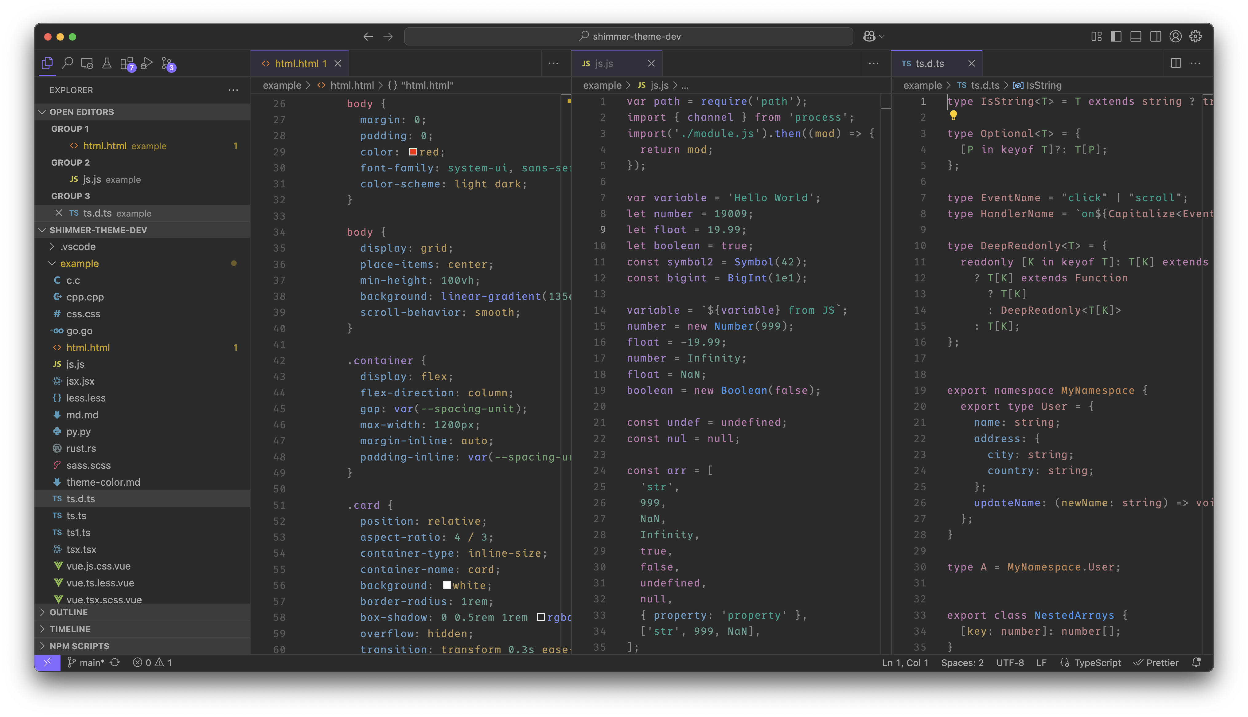
Dark Melancholy
Dark Melancholy Block
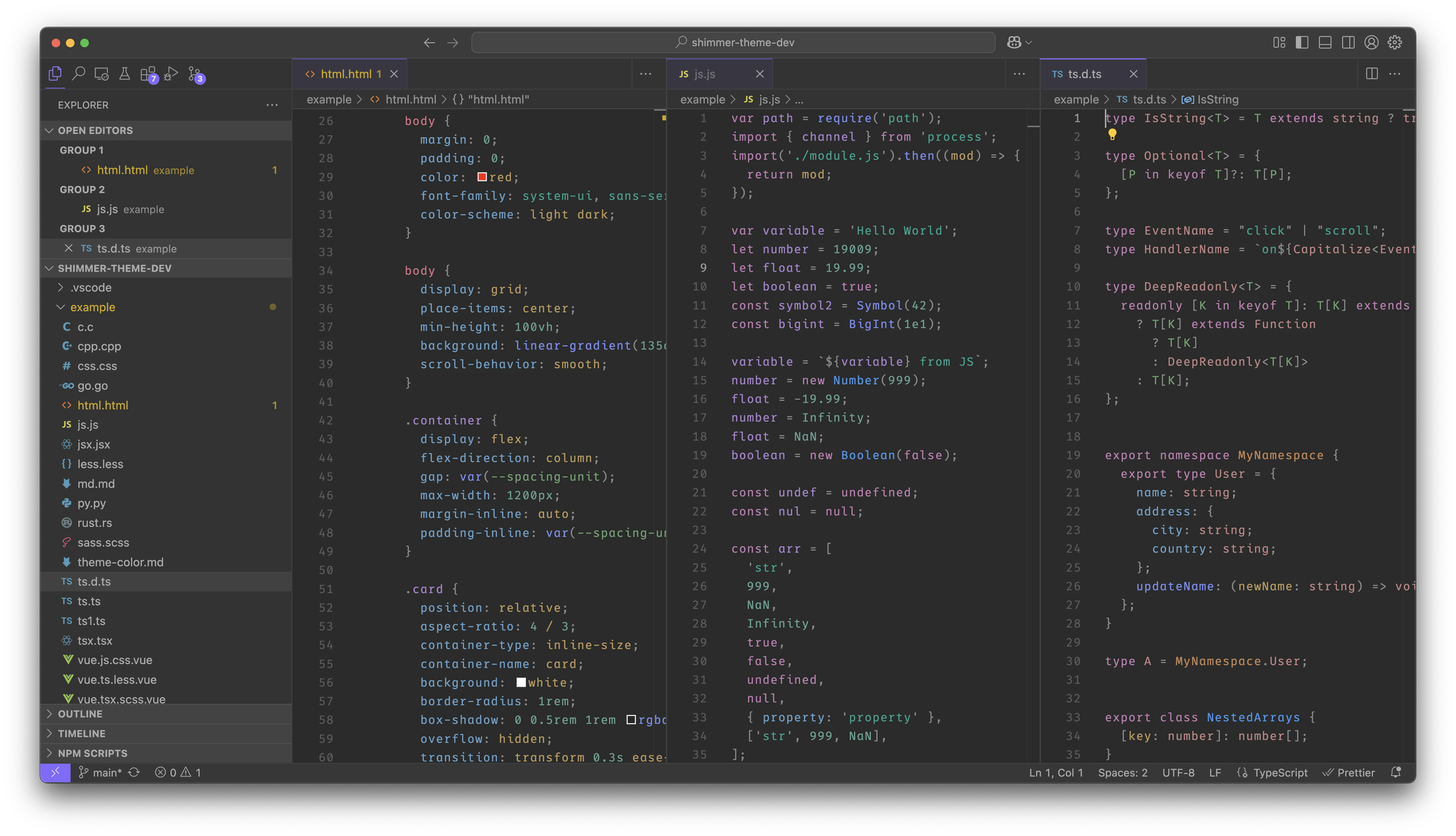
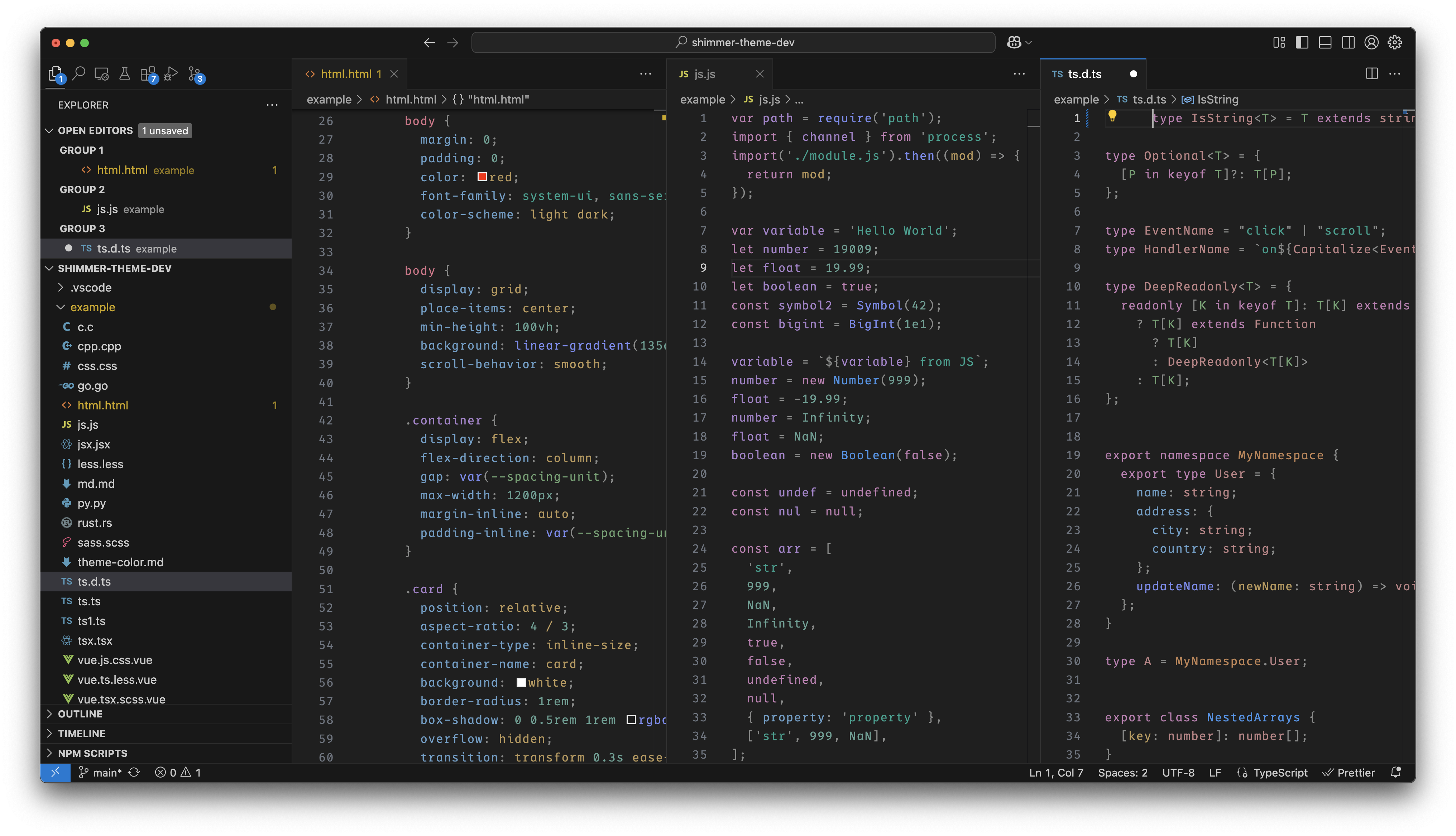
Dark Neutral
Dark Neutral Block
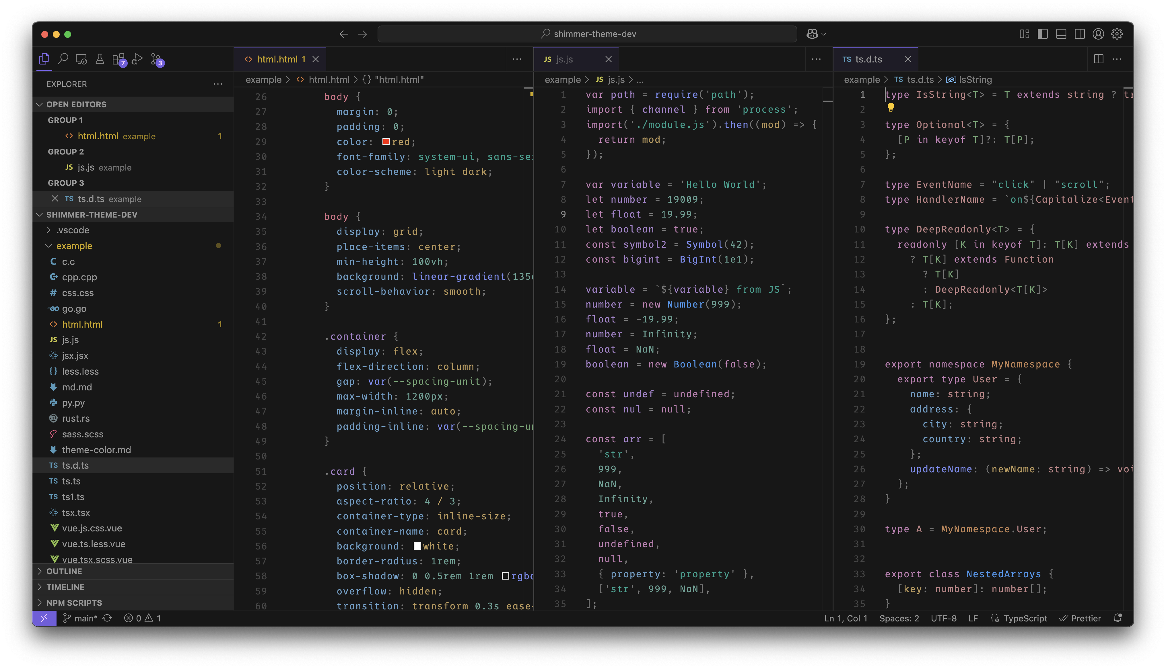
Dark Modern
Recommend
It is recommended to turn off Bracket Pair Coloring when using this theme, Open Manage → Settings → Search for bracket pair → Uncheck Controls whether bracket pair colorization is enabled or not.
Using
Method 1
After the installation is complete, press ctrl + shift + p to display all command pop-ups, enter Color Theme in the input box, find the option Preferences: Color Theme in the result bar, press Enter, and select the theme with the name starting with Shimmer Theme in the color theme list.
Method 2
Open Manage -> Themes -> Color Theme, and select the theme that starts with Shimmer Theme in the color theme list pop-up window.
Modify color scheme
Open Manage -> Settings -> Open Settings(Json) -> Open Settings (UI) [icon column on the right side of the tab bar] and add the following content to the setting.json file
Example
// setting.json
{
  ...
  "workbench.colorCustomizations": {
    // Current theme name
   "[Shimmer Theme Dark Melancholy]": {
     // Change primary color
     "activityBar.foreground": "#ff00ff",
     "activityBarBadge.background": "#ff00ff",
     "activityBarTop.activeBorder": "#ff00ff",
     "activityBarTop.foreground": "#ff00ff",
     "badge.background": "#ff00ff",
     "badge.foreground": "#ff00ff",
     "breadcrumb.focusForeground": "#ff00ff",
     "button.background": "#ff00ff",
     "button.hoverBackground": "#ff00ff",
     "editorSuggestWidget.highlightForeground": "#ff00ff",
     "inputOption.activeBackground": "#ff00ff",
     "panelTitle.activeBorder": "#ff00ff",
     "panelTitle.activeForeground": "#ff00ff",
     "peekViewTitleLabel.foreground": "#ff00ff",
     "progressBar.background": "#ff00ff",
     "statusBarItem.remoteHoverBackground": "#ff00ff",
     "statusBarItem.remoteHoverForeground": "#ff00ff",
     "tab.activeBackground": "#ff00ff",
     "tab.activeBorderTop": "#ff00ff",
     // other color scheme
   }
  }
}
View Theme Color Doc
Color matching rules
This theme is matched using Adobe Color Accessibility Tools WCAG 2.1 level (AA) and meets color matching level requirements