KonexForge Themes
Charcoal-forged surfaces. Molten orange accents. Code that feels premium.
A family of 4 VSCode color themes built around a "forge" aesthetic: hot
orange, amber, and copper accents — like metal cooling from an anvil —
carried consistently across a dark, a light, and two high-contrast
variants. Designed to be distinct, striking, and easy on the eyes during
long sessions.
What it looks like
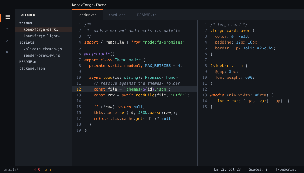
Light, and both High Contrast variants
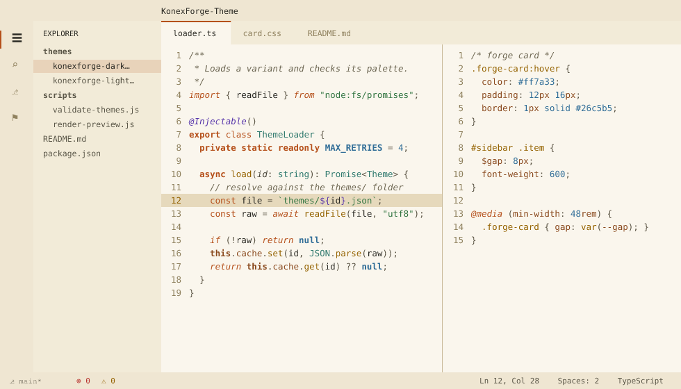
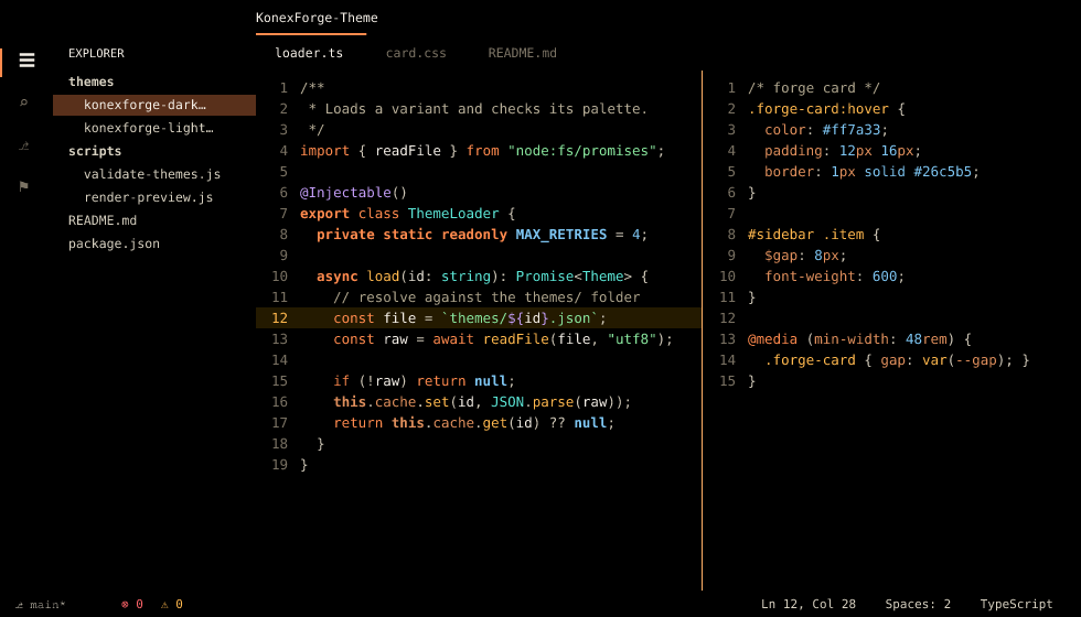
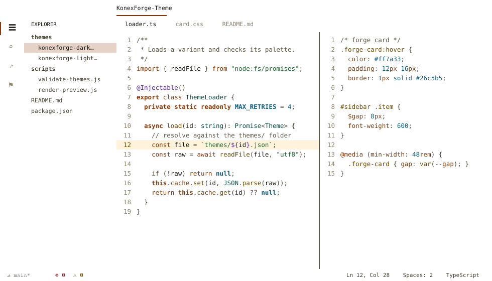
These previews are generated from the theme files themselves
(node scripts/render-preview.js), resolving each token through the same
scope lookup VSCode uses — so they can't drift from the actual themes.
The warm accents carry the "action" parts of code — keywords, tags, storage,
function and method names — plus, in copper, the parts that name a place
rather than hold a value. The literals are cool, so an ordinary line of
code doesn't turn into a wall of orange:
| You'll see |
In |
| Keywords, storage, tags |
orange |
| Functions, methods, CSS selectors |
amber |
this/self, properties and members, JSON/YAML keys, units |
copper |
| Operators |
rose |
try / catch / throw |
ember red |
| Strings |
green |
| Numbers, constants, colour literals, HTML attribute names |
steel blue |
| Types, classes, CSS property names, HTML attribute values |
slate teal |
Decorators, annotations, regex, escapes, ${...} |
violet |
| Comments |
muted blue-gray, italic (Dark/Light only) |
So <div class="row"> reads orange tag → steel-blue attribute name →
slate-teal value, const n = 42 reads orange keyword → plain text → rose
operator → steel-blue number, and padding: 12px reads teal property →
steel-blue number → copper unit.
No single file type is allowed to fall entirely into one temperature. Every
language the theme targets — TypeScript, SCSS, Python, JSON, YAML, Markdown,
HTML — lands between 12% and 65% warm, measured on a real token mix and
enforced on every commit.
Between comments and body text sits a four-step neutral ramp — doc comments,
punctuation, parameters and body text each get their own weight, in all four
variants — so structure stays readable without pulling colour into it.
The theme family
| Variant |
Best for |
| KonexForge Dark |
Everyday coding, low-light environments, the flagship "forge" experience |
| KonexForge Light |
Bright rooms/daytime use, presentations, screen-sharing on projectors |
| KonexForge Dark High Contrast |
Low-vision users, maximum boundary/contrast clarity in a dark environment |
| KonexForge Light High Contrast |
Low-vision users in bright environments, accessibility-mandated setups, high-glare use |
All four share the same "hot metal" hue language (orange/amber/copper
accents, steel-blue/slate-teal/violet cool counterpoints) re-derived per
variant for contrast, so they read as one recognizable family everywhere
you use them.
Features
- Four variants sharing one hue language — Dark, Light, Dark High Contrast,
Light High Contrast — installed together from a single extension.
- A "hot metal" accent system (orange / amber / copper / rose) as the
visual hero, balanced by cool counterpoint hues (steel blue, slate teal,
violet, green) held a step lower in chroma so they support the heroes
instead of competing with them.
- Full workbench theming: activity bar, status bar, tabs, terminal
(16-color ANSI palette), git decorations, diff editor, notebooks, debug
console, three-way merge editor, testing and coverage, notifications,
and more.
- Semantic highlighting support for richer accuracy in TypeScript, Python,
Rust, Go, C#, and other LSP-backed languages.
- Syntax tuned per language rather than left to generic fallbacks: CSS/SCSS
selectors, units and colour literals; Java/Kotlin annotations; Markdown
lists, fences and separators; Rust lifetimes; YAML, diff, shell and SQL.
- Deliberate, sparing use of italics in Dark/Light — reserved for the
"annotation layer" that describes other code: comments, keywords,
parameters, decorators, and markup attribute names. Storage, functions,
types, strings, and plain variables stay upright for fast scanning. Both
High Contrast variants drop italics entirely for maximum legibility.
- Every syntax color meets WCAG AA (4.5:1) against its background in
Dark/Light and AAA (7:1) in both High Contrast variants — enforced
automatically on every commit, not just eyeballed. The same suite
guarantees the four variants keep identical roles, not just identical
keys, so no variant quietly flattens a distinction the others make — and
measures the warm/cool balance of the palette itself — both overall and
per file type — so neither the theme as a whole nor any single language
can drift into one temperature.
Installation
From the Marketplace:
Search for KonexForge Themes in the Extensions view, or run:
ext install konexforge.konexforge-themes
Installing the extension gives you all four theme variants.
From a VSIX file:
code --install-extension konexforge-themes-1.2.0.vsix
Activating the theme
Open the Command Palette (Ctrl+Shift+P) → Preferences: Color Theme →
choose one of KonexForge Dark / KonexForge Light /
KonexForge Dark High Contrast / KonexForge Light High Contrast.
Customization
Each variant is built from a small set of role colors if you want to tweak
things via workbench.colorCustomizations. The Dark theme's full role
palette:
| Role |
Hex |
Used for |
| Editor background |
#14171C |
editor surface |
| Panel/sidebar surface |
#1A1E24 |
sidebar, panel, activity bar |
| Overlay surface |
#20252C |
menus, hover, suggest widget |
| Primary text |
#E4E1DC |
body text |
| Muted text |
#7C8494 |
comments, CodeLens, ghost text |
| Primary accent (orange) |
#FF7A33 |
keywords, tags, storage |
| Secondary accent (amber) |
#F5A623 |
functions, methods, macros |
| Tertiary accent (copper) |
#C97B4A |
this / self, properties and members, JSON/YAML keys, units |
| Operator accent (rose) |
#DF4E99 |
operators |
| Info accent (steel blue) |
#5DA7D5 |
numbers, constants, colour literals, HTML attribute names |
| Type accent (slate teal) |
#53C1B3 |
types, classes, CSS property names, attribute values |
| Decorator accent (violet) |
#906FD5 |
decorators, regex, escapes |
| Success accent (green) |
#67CD7C |
strings, git added, diff inserted |
| Error accent (ember red) |
#E5484D |
errors, git deleted, try/catch/throw |
The two warm accents are the loudest colors on screen on purpose: orange and
amber carry the code's skeleton and its actions, and the four cool accents sit
a step lower in chroma so they read as support rather than competing for
attention. Roughly half of all colored syntax scopes are warm — the validator
enforces that balance, because the palette had drifted cool once before
without anyone noticing.
Light and both High Contrast variants re-derive lightness per variant from
these same hue identities — deeper on the warm parchment background of
Light, brighter or deeper still in the High Contrast pair — so all four
read as one family. Don't copy Dark's hexes into Light: they won't meet
contrast there.
Recommended settings
Since comments and keywords render in italic on Dark/Light, a monospace
font with a distinct italic style (e.g. one with ligature support) pairs
especially well with those two variants. (Both High Contrast variants
don't use italics, by design, for maximum legibility.)
Contributing
Issues and PRs are welcome — especially feedback on contrast, language
coverage, or palette tweaks.
Changelog
See CHANGELOG.md.
License
MIT
| |