React Create Component
Generate your components quickly, with multiple easily customizable templates
Features
- Create a component depending on the selected language.
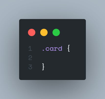
- Create a style file depending on the type of style or extension selected.
- You can create styles per module.
- You can create a component with built-in style import.
- It generates a barrel in your folder.
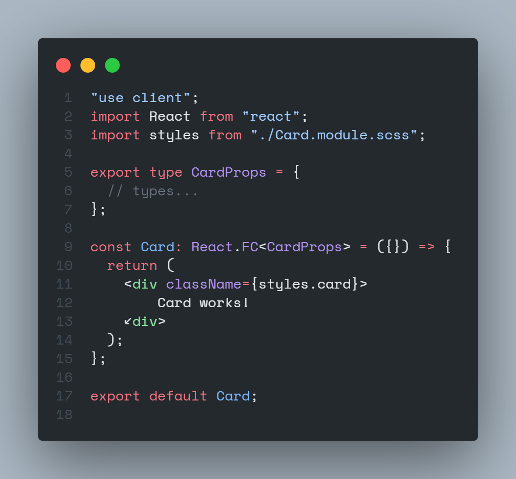
- In the tsx files, integrate the interface.
Commands
| Command |
Description |
context |
keybindings |
| RCC: Create Component |
Create a component in the path that you select |
palette command |
ctrl + shift + l |
| RCC: Delete cache |
Delete the cache of the component creator |
palette command |
|
| RCC: Create page |
Create a page in the path that you select |
menu context |
|
Integrations
How does it work?
Use from a specific path
https://github.com/JavGt/vscode-component-creator/assets/82567321/5043597c-17ea-4b66-9d5d-72c48691cb4a
You can use it by clicking on the folder where you want your component to be and clicking on the "Create Component" option.
Use by entering the path
https://github.com/JavGt/vscode-component-creator/assets/82567321/20b7775c-bd6c-4d9f-9a8b-5990f4508770
You can also use it by giving it by executing the "Create Component" command from the command palette
To create a component it can also be executed with the following keys (ctrl + shift + l)
Quick suggestions
https://github.com/JavGt/vscode-component-creator/assets/82567321/6adf1fdd-3e8d-429a-9428-db1634b1ea3f
Settings

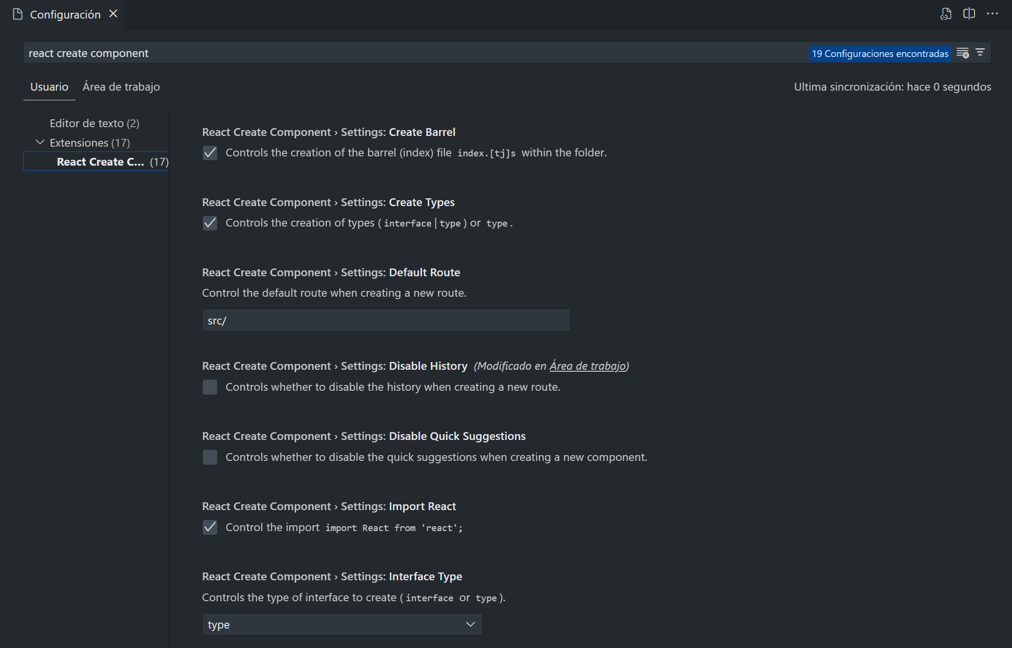
You can change the configurations of the templates to make the creation more customizable and faster, for more information go to the configuration documentation
Structure Results
ComponentFolder
│
│── Component.{jsx, tsx}
│
|── styles(.module).{css, scss, sass}
│
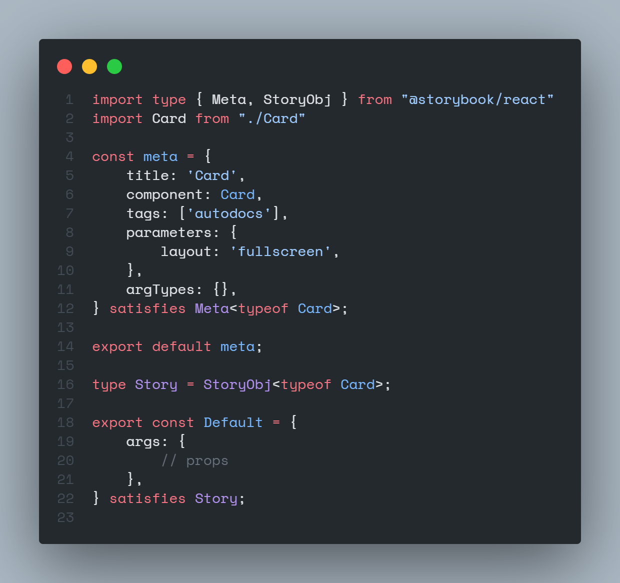
|── Component.stories.{jsx, tsx} [optional]
│
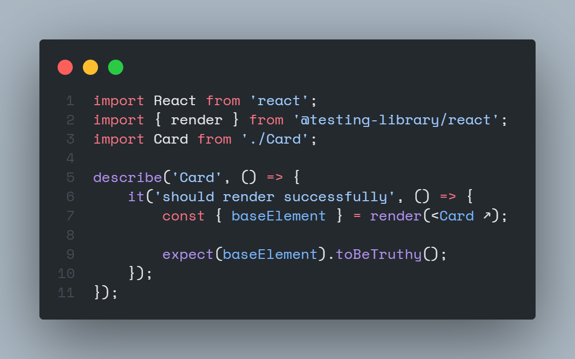
|── Component.test.{jsx, tsx} [optional]
│
└── index.{js, ts}
Example of output with traditional CSS
Typescript

CSS

Barrel

Testing

Storybook

License
React Create Component is MIT licensed.


