Mokka
Minimal dark theme for Visual Studio Code.
The idea was to create a color theme that highlights only those objects that are necessary for distinguishing and does not make the code difficult to read with unnecessary colors and highlights.
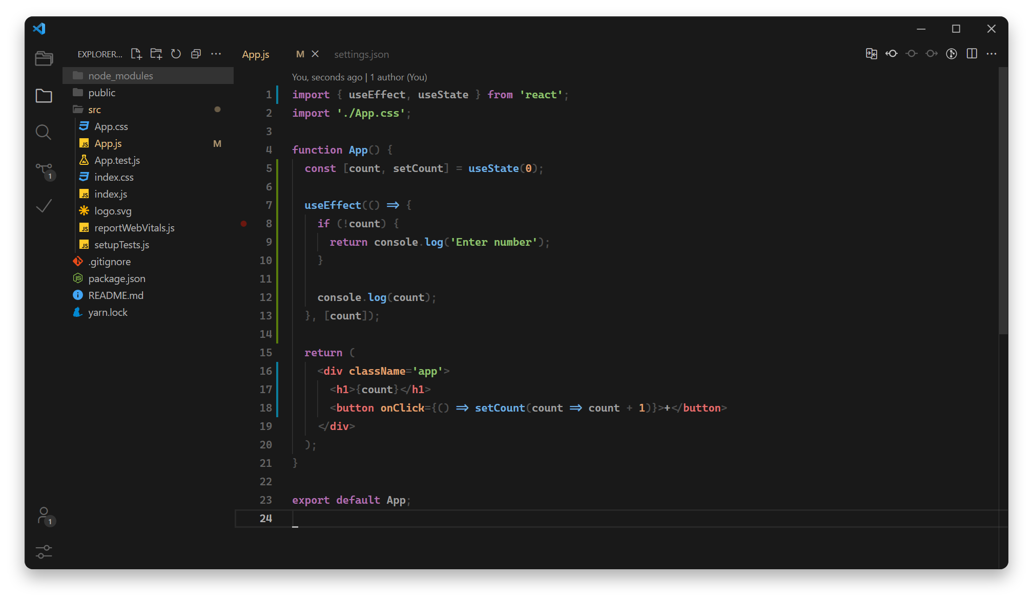
Default
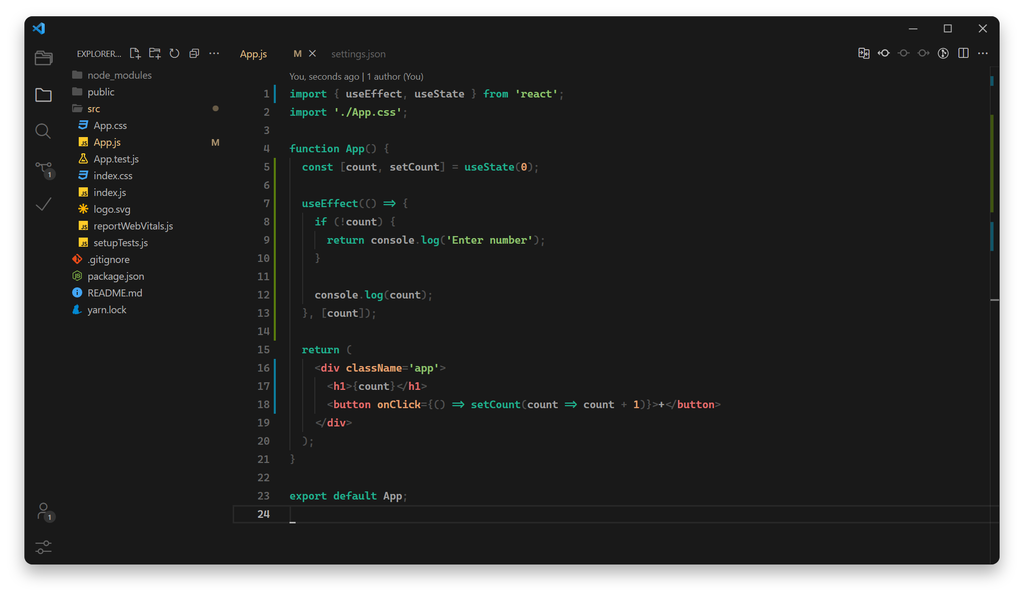
Green
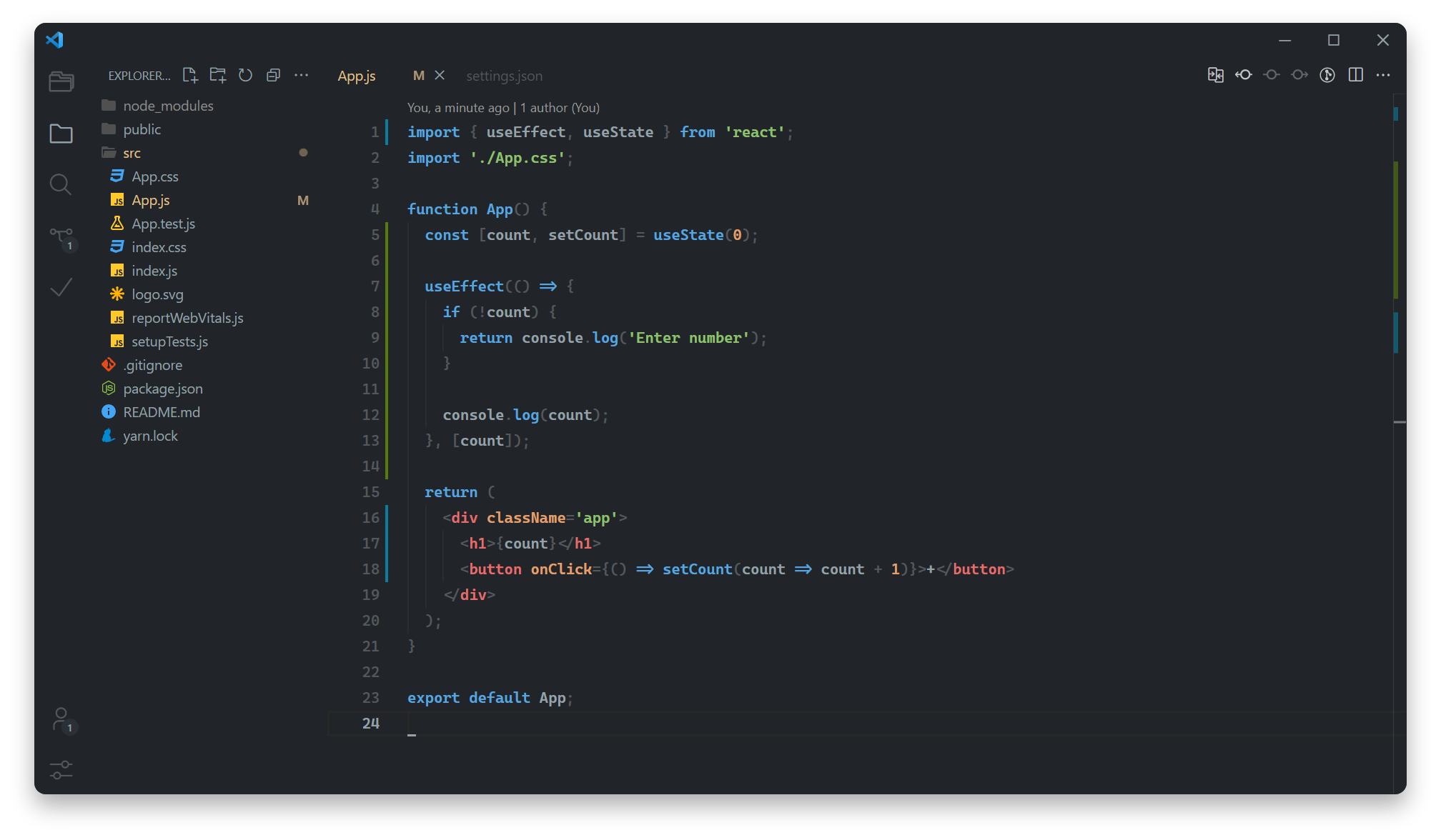
Blue
Recommended settings
Font
For a better experience, use the "Cascadia Code" or "JetBrains Mono" font.
"editor.fontFamily": "Cascadia Code, JetBrains Mono, monospace",
"editor.fontSize": 14,
"editor.lineHeight": 1.8,
"editor.fontLigatures": true,
"terminal.integrated.fontFamily": "Cascadia Code, JetBrains Mono, monospace",
Icons
For a better experience, use the "Material Icon Theme" icons.
"workbench.iconTheme": "material-icon-theme",
"material-icon-theme.folders.theme": "classic",
"material-icon-theme.folders.color": "#505050", // #53585c for lighten variants
"material-icon-theme.activeIconPack": "react",
"material-icon-theme.hidesExplorerArrows": true,
Cursor
"editor.cursorStyle": "underline",
"editor.cursorBlinking": "smooth",
"editor.cursorSmoothCaretAnimation": true,
"terminal.integrated.cursorBlinking": true,
"terminal.integrated.cursorStyle": "underline",
Interface
"workbench.editor.showIcons": false,
"breadcrumbs.icons": false,
"editor.minimap.enabled": false,
"workbench.statusBar.visible": false,
"workbench.activityBar.visible": false,
 Made for pleasure with love ❤️


 Made for pleasure with love ❤️