Harmonia Vision
Leer en Español
Personalized editor settings for visual comfort
Harmonia Vision is a VS Code extension that helps you calibrate editor readability and reduce visual fatigue through ergonomic configuration recommendations. Whether you have myopia, astigmatism, or simply experience eye strain after long coding sessions, this tool provides personalized settings to improve your coding comfort.
Features
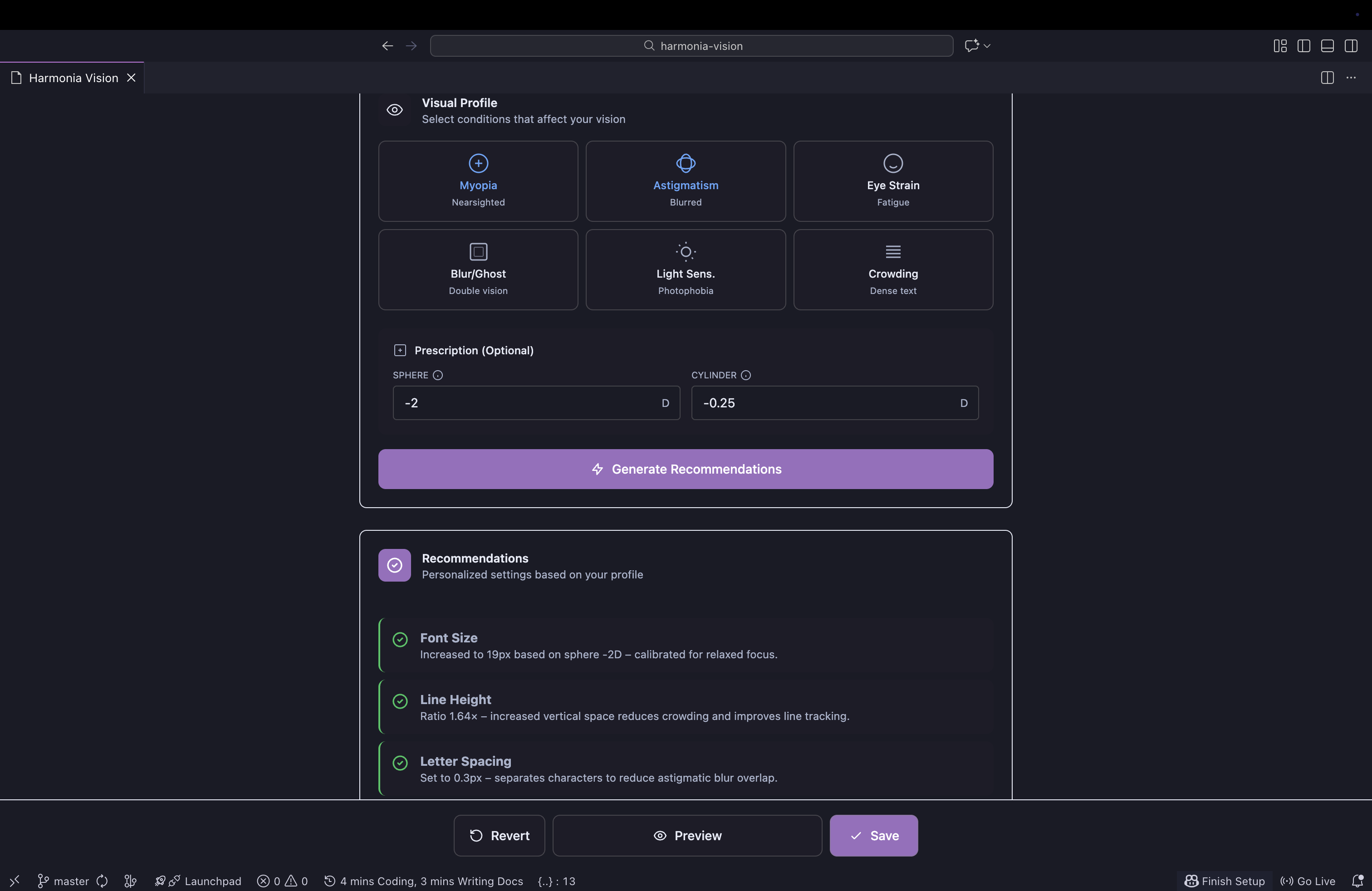
- Visual Profile Assessment - Select conditions that affect your vision (myopia, astigmatism, eye strain, light sensitivity, etc.)
- Optional Prescription Input - Enter your glasses prescription (Sphere/Cylinder) for more accurate recommendations
- Smart Recommendations - Get personalized editor settings based on your visual profile
- Live Preview - Compare original vs. recommended settings side-by-side before applying
- Safe Apply Model - Create a backup snapshot, preview changes, save when satisfied, or revert to snapshot
- Eye Break Reminders - Follow the 20-20-20 rule with customizable break reminders and status bar countdown
- Break Statistics - Track your eye health habits with local-only statistics (streaks, compliance rate, rest time)
- Theme Agnostic - Works with any VS Code theme
- Bilingual Support - Available in English and Spanish (auto-detected)
Installation
- Open VS Code
- Go to Extensions (Ctrl+Shift+X / Cmd+Shift+X)
- Search for "Harmonia Vision"
- Click Install
Or install from the command line:
code --install-extension AgusRdz.harmonia-vision
Usage
- Open the Command Palette (Ctrl+Shift+P / Cmd+Shift+P)
- Type "Harmonia Vision: Open Calibrator"
- Select your visual conditions
- Optionally enter your prescription values
- Click "Generate Recommendations"
- Use the sliders to fine-tune settings
- Preview changes in the side-by-side comparison
- Click "Preview" to test in your editor
- Click "Save" to apply permanently, or "Revert" to go back
Editor Settings Adjusted
Harmonia Vision can adjust the following VS Code editor settings:
| Setting |
Description |
Range |
editor.fontSize |
Font size in pixels |
12-32px |
editor.lineHeight |
Line height ratio |
Auto to 2.2x |
editor.letterSpacing |
Space between letters |
0-1.5px |
editor.fontWeight |
Font weight |
300-700 |
editor.cursorWidth |
Cursor width in pixels |
1-5px |
editor.renderLineHighlight |
Current line highlight |
None, Gutter, Line, All |
Eye Break Reminders (20-20-20 Rule)
The 20-20-20 rule is a simple practice to reduce eye strain: every 20 minutes, look at something 20 feet (6 meters) away for 20 seconds.
Harmonia Vision includes built-in break reminders to help you follow this rule:
Features
- Customizable Intervals - Set work intervals from 15-60 minutes
- Break Duration - Configure breaks from 10-60 seconds
- Status Bar Countdown - See time remaining until your next break
- Random Tips - Each reminder includes a helpful eye health tip
- Idle Detection - Timer pauses automatically when you're not actively coding
- Snooze Option - Delay a reminder by 5 minutes when needed
Commands
| Command |
Description |
Harmonia Vision: Toggle Eye Break Reminders |
Enable or disable break reminders |
Harmonia Vision: Take Eye Break Now |
Trigger an immediate break |
Harmonia Vision: Snooze Eye Break |
Snooze current reminder for 5 minutes |
Settings
Configure in VS Code Settings or through the Calibrator panel:
| Setting |
Description |
Default |
harmoniaVision.pause.enabled |
Enable eye break reminders |
false |
harmoniaVision.pause.workIntervalMinutes |
Minutes between breaks (15-60) |
20 |
harmoniaVision.pause.breakDurationSeconds |
Break duration in seconds (10-60) |
20 |
harmoniaVision.pause.showStatusBar |
Show countdown in status bar |
true |
harmoniaVision.pause.pauseWhenIdle |
Pause timer when inactive |
true |
harmoniaVision.statusBar.timerVisibility |
Status bar visibility mode |
auto |
Status Bar Visibility
The timerVisibility setting controls when the Eye Break countdown appears:
| Option |
Behavior |
always |
Always show the status bar countdown |
auto (default) |
Show when running, but hide if Harmonia Zen Pomodoro is active |
hidden |
Never show the status bar countdown |
Using with Harmonia Zen? Both extensions default to auto mode. When both timers are running, Zen Pomodoro takes priority and the Eye Break timer hides to avoid status bar clutter. The Eye Break reminders still work in the background.
Understanding Prescription Values
Sphere (SPH)
The spherical power corrects nearsightedness (myopia) or farsightedness (hyperopia):
- Negative values (-): Correct myopia (e.g., -2.00)
- Positive values (+): Correct hyperopia (e.g., +1.50)
Cylinder (CYL)
The cylindrical power corrects astigmatism:
- Only present if you have astigmatism
- Can be negative or positive depending on notation used
- Found on your glasses prescription
Note: These values are optional and only used to provide more accurate recommendations. They are never stored or transmitted.
Important Notice
This tool is designed to improve visual comfort while coding. It is NOT a substitute for professional eye care. If you experience persistent eye strain, headaches, or vision problems, please consult an optometrist or ophthalmologist.
Regular eye exams are essential for maintaining good eye health, especially for those who spend long hours in front of screens.
Visual Profile Options Explained
Each condition in the Visual Profile adjusts specific settings to address common visual challenges:
Myopia (Nearsightedness)
What it does:
- Increases font size based on severity (16-22px range)
- Widens cursor for easier tracking (3px)
Why: Larger text reduces the need to lean toward the screen and decreases ciliary muscle strain. If you provide your Sphere prescription value, the recommendation is calibrated more precisely.
Astigmatism
What it does:
- Increases letter spacing (0.2-0.6px) to separate characters
- Increases line height for better line tracking
Why: Astigmatism causes characters to blur together, especially similar shapes like c/e, r/n, 0/O. Added spacing reduces overlap and improves readability.
Eye Strain / Fatigue
What it does:
- Adds +1px to font size
- Ensures line height is at least 1.6x for "breathable" code
Why: Adequate spacing between lines reduces scanning effort during long coding sessions and helps your eyes rest between lines.
Blur / Ghosting
What it does:
- Adds +1px to font size
- May increase font weight to 500 (medium) for severe cases
- Widens cursor (3px)
Why: Larger, slightly heavier text improves edge definition when you perceive double images or ghosting effects.
Light Sensitivity (Photophobia)
What it does:
- Keeps font weight at 400 (normal), overriding heavier recommendations
Why: Heavier font weights appear brighter and can cause discomfort. Normal weight reduces perceived glare. For best results, pair with a dark theme.
Visual Crowding
What it does:
- Increases letter spacing to at least 0.5px
- Increases line height for better separation
Why: When dense code feels overwhelming or characters seem to "bunch up," added spacing creates visual breathing room.
Tip: You can select multiple conditions. The engine combines their effects intelligently (e.g., Photophobia will override heavier font weights even if Blur/Ghosting is also selected).
Preview
Privacy
- No data is collected, transmitted, or logged
- Prescription values are optional and only used locally
- All settings are stored in your VS Code user settings
- No telemetry or analytics
Requirements
Contributing
Contributions are welcome! Please feel free to submit issues or pull requests on GitHub.
License
MIT License - see LICENSE.txt for details.
Author
Created by AgusRdz
Enjoy coding comfortably!