Harmonia Theme
Harmonia is a carefully crafted theme suite for Visual Studio Code.
All variants are designed for long, focused coding sessions with soft, thoughtful visuals and semantic clarity.
🎨 Harmonia Theme Family
| Variant |
Mode |
Description |
Palette |
| 🌑 Dark |
Dark |
Technical, focused, and balanced. |
#1a1b26, #9CB8FF, #a3d9a5 |
| 🌌 Noir |
Dark |
Elegant, moody, and cinematic. |
#14121A, #a788de, #9BCAD9 |
| 🌙 Moonlit |
Dark |
Serene, blue-focused, and calm. |
#1a1b26, #4493F8, #a3d9a5 |
| 🌈 Aurora |
Dark |
Soft, colorful, and relaxing. |
#1d1c28, #E8A2C8, #9dd5b8 |
| 💎 High Contrast |
Dark |
Sharp and vivid for accessibility. |
#0B0C12, #c296e8, #a0dec0 |
| 🖤 OLED True Black |
Dark |
Pure black for OLED screens. |
#000000, #a68edb, #98d1b8 |
| ☀️ Light |
Light |
Clean, balanced, and neutral. |
#eceef1, #4B5EBD, #2F7C61 |
| 🌅 Daybreak |
Light |
Gentle, blue-accented, and clear. |
#eceef1, #4493F8, #2F7C61 |
| 📄 Paper White |
Light |
Print-like and ultra-readable. |
#ffffff, #9650c0, #2F7C61 |
🩵 The Harmonia Journey - Complete, but Ever-Evolving
With version 1.6.3, the Harmonia core collection is now complete with 9 carefully crafted variants.
Each theme - from Dark to Daybreak - represents a unique balance of clarity, comfort, and visual personality,
forming a complete spectrum designed for long, focused coding sessions across all environments and preferences.
Harmonia will continue to receive:
- Minor refinements for contrast, readability, and accessibility.
- Adjustments to stay in sync with new VS Code tokens and UI updates.
- Occasional explorations under Harmonia Elements,
a sub-family of experimental palettes inspired by natural tones (e.g. Teal, Sand, Rose).
Harmonia is no longer expanding - it’s maturing.
Its philosophy of visual harmony, comfort, and balance remains at the core of every update.
🌿 Thank you for helping Harmonia grow into a complete family of colors,
trusted by developers who value focus, serenity, and timeless design.
🌗 Purpose
Harmonia was created for developers who want:
- Visual peace over visual noise
- Focused, low-glare interfaces in both light and dark modes
- Clear, consistent syntax highlighting
- A UI that supports your work instead of distracting from it
🎯 Features
- 🎨 Cohesive color palettes - expressive accents with balanced backgrounds
- 🧠 Semantic clarity - functions, variables, parameters, and keywords all distinct
- 💬 Readable comments - styled to fade gently but never disappear
- 📄 Enhanced Markdown - blockquotes, headers, inline code,
separators styled for clarity
- 💻 Terminal harmony - ANSI colors tuned to match the theme
mood
- 🧩 Language-first design - tuned for PHP, JS, JSON, Docker, configs, logs, and more
🎨 Color Philosophy
Harmonia Dark
#1a1b26 - soft, deep background (never pure black)#d0d0e0 - consistent, low-contrast foreground text- Accents:
#9CB8FF, #88c6c3, #c574dd --- expressive yet quiet
- Structure:
#5a5f7a for dividers, quotes, and spacing
Harmonia Noir
#14121A - rich violet-black background for deep focus#d0d0e0 - soft, neutral foreground text- Accents:
#C2A0F5, #A8E0D2, #e0a96d - sophisticated, moody
tones
- Structure:
#4C4665 and #2A2835 for subtle depth and guides
Harmonia Moonlit
#1a1b26 - soft, deep background matching Dark#d0d0e0 - consistent, balanced foreground text- Accents:
#4493F8, #94E2D5, #a3d9a5 - serene blue-focused palette
- Structure:
#2c2e40 for dividers and subtle guides
Highlights:
- Blue-centric variant with cool, calming tones.
- Ideal for developers who prefer blue over purple accents.
- Maintains Dark's restrained aesthetic with a different color temperature.
Harmonia Aurora
#9e8aeb - gentle violet for keywords and logic#f7a3a8 - warm rose for HTML/JSX tags#9dd5b8 - soft mint for strings and class names#92c8ed - cool blue for functions and utilities#e6c58a - subtle amber for numbers and constants
Highlights:
- Balanced pastels with clean contrast - colorful yet easy on the eyes.
- Inspired by sunrise tones: a midpoint between Dark and Light.
- Perfect for relaxed creative coding or front-end design work.
Harmonia Dark High Contrast
#0f0f0f - stronger, pure background#ffffff - crisp, accessible foreground text- Accents:
#ff4081, #00e5ff, #76ff03 - high-contrast, vivid highlights
- Structure:
#888888, #444444 - clear borders and guides
Harmonia OLED True Black
#000000 - true black background for OLED panels (power efficient)#d0d0d0 - soft neutral text for comfort- Accents:
#ff79c6, #50fa7b, #8be9fd - vivid, high-energy highlights
- Structure:
#44475a, #282a36 - careful borders and subtle guides
Harmonia Light
#eceef1 - soft, light background (never pure white)#2d2d2d - clean, readable foreground text- Accents:
#c574dd, #86c591, #83bde7 --- elegant without harshness
- Structure:
#c1c1c1 and #c3c7ce for subtle guides and dividers
Harmonia Daybreak
#eceef1 - soft, light background matching Light#2d2d2d - clean, readable foreground text- Accents:
#4493F8, #4AB5B4, #2F7C61 - sky-blue and teal palette
- Structure:
#d0d3d6 for subtle guides and dividers
Highlights:
- Light variant with gentle blue accents instead of purple.
- Clear, bright, and optimized for daytime coding.
- Complements Moonlit as the light counterpart to its blue-focused philosophy.
Harmonia Paper White
#ffffff - bright, paper-like background for a clean and natural workspace#2d2d2d - crisp, comfortable foreground text- Accents:
#AA0000, #000088, #005500, #660066 - vivid ink-like hues inspired by print media
- Guides & dividers: soft grays (
#E0E0E0, #DDDDDD) for balanced separation without visual noise
Each variant is designed to reduce fatigue, keep code readable, and make
your editor feel like a calm workspace.
⚙️ Recommended Settings
{
  "workbench.colorTheme": "Harmonia Dark",
  "editor.fontFamily": "'Monaspace Argon', 'Fira Code', 'MonoLisa', 'JetBrains Mono', 'DejaVu Sans Code', 'monospace'",
  "editor.fontLigatures": "'calt', 'ss01', 'ss02', 'ss03', 'ss04', 'ss05', 'ss06', 'ss07', 'ss08', 'ss09', 'cv01' 2, 'liga'",
  "editor.fontSize": 16,
  "editor.lineHeight": 0,
  "editor.cursorBlinking": true,
  "editor.renderWhitespace": "none",
  "editor.minimap.enabled": false,
  "terminal.integrated.fontFamily": "'Fira Code', monospace",
  "terminal.integrated.fontSize": 16
}
🎨 Advanced Usage
Harmonia works out of the box, but you can take advantage of VS Code's customization options to fine-tune your experience.
Set Default Theme
"workbench.colorTheme": "Harmonia Noir"
Always start VS Code with Harmonia Noir.
Change to "Harmonia Dark" or "Harmonia Light" as needed.
Preferred Dark/Light Theme
"workbench.preferredDarkColorTheme": "Harmonia Noir",
"workbench.preferredLightColorTheme": "Harmonia Light",
"window.autoDetectColorScheme": true
Automatically switch between Light and Dark variants based on your operating system theme.
Theme-Specific Overrides
VS Code allows overriding colors per theme without editing the theme itself.
Official docs: Customize a Color Theme
"workbench.colorCustomizations": {
  "[Harmonia Dark]": {
    "editor.background": "#1a1b26",
    "editor.foreground": "#d0d0e0",
    // other tweaks...
  },
}
This example tweaks line numbers differently for each variant.
You can use the same method to adjust highlights, borders, or any UI color.
Customizable Properties
Here's a quick reference of the UI colors Harmonia controls that you can override.
Editor
| Key |
What it does |
editor.background |
Main editor background |
editor.foreground |
Default text color |
editor.selectionBackground |
Highlighted/selected text |
editor.lineHighlightBackground |
Current line highlight |
editor.findMatchBackground |
Search match highlight |
editor.wordHighlightBackground |
Occurrences of the selected word |
editorCursor.foreground |
Cursor color |
editorLineNumber.foreground |
Line numbers |
editorLineNumber.activeForeground |
Active line number |
editorIndentGuide.background1 |
Indent guides |
editorBracketMatch.background |
Matching bracket highlight |
editorGutter.addedBackground |
Git added indicator in gutter |
editorGutter.modifiedBackground |
Git modified indicator in gutter |
editorGutter.deletedBackground |
Git deleted indicator in gutter |
Sidebar & Activity Bar
| Key |
What it does |
sideBar.background |
Sidebar background |
sideBar.border |
Border between sidebar and editor |
sideBar.foreground |
Sidebar text color |
sideBarSectionHeader.background |
Section header background |
activityBar.background |
Activity bar background |
activityBar.foreground |
Activity bar icon color |
activityBar.border |
Activity bar border |
Tabs & Title Bar
| Key |
What it does |
tab.activeBackground |
Active tab background |
tab.activeForeground |
Active tab text color |
tab.inactiveBackground |
Inactive tab background |
tab.inactiveForeground |
Inactive tab text color |
tab.activeBorderTop |
Top border on active tab |
tab.border |
Tab separator border |
titleBar.activeBackground |
Title bar background |
Status Bar
| Key |
What it does |
statusBar.background |
Status bar background |
statusBar.foreground |
Status bar text color |
statusBar.debuggingBackground |
Background while debugging |
statusBarItem.remoteBackground |
Remote indicator background |
Terminal
| Key |
What it does |
terminal.background |
Terminal background |
terminal.foreground |
Terminal text color |
terminal.selectionBackground |
Selected text in terminal |
terminal.ansiBlack ... terminal.ansiBrightWhite |
ANSI color palette (16 colors) |
Panel & Borders
| Key |
What it does |
panel.background |
Bottom panel background |
panel.border |
Border above the panel |
focusBorder |
Global focus outline color |
editorGroup.border |
Border between split editors |
Lists & Inputs
| Key |
What it does |
list.activeSelectionBackground |
Selected item in lists |
list.hoverBackground |
Hovered item in lists |
list.inactiveSelectionBackground |
Selected item when list is unfocused |
input.background |
Input field background |
input.border |
Input field border |
input.foreground |
Input field text color |
dropdown.background |
Dropdown background |
Diff Editor
| Key |
What it does |
diffEditor.insertedTextBackground |
Added code highlight |
diffEditor.removedTextBackground |
Removed code highlight |
diffEditor.insertedLineBackground |
Added line background |
diffEditor.removedLineBackground |
Removed line background |
diffEditor.border |
Diff editor border |
Git Decorations
| Key |
What it does |
gitDecoration.modifiedResourceForeground |
Modified files in explorer |
gitDecoration.addedResourceForeground |
New files in explorer |
gitDecoration.deletedResourceForeground |
Deleted files in explorer |
gitDecoration.untrackedResourceForeground |
Untracked files in explorer |
gitDecoration.ignoredResourceForeground |
Ignored files in explorer |
This is not the full list — Harmonia defines ~270 UI color keys.
For the complete reference, see the VS Code Theme Color docs.
Optimize for Code Review
If you frequently review pull requests or work with diffs, you can increase the diff highlighting intensity:
"workbench.colorCustomizations": {
  "[Harmonia Dark]": {
    "diffEditor.insertedTextBackground": "#A3D9A525",
    "diffEditor.removedTextBackground": "#EC727925"
  },
  "[Harmonia Light]": {
    "diffEditor.insertedTextBackground": "#A3D9A530",
    "diffEditor.removedTextBackground": "#EC727930"
  }
}
This makes added/removed code more prominent during code review sessions while preserving Harmonia's restrained aesthetic for normal coding.
🔤 Recommended Fonts
Harmonia pairs well with these fonts, chosen for clarity and comfort
during long sessions:
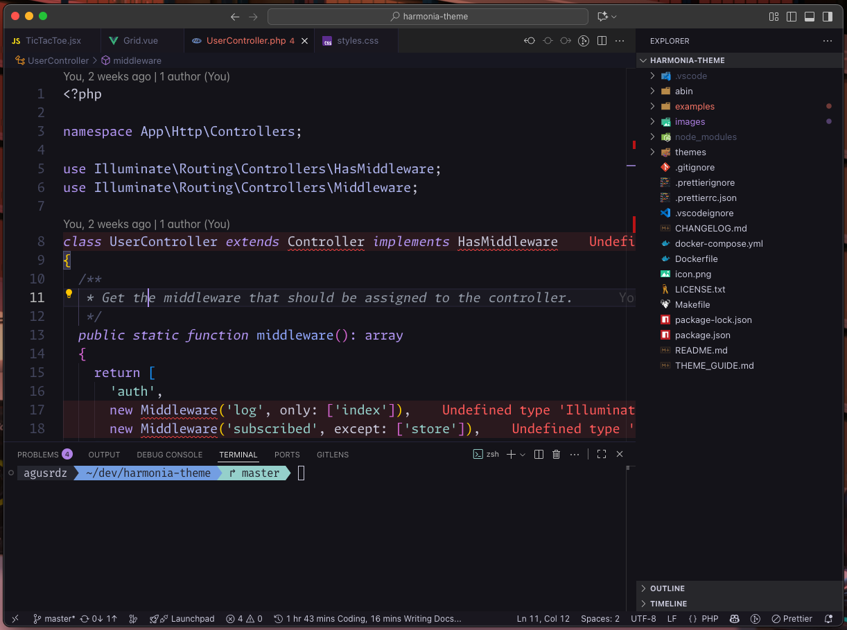
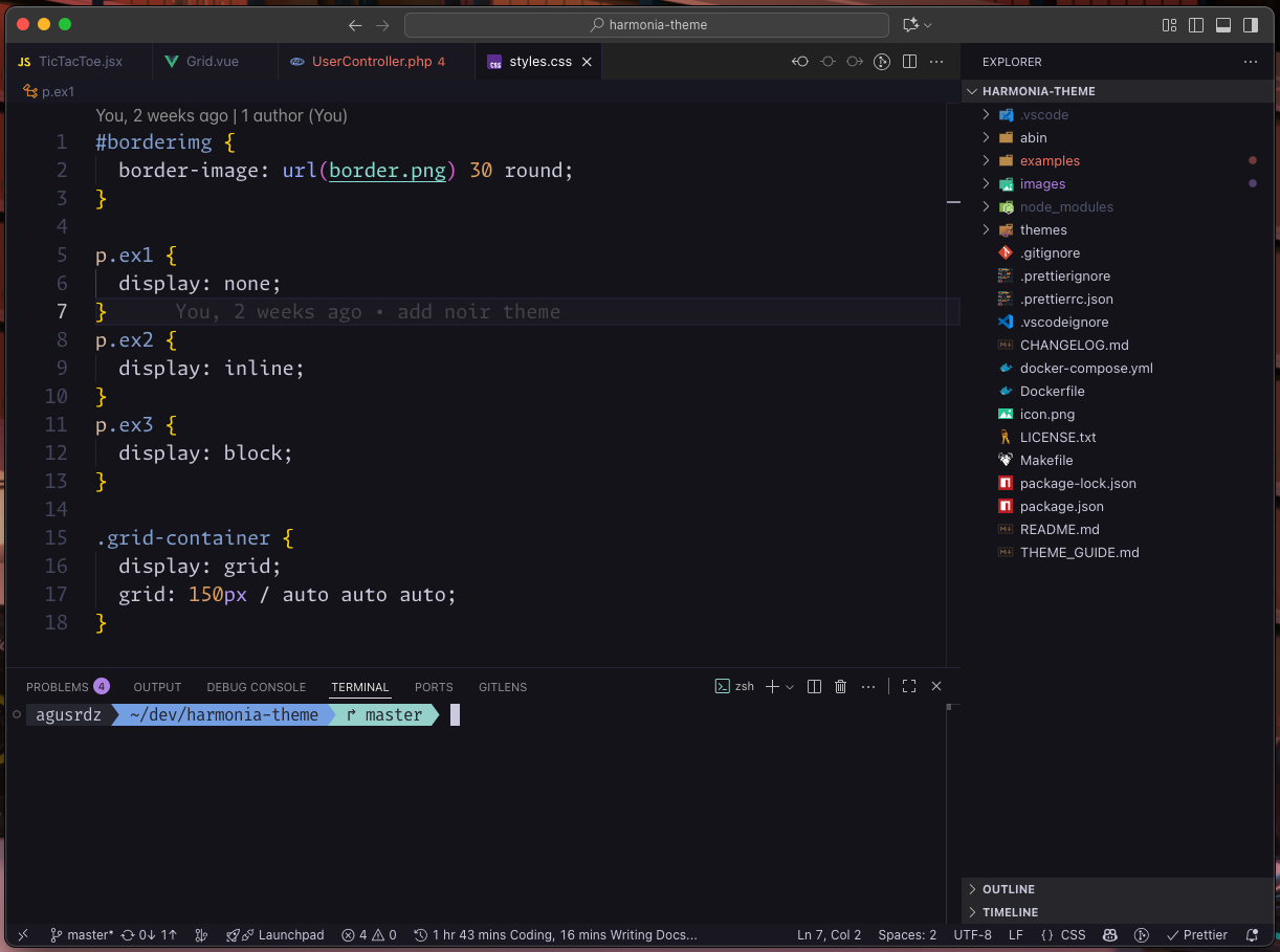
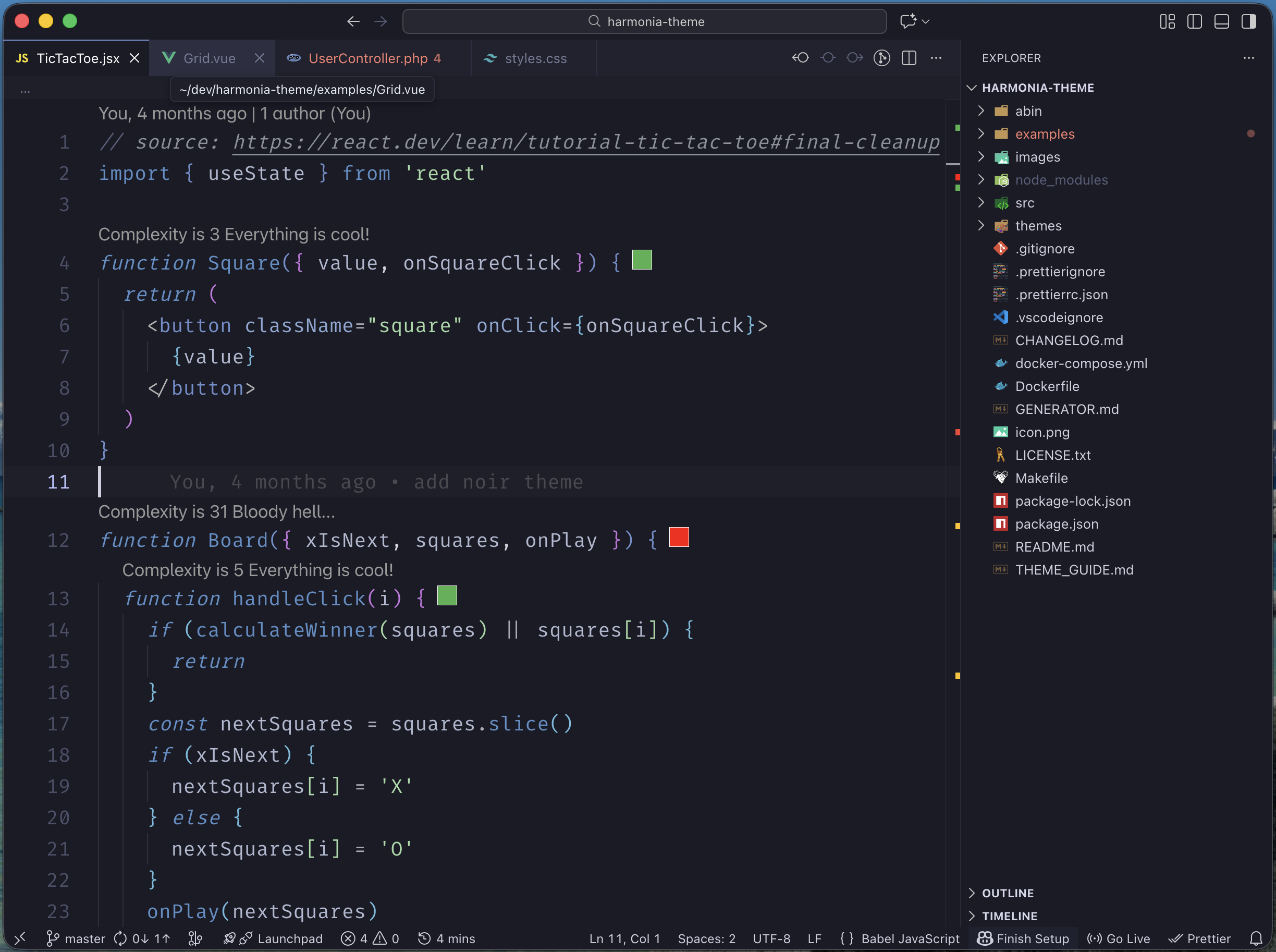
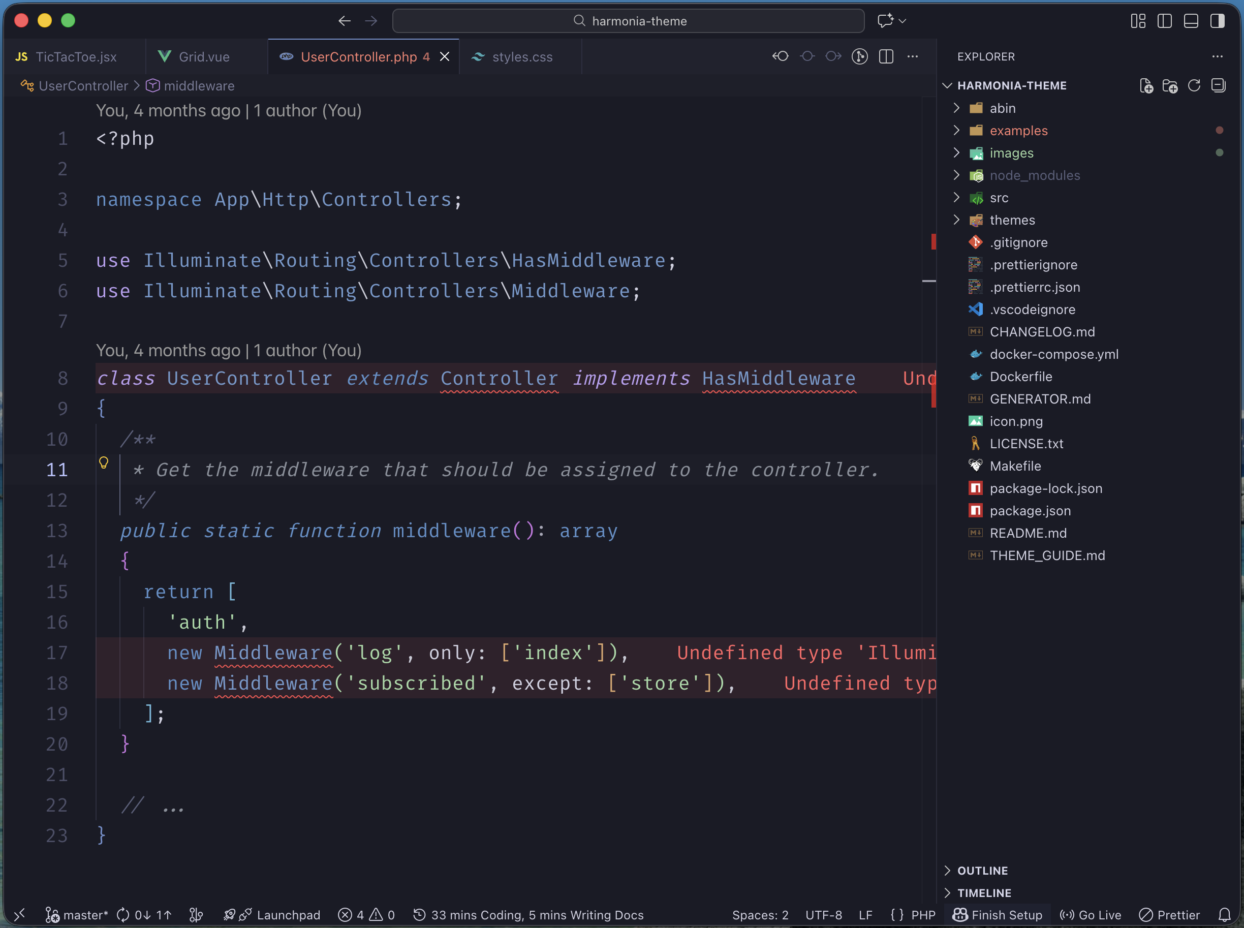
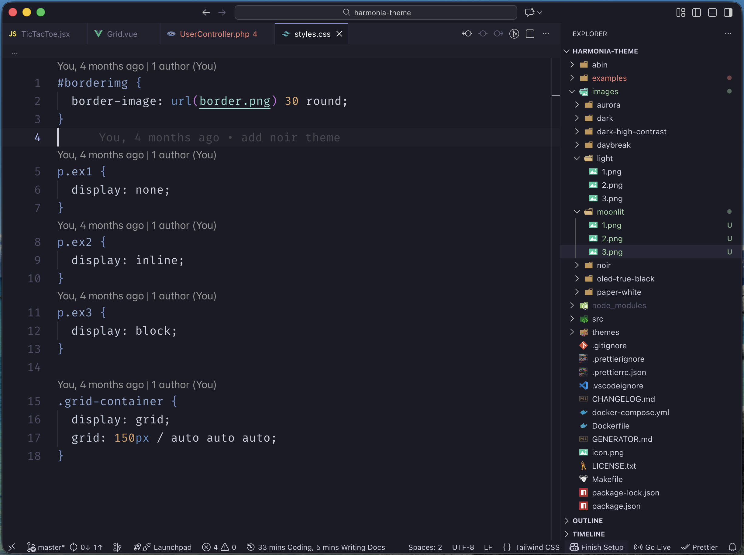
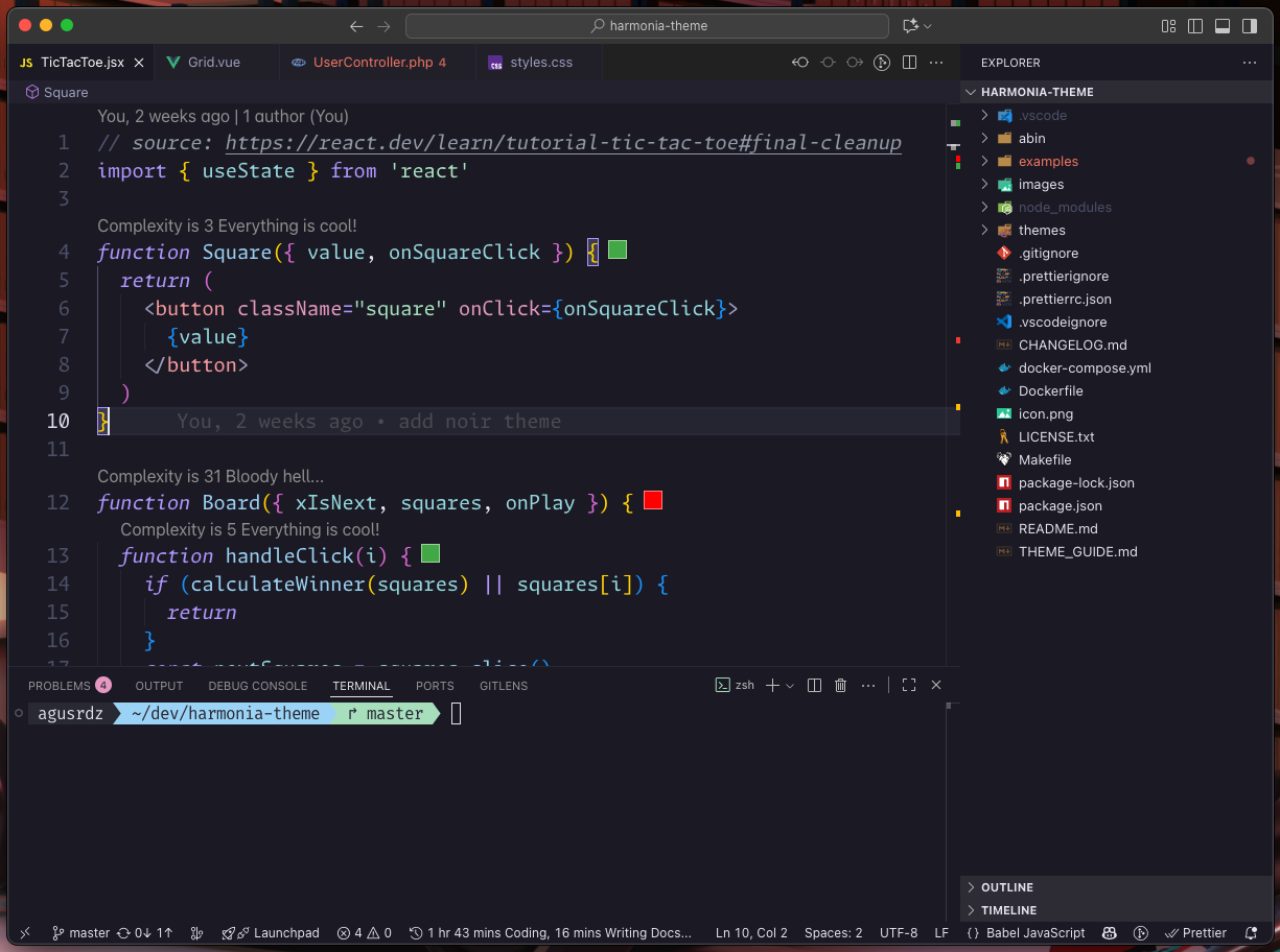
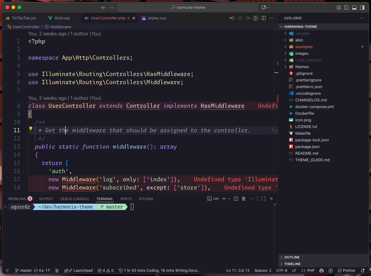
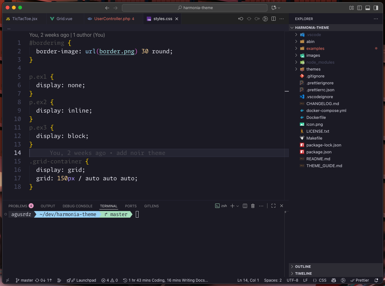
🎨 Preview
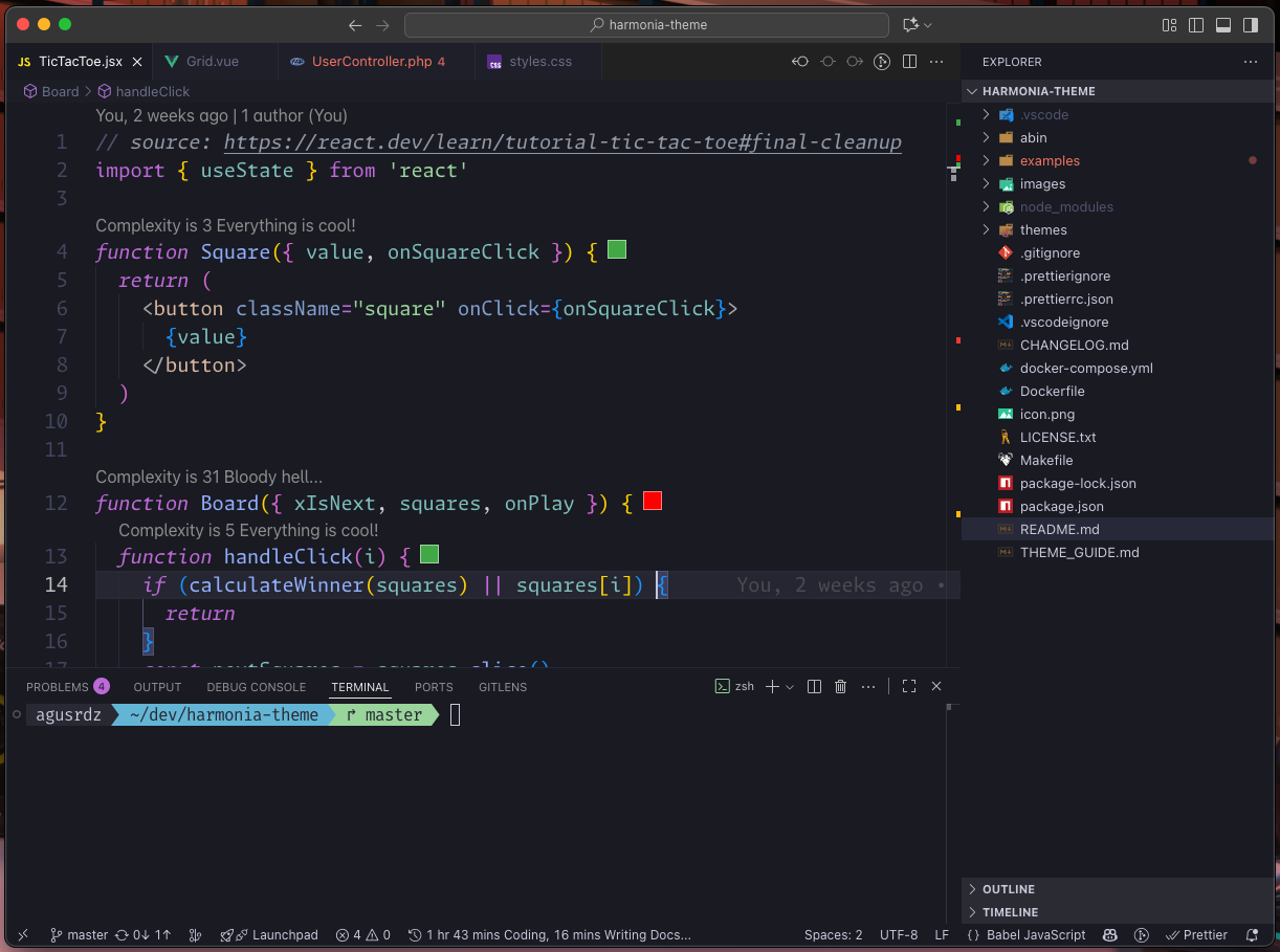
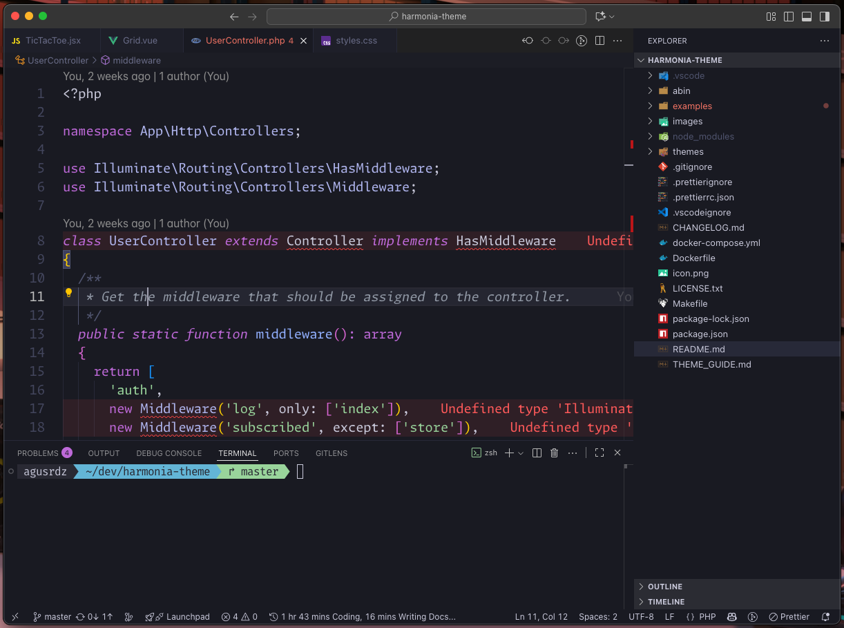
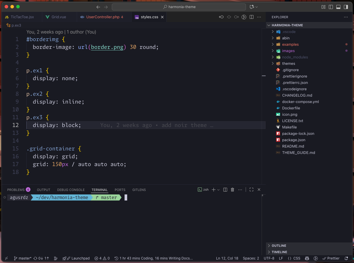
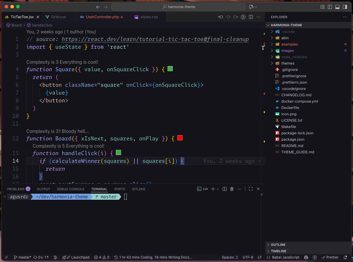
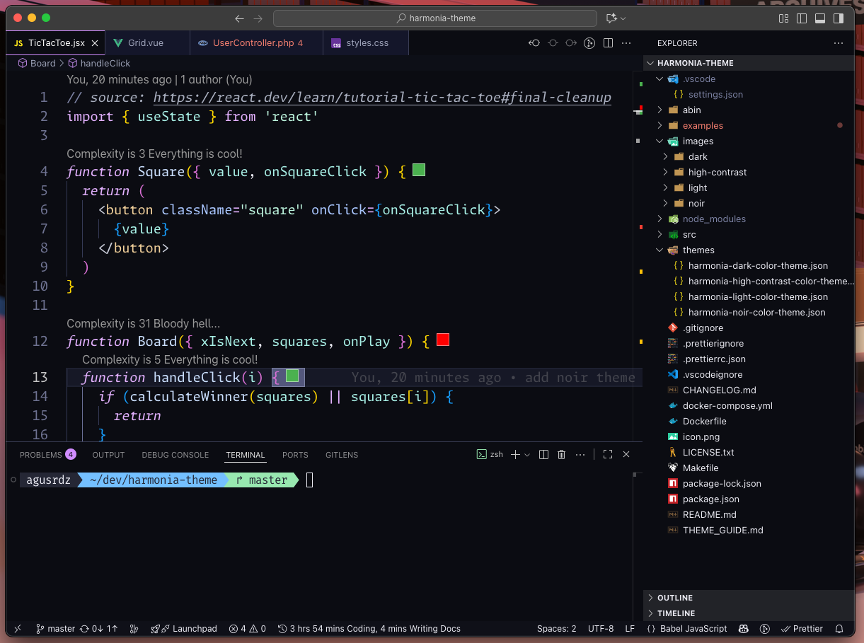
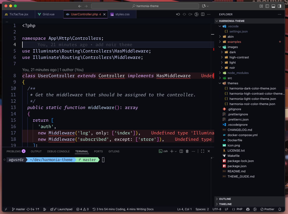
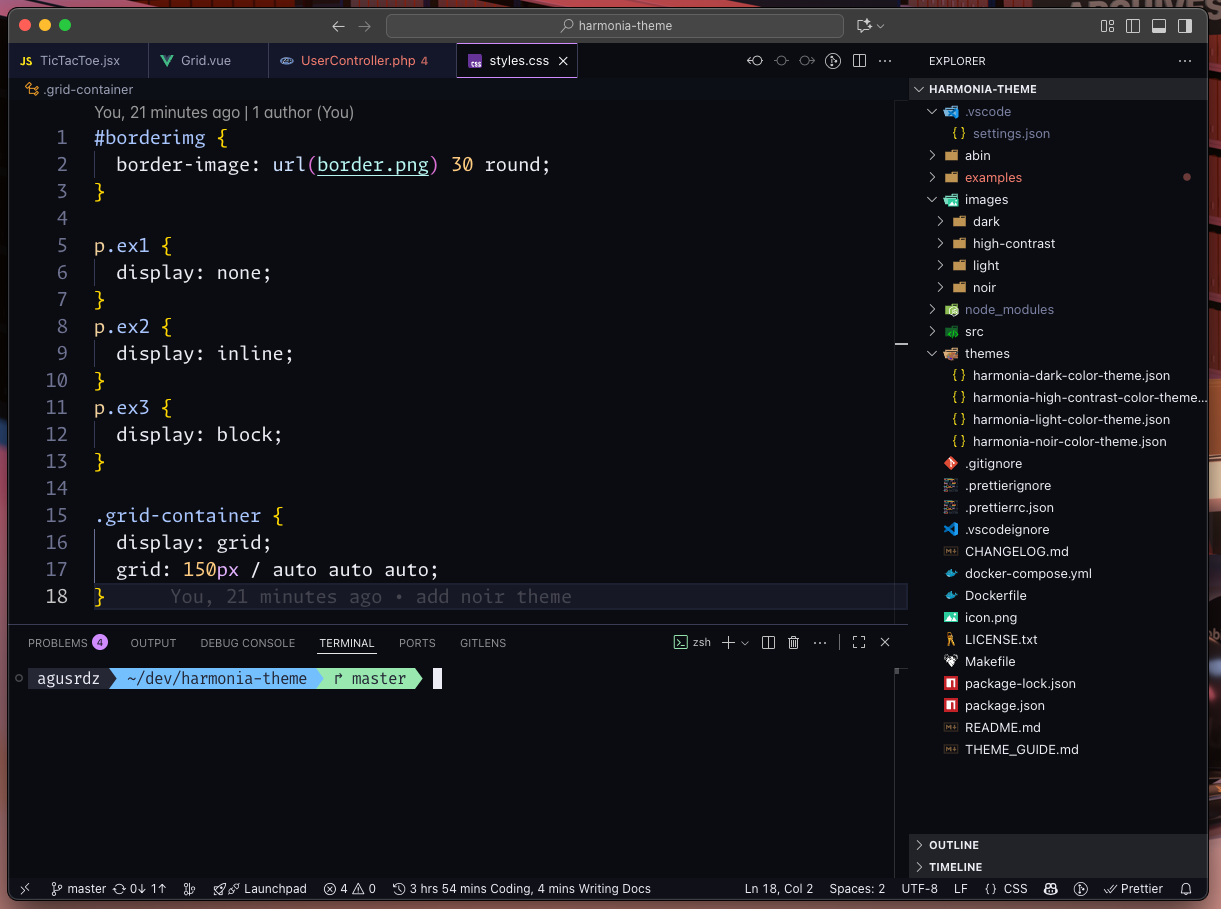
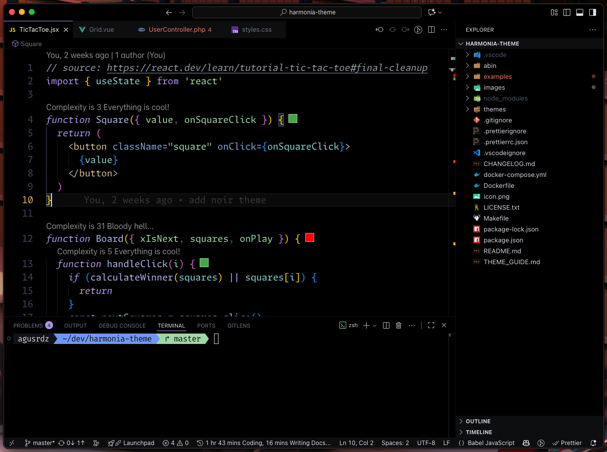
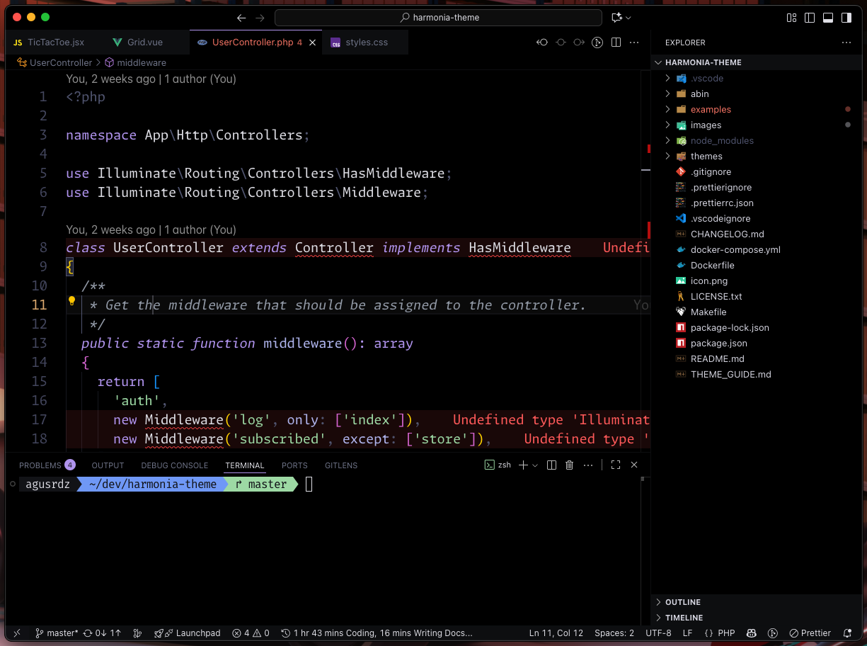
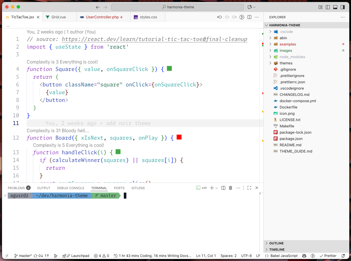
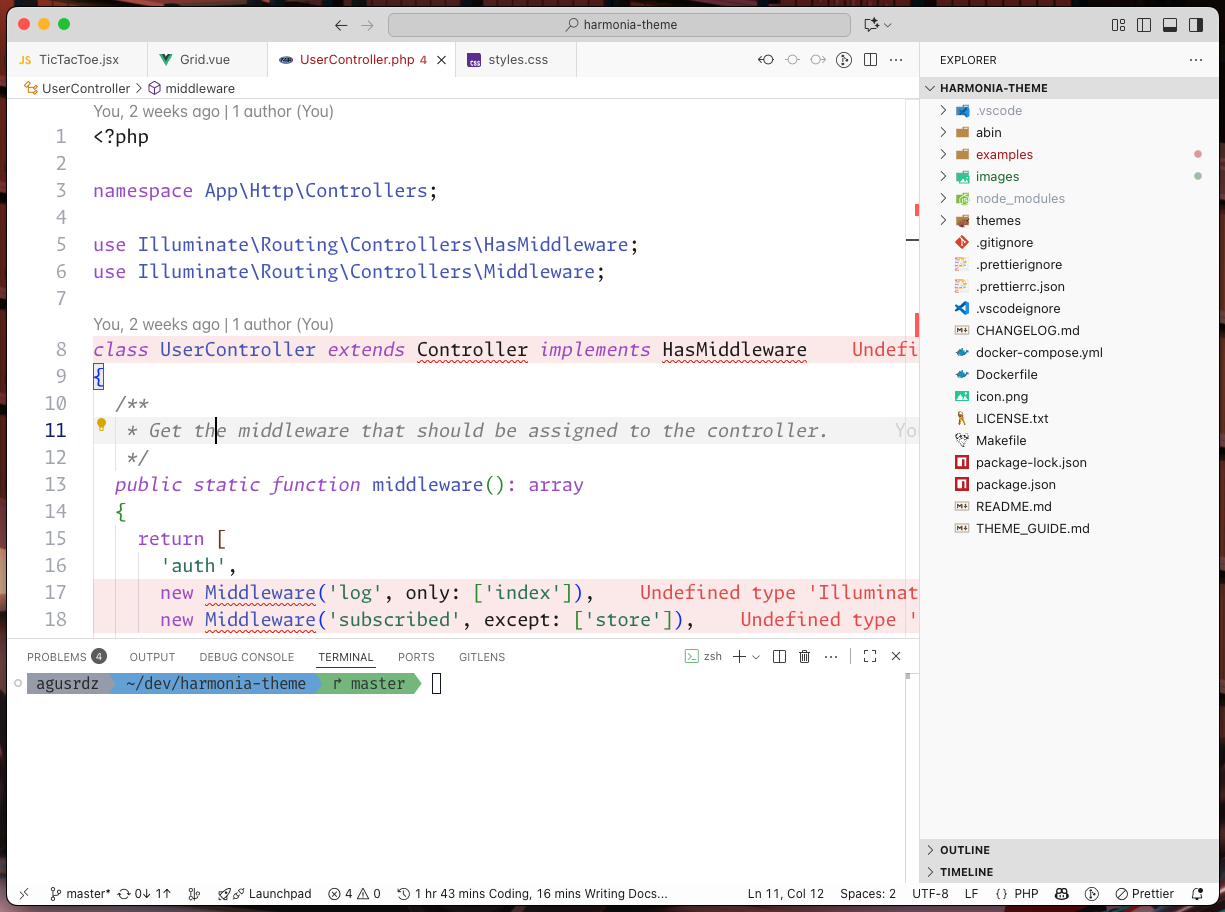
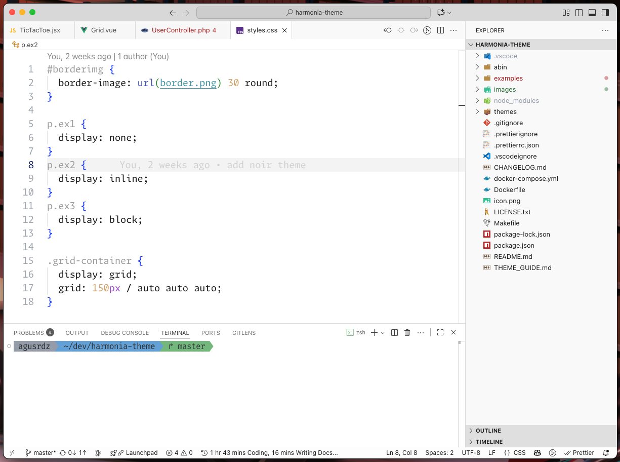
Harmonia Dark
Harmonia Noir
Harmonia Moonlit
Harmonia Aurora
Harmonia Dark High Contrast
Harmonia OLED True Black
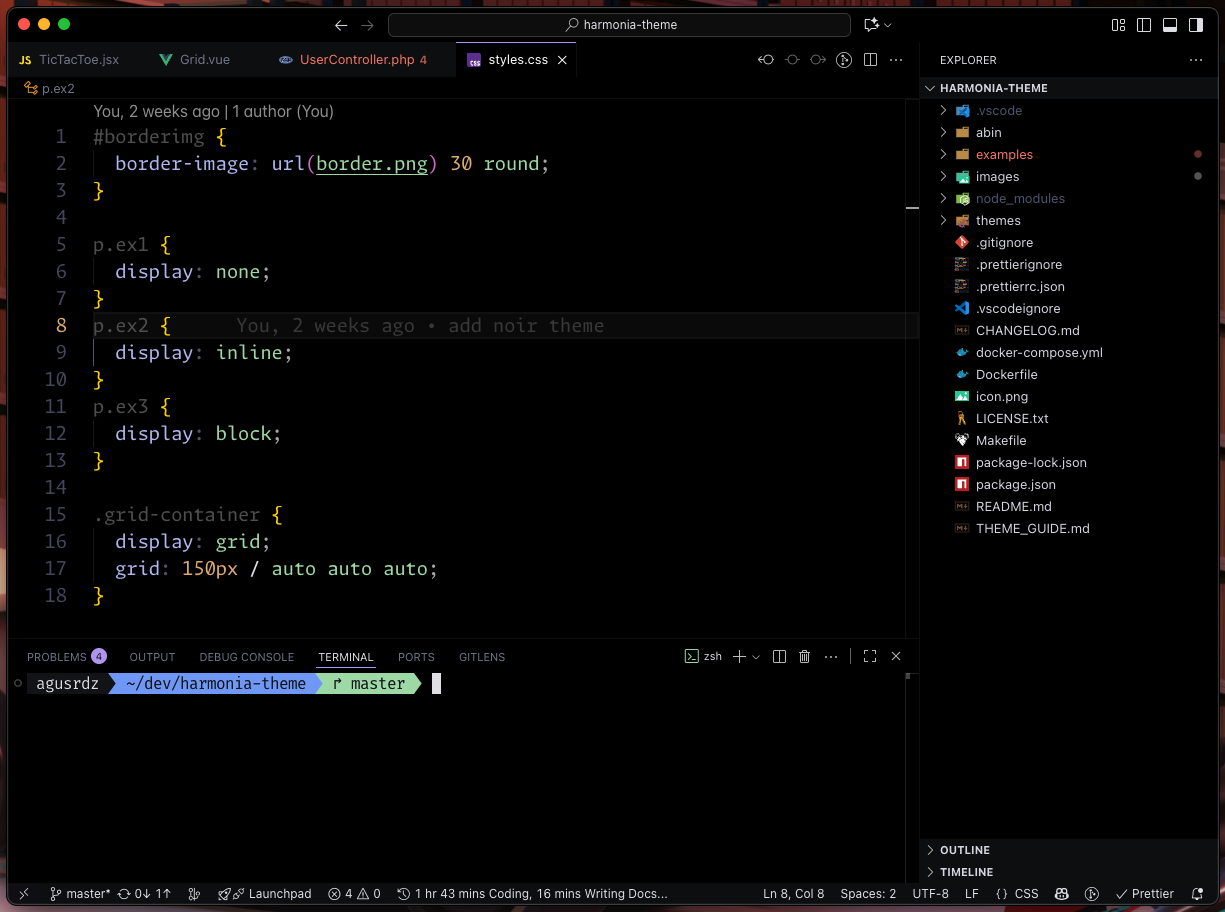
Harmonia Light
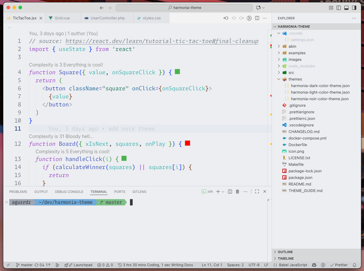
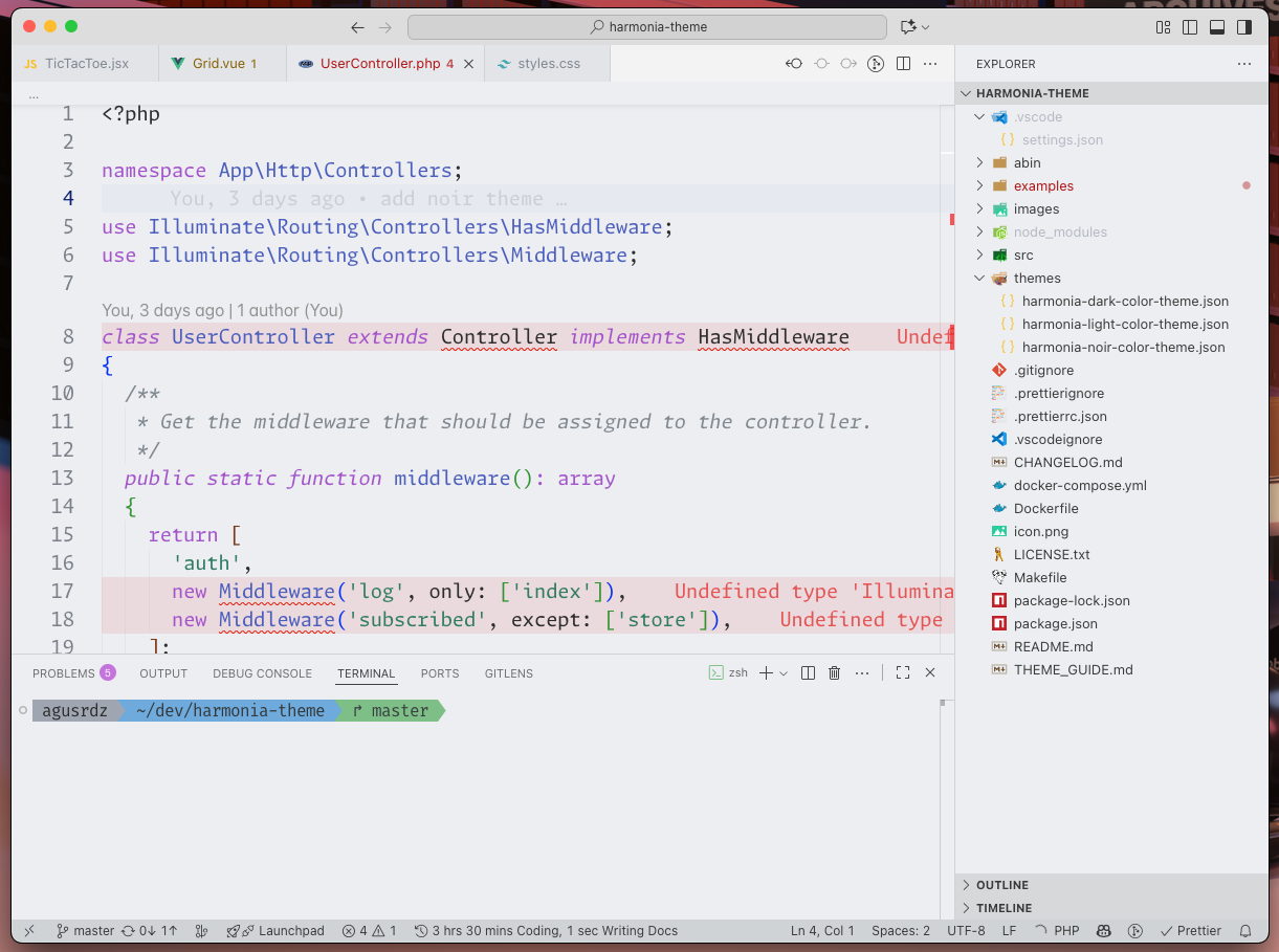
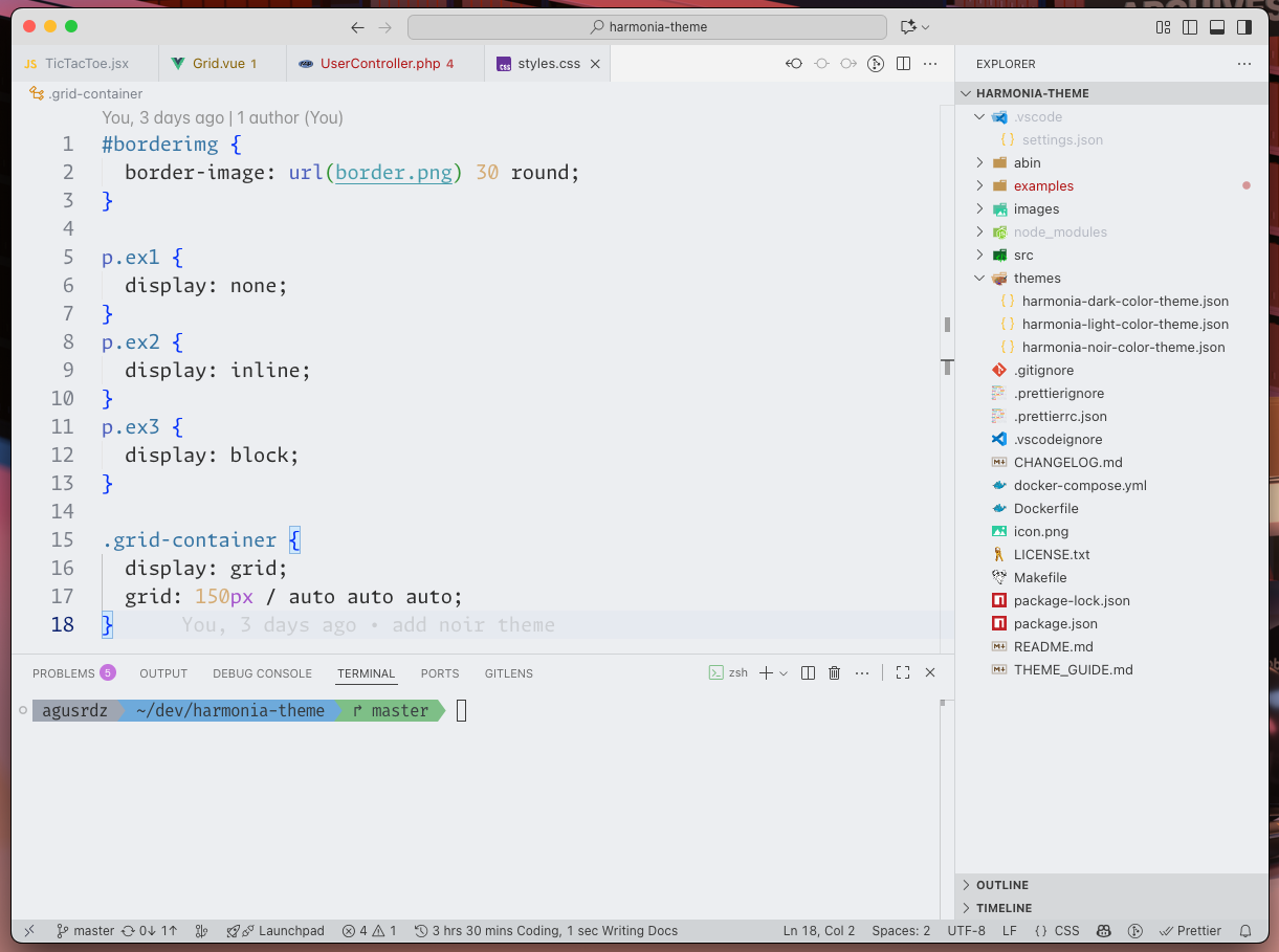
Harmonia Daybreak
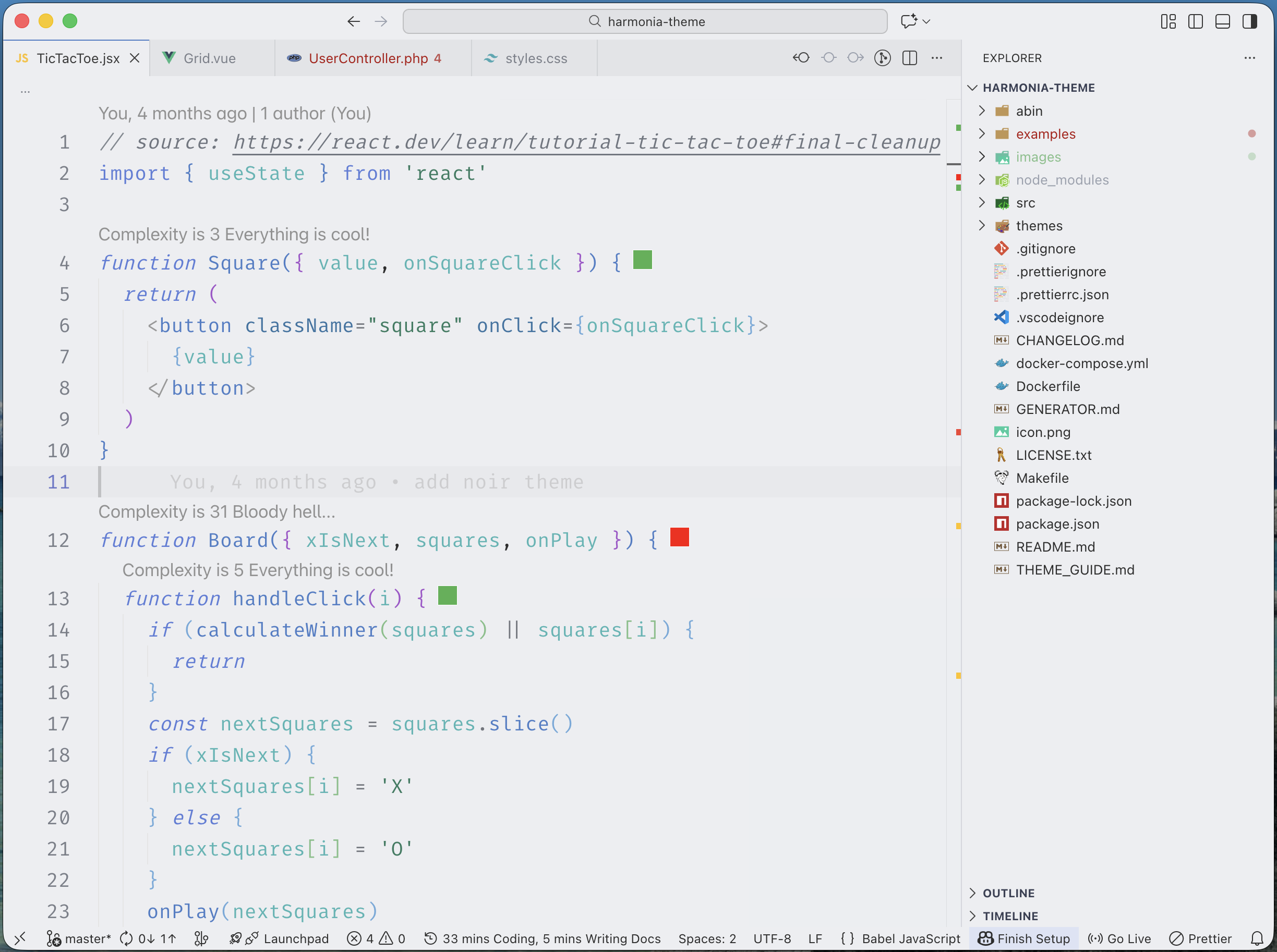
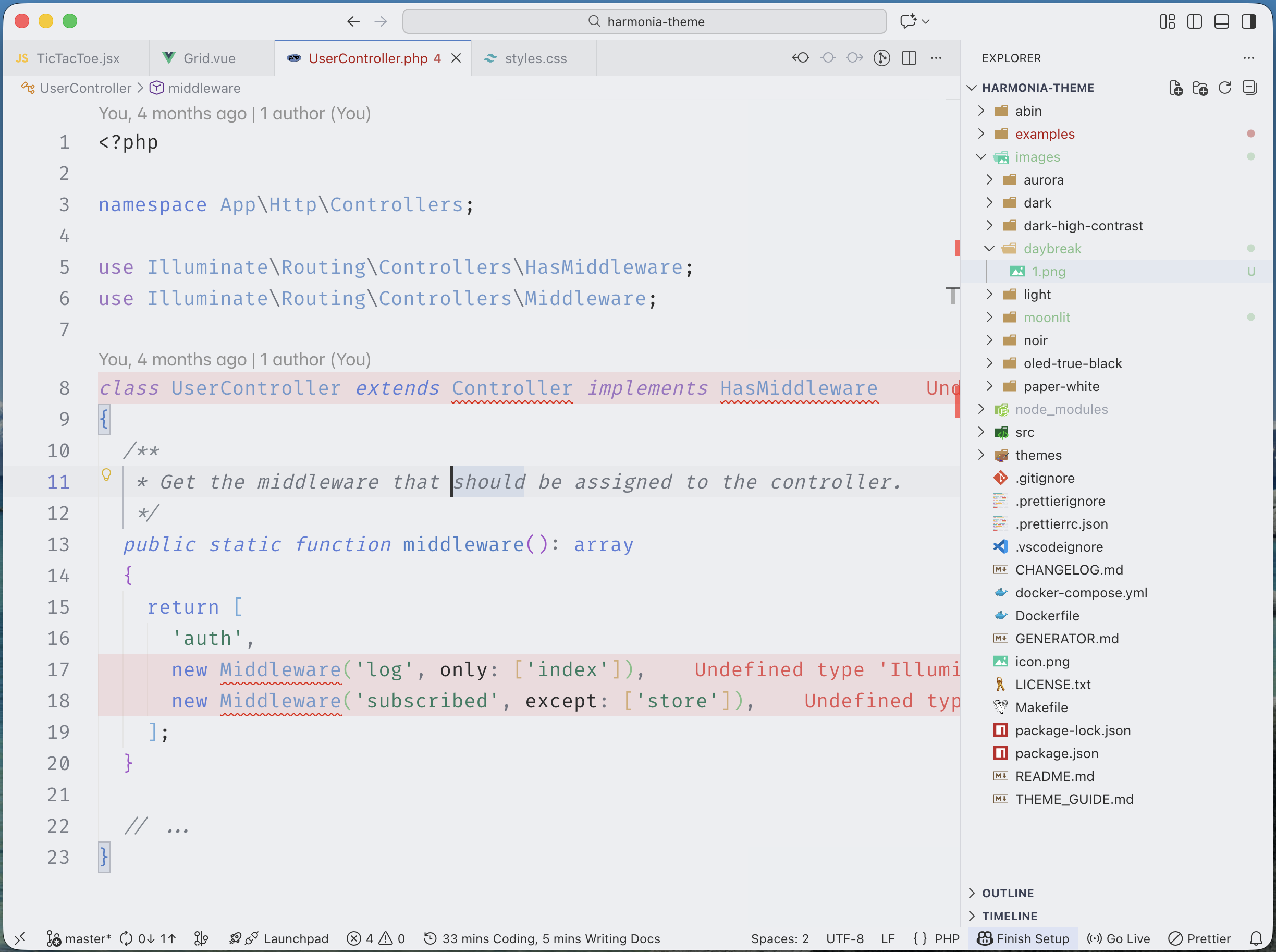
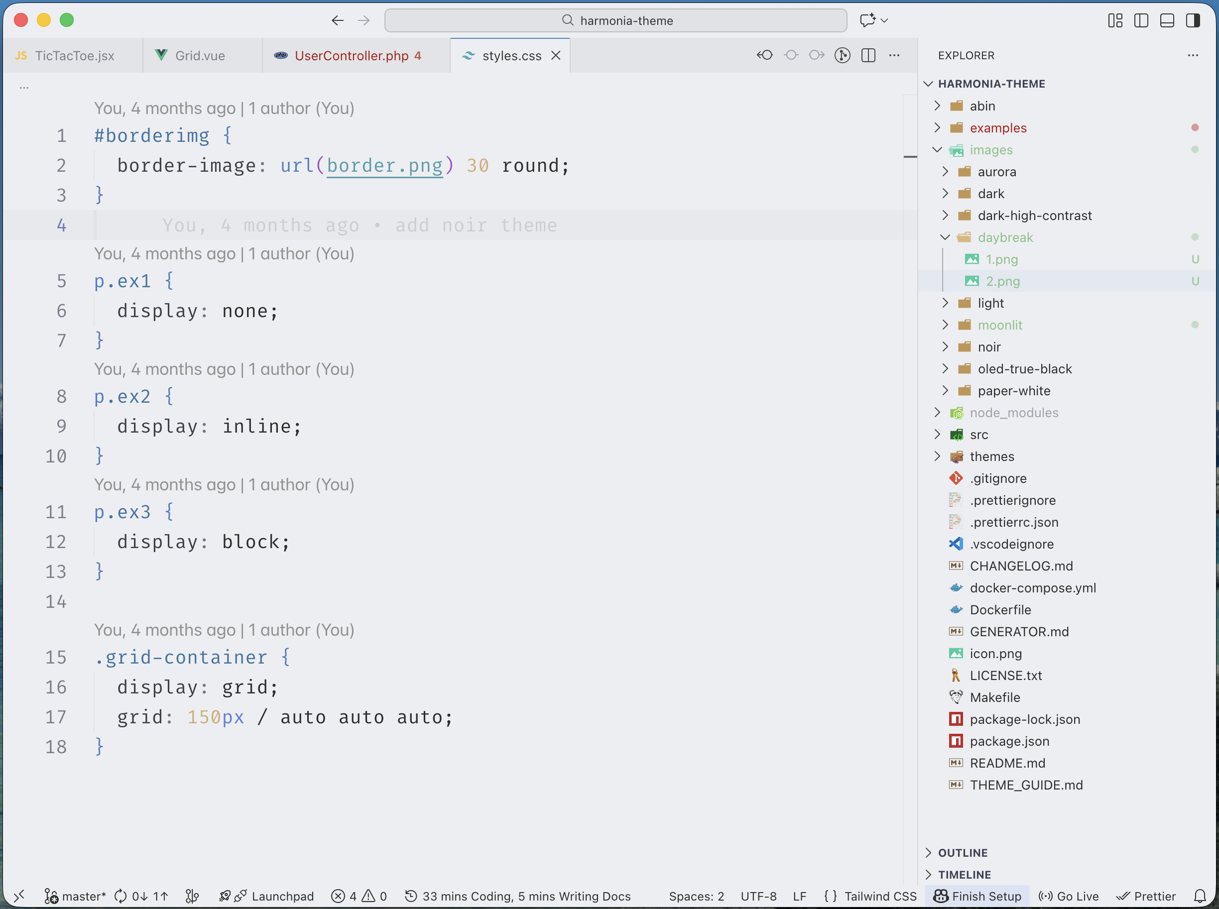
Harmonia Paper White
License
Harmonia is released under the MIT License.
Use, modify, and share it freely.
Feedback is always welcome! This started as a personal project for my
own daily coding, and I'm happy to share it with anyone who finds it
useful.
Suggestions are appreciated - updates are not guaranteed, but the
theme will continue to evolve with time.
| |
