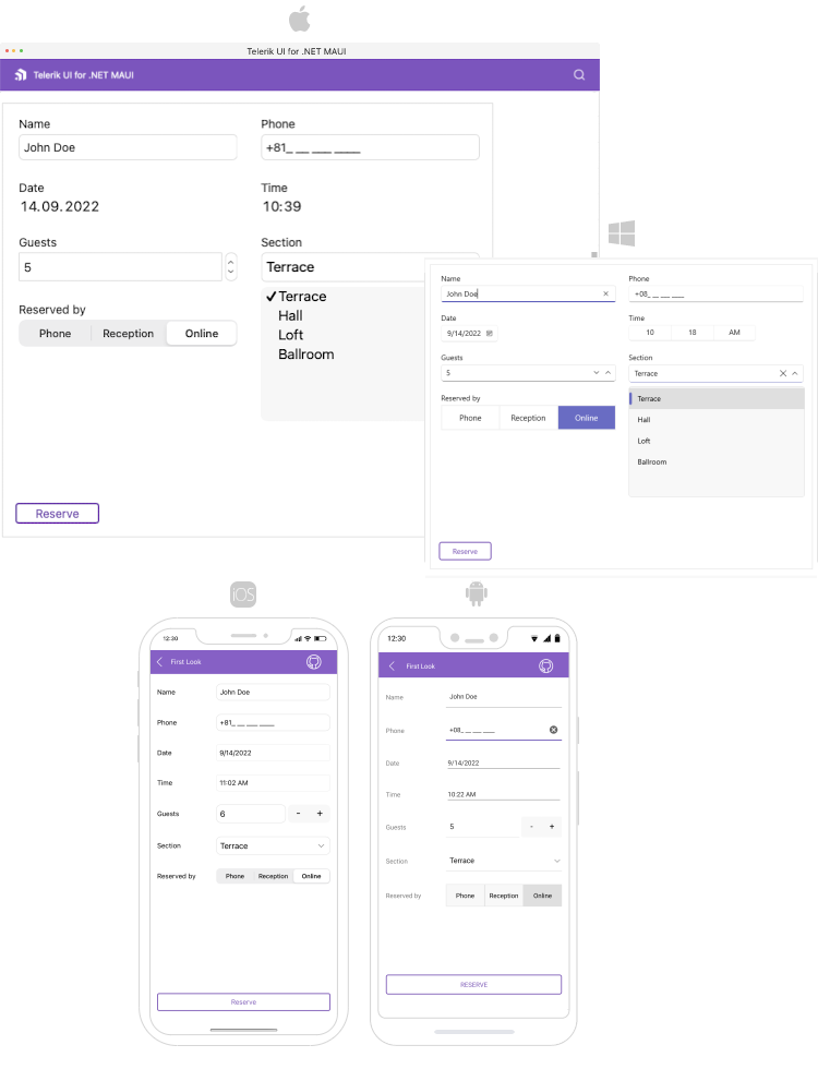
OverviewThe Telerik UI for .NET MAUI DataForm control helps you quickly and easily create forms for collecting or editing business data in both mobile and desktop applications from a single shared codebase. It features editors, commit modes, validation support, grouping, different layouts and more. Adding validation to your forms is easy, and you can take advantage of different commit modes to commit property values one by one or the whole form at the same time. You can make large forms more manageable thanks to the rich set of built-in editors and organize them by grouping UI elements. The flexible styling API enables you to customize most aspects of the DataForm control, including editors, groups, headers, control look and more.
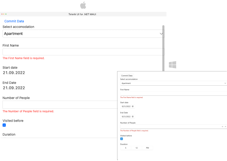
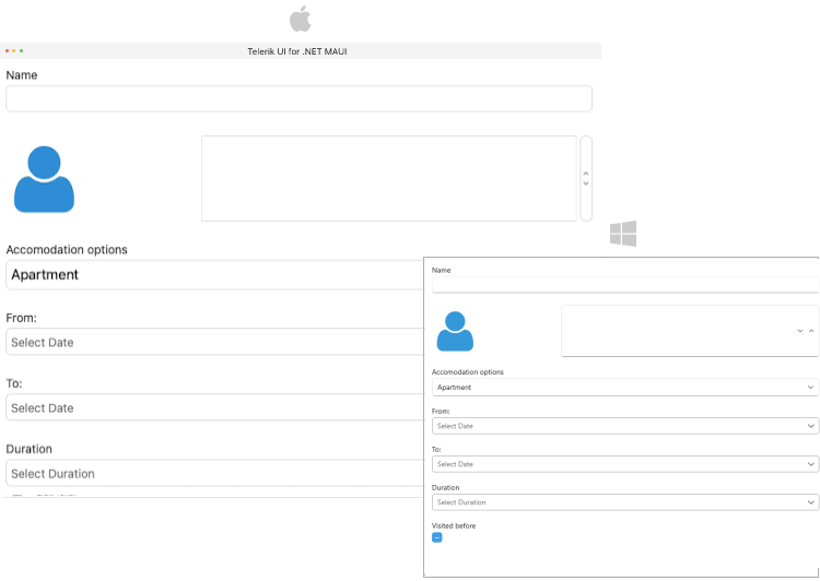
Two-Way Data BindingWith two-way data binding, when the source properties are updated outside of the control, they are still kept in sync with the DataForm editors, enabling you to solve a wide range of scenarios. Built-In EditorsThe DataForm control provides a set of built-in editors for the available primitive types such as numeric, string, Boolean, enumerations, DateTime and TimeSpan. The control detects the object’s data types and automatically displays the appropriate editors. You can make the DataForm fit seamlessly into your application by customizing the appearance of its editors. ValidationWith built-in validation, you have full control over the data collected through the DataForm. According to your specific scenario, you can choose between three different validation modes. Additionally, you can also style and customize the validation and error messages.
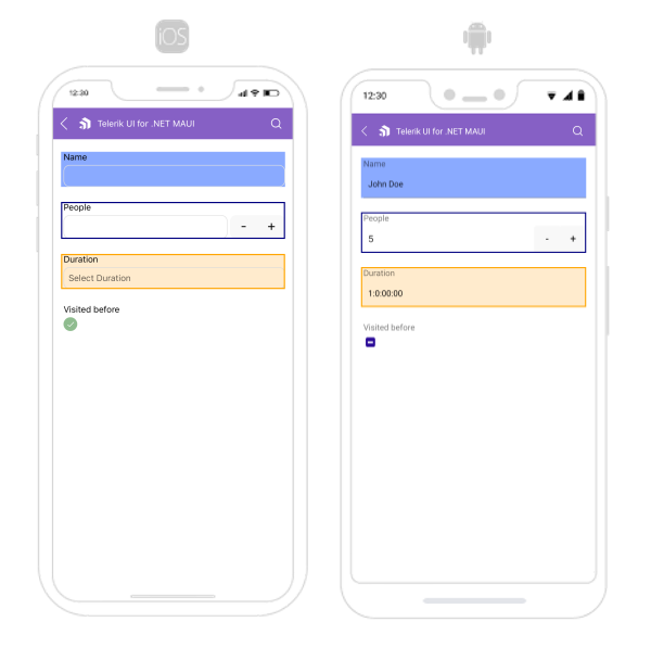
GroupingWhen the grouping feature is enabled, users can focus on the groups they need and ignore the items that are not relevant to them. The DataForm supports different group layouts that can be applied with ease via a single property. LayoutsThe DataForm supports different layouts that allow you to arrange the editors. You can use the predefined layouts or create a custom one.
Commit (Editing) ModesThe Telerik UI for .NET MAUI DataForm component for Telerik UI for .NET MAUI comes with three commit modes.
HeadersThe Telerik UI for .NET MAUI DataForm component editors have group headers. You can apply various configurations such as setting the header text, length, position, image, display options and more.
StylingThe Telerik UI for .NET MAUI DataForm is especially flexible in terms of styling.
Related Links
Are You Planning a Complex or Multi-Platform Project Soon?If Yes, Take a Look at Our Best Value OfferTelerik DevCraft is the most powerful software development tools collection for any platform and technology. It includes all Telerik .NET (MAUI, UWP, Xamarin, WPF, WinForms, WinUI, Blazor, ASP.NET Core, ASP.NET MVC, ASP.NET AJAX) and Kendo UI JavaScript (Angular, React, Vue, jQuery) UI component libraries for web, desktop and mobile, embedded reporting and end-to-end report management solutions, document processing libraries, automated testing for developers, C# mocking and unit testing tools. DevCraft will arm you with everything you need to deliver outstanding applications in less time and with less effort. With award-winning technical support delivered by the developers who built the products and a ton of resources and training, you can rest assured that you have a stable provider to rely on for your everyday challenges along your software development journey. More than 270,000 customers from 100+ countries trust us to move their business forward by relying on our components and tools. |