Skip to content
| Marketplace
Sign in
Visual Studio>Controls>Progress KendoReact Data Grid (Table) Component
Progress KendoReact Data Grid (Table) Component

Progress KendoReact Data Grid (Table) Component

Telerik

|
84 clicks
| (0) | Free Trial
The KendoReact Data Grid (Table) provides 100+ ready-to-use features covering everything from paging, sorting, filtering, editing, and grouping to row and column virtualization, export to PDF and Exce
Get Started

Overview

The React Data Grid, part of KendoReact, is one of the most powerful grid components available to React developers, with features such as live data loading, export to Excel & PDF, flexible selection options, a variety of column interactions and sticky columns, virtualization, as well as the ability to handle thousands and hundreds of thousands of data items. Aside from that, the React data table has interactive capabilities like presenting hierarchical data, column and context menus to give extra functionality depending on currently chosen rows or columns, possibilities for custom layout, and much, much more. Check out its entire feature set down below!

See React Data Grid Overview demo

react-data-grid-component-overview.jpg

Data Operations

  • Local Data Operations - React Data Grid enables you to sort, filter, group your data locally.

See React Data Grid Local Data Operations Demo

  • OData Server Operations - You can sort, filter, or paginate the data to which the Grid is bound via the OData service.

See React Data Grid OData Server Operations Demo

Editing

Allowing users to modify data items is a typical use case for the KendoReact Grid, which is why the React data table supports multiple options to change a data item. These include the ability to alter the value of a single cell by clicking into it, putting the full row in edit mode by clicking on an Edit button or action item, and updating data in a form hosted outside of the React Data Grid.

See React Data Grid Editing demo
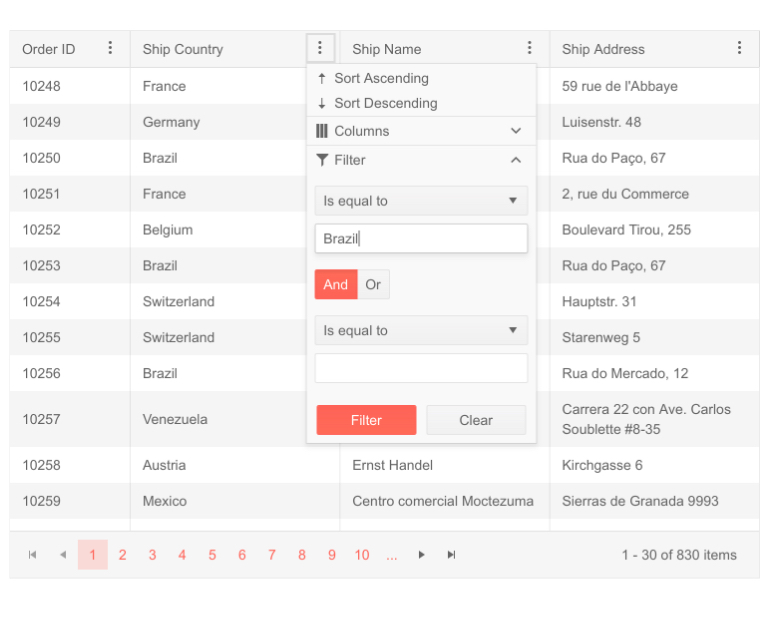
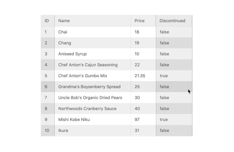
react-data-grid-component-editing.jpg

Filtering

End-users may instantly slice and dice data depending on any filter expression thanks to the KendoReact Grid's powerful filtering user experience. The React Data Grid can be modified to provide a custom component to handle filtering, with features such as a dedicated filter row or a filter menu that shows when clicking a filter symbol in a column header.

See React Data Grid Filtering demo
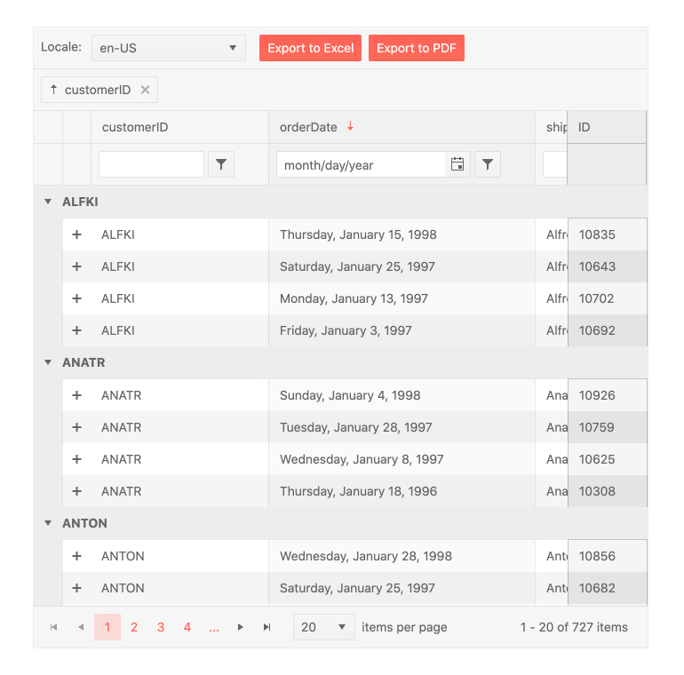
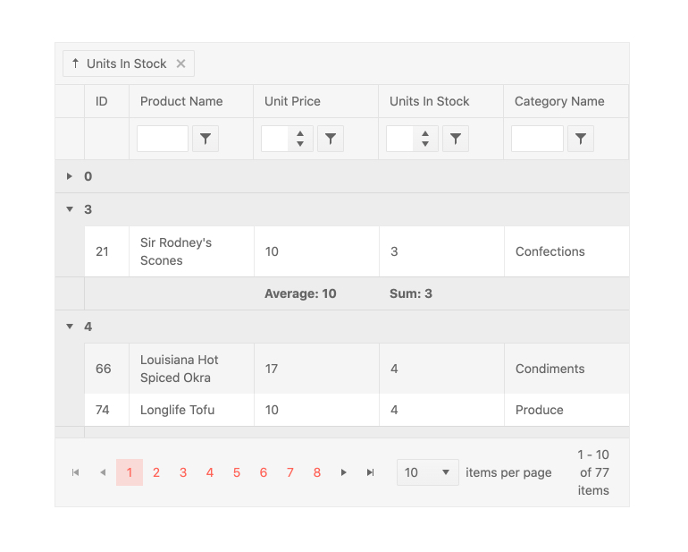
react-data-grid-component-filtering.jpg

Grouping & Aggregates

The KendoReact Data Grid enables you to display grouped table data. You will be aid by the following the grouping utilities:

  • Grouping Columns Dynamically - You can implement a dynamic grouping to any column via a simple property.
  • Persist Grouping - The state of the KendoReact Data Grid's groups will be preserved throughout data operations thanks to the persist grouping functionality. When users page, filter, or sort data, the expanded or collapsed state will persist.

See React Data Grid Persist Grouping demo

  • Expand and Collapse All Groups - The KendoReact Data Table supports various methods for expanding and collapsing all accessible groups, allowing developers to programmatically modify the Data Grid's group expansion status or give a personalized user experience.

See React Data Grid Expand and Collapse All Groups demo

  • Aggregates - Data Grid enables you to visualize the aggregates for the grouped data in the respective column group footer of the component.

See React Data Grid Aggregates demo
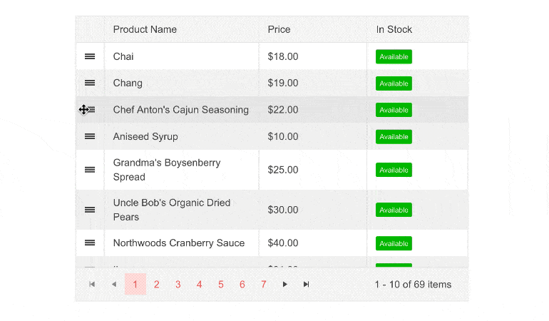
react-data-grid-component-grouping.jpg

Paging

The Paging functionality allows dividing a KendoReact Data Grid into discrete pages thus easing the user in navigating into vast amounts of data.

  • Pager Types - Numeric (renders buttons with numbers) and Input (renders an input field for typing the page number). End-users may page through data with a set page size that can be adjusted on the fly, as well as use intuitive controls to browse between next and previous pages and choose a specific page based on a page number. Paging may be enabled in the React Data Grid with a single configuration parameter. Paging reduces the quantity of data presented at once, which improves page speed and keeps viewers focused on the given data set.

See React Data Grid Paging demo

  • Custom Pager - Whether a React developer employs the built-in user experience for paging over data inside the KendoReact Data Grid or if design needs call for a fully bespoke user experience while paging—with the React Data Table, everything is possible. To guarantee that the paging mechanism of the KendoReact Data Table meets all needs, the UI components responsible for paging may be totally modified using a custom renderer.

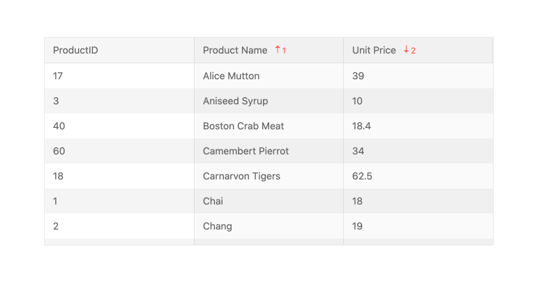
See React Data Grid Custom Pager demo

Sorting

When sorting is enabled in the KendoReact Grid, any column may be sorted ascending or descending by clicking on its header. Multiple clicks will cycle among ascending, descending, and unsorted options. The KendoReact data table may be presorted, allowing you to specify which columns to sort and in what order ahead of time, and it also provides sorting over multiple columns.

See React Data Grid Sorting demo
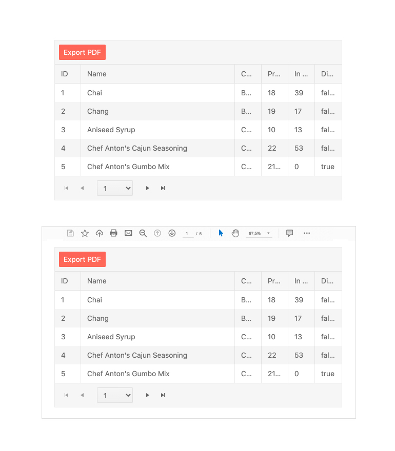
react-data-grid-component-sorting.jpg

Export to Excel & PDF

The React Data Grid integrates with the KendoReact library's Excel and PDF Export libraries. Thanks to this, every part of the table can be exported to Excel or PDF with a single click. With a plethora of configuration choices at their disposal, developers may choose whether to simply export the current data set presented or the whole data set. For even more flexibility, the exported file can be altered on-the-fly.

See React Grid Export to Excel & PDF demo
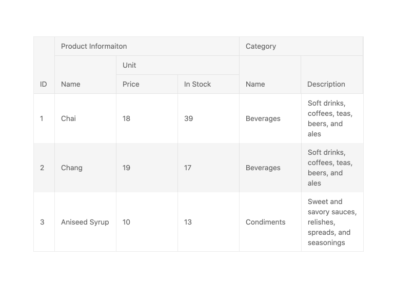
react-data-grid-component-export-to-pdf.jpg

Columns

The React Data Grid is packed with column-related features that will ease your life.

  • Column Interactions - Any column in the KendoReact Grid can be resized, reordered, dragged to be grouped, and toggled between showing and hiding. Each option can be applied to all columns in the data table as a whole or defined column by column.

See React Data Grid Column Interactions demo

  • Multi-Column Headers - The underlying data model related to the Data Grid ties column headings to data fields. Because some fields may not make sense on their own, end users may find it useful to aggregate these columns into a category, which is where the React Grid's Multi-Header Columns functionality comes in handy. This enables column headings to span several sub-columns, so arranging the data in the data table and allowing column interactions to be applied to the entire set of columns at once.

See React Data Grid Multi-Column Headers demo

react-data-grid-component-multi-column-headers.jpg

  • Locked (Frozen) Columns - Frozen (also known as locked or sticky) columns can be added to both the left and right edges of the table using the KendoReact Grid. These can be set up in advance, added dynamically by the user within the Data Grid, or applied externally. Furthermore, the React data table supports sticky columns, which are added to the frozen columns list as they are scrolled in to view and may be removed by scrolling back to their original location.

See React Data Grid Locked Columns demo

react-data-grid-component-frozen-columns.gif

  • Column Menu - The KendoReact Data Grid supports multiple interactions through a menu that appears when users interact with the header of a column. Users can easily sort or filter individual columns via the column menu and effortlessly group and ungroup columns with a single click. Additionally, you can implement complex scenarios in the menu and meet the specific requirements of your project.

See React Data Grid Column Menu demo

  • Column Auto-Size - When column auto-sizing is enabled, double-clicking the resize handler in the column header will resize the column to the minimum available width while keeping all content visible. This common Excel-like behavior may also be implemented as an automatic grid configuration using the fitColumns technique.

See React Data Grid Column Auto-Size demo

  • Row and Column Virtualization - The React Data Grid Virtualization functionality is a must-have for scenarios that need loading thousands or hundreds of thousands of data objects all at once. The KendoReact Data Grid will provide buttery-smooth scrolling over rows and columns without breaking a sweat by recycling components on the page as users browse horizontally or vertically.

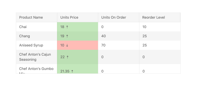
See React Data Grid Row and Column Virtualization demo

Cells

The KendoReact Grid includes default elements for displaying information in cells as well as UI components that may be used when editing data items, such as a React DatePicker for any field that is tied to a date. In circumstances where greater customization is required, every cell inside the React data table may utilize a custom renderer in both read and edit modes, giving developers complete control over what is displayed within the KendoReact Grid.

You can customize the cell content by defining different types of cells.

Types:

  • Grid cells
  • Filter cells
  • Header cells
  • Footer cells
  • Custom cells

See React Data Grid Custom Cells demo
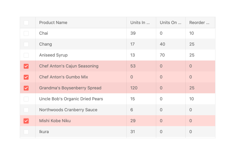
react-data-grid-component-custom-cells.jpg

Keyboard Navigation

While the KendoReact Grid is an exceptionally sophisticated component with a plethora of functions, traveling around the data table with just a keyboard is a pleasure thanks to the KendoReact Data Grid's built-in keyboard navigation functionality. End users can interact with any part of the data table using only their keyboard using this functionality.

See React Data Grid Keyboard Navigation demo

Selection

The KendoReact Grid supports selection in a variety of ways, such as the ability to pick rows and create a distinct highlighted look, or to add a selection column with checkboxes that provides a simple method to interact with selecting and deselecting a row. The selection may be made programmatically, and the KendoReact data table has methods for extracting and interacting with the selected rows.

See React Data Grid Selection demo

react-data-grid-component-selection.jpg

Rows

  • Detail Rows - When some rows in the React Grid are extended, they may require extra information, which is where the Detail Rows feature of the KendoReact data table shines. This feature lets developers connect a custom renderer to the content section displayed when a row is expanded, allowing them complete control over what is displayed in this region.

See React Data Grid Detail Rows demo

  • Row Pinning - KendoReact Data Grid rows can be pinned or locked at the top and bottom of the Data Table. When a row is pinned, it remains in place while the user scrolls through the remainder of the React Data Grid's content. Row pinning can be accomplished programmatically or as an interactive UI element within each data row.

See React Data Grid Row Pinning demo

  • Reordering of Rows - The KendoReact Grid allows manual reordering of rows via drag & drop functionality. The drag & drop can be combined with the multy-row selection thus enabling advanced reordering scenarios.

See React Data Grid Reordering of Rows demo

react-data-grid-component-drag-and-drop-rows.gif

  • Hierarchy - The KendoReact Grid may have an infinite number of parent and child tables thanks to the built-in Hierarchy functionality. Each level of the hierarchy can be presented as a React data table, with all of the same capabilities like sorting and paging as the parent table, or it can be tailored to showcase a restricted range of features based on the requirements of that level of the hierarchy.

See React Grid Hierarchy demo

Accessibility

Accessibility is one of the KendoReact library's key foundations, and it can be observed in all available React UI components. In this manner, the KendoReact Grid is AAA certified with WCAG 2.0 and is Section 508 and WAI-ARIA compatible.

See React Data Grid Accessibility demo

Globalization

Globalization process combines the translation of component texts (localization) and their adaptation to different cultures.

See React Data Grid Globalization demo

  • Internationalization - Process that applies specific culture format to an application.
  • Messages - The Grid provides build-in message keys with default values and allows you to change them as according to your needs.
  • Right-to-Left Support - KendoReact Grid offers right-to-left functionality support.

React Data Grid Video Demos

Guided Tour of the KendoReact Data Grid

Learn all there is to know about the KendoReact Data Grid feature set in this guided video tour led by KendoReact Product Manager Carl Bergenhem.

How to Implement the KendReact Data Grid

In this video lesson, you will learn how to use the KendoReact Grid and its various grid capabilities, including theming and style, paging, and filtering.

Related Links

  • Learn more about KendoReact and the most popular controls
  • Download Free Trial
  • Pricing
  • Online Demos
  • Community Forums
  • Data Grid component is also available for Blazor, ASP.NET Core & Angular

Are You Planning a Complex or Multi-Platform Project Soon?

More than 270,000 customers in 100+ countries, trust us to move their business forward by relying on our controls and tools for web (React, Angular, jQuery, Vue, ASP.NET AJAX, ASP.NET MVC, ASP.NET Core, Blazor, Silverlight, PHP, JSP), mobile (.NET MAUI, Xamarin), desktop development (WinUI, WinForms, WPF, UWP), reporting and mocking (Reporting, Report Server, JustMock), automated testing (Test Studio, Test Studio Dev Edition), CMS (Sitefinity), document management (Telerik Document Processing), UI/UX design (Unite UX), debugging (Fiddler Everywhere, Fiddler Classic, Fiddler Jam, FiddlerCap, FiddlerCore), extended reality (UI for Unity XR), free tools (JustAssembly, JustDecompile, VB.NET to C# Converter, Testing Framework). Learn more at Telerik.com.

  • Contact us
  • Jobs
  • Privacy
  • Manage cookies
  • Terms of use
  • Trademarks
© 2025 Microsoft