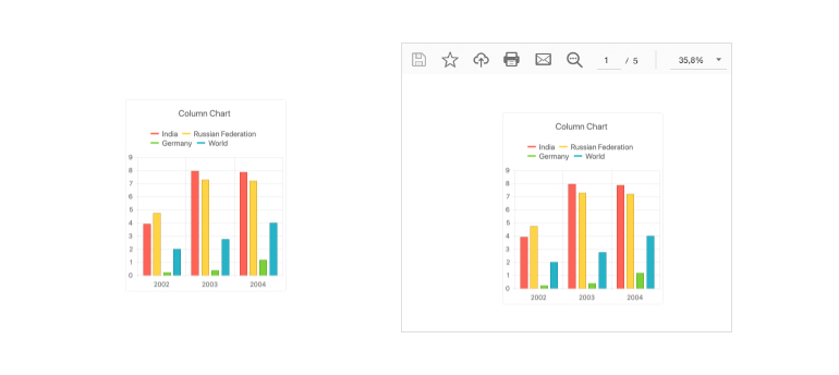
OverviewThe React Charts library within KendoReact is a robust data visualization tool that can be used in any React application. It includes over 16 distinct types of charts, all of which feature built-in support for interactions, tooltips, zooming and panning, and much more. This React chart library was created from the ground up and is 100% React. Each chart may be displayed as an SVG or a Canvas element, specified by a single attribute, and exported to a variety of formats such as an image or a PDF.
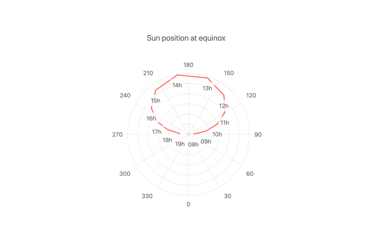
Extensive List of Chart TypesThe KendoReact Chart library comes with a large number of chart and series types. They function well as separate series types, and many of them may be combined and displayed in a single chart. The following chart types are available:
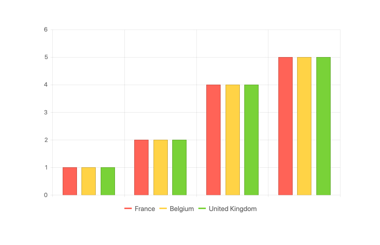
Binding to Different Data TypesThe KendoReact Chart may be tied to a variety of data types, ranging from simple arrays with X and Y values to more complicated data types and objects with fields reflecting the values to be shown. Furthermore, the React Chart can be easily bound to dates and includes built-in methods for controlling which days or months should be displayed on the axis. See React Charts Data Types Binding demo Multiple Axes and Chart Series on the Same PlotA classic chart has a single series and an X and Y axis that starts at zero. The KendoReact Chart is ideal for scenarios that demand numerous series in the same chart, such as having various axes showing distinct values and scales. Defining numerous series or multiple axes is as simple as defining your first.
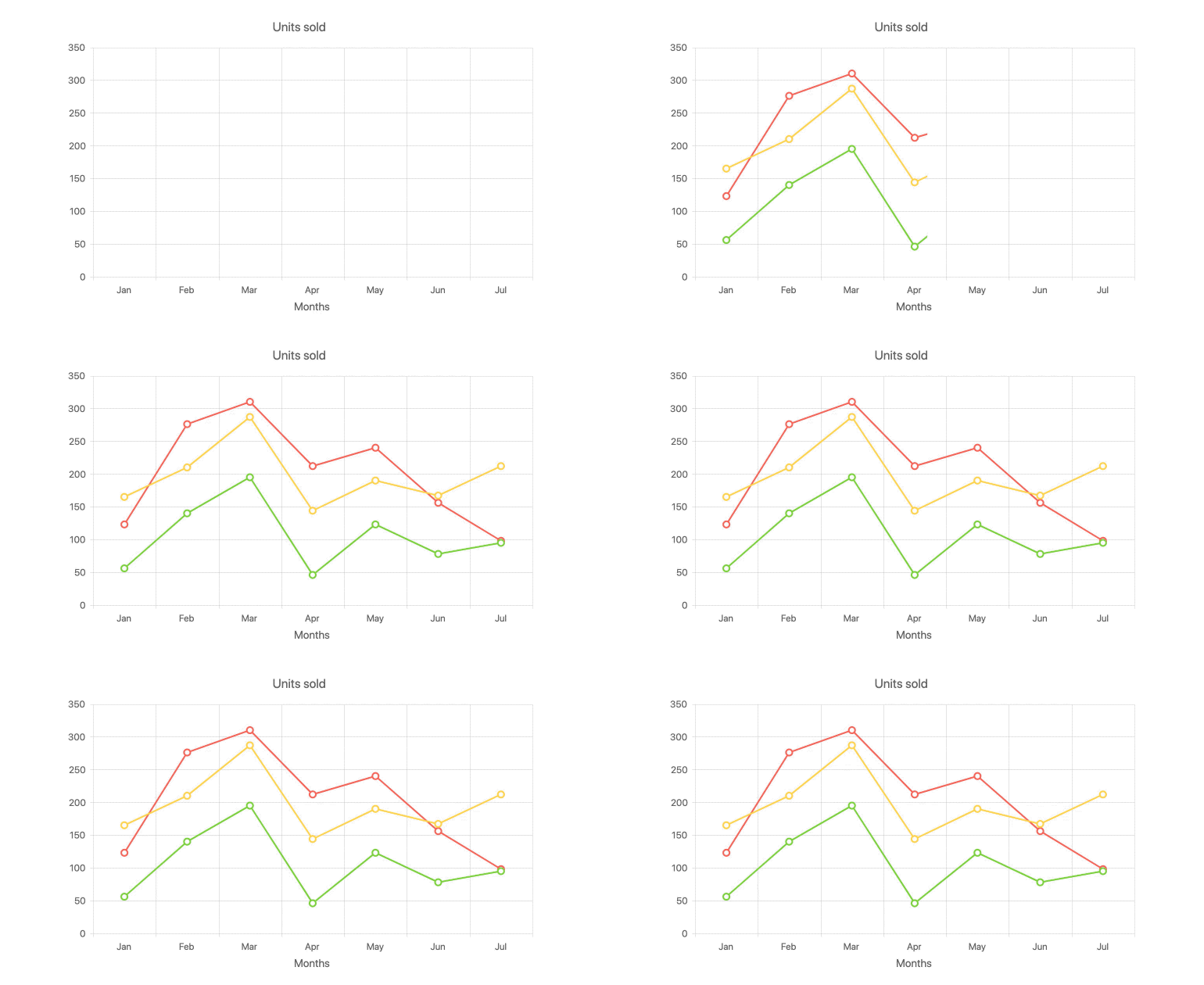
Chart AnimationsData visualization is more than just presenting data. Animating a series as it renders from lowest to highest value or allowing bars to animate-in one at a time, are all tiny steps that can be taken to make any chart stand out—and be aesthetically appealing to end users. The KendoReact Charts include built-in animations that are activated by default; however, each animation can be fully controlled and switched on or off at the granular level.
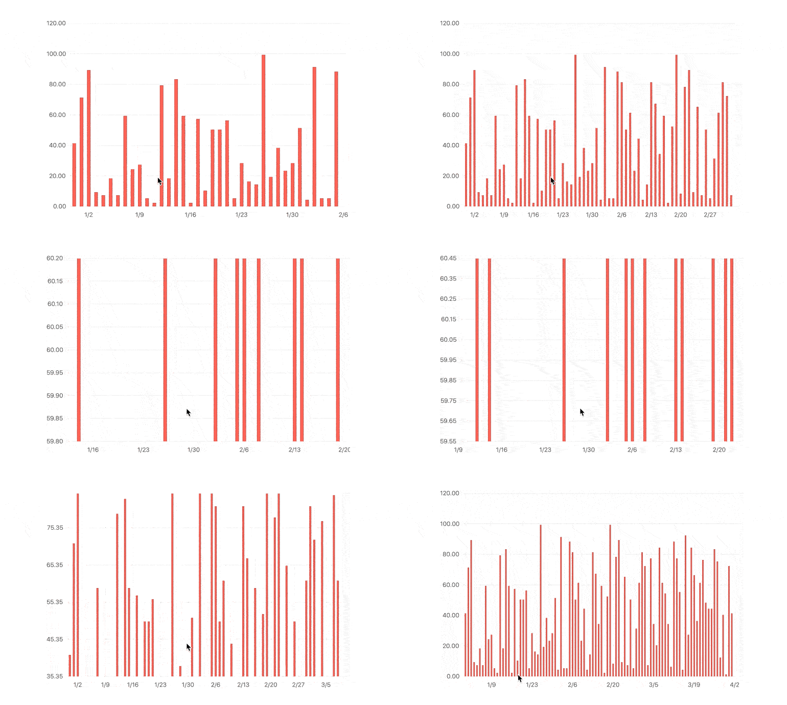
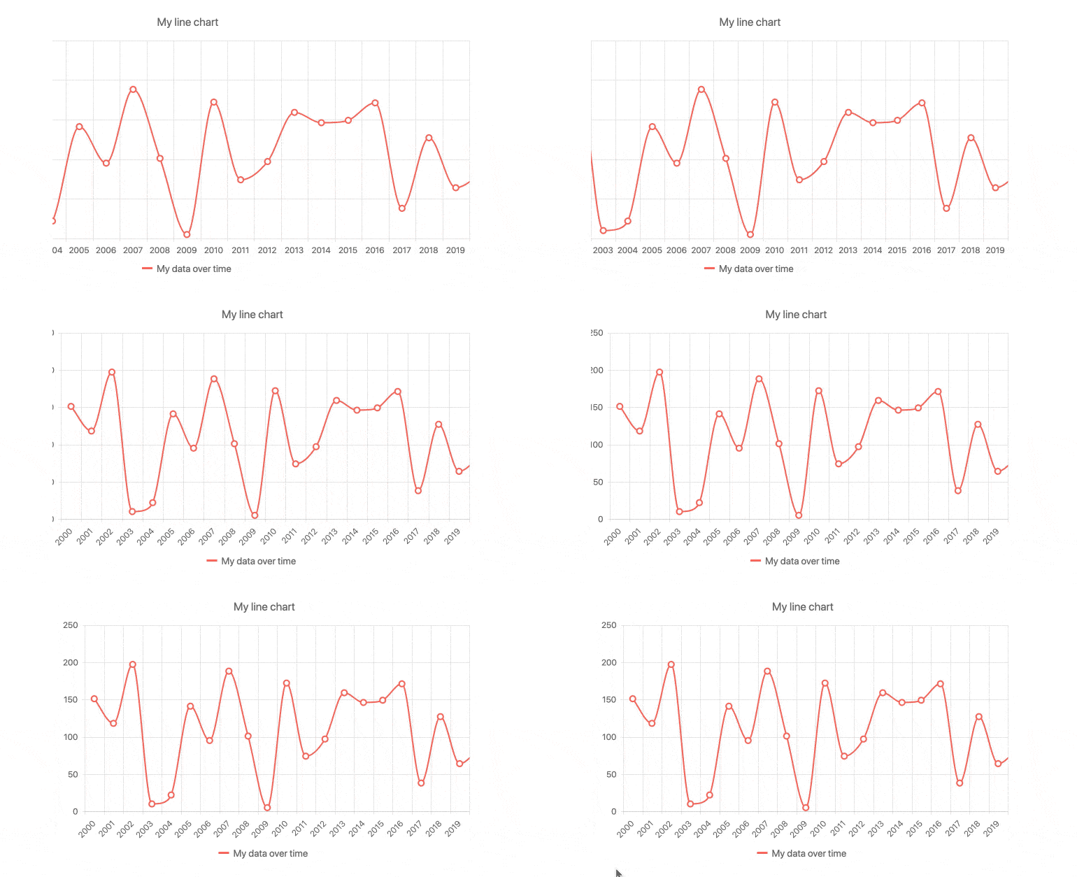
Panning & ZoomingWhen dealing with enormous amounts of data, it may not always be possible to represent everything in a single chart area. This is when features such as panning and zooming come in handy. Panning allows users to easily move through enormous amounts of data by scrolling horizontally over an axis and sliding left and right. Zooming in and out of a chart area may be accomplished by using the mouse's scroll wheel or by choosing an area on the KendoReact Chart. See React Charts Panning and Zooming demo
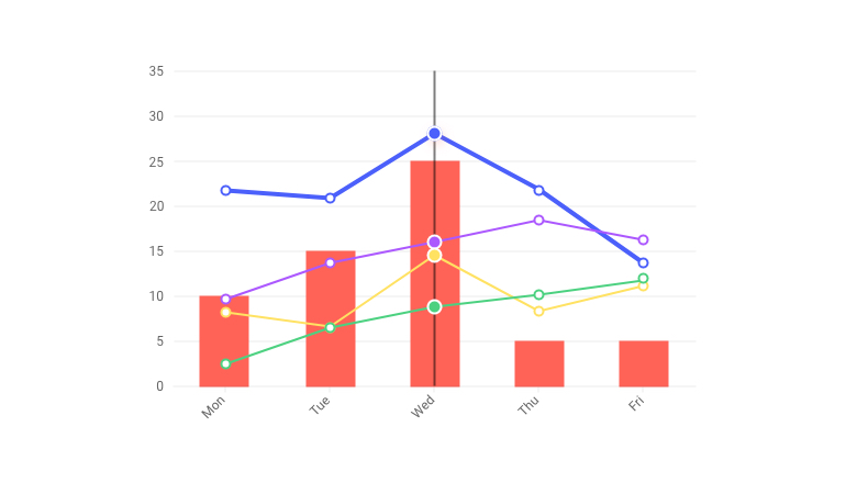
Chart ElementsThe KendoReact Chart's construction is divided down into numerous pieces. These include the axes, chart area, labels, legends, plot bands, title, and other chart elements. Developers may edit and interact with any part of the chart thanks to this breakdown. TooltipsThe KendoReact Charts have built-in support for tooltips across all chart types. This React Tooltip can appear when the mouse is hovered over certain spots on the chart, or it can be displayed continuously along a set of crosshairs as users move the mouse over the chart area. These tooltips are often connected to a field from the underlying data model, but they may be altered to have a fully unique style by using a custom renderer for the tooltip element. See React Charts Tooltips demo
LabelsLabels may be seen throughout the KendoReact Chart, including adjacent to series data points inside the chart area and on each of the displayed axes. These labels may be readily altered by accessing the built-in features of each label, and each label is separated down into a component within the React Chart to make it as easy to modify the particular labels as needed.
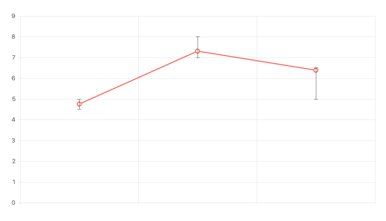
Error BarsA data point depicted in a chart may have a margin of error and actually fall within a range of possible values in some scenarios. React Error Bars are useful in this situation. Values can have a specified high and low field associated with them in the KendoReact Chart, allowing an indication to identify where the displayed data point falls within a range of potential values. See React Charts Error Bars demo
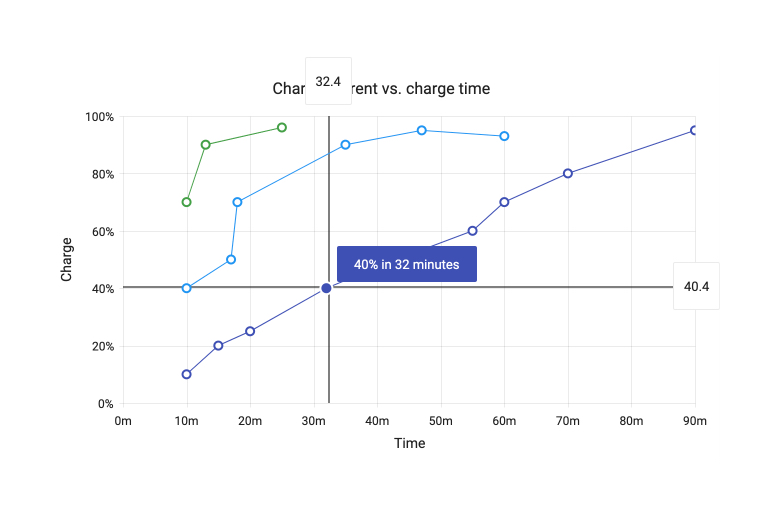
CrosshairsIt might be difficult to see a precise X and Y value of a data point in a crowded or huge graphic. Lines spanning the X and Y axes follow the mouse pointer and display the current X and Y values along the way, thanks to the React Chart's built-in Crosshairs functionality. Setting a single attribute of the React Chart library is all it takes to enable this feature. See React Charts Crosshairs demo
LegendThe Legend Area of KendoReact Charts may be created automatically depending on the series connected to the Chart, providing a concise depiction of which series and data are associated with which hue and type. The React Chart Legend also has interactivity, such as the ability to show or hide series in the cart by clicking on their names.
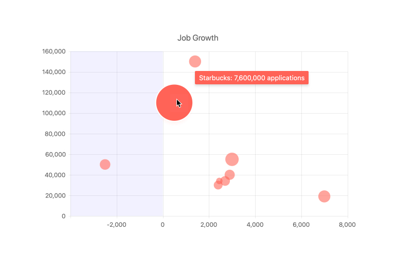
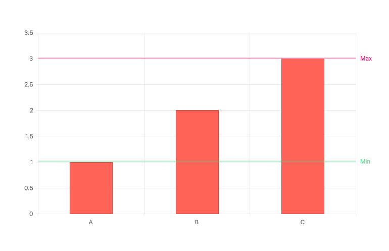
Plot BandsPlot Bands allow you to emphasize a specified range on any axis (both X and Y) to highlight more information about the series you're looking at. This is handy for showcasing a range of good or bad numbers, or just drawing attention to a certain section of the React Chart. There is no limit to the number of various plot bands that may be set in a single chart using the KendoReact Chart library. See React Charts Plot Bands demo
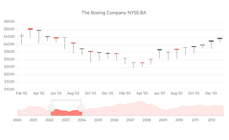
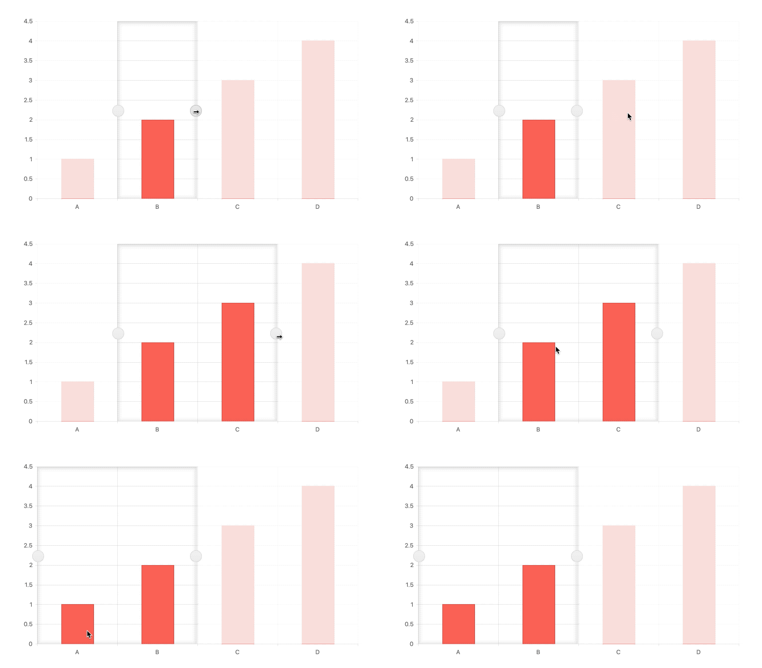
SelectionA built-in user experience for selecting a single data point or a range of data inside the KendoReact Chart is included. A single property may be used to allow selection, which displays a visible region to represent the chart's current selection. The built-in drag handles, the scroll wheel, clicking elsewhere in the chart area, or dragging the selection region around can all be used to change the selection. The data points you want to utilize may then be extracted programmatically and used elsewhere in your React project. See React Charts Selection demo
Responsive Design SupportWhile KendoReact Charts are most commonly seen on desktop browsers, they may also be seen on mobile devices. The KendoReact Charts feature built-in functionality for handling resizing and responsive design, in addition to producing the charts as usual. This contains functionalities such as rotating labels on multiple axes and shrinking content shown inside the chart area to match the available space - all of this without the necessity to write any additional logic.
Canvas & SVG RenderingData Visualization within React apps commonly comes in two forms: SVG or Canvas rendering. There's no need to choose between the two with KendoReact Charts, as our React Charts can render as both Canvas and SVG elements. It is as simple as altering a single configuration option to switch between the two. See React Charts Rendering Modes demo Custom RenderingThe KendoReact Charts library may be totally customized in every way. Customization possibilities include utilizing custom renderers, supplying custom CSS, or simply creating a template that can be reused throughout the various sections of the charts. See React Charts Custom Rendering demo Export OptionsEach KendoReact Chart may be exported as an image, PDF, or SVG element with a simple click of a button, in addition to showing data visualizations on a web page! The connection with the KendoReact Drawing package allows a single method to be called to export the full React chart and allow the end user to store the file locally. See React Charts Export Options demo
React Charts Video TutorialLearn how to use the KendoReact Charting Library to integrate React Charts into your project in less than 10 minutes. TJ VanToll prepared this simple tutorial to show how, with only a few lines of code, you can construct a nice-looking chart with animations, a title, custom axes, a chart legend, and tooltips. React Charts Tutorial with the KendoReact Chart Library (video) Related Links
Are You Planning a Complex or Multi-Platform Project Soon?More than 270,000 customers in 100+ countries, trust us to move their business forward by relying on our controls and tools for web (React, Angular, jQuery, Vue, ASP.NET AJAX, ASP.NET MVC, ASP.NET Core, Blazor, Silverlight, PHP, JSP), mobile (.NET MAUI, Xamarin), desktop development (WinUI, WinForms, WPF, UWP), reporting and mocking (Reporting, Report Server, JustMock), automated testing (Test Studio, Test Studio Dev Edition), CMS (Sitefinity), document management (Telerik Document Processing), UI/UX design (Unite UX), debugging (Fiddler Everywhere, Fiddler Classic, Fiddler Jam, FiddlerCap, FiddlerCore), extended reality (UI for Unity XR), free tools (JustAssembly, JustDecompile, VB.NET to C# Converter, Testing Framework). Learn more at Telerik.com. |


