The Kendo UI for Angular Dropdowns package is a collection of versatile Angular dropdown components. They include a variety of types and styles that have extensive configuration options. This flexibility allows you to quickly and easily create the exact dropdowns you need to fit your specific requirements for functionality and appearance. These Dropdowns are built from the ground up and specifically for Angular, so that you get high-performance drop-down controls which integrate tightly with your application and with the rest of the Kendo UI for Angular components. Components Included in the Angular Dropdowns PackageAngular DropDownList
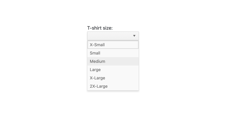
THe Kendo UI for Angular DoropDownList component component is a form component which enables users to select a single item from a popup list of options. A richer version of the HTML <select> element, the Angular DropDownList does not include an input element for typing values and instead relies on the user to select a value from the provided data list. Angular Autocomplete
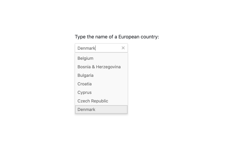
The Kendo UI for Angular Autocomplete component enables users to easily and intuitively discover, narrow down and select items from a list of available options. It will show a drop down of matching items from a list as they type charactes into the input field. Angular Combobox
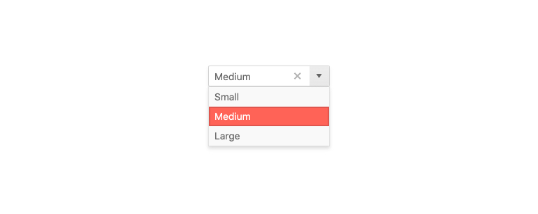
The Kendo UI for Angular ComboBox is a form component designed to let you choose a predefined value from a list of items. It operates similarly to the Select HTML element, and supports filtering, custom rendering and virtualization to give users a more comprehensive experience. Angular DropDownTree
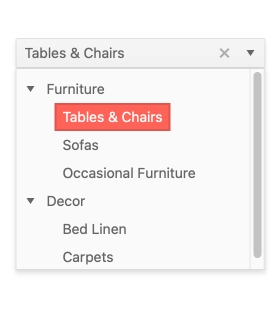
The Kendo UI for Angular DropDownTree is a form component that renders data in a tree-like structure within a DropDown component. The user can click the dropdown and then choose a single predefined value. It is a richer version of the <select> HTML element and supports data binding, filtering and templates. Angular MultiColumnComboBox
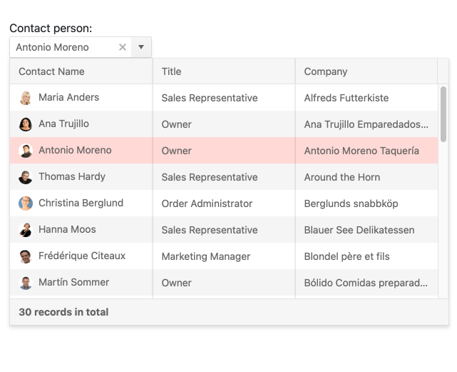
The Kendo UI MultiColumnComboBox is a form component that lets you choose from a table-structured list of options from a popup. It is a richer version of the <select> element and supports data binding, filtering, templates, and the entering of custom values. Angular MultiSelect
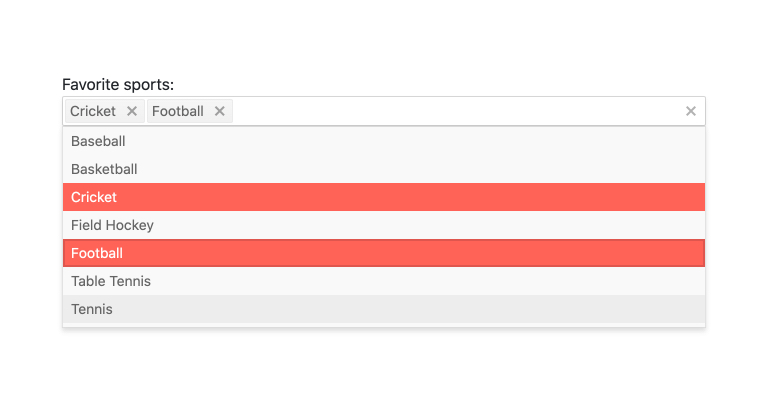
Kendo UI for Angular MultiSelect is a form component which allows users to select multiple items from a list of available options. Each selected item is rendered as a token with a built-in icon to remove the value, giving users a sleek visual interface to preview their list of selected items. Angular MultiSelectTree
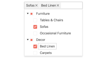
The Angular MultiSelectTree component gives you a surprisingly quick way to allow users to select one or more items from a hierarchical list of data. Much like the Angular DropDownTree, this component will automatically organize your data in a tree format and display it in a dropdown that users can easily access and select items from. The difference in the Angular MultiSelectTree is that users can select multiple values, each item displaying either as a token or text in the input element of the component. This is a valuable tool in your collection when you need on option to show complex data on limited screen space. Helpful LinksAlso Available for These PlatformsEverything You Need To Build Great Angular UIThe Kendo UI for Angular Calendar is part of the Kendo UI for Angular component library. With 100+ Components, 3 themes (standard, Material, Bootstrap), Theme Builder, and UI Kits for Figma, Kendo UI for Angular is the library professional developers rely on. See the entire list at www.telerik.com/kendo-angular-ui. Our most popular components:
|