The Kendo UI for Angular Calendar component is a form component representing a Gregorian calendar. The component allows users to quickly select a single date with just a single click. Each cell within the calendar can be completely customized and the Angular Calendar component is fully compatible with modern accessibility guidelines.
Note: The Calendar Compponent is intended for date viewing and selection, typicaly in the context of forms. If you are looking for scheduling, check out our [Angular Scheduler component]https://www.telerik.com/kendo-angular-ui/scheduler?utm_source=vsmkt&utm_medium=referral&campaign=angular-calendar).
Features
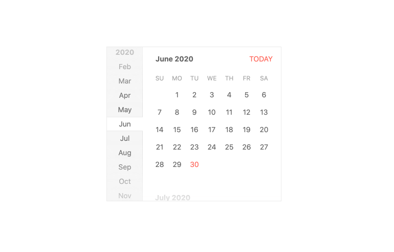
Fast Navigation Bar: Give users a way to navigate through years and months without having to leave the main calendar interface. Enabled by default, this part of the user experience can be hidden with a single configuration option.
Templates: Customize individual calendar cells, including date, month, year and week cells as well as the navigation elements like the header title.
Week Number Column: Add the week number, one through 52, to any date or date range.
Active View: Define how far back and how far ahead users can go to start selecting a date, including years, months and dates. You can set the default Active View to show only the days of a month, the months in a year or the years in a decade in a calendar month format.
View Selection Depth: Limit or expand the depth of the calendar to which the user can navigate. You can define how far users can zoom in on a date selection or zoom out of a date by for example narrowing down the selection options to only selecting a year and a month or only a month of a particular year.
Date Limits: The Kendo Angular Calendar component allows users to select any date in the past, present or future. You can limit the range of available dates users can select from with the Date Limits feature by setting the min and max properties.
Globalization: Globalization within the Kendo UI for Angular Calendar allows the component to adhere to the locale of the user. This can include changing the language of the placeholders and messages that appear in the Calendar, as well as updating the names of the month.
Keyboard Navigation: Keyboard navigation to assist with traversing the component and selecting a date using nothing but a keyboard is included.
Accessibility: The Angular Calendar is compliant with Section 508 standards, follows WAI-ARIA standards, and is AAA rated according to WCAG 2.1.
The Kendo UI for Angular Calendar is part of the Kendo UI for Angular component library. With 100+ Components, 3 themes (standard, Material, Bootstrap), Theme Builder, and UI Kits for Figma, Kendo UI for Angular is the library professional developers rely on. See the entire list at www.telerik.com/kendo-angular-ui.