Rich Markdown
Display rich Markdown content directly on an Azure DevOps dashboard.
Rich Markdown supports GitHub-Flavored Markdown, tables, task lists, code blocks, links, images, and regular HTML elements such as section, div, span, and strong. Use it for release notes, team guidance, project status, runbooks, and QueryTile-style dashboard cards.
Features
- Write Markdown directly in the widget configuration.
- Select a Markdown file from an Azure Repos Git repository.
- Choose the repository, branch, and Markdown file independently.
- Render rich HTML while filtering executable content and unsafe links.
- Create read-only QueryTile-style cards with configurable background colors.
- Start with a native Azure DevOps dashboard size of 1 x 2.
- Resize the widget from 1 x 1 through 10 x 10.
- Remove the default widget margin for repository-backed content when you need edge-to-edge Markdown.
Getting started
- Add Rich Markdown to an Azure DevOps dashboard.
- Open the widget configuration.
- Choose Custom markdown to enter content, or choose Select a markdown file to use a file from Azure Repos.
- Save the configuration.
Repository access
Repository-backed content uses the current Azure DevOps project context and requires access to the selected Git repository.
QueryTile-style cards
Rich Markdown can display a visual, read-only card that resembles the Azure DevOps QueryTile widget. It does not execute a WIQL query or update the number automatically. The value is the text written in query-tile__value, so update it manually or generate the Markdown from your own automation.
Example
Paste this HTML into the Custom markdown field:
<section
	class="query-tile"
	data-background-color="#334451"
	aria-label="İş Gücü Gerçekleşmeleri Current">

	<div class="query-tile__content">
		<span class="query-tile__title">İş Gücü Gerçekleşmeleri Current</span>
		<strong class="query-tile__value">97</strong>
		<span class="query-tile__unit">Work items</span>
	</div>
</section>
How to use it
- Add Rich Markdown to an Azure DevOps dashboard.
- Open the widget configuration and choose Custom markdown, or save the HTML in a repository Markdown file.
- Paste the example into the Custom markdown field, or select the repository, branch, and Markdown file.
- Save the configuration and resize the widget to a compact size such as 1 x 1.
Background color
data-background-color is optional:
- If it is omitted, the default background is
#009ccc.
- If it contains a valid CSS color, that color is used for the card background.
- If it is empty or invalid, the default
#009ccc is kept.
For example:
<section class="query-tile" data-background-color="#2f9e44">
	<div class="query-tile__content">
		<span class="query-tile__title">Open work items</span>
		<strong class="query-tile__value">97</strong>
		<span class="query-tile__unit">Work items</span>
	</div>
</section>
Preview
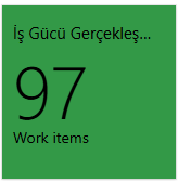
The card is intentionally read-only. Use div for query-tile__content; it is not a link and does not open the query when clicked. The title is truncated when the widget is narrow, while the value and unit remain visible.
Do not place CSS in a <style> tag inside the Markdown content. The widget removes <style> and executable HTML during sanitization; the QueryTile styles are already included in the extension stylesheet.