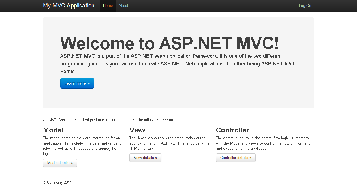
This is an ASP.NET MVC template that uses Twitter Bootstrap framework for style. BootstrapMVC allows you to a fresh look and a break from the tired defeault MVC style and offer a classy and fresh template for your project really fast. The framework itself let's you to stay consistent while to be able to use several different and well designed UI elements such as forms, buttons, hints, callouts, tables. The Bootstrap Framework also implements a 960 grid system that let's you easily position elements on your page.
Disclaimer: This is not an official Twitter projects. It just me offering the product of my moonlight tinkering!
For more informatio or for feedback, please visit: http://www.littlebigtomatoes.com/bootstrapmvc/
Here is how the landing page looks like:

The rest of the content is to overcome this idiotic 280 characters minimal length limit. Whoever invented this is part of the group of people that are creating braindead unusable interfaces and dumb rules that renders good ideas like this site almost unusable....
HistoryEngineers at Twitter have historically used almost any library they were familiar with to meet front-end requirements. Bootstrap began as an answer to the challenges that presented. With the help of many awesome folks, Bootstrap has grown significantly.
Browser supportBootstrap is tested and supported in major modern browsers like Chrome, Safari, Internet Explorer, and Firefox.
What's includedBootstrap comes complete with compiled CSS, uncompiled, and example templates.
NEW IN 1.3 Javascript pluginsAll original .less filesFully compiled and minified CSSComplete styleguide documentationThree example pages with different layouts
Default gridThe default grid system provided as part of Bootstrap is a 940px wide 16-column grid. It’s a flavor of the popular 960 grid system, but without the additional margin/padding on the left and right sides.
Roll your own gridBuilt into Bootstrap are a handful of variables for customizing the default 940px grid system. With a bit of customization, you can modify the size of columns, their gutters, and the container they reside in.
Default stylesAll forms are given default styles to present them in a readable and scalable way. Styles are provided for text inputs, select lists, textareas, radio buttons and checkboxes, and buttons.
Stacked formsAdd .form-stacked to your form’s HTML and you’ll have labels on top of their fields instead of to their left. This works great if your forms are short or you have two columns of inputs for heavier forms.


