Xamarin.Forms TreeView - Syncfusion Xamarin UI ControlsThe Xamarin.Forms TreeView control displays data in a tree structure with expanding and collapsing nodes. The control provides an optimized reuse strategy, smooth scrolling experience, and virtualization. |

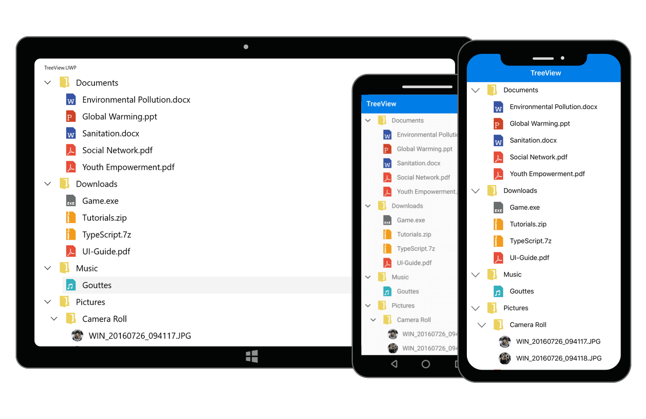
The Xamarin.Forms TreeView control displays hierarchical data in a tree structure with expanding and collapsing nodes. The control provides an optimized reuse strategy, smooth scrolling experience, and virtualization. In addition, illustrates an office hierarchy, org structure, or nested relationships in an application by using the TreeView control. It offers performance with features like data binding, unbound node population, a template selector, selection with different selection modes, complete UI customization, and commands for MVVM.
Features and Benefits of Xamarin TreeView ControlData bindingThe TreeView control supports both ItemsSource binding and unbound mode nodes population. Easily customize the TreeView control as a navigation control by populating the unbound mode nodes. This layout can be easily defined in the XAML. In addition, you can use all the necessary properties and commands of Xamarin.Forms TreeView in the MVVM approach. Customize templateThe TreeView control allows you to customize the entire tree node by hosting any image and custom view using a template. The control supports customizing each node (both parent and child nodes) by dynamic selection of the UI using a data template selector. Selection
Interaction with nodes
AppearanceExpander customization - Provides a customizable expander UI, including size customization for creating an elegant look and feel. Item sizing - Easily customize the item height. Indentation - Specify the required indentation space for child nodes. Related LinksAbout SyncfusionFounded in 2001 and headquartered in Research Triangle Park, N.C., Syncfusion has more than 38,000 customers and more than 1 million users, including large financial institutions, Fortune 500 companies, and global IT consultancies. Today, we provide 1700+ controls and frameworks for web (ASP.NET Core, ASP.NET MVC, ASP.NET WebForms, JavaScript, Angular, React, Blazor, Vue, and Flutter), mobile (Xamarin, UWP, JavaScript, and Flutter), and desktop development (Windows Forms, WPF, UWP, Flutter, WinUI, and .NET MAUI). We provide ready-to-deploy enterprise software for dashboards, reports, data integration, and big data processing. Many customers have saved millions in licensing fees by deploying our software. sales@syncfusion.com | Toll Free: 1-888-9 DOTNET
sales@syncfusion.com | Toll Free: 1-888-9 DOTNET |