Xamarin.Forms ListView – Syncfusion Xamarin UI ControlsThe Xamarin.Forms ListView control displays items in horizontal or vertical orientation. It supports all the essential features such as swiping, template selectors, pull-to-refresh, load more, reordering items, autofitting items, and much more. |

The Xamarin.Forms ListView control is a list-like interface used to render a set of data items in a vertical or horizontal orientation with visual representation of linear or grid structure. It supports all the essential features such as swiping, template selectors, horizontal and vertical orientations, pull-to-refresh, load more, reordering items, autofitting items, and more. It also supports sorting, grouping, and filtering with optimizations for working with large amounts of data.
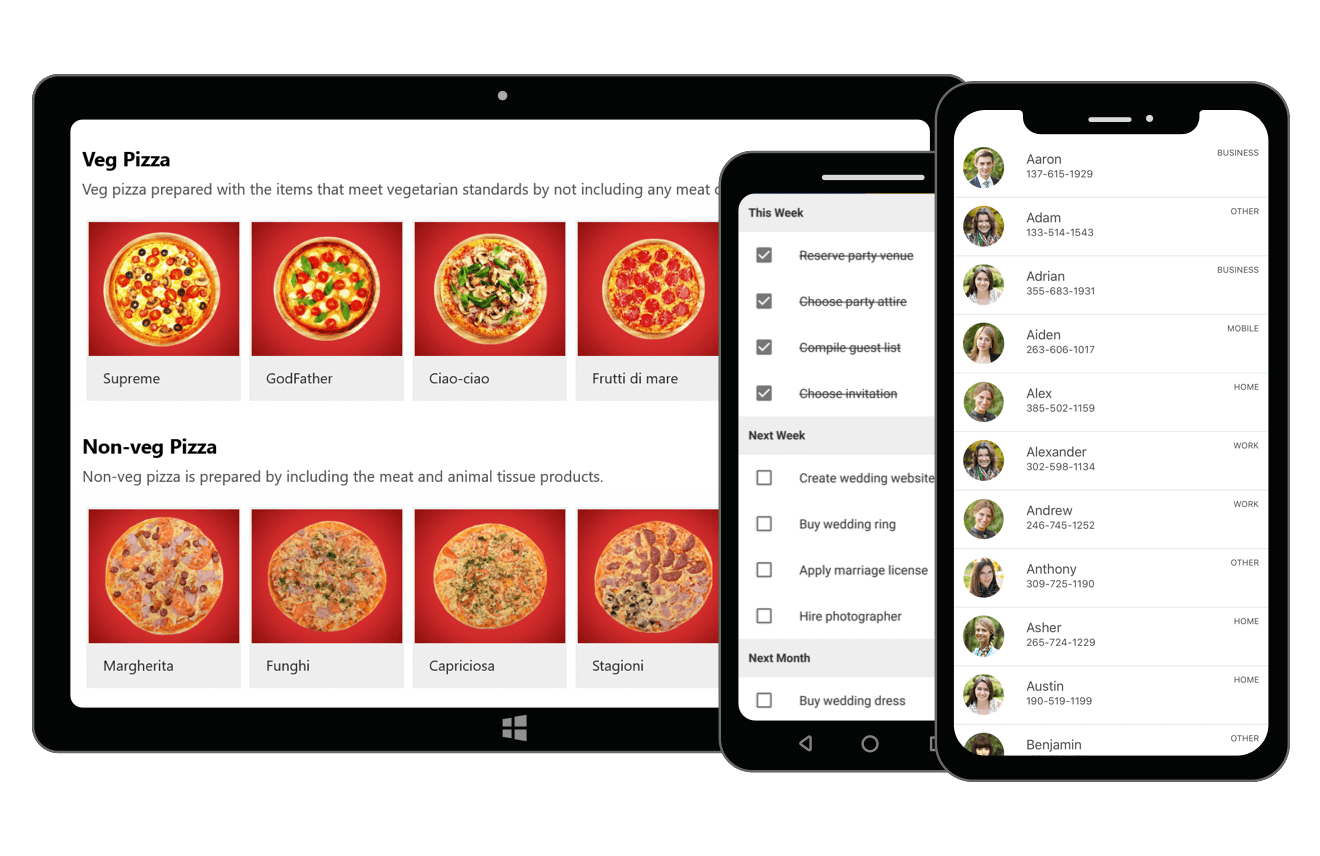
Features and Benefits of Xamarin ListView ControlData bindingData binding works out of the box for the most popular data sources such as Lists, ObservableCollection, and more. Load data from data sources and sort, group, and filter out of the box. High performanceThe Xamarin ListView provides the best possible performance on the Xamarin platforms with an optimized reuse strategy, smooth scrolling experience, and virtualization, even when loading large data sets. Different layoutsThe Xamarin ListView supports two layouts: linear and grid. The linear layout arranges items in a single column, whereas the grid layout arranges items in a predefined number of columns. Both layouts are supported in a horizontal list view as well. Custom templateHost any view or control to customize the ListView items using data templates. Customize each item by dynamic selection of the UI using a data template selector. Horizontal ListViewEasily configure a horizontal ListView to load items in a horizontal orientation based on the business requirements. Item swipeAssociate swipe views with custom actions. Swipe views are displayed by swiping left to right or right to left on an item. Selection
Drag and dropReorder items by dragging them with a long press or from the drag indicator view. Customize item appearance when dragging. Pull to refreshRefresh the data source at runtime by a pull-to-refresh action. Load more
Expandable ListViewDisplay the ListView items in the accordion view. Each item can be expanded or stretched to reveal the content associated with that item. Depending on the configuration, one item, multiple items, or no itemcan be expanded . MVVMAn easy and flexible way to use all the necessary properties and commands of Xamarin.Forms ListView in the MVVM approach. Pull to refresh and load more are also supported seamlessly in the MVVM pattern. SortingSort data in the ascending or descending order programmatically and by using XAML. Custom sorting logic is also supported. GroupingGroup items with easy-to-use APIs or by using custom grouping logic. ListView also supports expanding and collapsing groups and freezing group headers. Search itemsSet predicates to easily filter items by searching the underling data or currently viewed data. Real-time updatesAutomatically update the UI when adding new items and deleting items in the underlying collection. Update sorting and grouping when changing business objects. ListView headerDisplay a header view at the top of the control and customize the header UI. Freeze a header or make it scrollable. ListView footerFreeze a footer at the bottom of the control or make it scrollable. Customize the footer by adding any view such as an image, text, and more. Auto row heightDynamically change the size of items to enhance their readability. PagingThe Xamarin ListView items can be paged using the data pager control, which supports interactive data manipulation. ListView styleSpacingSpecify the required space between items in the Xamarin ListView for an elegant look and feel. SizingCustomize the size of the header, footer, group header, and items in a ListView. It is also possible to autofit them based on their content. Rounded corners on itemsCustomize the ListView items with rounded corners to match the appearance of other buttons in the app. Alternative row styleApply alternate row styling to the ListView items for better data readability. Shadow effects on itemsCustomize the appearance of Xamarin ListView items to show drop shadow effects using frames. Apply built-in Xamarin.Forms effects to an item. Conditional styleApply styling for each item in the ListView based on different conditions. Apply styling to certain views of an item or an entire row based on the property values of the business object. Animate an item on appearingApply default and custom animations to the Xamarin ListView items when they appear in the view, when scrolling, navigating from one page to another page, or interacting with an item. Right to left (RTL)Change the flow direction of the text from right to left in vertical and horizontal orientations. LocalizationAll static texts within the ListView can be localized to any desired language. Dynamic heightAutomatically adjust the list height at runtime when the content of a list view item is changed. Get the Demo ApplicationExplore the full capabilities of our Xamarin controls on your device by installing our sample browser applications from the matching app stores.
Related LinksAbout Syncfusion Xamarin UI ControlsSyncfusion's Xamarin.Forms library offers over 150 UI controls to create cross-platform native mobile apps for iOS, Android, UWP and macOS platforms from a single C# code base. In addition to ListView, we provide popular Xamarin controls such as DataGrid,Charts, Scheduler, Diagram, and PDF Viewer. About SyncfusionFounded in 2001 and headquartered in Research Triangle Park, N.C., Syncfusion has more than 38,000 customers and more than 1 million users, including large financial institutions, Fortune 500 companies, and global IT consultancies. Today, we provide 1700+ controls and frameworks for web (ASP.NET Core, ASP.NET MVC, ASP.NET WebForms, JavaScript, Angular, React, Blazor, Vue, and Flutter), mobile (Xamarin, UWP, JavaScript, and Flutter), and desktop development (Windows Forms, WPF, UWP, Flutter, WinUI, and .NET MAUI). We provide ready-to-deploy enterprise software for dashboards, reports, data integration, and big data processing. Many customers have saved millions in licensing fees by deploying our software. sales@syncfusion.com | Toll Free: 1-888-9 DOTNET |