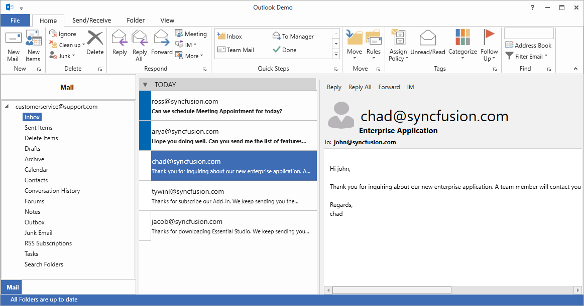
WPF Ribbon - Syncfusion WPF UI ControlsThe WPF Ribbon control is a command bar. It helps to create Office-like Ribbon Menu UIs with application menus or backstage, buttons, combo box, gallery, and more. |
The WPF Ribbon control (ribbon menu) accommodates all the tools required for an application in a single, easy-to-navigate user interface similar to Microsoft Office. Its dynamic resizing, keyboard accessibility, and complete customization options help organize an application.
Features and Benefits of WPF Ribbon ControlCreate an application with an office-like ribbonThe Ribbon control provides an application UI similar to Microsoft Office with a 2007 style that contains an application menu and a 2016 style that contains a backstage view.
A wide variety of ribbon itemsThe Ribbon control for WPF comes with a variety of ribbon items. Button items—like the ribbon button, drop-down button, and split button—can be included in any of the three different types of states. The Ribbon control can also include the following controls, making it comprehensive yet flexible: CheckBox, ComboBox, RadioButton, Ribbon Gallery, TextBox, and ListBox. All these controls can be separated using the ribbon separator.
Access items with the Quick Access ToolbarThe Quick Access Toolbar (QAT) is used to render a set of ribbon items that are commonly used in applications. It renders at the top-left corner of a window to make it more accessible. Users can choose to place it above or below the ribbon, remove certain commands from it, or add commands to it. Tabs with contextual groupsThe Ribbon control supports any number of contextual tab groups, which can be hidden or shown in certain contexts. Office 2010 and 2016 backstage viewThe backstage is a separate view that contains tabs and buttons that can show an application’s information and basic settings. Office 2007 application menuThe application menu is equivalent to a file menu found in a traditional UI. Ribbon resizingThe ribbon will resize its controls to fit within the space available in the ribbon window. Ribbon modal tabsModal tabs in the Ribbon control are used to temporarily display a collection of commands other than those found in the core tabs. When shown, all other core tabs will be invisible. In Microsoft Office, modal tabs are used to display print-preview commands when printing a document. User customizationThe Ribbon control lets users customize the QAT as well as the ribbon window, its appearance, and its tabs.
State persistence for user convenienceThe Ribbon control for WPF allows users to customize a control’s state, such as the Quick Access Toolbar, the minimize-maximize state of the ribbon, the ribbon tab, etc. This requires the customized state to persist across application instances and when the app closes. Upon restarting, the app will again apply the state. More Office Ribbon UI controls
Complete keyboard accessibilityThe Ribbon control supports key tips for ribbon items, letting users quickly access a command in a few keystrokes. When a user presses the Alt key, key tips for commands in the current tab are displayed. Pressing a key indicated in the key tip invokes the corresponding command. AppearanceThe Ribbon control supports a traditional look with Office 2007 and Office 2010 styles, and a flat look with Office 2013 and Office 2016 styles. TooltipsSupports super tooltips, which are used to customize the default look and feel of all tooltips. Right-to-left languagesRight-to-left (RTL) orientation allows users to work in right-to-left languages like Hebrew, Arabic, or Persian. LocalizationContent in the Ribbon control can be formatted according to culture. Related LinksAbout SyncfusionFounded in 2001 and headquartered in Research Triangle Park, N.C., Syncfusion has more than 38,000 customers and more than 1 million users, including large financial institutions, Fortune 500 companies, and global IT consultancies. Today we provide 1700+ controls and frameworks for web (Blazor, ASP.NET Core, ASP.NET MVC, ASP.NET WebForms, JavaScript, Angular, React, Vue, and Flutter), mobile (Xamarin, Flutter, UWP, and JavaScript), and desktop development (WinForms, WPF, WinUI, UWP, Flutter, and .NET MAUI). We provide ready-to-deploy enterprise software for dashboards, reports, data integration, and big data processing. Many customers have saved millions in licensing fees by deploying our software.
sales@syncfusion.com | www.syncfusion.com | Toll Free: 1-888-9 DOTNET |