WinUI ComboBox - Syncfusion WinUI ControlsThe WinUI ComboBox control(multi-select ComboBox) is a selection component that allows users to type a value or choose an option from a list. Supports multiple selection, editing, filtering, and more. |
The WinUI ComboBox control (multi-select ComboBox) is a selection component that allows users to type a value or choose an option from a list of predefined options. It has many features, such as data binding, multiple selection with checkboxes, editing, searching, filtering, UI customization, and custom templates.
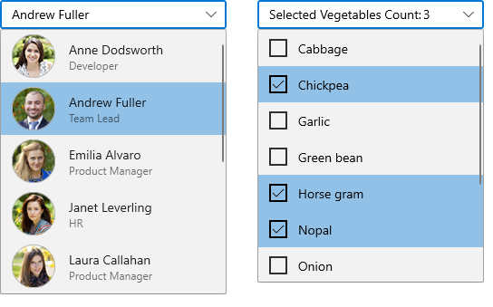
Features and Benefits of WinUI ComboBoxData bindingData-binding support works for all popular data sources and displays data based on display member. It automatically generates items from a data-bound collection. The application can be designed in the MVVM pattern. Editable and non-editable modesThe ComboBox control supports editable and non-editable text boxes to select items from the given data source. Editable mode - Edit the text in the text box. Suggestions will be shown in the drop down list based on the input. Non-editable mode - Items can be selected from the drop down list, but the selected item cannot be edited. SelectionComboBox control allows you to select single or multiple items from the drop down list. The available selection modes are, Single - Select a single item from the drop down list. Multiple - Select more than one item from a drop down list. Checkboxes can be used to represent selected items. SearchingHighlights the first item which fits the user input in the drop down list. FilteringFilter the items in the drop down based on the starting letter or whether they contain a specific letter. The available filtering modes are, Start with - Filter the matching items based on the starting text. Contains - Filter the matching items containing specific text. AppearanceSelection box UI - Customize the appearance of the selection box in ComboBox control. Drop down height - Adjust the drop down height based on the number of items to enhance readability without scrolling. Conditional Styling - Customize the appearance of drop down list items conditionally based on the data. Drop down item customization - Drop down list items can be customized with an image or custom control. ThemesThe WinUI ComboBox control includes light, dark, and high-contrast themes. Related linksView source code of demos in GitHub About SyncfusionFounded in 2001 and headquartered in Research Triangle Park, N.C., Syncfusion has more than 38,000 customers and more than 1 million users, including large financial institutions, Fortune 500 companies, and global IT consultancies. Today we provide 1700+ controls and frameworks for web (Blazor, ASP.NET Core, ASP.NET MVC, ASP.NET WebForms, JavaScript, Angular, React, Vue, and Flutter), mobile (Xamarin, Flutter, UWP, JavaScript, and .NET MAUI), and desktop development (WinForms, WPF, WinUI, UWP, Flutter, and .NET MAUI). We provide ready-to deploy enterprise software for dashboards, reports, data integration, and big data processing. Many customers have saved millions in licensing fees by deploying our software.
sales@syncfusion.com | Toll Free: 1-888-9 DOTNET |