WinForms ComboBox - Syncfusion WinForms UI ControlsThe WinForms ComboBox (aka Multiselect ComboBox) control’s rich feature set– includes editing, autocomplete, multiselect items using checkbox, sort and more. |
The WinForms ComboBox (Multiselect ComboBox) Control allows users to type a value or choose an item or multiple items using multiselect option . Any UI control can be loaded as the header of the dropdown. Users can perform customized actions like search and filter in the dropdown. It’s rich feature set includes autocomplete, sorting, watermark text, appearance customization, and more.
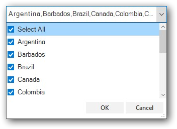
Features and Benefits of WinForms ComboBoxData bindingThe WinForms ComboBox control has data binding support to work out-of-the-box with all the popular data sources like IEnumerable (IList, IBindingList, ObservableCollection) and data tables. It also supports sorting and filtering. Data can be shown based on the display member and value member. The control also allows users to bind the data source at the designer level. Multiselect ComboBoxThe WinForms ComboBox (multiselect combobox) provides support to select multiple items from the dropdown. Users can select multiple items by using the intuitive checkbox in each item in the dropdown. It also supports confirmation buttons (OK and Cancel) in the dropdown and select all option similar to Excel. Learn more multiselect combobox Header and footer
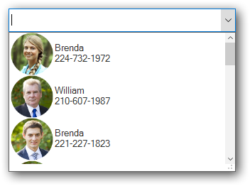
Autocomplete (filter by typing)Suggestion • A list of items is displayed in the dropdown based on the text typed in the editor control. • Users can perform case-sensitive autocompletion. • Users can filter suggested items using starts with or contains. Append • The control completes the user-typed word with suggestion text to help users search for correct items easily. • Users select an item from the dropdown list based on the appended word in the edit control. Suggest and append • This combines the operations of suggestion and append. • Users can perform case-sensitive autocompletion. • Control completes a word that the user types with suggestion text and filters the suggestions. Users can choose an item from the filtered list. Sorting• Sort the items in the dropdown in either ascending or descending order. • Sort items by writing your own custom logic. FilteringThe WinForms ComboBox allows users to filter data. For example, items in the dropdown can be filtered based on user input. WatermarkA watermark provides a hint to users about the data to be selected from the listed values. Appearance styleStyling - Customize the appearance of the edit control and drop-down list. Conditional styling - Customize the appearance of the dropdown list items based on the data. Image in drop-down - Users can load an image to each list item in the dropdown. Also, supports image alignment with text. Custom drawing - Supports making a custom drawing for every list item. Built-in themesThe WinForms ComboBox control provides Office 2016 built-in theme support to adapt the control to the rest of the business application. The following Office 2016 themes are supported:
Item heightUsers can adjust (auto fit) the item height in the drop-down based on the content of an item to enhance readability. It is also possible to set the item height conditionally. Dropdown sizing
LocalizationLocalize all static default strings in the WinForms ComboBox to any desired language. Right to left (RTL)Supports right to left (RTL) direction for users working in right-to-left languages like Hebrew, Arabic, or Persian. UI automationThe WinForms ComboBox control is compatible with Coded UI and UFT (formerly QTP) automation tools to automate applications. Related LinksLearn More about WinForms ComboBox About Syncfusion WinForms UI ControlsSyncfusion's WinForms UI Controls library is the only suite that you will ever need to build an application since it contains over 130 high-performance, lightweight, modular, and responsive UI Controls in a single package. In addition to ComboBox, we provide popular WinForms Controls such as DataGrid, Chart, Scheduler, Diagram, and Syntax editor. About SyncfusionFounded in 2001 and headquartered in Research Triangle Park, N.C., Syncfusion has more than 38,000 customers and more than 1 million users, including large financial institutions, Fortune 500 companies, and global IT consultancies. Today we provide 1700+ controls and frameworks for web (Blazor, ASP.NET Core, ASP.NET MVC, ASP.NET WebForms, JavaScript, Angular, React, Vue, and Flutter), mobile (Xamarin, Flutter, UWP, JavaScript, and .NET MAUI), and desktop development (WinForms, WPF, WinUI, UWP, Flutter, and .NET MAUI). We provide ready-to deploy enterprise software for dashboards, reports, data integration, and big data processing. Many customers have saved millions in licensing fees by deploying our software.
sales@syncfusion.com | www.syncfusion.com | Toll Free: 1-888-9 DOTNET |