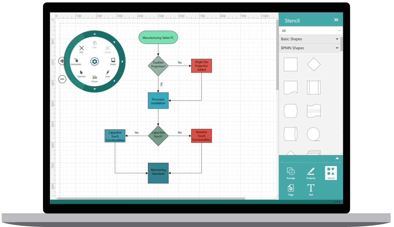
The UWP Diagram control allows users to quickly create and edit flowcharts, organizational charts, UML diagrams, swim lane charts, mind maps, floor plans, circuit, network, entity relationship, and more within your UWP applications.
Features and Benefits of UWP Diagram ControlFlowchartThe UWP Diagram control provides all the standard flowchart shapes as ready-made objects to build flowcharts, making it is easy to add them to a diagram surface in a single call. Learn more about flowchart diagram features Organizational chartBuilt-in automatic layout algorithm specifically made for organizational charts to arrange the parent and child node positions automatically. Learn more about Organizational chart features High PerformanceQuickly load large diagrams using UI-virtualization techniques, which selectively loads only the objects that lie within the viewport area. Smooth scrolling performance is achieved using a built-in spatial search algorithm that builds an index based on the element position. NodesVisualize any graphical object using nodes, which can also be arranged and manipulated on a diagram page.
ConnectorsA connector is used to represent a relationship between two nodes. Some of the key features are listed below.
PortsConnect to desired places of a node through different types of ports or connecting points available. AnnotationShow additional information by adding text or labels on nodes and connectors. Interactive featuresUse interactive features to improve the editing experience of a diagram at runtime. Furthermore, you can easily edit a diagram with mouse, touchscreen, or keyboard interfaces.
Automatic layoutUWP Diagram control provides an automatic layout algorithm, which is used to arrange nodes automatically based on a predefined layout logic. There is built-in support for an organization chart layout, hierarchical tree layout, and radial tree layout. StencilThe stencil control is a gallery of reusable symbols and nodes. Drag and drop these symbols onto the surface of the diagram any number of times. Overview controlImprove the navigation experience when exploring large diagrams using the overview control. It displays a small preview of the full diagram page. It also allows users to perform operations such as zooming and panning within it. Data SourceUWP Diagram control allows you to populate diagrams with nodes and connectors based on data from data sources. Data in any format can be easily converted, mapped, and consumed in the diagram by setting a few properties, without having to write any code. It also supports loading data from an ObservableCollection, List, or IEnumerable collections. UWP Diagram control supports printing with a print preview option. You can also customize the page size, orientation, page margins, and fit to a single page. ExportShare your diagrams with others by easily exporting as .xps, .png, .jpeg and .bmp file formats. Page layoutUWP Diagram control provides a page-like appearance to a drawing surface using page size, orientation, and margins. Related linksAbout SyncfusionFounded in 2001 and headquartered in Research Triangle Park, N.C., Syncfusion has more than 38,000 customers and more than 1 million users, including large financial institutions, Fortune 500 companies, and global IT consultancies. Today, we provide 1600+ controls and frameworks for web (ASP.NET Core, ASP.NET MVC, ASP.NET WebForms, JavaScript, Angular, React, Blazor, Vue, and Flutter), mobile (Xamarin, UWP, JavaScript, and Flutter), and desktop development (Windows Forms, WPF, UWP, WinUI, Flutter, and .NET MAUI). We provide ready-to-deploy enterprise software for dashboards, reports, data integration, and big data processing. Many customers have saved millions in licensing fees by deploying our software. sales@syncfusion.com | Toll Free: 1-888-9 DOTNET |


