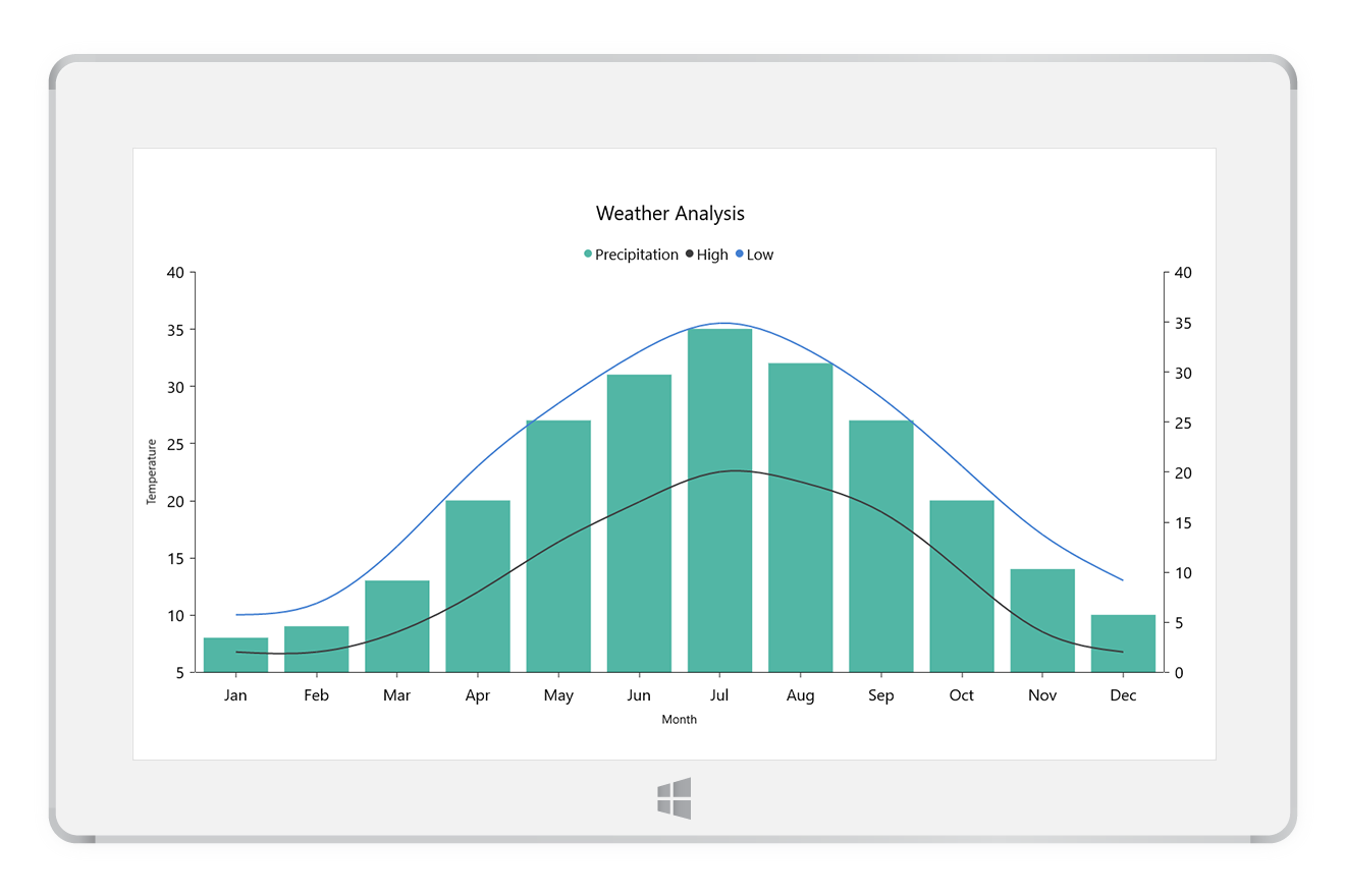
The UWP charts, a mobile friendly easy-to-use charting package, is used to add beautiful charts to UWP apps. It contains a rich gallery of 45+ charts and graphs, ranging from line to financial charts, that cater to all charting scenarios. Its high performing quality helps to render large amount of data quickly in your surface and desktop devices. It also comes with a lot of features such as zooming, panning, tooltip, crosshair, trackball, drill-down, and events to make the charts more interactive.
Features and BenefitsHigh performanceThe charts include several data rendering optimizations. It provides the best possible performance when plotting large volumes of data and handling high-frequency real-time data. Chart typesThe charts include functionality for plotting more than 45 chart types. Each chart type is easily configured with built-in support for creating stunning visual effects.
Chart axisThe charts support four different types of axes: numerical, categorical, date-time, and logarithmic. The appearance of all chart axis elements can be customized with built-in properties.
User interactionsThe UWP charts have been packed with interactive features such as zooming and scrolling, trackball, tooltip, drill-down, and selection. You can configure these interactive features using the developer-friendly APIs. Data labels and markersData points can be easily annotated with labels to improve the readability of data in a chart control. Readability can be further enhanced by adding markers or customizable symbols. LegendsLegends provide additional information helpful in identifying individual data or series in a chart control. AnnotationsAnnotations display metadata about a chart control or series at a specific point of interest in the plotting area. Multiple annotations can be added to a single chart control. Empty pointsElegantly handle the empty point values in UWP charts. Range highlighterHighlight the specific regions in a chart area using strip lines. Also, add text to describe the highlighted area. Technical indicatorsThe charts support 10 different types of financial technical indicators such as RSI, momentum, Bollinger bands, accumulation distribution, EMA, SMA, stochastic, ATR, MACD, and TMA indicators. TrendlinesChart has built-in support for rendering linear, exponential, logarithmic, power, and polynomial trendlines. Axis scale breakAn axis scale break allows users to view different ranges in the same chart area without having a huge space in the plot area. Vertical chartsRotate all the series types to plot data in a vertical direction and view the data from a different perspective. Grouping and aggregationData points with similar categories can be grouped and aggregated using aggregate functions. LocalizationLocalize all the static text within the chart control to any desired language. Exporting and printingThe chart can be printed and also be exported into image formats like JPEG, BMP, PNG, TIFF, and XPS. Related LinksAbout SyncfusionFounded in 2001 and headquartered in Research Triangle Park, N.C., Syncfusion has more than 38,000 customers and more than 1 million users, including large financial institutions, Fortune 500 companies, and global IT consultancies. Today, we provide 1900+ controls and frameworks for web (ASP.NET Core, ASP.NET MVC, ASP.NET WebForms, JavaScript, Angular, React, Blazor, Vue, and Flutter), mobile (Xamarin, UWP, JavaScript, and Flutter), and desktop development (Windows Forms, WPF, UWP, WinUI, Flutter, and .NET MAUI). We provide ready-to-deploy enterprise software for dashboards, reports, data integration, and big data processing. Many customers have saved millions in licensing fees by deploying our software. sales@syncfusion.com | Toll Free: 1-888-9 DOTNET |


