Blazor Diagram Component - SyncfusionThe Blazor Diagram component is a feature-rich control for visualizing, creating, and editing interactive diagrams. It supports creating flow charts, organizational charts, BPMN diagrams, and more either through code or a visual interface. |
The Blazor Diagram component is a feature-rich control for visualizing, creating, and editing interactive diagrams. It supports creating flow charts, organizational charts, BPMN diagrams, and more either through code or a visual interface.
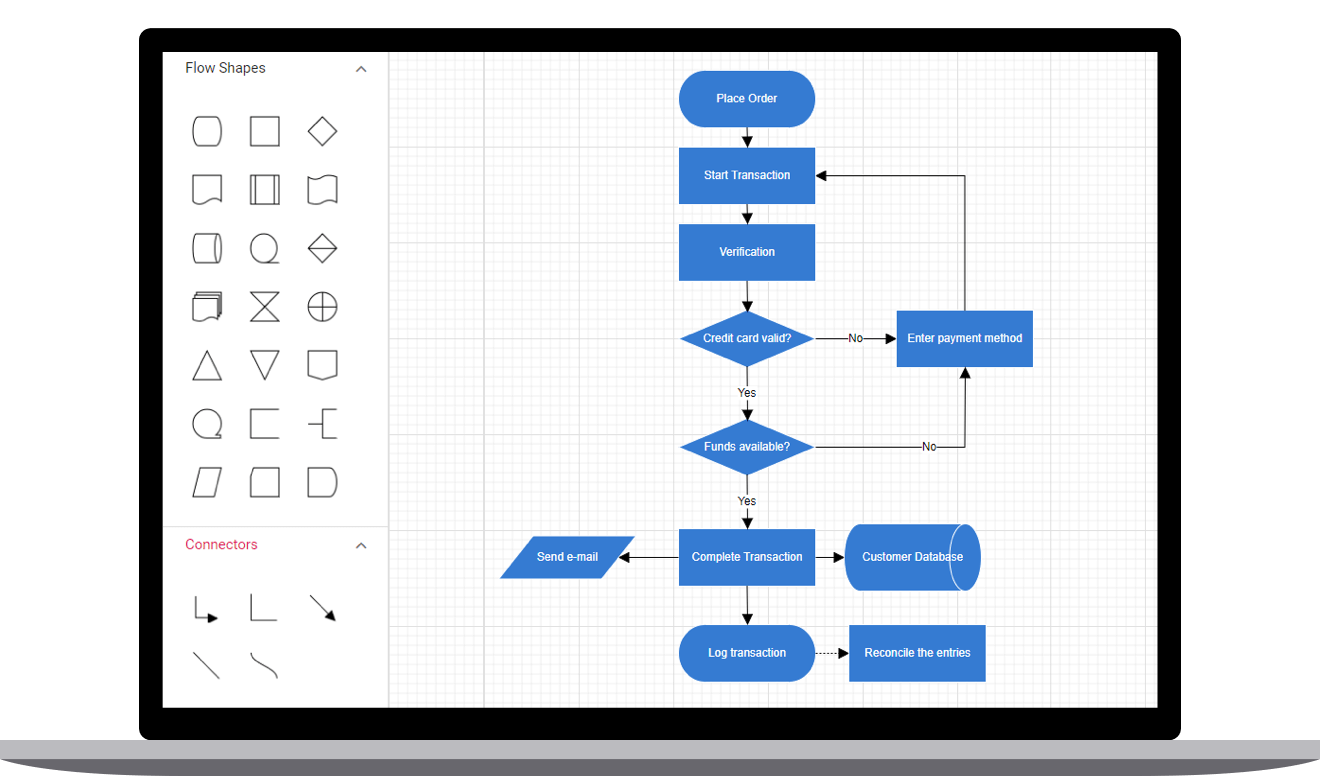
Features and BenefitsFlowchartThe Diagram library provides all the standard flowchart shapes as ready-made objects to build flowcharts, making it is easy to add them to a diagram surface in a single call. Learn more about flowchart diagram features Organizational ChartBuilt-in automatic layout algorithm specifically made for organizational charts to arrange the parent and child node positions automatically. Learn more about organizational diagram features Mind MapThe built-in automatic layout algorithm is designed for mind map diagrams, allowing users to define which node should be at the center and which nodes should be placed around it in the diagram surface. Learn more about mind map features NodesVisualize any graphical object using Blazor Diagram Nodes, which can be arranged and manipulated on a diagram page.
ConnectorsThe relationship between two nodes is represented using a Blazor Diagram Connector. Some of the key features are listed.
Interactive featuresBlazor Diagram Interactive features are used to improve the runtime editing experience of a diagram. You can easily edit a diagram with mouse or keyboard interfaces. Select one or more nodes, connectors, or annotations and edit them using thumbs or handlers. Data bindingPopulate diagrams with nodes and connectors created and positioned based on data from data sources. In addition, data in any format can be easily converted, mapped, and consumed in the diagram by setting a few properties, without having to write any code. Automatic layoutsBlazor Automatic layouts are used to arrange nodes automatically based on a predefined layout logic. There is built-in support available for following layouts.
Symbol paletteBlazor Symbol Palette includes a gallery of stencils, reusable symbols, and nodes that can be dragged onto the surface of a diagram. Overview panelThe Blazor Diagram Overview Panel is used to improve the navigation experience when exploring large diagrams. It displays a small preview of the full diagram page that allows users to zoom and pan within it. SerializationSave diagram state in JSON format and load it back for further editing using the serializer. Exporting and printingYou can easily export the diagrams to different image formats such as PNG, JPEG, BMP, and SVG and also can be printed from the browser. Zooming and panningView a large diagram closely or assume a wider view by zooming in and out. Also, navigate from one region of a diagram to another by panning across the diagram. Web framework integrationBlazor Diagram component is also available in ASP.NET Core, ASP.NET MVC, JavaScript, React, Angular, and Vue frameworks. Check out the different Diagram platforms from the links below,
Related linksLearn More about Blazor Diagram About Syncfusion Blazor ComponentsThe Syncfusion's Blazor components library is the only suite that you will ever need to build an application since it contains over 155 high-performance, lightweight, modular, and responsive UI components in a single package. In addition to Diagram, we provide popular Blazor Components such as Diagram, DataGrid, Scheduler, and more. About SyncfusionFounded in 2001 and headquartered in Research Triangle Park, N.C., Syncfusion has more than 38,000 customers and more than 1 million users, including large financial institutions, Fortune 500 companies, and global IT consultancies. Today we provide 1600+ controls and frameworks for web (ASP.NET Core, ASP.NET MVC, ASP.NET WebForms, JavaScript, Angular, React or Vue), mobile (Xamarin, UWP, JavaScript, and MAUI), and desktop development (WinForms, WPF & UWP, and MAUI). We provide ready-to deploy enterprise software for dashboards, reports, data integration, and big data processing. Many customers have saved millions in licensing fees by deploying our software.
sales@syncfusion.com | www.syncfusion.com | Toll Free: 1-888-9 DOTNET |