ASP.NET Core Circular Gauge - Syncfusion ASP.NET Core UI ControlsVisualize numeric values on a circular scale using the ASP.NET Core Circular Gauge control with built-in animation, tooltips, and multiple axes support. A circular gauge can be used to create a speedometer, meter gauge, multi-axes clock, direction compass, and more. |

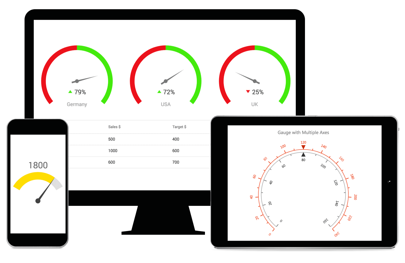
The ASP.NET Core Circular Gauge is ideal for visualizing numeric values over a circular scale. A circular gauge, also known as a radial gauge, can be used to create a speedometer, meter gauge, multi-axes clock, modern activity gauge, direction compass, and more. All circular gauge elements are rendered using scalable vector graphics (SVG).
Features and BenefitsAxes customizationThe gauge axes are circular scales where a set of values can be plotted based on any business logic. You can easily change the appearance of the axes by customizing the labels, major and minor ticks, axis line, and flow direction. Ranges customizationA range in the circular gauge is a visual element that helps to quickly visualize where a value falls on the axis. Position, width, color, start and end values of the ranges can be customized. Also, you can add any number of ranges to the gauge. Various pointer typesIndicate values on an axis using pointers. The ASP.NET Core Circular Gauge control supports three types of pointers namely needle, marker, and bar. Position, color, shape, tail and cap of the pointers can be customized. Half and quarter-circular gaugesForm half or quarter circular gauges by modifying the start and end angles of a gauge. This allows the gauge to render in a very small area. AnnotationsDisplay any HTML element as an annotation at a specific point of interest in the circular gauge. You can also add multiple annotations in a gauge. User interactionsEnrich the visualization by adding the built-in interactive features such as tooltip, animation and pointer drag in the ASP.NET Core Circular Gauge control. Responsive and touch-friendlyThe ASP.NET Core Circular Gauge is highly responsive and has a finely optimized design for desktops, touch screens, and smartphones. It works well on all mobile phones that use iOS, Android, or Windows 8 OS. Customizable appearanceThe complete appearance of the circular gauge can be changed to the desired style. Built-in support is provided to customize all the element's font, color, opacity, border color, border width, etc. Web framework integrationThe Circular Gauge integrates easily with any web framework:
Related LinksDownload Free Trial About SyncfusionFounded in 2001 and headquartered in Research Triangle Park, N.C., Syncfusion has more than 38,000 companies and more than 1 million users, including large financial institutions, Fortune 500 companies, and global IT consultancies. Today, we provide 1600+ controls and frameworks for web (ASP.NET Core, ASP.NET MVC, ASP.NET WebForms, JavaScript, Angular, React, Blazor, Vue, and Flutter), mobile (Xamarin, UWP, JavaScript, and Flutter), and desktop development (Windows Forms, WPF, UWP, Flutter, WinUI, and .NET MAUI). We provide ready-to-deploy enterprise software for dashboards, reports, data integration, and big data processing. Many customers have saved millions in licensing fees by deploying our software. sales@syncfusion.com | Toll Free: 1-888-9 DOTNET |