|
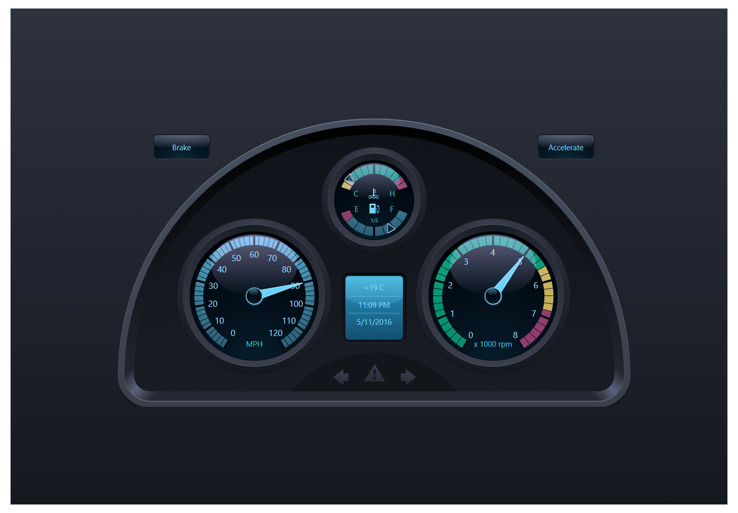
WPF Gauge & Indicators
Executive dashboards require powerful gauge controls that can clearly explain information states. The DevExpress WPF Gauge Control Suite includes numerous ready-to-use presets for countless usage scenarios. Whether your dashboard requires Circular, Linear, or State Indicator Gauges, you can rest assured that the DXperience Subscription has been engineered to exceed your expectations.
Circular Gauges Available in Any Shape
The WPF Circular Gauge control provides numerous shapes (Full, Three Quarters, Half, Top-Left Quarter and many others) with layout and appearance options so you can deliver stunning dashboards in the shortest possible time. Circular Gauge Elements include:
Arc Scales • Needles • Markers • Range Bars • Ranges • Tickmarks • Lines • Labels • Custom Labels • Layers • Spindle Cap • Custom Elements
Horizontal and Vertical Linear Gauges
Like its Circular counterpart, the WPF Linear Gauge control provides a rich collection of models that mimic real-life gauges. Linear Gauge Elements include:
Linear Scale • Level Bars • Markers • Range Bars • Ranges • Tickmarks • Lines • Labels • Custom Labels • Layers • Custom Elements
Matrix and Segment Digital Gauges
With intuitive options and numerous built-in models for both matrix and segment view types, the WPF Digital Gauge Control allows you to create LED style interfaces. Digital Gauges supports custom symbol mapping, so that end-users can draw any picture on the symbols panel.
State Indicators
The State Indicator provides built-in images that can be used to imitate the states of real-life indicators. You can extend its image collection by adding your custom images to the control.
Uniform Look with Built-in Animation Effects
All WPF Gauge Controls ship with predefined models: Default, Clean White, Cosmic, Smart, Eco, Progressive and many others. These models fully define the look-and-feel of the Gauge control and all its elements.
When using multiple gauge types within an application, you can choose the same model and be confident that their appearances matches one another.
You can use life-like animation effects for all Circular and Linear elements that indicate changes to values over time (needles, level bars, markers, range bars). For the Digital Gauge, you can animate any character on the symbols panel using blinking or creeping line animation effects.
To implement animation effects, you simply need to select the animation type and specify its duration.
Hit-Testing and Interactivity
You can enable end-user interaction or allow data input using individual WPF Gauge Controls via the built-in hit-testing engine. When handling mouse events, you can determine whether the mouse pointer is over a particular element - such as the circular gauge's needle.
Once you obtain this information, you have an endless number of ways in which to enhance data presentation. For instance, you can display tooltips with additional information or you can allow end-users to drag-and-drop elements, thus changing the underlying data.
Related Links
Download Free Trial
Pricing
Learn More
|