Actipro Wizard for WPFProvides a powerful framework for creating wizard dialogs. Features include multiple page types, easy page sequencing, selection change processing, theming, animated transitions, VS designer support. |


Wizard dialogs simplify the user experience of applications by taking complex tasks and breaking them up into a series of simple steps. Actipro Wizard is a lightweight control for building these wizard dialogs in WPF, while conforming to the Wizard97 specifications. Its rich designer functionality and straightforward API make it easy to quickly configure wizard pages. Simply create a page, set its page type, caption, description, and start adding controls to it. Special page types are included to support welcome and finish pages. Basic sequential page navigation is enabled by default, and via the use of several properties, more complex page order sequencing can be achieved. Dynamic run-time decisions about which page should come next can also be made via the handling of selected page change events. Optional page history tracking can be enabled so that pressing the back button will revisit the previous pages in the reverse order they were originally visited, even when complex sequencing was used. Wizard page changes can be animated with a number of built-in transition effects, or even custom transition effects from third-parties such as those found in the open-sourcePixel Shader Effects Library. These subtle animations enhance the user experience by adding a visual polish to your applications. Page DesignThe pages in the Actipro Wizard can be easily created to follow the Wizard 97 specification or completely customized to fit your needs. There are tons of options available to you when designing your pages, everything from titles and descriptions to enabling or disabling buttons. The pages presented by the Wizard control can be defined via XAML or programmatically. Page TypesThere are three distinct page types, which include Exterior, Interior, and Blank. The Exterior and Interior types are based on the Wizard 97 specification and the Blank type allows for complete customization. Page types are only used in determining which default style will be applied the page and do not affect the wizard behavior in any other way. Exterior PagesExterior pages typically come at the beginning and end of the wizard, which are known as welcome pages and completion/finish pages, respectively. Welcome pages are used to convey the purpose of the wizard and completion/finish pages can be used to summarize the operation that was or is going to be performed. 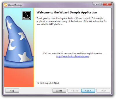 An example of an exterior page Exterior pages have a watermark area that appears on the left side of the page, which can be used to help the end-user quickly recognize the wizard and the operation it performs. By default this area is filled with the system highlight color but can be customized to any sort of image or gradient background. There is a large header label at the top of the content area, which displays the caption of the page. Another label is placed under the header and provides a brief description of the page. Interior PagesInterior pages typically appear as the "inner" pages of the wizard and are used to collect information from the end-user. This information can include everything from contact information to file/folder paths. Since the pages can host any WPF content, there is no limit to what you can do. 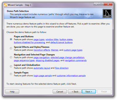 An example of an interior page Interior pages have a header area that stretches across the entire top of the page, which displays the page's caption and description. The header can be customized to display any sort of image or gradient background to give it more pizzazz. Blank PagesBlank pages do not have any kind of header or watermark and simply display their content in the area given. This gives you full control over what is displayed and how. 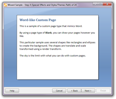 An example of an custom blank page Blank pages can be used to create slide shows, step-based training materials, quizes/exams, and much more. 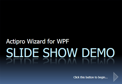 A Wizard control using blank pages to create a custom slide show Page HeaderEvery wizard page has a unique caption, description, and title, each of which is designed for a certain purpose. 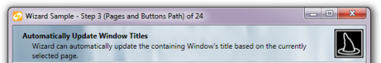 A page header and the title bar of the containing Window Caption and DescriptionA page's caption is a small phrase that is typically displayed in a bold or large font as header text for the page. A brief description of the page can be included, which typically appears below the caption. TitleThe Wizard control can automatically update the containing Window's title based on the selected page. The title of a Wizard page is not visible in the page by default, however it can be used to construct the window's title. There are several other options available for customizing the window's title, including custom formats. ButtonsThe buttons at the bottom of the Wizard control are used by the end-user to navigate the pages. There are several options available to customize these buttons. Visibility and Enabled StateThe Wizard control allows total control over the visibility and enabled states of the buttons, both at a global wizard level and at a page-specific override level. Global settings made on the Wizard control are default settings for all contained pages. Individual pages can be configured to inherit the global settings or override one or all of the settings. The page-specific settings take effect while that particular page is selected. All of these properties may be changed at run-time programmatically to update the user interface button states. Window InteractionThe Wizard control can optionally attempt to close the containing Window when the Finish or Cancel buttons are clicked. It can even set the dialog result of the Window, based on whether the Finish or Cancel button is clicked. This allows you to easily determine if the end-user completed the wizard or is trying to cancel it. Page NavigationThe order or sequence of the pages pages in the Actipro Wizard can be easily customized and manipulated, giving you complete control. There are also several visually appealing transitions which will really make your application stand out. Page SequencingThe Wizard control has many helpful features for setting up the sequence in which pages will be visited. By default, pages will be visited in the other that they are defined in the wizard. While this linear sequencing works in many situations, the order of the pages can be easily customized to achive much more complex sequences. Next and Previous PagesFor every Wizard page you can override the default page sequencing by specifying the next and previous page to visit. The next and previous page can be specified by reference, name, or index. 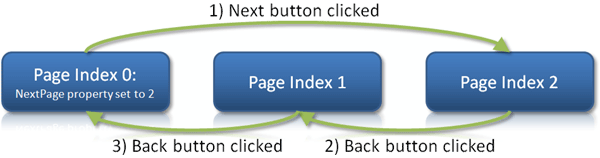 This allows for circular sequences, which is helpful when a given step may need to be repeated several times. Sequence TypesThe Wizard control offers two types of automatic sequence handling when navigating backwards through the pages by clicking the Back button. The normal sequence types simply navigates linearly through the pages, while still respecting the previous page setting. The stack sequence type is more advanced and tracks all the pages visited by the end-user in order. This allows the end-user to easily navigate backwards through the wizard, even when a given page may have been visited more than once. 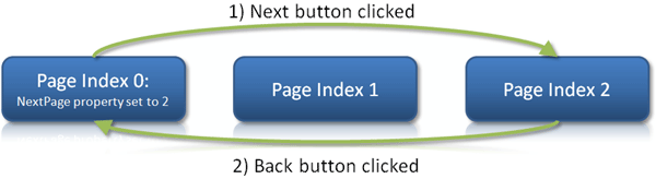 Disabled PagesAny pages that are disabled will be skipped by the default page sequencing. This makes it easy to "turn off" pages, as needed, based on any custom logic.  Page SelectionThe selected item/page in the Wizard control can be easily changed programmatically, as well as through several cancellable selection change events. Selected Item/PageThe selected item in the Wizard control can easily be set by reference or by index. These properties can also support data binding, which makes it easier to integrate into MVVM applications. Selection EventsWhenever a selected page change occurs, regardless of what caused it, numerous events fire. The event sequence is designed so that you can process the selection change events at either the wizard or page-specific levels. Several changing events are the first events raised after a page change request, both on the Wizard control as well as the appropriate pages. These events can be used to cancel or customize the page change operation, thus preventing the user from navigating away from the given page. If the page change operation is not cancelled, then a similar series of page changed events will be raised. Page changed events are a great place to add code to initialize a page that is about to be displayed. The selection events include a lot of information about why the selection changed, which allows you to determine whether you may want to take some sort of programmatic action to override or cancel a page change. Transition EffectsWizard supports numerous types of animated transition effects to add some extra dazzle to your wizard dialogs during selected page changes. Transition SettingsDifferent transitions may be applied to forward progress page changes and backward progress page changes. This allows you to perform a certain transition effect in one direction for forward movement through pages, and apply it in the opposite direction for backward movement through pages. You have full control over the duration of forward and backward transitions, the default "direction" they should use, and which transitions should be used. Included classes make it easy to use a single transition, randomly pick a transition from a list, or write your own logic to select a transition based on the "from" and "to" pages. Transition TypesThere are numerous built-in transitions that are available for use including:
Custom transitions can easily be built programmatically or in XAML as well. Aero WizardsWizard includes a couple special classes that are used for the creation of wizards the conform to the Aero Wizard standard, like the wizards found in Windows Vista/7. Aero Wizard StyleAero Wizards have a newer and more appealing look and make use of the Aero glass effect in the title bar area. This style provides for consistency with the other explorer-like dialogs found in Windows Vista/7. 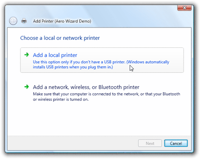 An Aero Wizard that mimics the Vista Add Printer wizard Since the Back button is located in the title area, there is no Back button in the button container at the bottom of the wizard. There is no concept of exterior pages in Aero wizards. Instead, all pages are treated more like interior pages since they have their caption displayed at the top of the client area of the window. Command ButtonsThe screenshot above shows two CommandButton controls in the wizard's page, which are special buttons with a title and content. They have smooth animations that change state when the mouse moves over them or when they are clicked. These buttons usually are presented on pages where large branching choices must be made by the end-user. |