Jumpstart your application's user interface with a bundle of over 100 controls and components, including all of Actipro's WPF products: SyntaxEditor, Docking/MDI, Ribbon, Editors, Gauge, Charts, Micro Charts, Navigation, PropertyGrid, Themes, Views, Wizard, Views, Bar Code, and the Shared Library. All products are XBAP compatible and have extensive documentation and a large number of samples.
Actipro WPF Studio is the premiere suite of professional UI controls and components for WPF. WPF Studio licensees enjoy one year of free upgrades to any new WPF product versions and also any new WPF component products added to the suite.
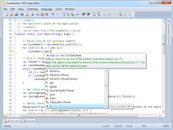 Actipro SyntaxEditor is a powerful text editing control that is packed with features for efficient code editing, including syntax highlighting, code outlining, parsing, line numbers, block selection, IntelliPrompt UI, split views, zooming, adornments, single-line mode, bi-di support, and much more. It is built on top of our next-generation extensible text/parsing framework and has many of the same code editing features found in the Visual Studio code editor. Over 20 sample languages are included to get you started (such as C#, HTML, Javascript, and more), and optional premium add-ons with advanced functionality for editing C#, VB, Python, XML, JavaScript, and JSON are available as well. For developers who need to support editing other code languages, custom syntax languages can be developed and distributed with your applications. Actipro offers a unique parser framework with SyntaxEditor that features grammars written in C#/VB using EBNF-like notation, customizable AST construction, advanced error handling/reporting, easy code injection, a complete debugger UI, and much more.
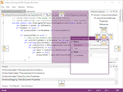 Actipro Docking/MDI is a complete solution for easily adding a docking tool window and/or multiple document interface to your WPF applications. Allow your end users to drag and dock windows wherever they please, and to persist their customizations. It has more options than nearly any other competitive product out there. While it supports all the types of standard layouts you find in most docking window products, it also supports some extended functionality such as: nested dock sites (a self-contained set of docking windows within another docking window), side-by-side dock sites (two or more self-contained sets of docking windows next to each other), tool window inner fill (no workspace area), tabbed and standard MDI styles, custom workspace content, total control over docking window capabilities and appearance, animated transitions, MVVM support, Prism integration, and much more.
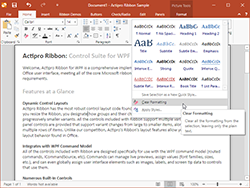 Actipro Ribbon is a control suite that implements an Office-like user interface and meets all of the Microsoft licensing requirements for ribbon UIs. Powerful features like automated layout resizing, galleries with live preview, QAT customization, color pickers, contextual tab groups, themes, WPF command model integration, key tips and screen tips are just some of the amazing features you'll find.
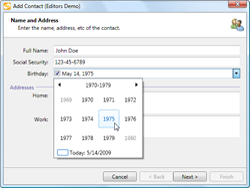 Actipro Editors is a suite of controls, including several parts-based editors and a masked text control, that can be used to collect user input. The parts-based editors use individual controls, called parts, to present and modify discreet values in an associated object or objects. Several default implementations are provided, for such types as Brush, Color, DateTime, and many more, or you can build your own. The masked text control can be used to restrict user input to a predefined regular expression mask, with support for input prompts, literal completion, and custom validation. An advanced month calendar control is also provided, that supports multiple selection, easy navigation, and much more. In addition, Actipro Editors can be quickly and seemlessly integrated into both the Actipro Ribbon and Actipro PropertyGrid controls.
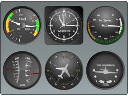 Actipro Gauge provides circular, linear, digital gauge, LED and toggle switch controls, natively written for the WPF framework. Each control is fully customizable and is packed with features. The circular and linear gauge controls include support for tick marks, labels, pointers, ranges, and much more. The digital gauge control can be used to display text using segmented or matrix characters. The LED control mimics an LED light and presents simple states. The toggle switch can be used in place of a WPF CheckBox, while providing the look and feel of a real-life switch.
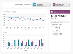 Actipro Charts is a set of charts that are designed to provide rich visualization for complex, quantitative data. Chart types include area, bar, line, pie, donut, and scatter, as well as stacked area and stacked bar. Visualization features include legends, axis ticks and labels, data point labels, grid lines and stripes, as well as customization, styling, and templating support.
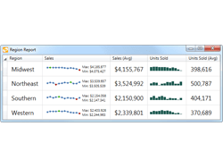 Actipro Micro Charts is a set of charts that visualize quantitative data and are designed to render clearly in compact spaces. Many chart types are supported, from basic line and bar charts to stacked area charts. The chart control includes numerous useful features such as multiple series, stacking, hot tracking, customizable palettes, and data aggregation. Common usage scenarios for micro charts are within dashboards, reports, and grids.
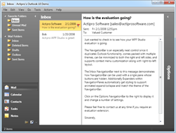 Actipro Navigation is a control suite that includes Outlook 2007 navigation bar, Windows explorer bar and breadcrumb controls, along with styles for animated Expander controls. Functionality and styles match their real-world counterparts and numerous built-in themes are provided for each control.
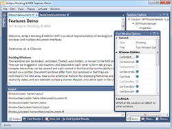 Actipro PropertyGrid brings the power of the native Windows Forms PropertyGrid to WPF applications. The PropertyGrid control can be populated using static items defined in XAML with binding support, or dynamically by leveraging TypeDescriptors, including support for ICustomTypeDescriptor. Dynamic items can be fully customized using custom factories. Several property editors are included that leverage existing WPF controls. Custom property or category (as seen in Microsoft Expression Blend) editors can be used as well, to provide a custom look or feel.
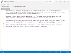 Actipro Themes ensures that a great consistent visual appearance is applied to all controls within your application, regardless of whether they are Actipro control products or native WPF controls. It is built right into the Actipro Shared Library, which means it may be freely used by any developer who has a license for one of our WPF control products.
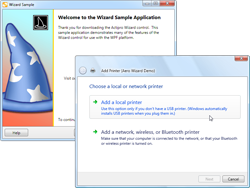 Actipro Wizard provides a powerful framework for developing wizard dialogs in WPF that follow the Aero Wizard and Wizard97 specifications. Features include multiple page types, easy page sequencing, selection change processing, full control over button states, page titles that update the containing Window, themes, templating, animated page transitions, automatic layout, and more. You can even retemplate Wizard for use in making WPF-based slide show presentations.
 Actipro Views offers custom controls and a range of panels that support fluid animations of their child elements for the WPF framework. Several built-in animations are included, which can be easily customized, or you can build your own using native WPF animations. Drop-in replacements are available for several native WPF panels, including Canvas, DockPanel, StackPanel, and WrapPanel. Views includes additional panels that use unique layout logic, not found natively in WPF. Other controls are included such as a TaskBoard for visually organizing tasks, Book for presenting a page turning interface, and InertiaScrollViewer for a smoothly animated variation of ScrollViewer.
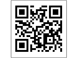 Actipro Bar Code is an easy-to-use vector-based bar code generation suite written in WPF. Add bar codes directly in your application or in any WPF context, like XPS documents. The most common symbologies, everything from Code 39 to EAN to UPC and more, are all supported. ncludes many display options like titles, values, bar heights, bar width ratios, quiet zone thickness, etc.
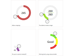 Actipro Shared Library is a useful library of miscellaneous controls and components. There are controls for easily adding reflections or resizing capabilities to any control, radial sliders and spinners, a radio button list, color pickers, animated transition presenter, and more. Components include everything from various helper classes to a recent document reference manager.
Visit our web site to download a free evaluation.


 Actipro SyntaxEditor is a powerful text editing control that is packed with features for efficient code editing, including syntax highlighting, code outlining, parsing, line numbers, block selection, IntelliPrompt UI, split views, zooming, adornments, single-line mode, bi-di support, and much more. It is built on top of our next-generation extensible text/parsing framework and has many of the same code editing features found in the Visual Studio code editor. Over 20 sample languages are included to get you started (such as C#, HTML, Javascript, and more), and optional premium add-ons with advanced functionality for editing C#, VB, Python, XML, JavaScript, and JSON are available as well. For developers who need to support editing other code languages, custom syntax languages can be developed and distributed with your applications. Actipro offers a unique parser framework with SyntaxEditor that features grammars written in C#/VB using EBNF-like notation, customizable AST construction, advanced error handling/reporting, easy code injection, a complete debugger UI, and much more.
  Actipro Docking/MDI is a complete solution for easily adding a docking tool window and/or multiple document interface to your WPF applications. Allow your end users to drag and dock windows wherever they please, and to persist their customizations. It has more options than nearly any other competitive product out there. While it supports all the types of standard layouts you find in most docking window products, it also supports some extended functionality such as: nested dock sites (a self-contained set of docking windows within another docking window), side-by-side dock sites (two or more self-contained sets of docking windows next to each other), tool window inner fill (no workspace area), tabbed and standard MDI styles, custom workspace content, total control over docking window capabilities and appearance, animated transitions, MVVM support, Prism integration, and much more.
 Actipro Ribbon is a control suite that implements an Office-like user interface and meets all of the Microsoft licensing requirements for ribbon UIs. Powerful features like automated layout resizing, galleries with live preview, QAT customization, color pickers, contextual tab groups, themes, WPF command model integration, key tips and screen tips are just some of the amazing features you'll find.
 Actipro Editors is a suite of controls, including several parts-based editors and a masked text control, that can be used to collect user input. The parts-based editors use individual controls, called parts, to present and modify discreet values in an associated object or objects. Several default implementations are provided, for such types as Brush, Color, DateTime, and many more, or you can build your own. The masked text control can be used to restrict user input to a predefined regular expression mask, with support for input prompts, literal completion, and custom validation. An advanced month calendar control is also provided, that supports multiple selection, easy navigation, and much more. In addition, Actipro Editors can be quickly and seemlessly integrated into both the Actipro Ribbon and Actipro PropertyGrid controls.
  Actipro Gauge provides circular, linear, digital gauge, LED and toggle switch controls, natively written for the WPF framework. Each control is fully customizable and is packed with features. The circular and linear gauge controls include support for tick marks, labels, pointers, ranges, and much more. The digital gauge control can be used to display text using segmented or matrix characters. The LED control mimics an LED light and presents simple states. The toggle switch can be used in place of a WPF CheckBox, while providing the look and feel of a real-life switch.
  Actipro Charts is a set of charts that are designed to provide rich visualization for complex, quantitative data. Chart types include area, bar, line, pie, donut, and scatter, as well as stacked area and stacked bar. Visualization features include legends, axis ticks and labels, data point labels, grid lines and stripes, as well as customization, styling, and templating support.
 Actipro Micro Charts is a set of charts that visualize quantitative data and are designed to render clearly in compact spaces. Many chart types are supported, from basic line and bar charts to stacked area charts. The chart control includes numerous useful features such as multiple series, stacking, hot tracking, customizable palettes, and data aggregation. Common usage scenarios for micro charts are within dashboards, reports, and grids.
 Actipro Navigation is a control suite that includes Outlook 2007 navigation bar, Windows explorer bar and breadcrumb controls, along with styles for animated Expander controls. Functionality and styles match their real-world counterparts and numerous built-in themes are provided for each control.
  Actipro PropertyGrid brings the power of the native Windows Forms PropertyGrid to WPF applications. The PropertyGrid control can be populated using static items defined in XAML with binding support, or dynamically by leveraging TypeDescriptors, including support for ICustomTypeDescriptor. Dynamic items can be fully customized using custom factories. Several property editors are included that leverage existing WPF controls. Custom property or category (as seen in Microsoft Expression Blend) editors can be used as well, to provide a custom look or feel.
  Actipro Themes ensures that a great consistent visual appearance is applied to all controls within your application, regardless of whether they are Actipro control products or native WPF controls. It is built right into the Actipro Shared Library, which means it may be freely used by any developer who has a license for one of our WPF control products.
 Actipro Wizard provides a powerful framework for developing wizard dialogs in WPF that follow the Aero Wizard and Wizard97 specifications. Features include multiple page types, easy page sequencing, selection change processing, full control over button states, page titles that update the containing Window, themes, templating, animated page transitions, automatic layout, and more. You can even retemplate Wizard for use in making WPF-based slide show presentations.
 Actipro Views offers custom controls and a range of panels that support fluid animations of their child elements for the WPF framework. Several built-in animations are included, which can be easily customized, or you can build your own using native WPF animations. Drop-in replacements are available for several native WPF panels, including Canvas, DockPanel, StackPanel, and WrapPanel. Views includes additional panels that use unique layout logic, not found natively in WPF. Other controls are included such as a TaskBoard for visually organizing tasks, Book for presenting a page turning interface, and InertiaScrollViewer for a smoothly animated variation of ScrollViewer.
 Actipro Bar Code is an easy-to-use vector-based bar code generation suite written in WPF. Add bar codes directly in your application or in any WPF context, like XPS documents. The most common symbologies, everything from Code 39 to EAN to UPC and more, are all supported. ncludes many display options like titles, values, bar heights, bar width ratios, quiet zone thickness, etc.
 Actipro Shared Library is a useful library of miscellaneous controls and components. There are controls for easily adding reflections or resizing capabilities to any control, radial sliders and spinners, a radio button list, color pickers, animated transition presenter, and more. Components include everything from various helper classes to a recent document reference manager.