Actipro Themes for WPFActipro Themes ensures that a great consistent visual appearance is applied to all controls within your application, regardless of whether they are Actipro control products or native WPF controls. |
Professionally-Designed Themes for Your Whole AppActipro Themes ensures that a great consistent visual appearance is applied to all controls within your application, regardless of whether they are Actipro control products or native WPF controls. It is built right into the Actipro Shared Library and thus is free to use for any Actipro WPF control customers. Native ControlsActipro Themes includes styles and templates for all native WPF controls that have been given a more modernized appearance, and mesh perfectly with Actipro's custom control products. Visual ConsistencyActipro Themes uses the same common asset (brush, thickness, etc.) pool for its native WPF control styles and custom control styles. Thus no matter which native or Actipro controls you use together, the appearance will consistently look great. 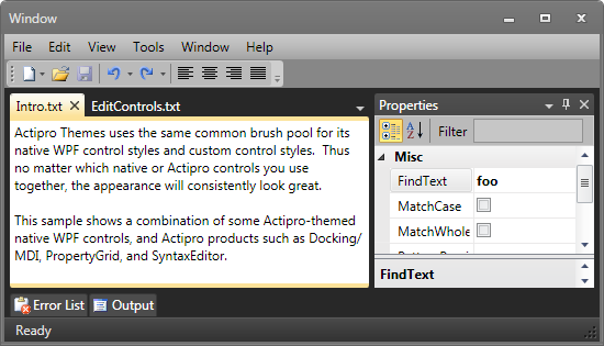 An Office black themed application that uses Actipro Themes for both native and Actipro controls The screenshot above shows a combination of some Actipro-themed native WPF controls, and Actipro products such as Docking/MDI and PropertyGrid. Notice how everything has an attractive styling that meshes well together. Enhanced Styles and Templates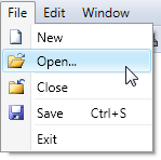 In most cases such as scrollbars and buttons, we’ve re-created but kept the default control appearance for each system theme. However in some other cases, such as with menus, toolbars, and list highlights we’ve reimagined their appearance with more modernized designs. You've never seen WPF's native controls look so good. Office ThemesComplete themes for each of the three official Office color schemes are included with Actipro Themes and provide you with the option to easily make your own applications look just like an Office application. 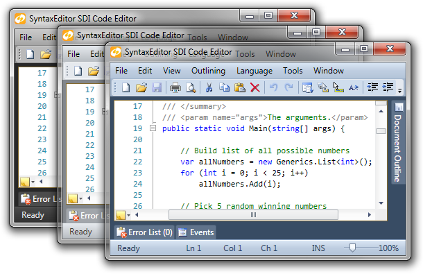 Samples of the Office themes UsageActipro's styles/templates for native WPF controls are not applied by default In this scenario, we've designed our styles for each native control to be usable via a simple resource key reference. This allows you to pick and choose which native controls should receive our enhanced theming. Hovever most developers will want to activate app-wide usage of the native WPF control styles/templates instead, via a single property setting on our theme manager. ArchitectureActipro's theme architecture is designed to easily support customizable application-wide themes that provide a modern user interface appearance, with a consistent look throughout. Basically, we make your application look great! Application-Wide ThemesThe current theme can be set via a single property on the Actipro theme manager. When changed, the entire application will shift to render in the new theme. This includes native WPF controls too, if Actipro'sthemes for native controls are being used. 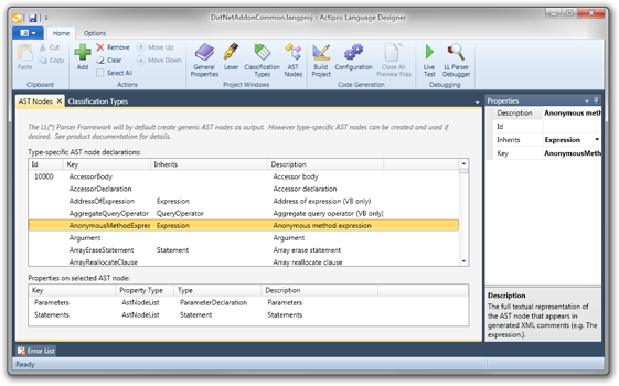 Actipro Themes can be applied to your entire application to give it a stunning appearance Metro-Style WindowActipro Themes includes a special class that is capable of rendering a WPF Window in a Metro style, similar to Visual Studio and Office. 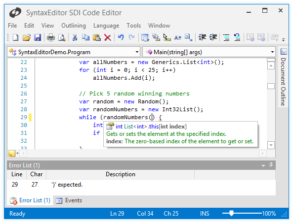 A regular WPF window with the Metro theme and window chrome applied to give it a modern UI appearance The window uses a completely custom chrome to render its non-client area. Custom-sized icons can be used and the border around the window uses a semi-transparent glow effect. The window fully supports Aero snap, and is resizable by dragging the glow effect areas. Common Asset PoolActipro Themes consolidates all brush, thickness, etc. assets for a theme into a single place called the common asset pool. This asset pool contains over 800 distinct asset resources for each theme supported by Actipro Themes, everything from the background of a menu item in hover state to the padding thickness for a button. 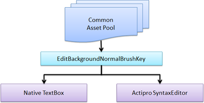 A diagram showing how the same brush from the common asset pool is used by the styles for both a native TextBox and an Actipro SyntaxEditor All of the Actipro control product styles/templates as well as Actipro's native WPF control styles/templates use the same assets, meaning there is visual consistency in sizes, colors, etc. when controls appear next to each other. Reusing AssetsThe hundreds of assets in the common asset pool are designed to be reusable in your applications. They can all be accessed with a simple resource key reference. 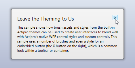 A demonstration of reusing various container and workspace brush assets, as well as a pre-defined style for embedded buttons The pool define several additional helpful brush assets in each theme for things like container and workspace backgrounds. There are multiple variations of each (light, medium, dark). You can choose which to use for various scenarios but regardless of which one you choose, everything will look great with the rest of the theme. Several styles for native controls are also included, allowing the X button in the screenshot above to easily render similar to a standard toolbar button. Redefining AssetsIt’s easy to redefine individual assets if you don’t like the pre-defined defaults. There is also a built-in simple mechanism by which you can redefine assets only for specific themes so that if you only wanted to modify a particular asset for Office themes, you could do so. Either way, these redefined assets can flow into all Actipro and native controls in your application. Browsing AssetsA Theme Browser utility is included that allows you to view all the assets defined for a theme, and then optionally copy the resource key reference for usage in your application. 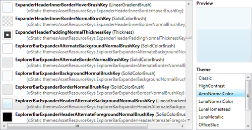 Tinting ThemesEach of the hundreds of brush assets for each theme have been categorized into numerous tint groups. Further, the various tint groups have been organized into several pre-defined tint group sets. With just several lines of code, an entire theme can be tinted towards multiple colors. For instance, the main set of brushes can go towards one color, while state-related (hover, pressed, etc.) brushes can be tinted towards another. If you are using Ribbon, you can also tint the application button towards another color in case you don't wish it to be its default blue. |

