Actipro Shared Library for WPFIncludes WPF date/time picker, calendar, color picker, animated
transition presenter, reflection and resizing controls, along with many
other useful classes for WPF development. |


The Actipro WPF Shared Library is a common control library referenced by all of our WPF .NET controls. It contains a number of very useful controls and components that can be used in your projects. The Shared Library is included free with any of our WPF control products. ControlsThe Actipro WPF Shared Library contains several controls that can enhance your application, everything from popup buttons to glass windows. AnimatedExpanderAnimatedExpander is a regular Expander that provides optional animated expansion functionality. The animation consists of crossfade and slide behavior. It even has options for auto-expanding/collapsing on focus changes and auto-focusing the child content when it is expanded. AnimatedProgressBarAnimatedProgressBar includes all the features of the native WPF ProgressBar, plus the following features: support for multiple states, smooth animation of value changes, and support for a continuous or segmented indicator. 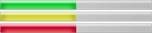 The AnimatedProgressBar control using the Aero theme in the three possible states, Normal, Paused, and Error CustomDrawElementThe CustomDrawElement class inherits FrameworkElement and provides a CustomDraw event. By handling this event, you can draw the content of the element as if you had created a subclass of FrameworkElement and overrode the OnRender method. This element is useful for placement in item templates where you may wish to custom draw items in an event handler. DropShadowChromeDropShadowChrome can be used to add a drop-shadow or subtle out glow to its content, all without the use of shader effects. There are several options available, including the ability to customize the shadow color. 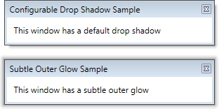 The DropShadowChrome control showing a drop shadow and outer glow GlassWindowThe GlassWindow control is a Window that allows the Aero glass effects to be quickly and easily extended into the client area of the window. 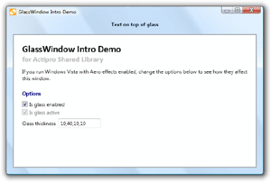 A GlassWindow with Aero glass extended into the client area of the window PixelSnapperA common problem in WPF is that images and borders can become very blurry when they are positioned on non-pixel boundaries. This makes the application appear to be poorly designed to end users even though technically, the developer did nothing wrong. This scenario can even happen when SnapsToDevicePixels is true! WPF 4 introduced the UseLayoutRounding property, which can be used to correct this issue. But this is not an option for users that have not migrated to WPF 4 yet.  A demonstration of the differences between using and not using PixelSnapper The PixelSnapper decorator helps prevent this issue by snapping the measurement of its child content to integer values, thereby preventing blurry images and borders that may appear after it. PopupButtonPopupButton functions like a normal Button, but also supports showing a ContextMenu or custom content in a Popup. The PopupButton has four display modes: split, merged, button-only, and popup-only.  The PopupButton control showing a resizable popup It can be configured to not show a border or background when it is inactive, which can be more visually appealing when used in a grid or list. RadioButtonListThe RadioButtonList control directly inherits ListBox and changes the template of items to look like radio buttons.  The RadioButtonList control bounds to the Dock enumeration ReflectionContentControlThe ReflectionContentControl is a regular ContentControl however it also renders a reflection effect of the content below the actual content. This reflection effect has become quite popular in recent user interfaces.  The ReflectionContentControl control providing reflection effects on the Actipro logo You have total control over the size, distance and visual characteristics of the reflection. You can even skew the reflection to an angle. A reflection effect like what is provided in this control can be implemented from scratch in XAML however it takes many lines of code to do so. Instead, just wrap your content with a ReflectionContentControl and you're done. The content and reflection can be animated to produce a nice bouncing effect. Our Sample Browser includes an example of how to do this. ResizableContentControlThe ResizableContentControl is a regular ContentControl that contains a gripper on one of its sides or corners. When it is dragged by the mouse, the content is resized. The gripper may be double-clicked to reset its size back to the content's desired size.  The ResizableContentControl control adding a gripper that allows for horizontal and vertical resizing Resizing direction options are None, Horizontal, Vertical, or Both. The functionality provided by this control is especially useful within popups, such as those used in our PopupButton. You can provide a custom template for the ResizableContentControl to position the gripper in a custom location if the default options don't meet your needs. You also can make a custom Style for the Thumb control (gripper) that it contains to draw the gripper however you like. ZeroSizeContentControlThe ZeroSizeContentControl is a regular ContentControl that can return a zero width or height during its measuring pass. This is useful in scenarios where the content should take up some space but you don't want the WPF layout routines to consider the space that it will take up during its measuring pass. Color SelectionThe color selection controls that mimic the visual color selection found in products like Adobe Photoshop and Microsoft Expression Blend. SpectrumColorPickerA color hue spectrum-based color picker that makes it very easy for end-users to make color selections. The control can display initial and selected colors for easy reference. 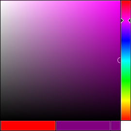 The SpectrumColorPicker with a purple color selected The SpectrumSlice and SpectrumSlider controls used by the SpectrumColorPicker can also be used independently. The former allows the end-user to adjust the saturation/brightness, while the latter allows the hue to be adjusted. ColorComponentSliderThe ColorComponentSlider can be used to display and alter a single component (alpha, red, green, or blue) of a color. 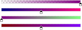 A ColorComponentSlider for each component (ARGB) of the color purple Multiple instances of ColorComponentSlider can be bound to the selected color of a SpectrumColorPicker to give the end-user more ability to fine tune their color selection. GradientBrushSliderThe GradientBrushSlider can be used to interactively alter the stop of a linear or radial brush. The thumbs on the slider display the color associated with the stop for easy reference.  A GradientBrushSlider bound to a gradient brush with 3 stops (red, green, and blue) The offset of the stops can be easily adjusted by dragging the associated thumb and stops can be quickly added or removed using the mouse. Any of the thumbs can be selected and bound to an instance of our SpectrumColorPicker, allowing the user to adjust the color of the stop as well. Transition EffectsThe Actipro WPF Shared Library contains a number of animated transition controls and effects are available for use in your application to give it some extra flair. The transition classes are extensible and provide the foundation for page transitions in our Wizard for WPF product. TransitionPresenter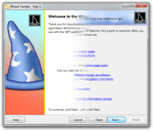 Wizard for WPF using the transition presenter with a bar wipe transition to switch between pages Built-in Transition EffectsCustom Transition EffectsCustom transitions can easily be created programmatically or via XAML. Shader Transition EffectsIn addition to the built-in transition effects, transitions from the WPF Pixel Shader Effects Library can also be easily integrated. This list shows the shader transitions:
|