Actipro Micro Charts for WinRT/XAMLActipro Micro Charts is a set of charts that visualize quantitative data and are designed to render clearly in compact spaces within the new breed of Windows 8 apps. |

Charts Optimized for Dashboards, Reports, and GridsActipro Micro Charts is a set of charts that visualize quantitative data and are designed to render clearly in compact spaces within the new breed of Windows 8 apps. Many chart types are supported, from basic line and bar charts to stacked area charts. The chart control includes numerous useful features such as multiple series, stacking, hot tracking, customizable palettes, and data aggregation. Common usage scenarios for micro charts are within dashboards, reports, and grids.
Chart TypesA large variety of chart types are included in Micro Charts. Chart types can be combined in many interesting and visually appealing ways. Series-Based Chart TypesLine Charts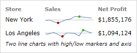 A line chart, also commonly known as a sparkline, renders quantitative data as a series of points connected by line segments. Lines can be straight, curved, or stepped. Lines falling below a baseline value can have an alternate style applied. Markers can optionally be displayed and various highlight effects can be applied to certain marker values (such as first/last, high/low, negative, etc.). Scatter Charts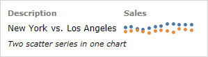 Scatter charts render data points where each point is represented by a marker. Similar to line charts, the markers can have various highlight effects applied. Markers can use numerous built-in shapes or can be set to use custom shapes. Area Charts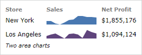 An area chart is a derivative of a line chart, where the area between the line and axis is filled in. As with line charts, areas can also be rendered using straight, curved, or stepped lines. Areas falling below a baseline value can have an alternate style applied. Stacked Variant A stacked area chart combines multiple area series to represent cumulative totals. 100% Stacked VariantA 100% stacked area chart ensures that the combined areas fill the chart, and that each area is representative of its percentage of the cumulative total. Bar Charts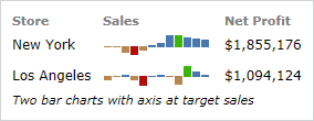 A bar chart displays rectangular bars with lengths proportional to the values they represent. Bar spacing can be set and the bars can be changed to render in a vertical orientation instead. High/low and negative bar highlight effects are available. Stacked VariantA stacked bar chart combines multiple bar series to represent cumulative totals. 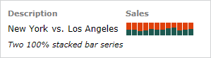 100% Stacked VariantA 100% stacked bar chart ensures that the combined bars fill the chart, and that each area is representative of its percentage of the cumulative total. Win/Loss Charts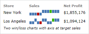 A win/loss chart is a special kind of bar chart where any positive value renders as a full-height upward bar, any negative value renders as a full-height downward bar, and zero values render as a line in the middle. This type of chart provides an absolute view of the data. Combining Chart Types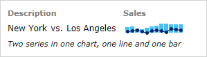 A micro chart can contain multiple series, even series of differing types. For instance a line series can be plotted on top of a bar series. The combination of multiple kinds of series can help make data visualization even more attractive. Box PlotsA box plot visualizes key statistical measures for a data set, such as the median, mean and quartile values. 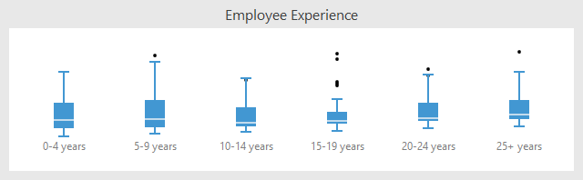 Multiple box plots showing various statistical measures of data, including outliers Bullet GraphsA bullet graph is a special kind of bar chart used to display a single value in a context of one or more related values. 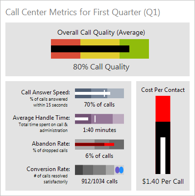 Multiple bullet graph controls, showing a variety of appearance customization options Candlestick ChartsCandlestick charts are designed to visualize a change in value over an interval of time, and as such are excellent at showing price movements in stocks, currency values, or securities such as bonds. 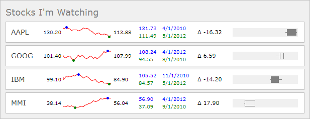 Candlestick charts can show prices for a time period, including open/close and high/low Heat MapsA heat map is a type of chart that displays a data value matrix represented through markers of varying colors and/or sizes. The gradient used to determine the color to render for any given value is fully customizable. 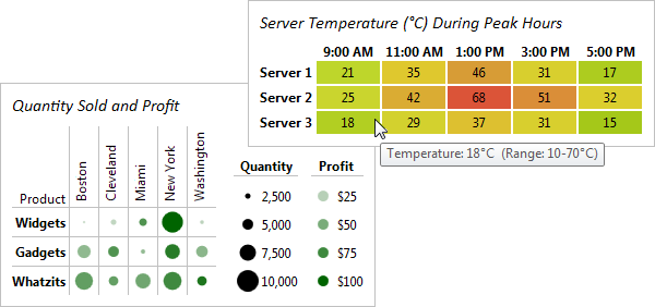 Two examples of heat maps, one that only changes color and one that changes both marker color and size FeaturesMicro Charts has an enormous number of data-related and appearance features. Data SourcesSpecifying ItemsEach series in a chart control can be bound to a separate data source, or to different properties on the same data source. The ItemsSource property on each series can be set to any collection of objects, including custom objects, as long as the collection implements IEnumerable. There are two types of collections that can be used: simple (such as as list of Double) and complex (such as a list of custom objects). For simple collections, the actual value in the collection is used as the primary value (which is typically the Y value) and the index in the collection is used as the secondary value (which is typically the X value). For complex collections, the primary value can be obtained from any property on the custom object by indicating the target property name. The secondary value defaults to the index in the collection, but a property name can also be specified so that it comes from a property on the custom object. Data AggregationIn order to increase rendering performance, the chart control automatically determines the optimal number of data points to display based on the size of the control. Options are included for whether aggregation is enabled, the degree of aggregation to apply, and the method by which to aggregate groups of data (average, first, min, etc.). 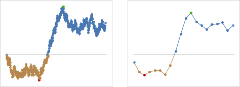 A line series with markers visible that compares no aggregation vs. 10% aggregation Appearance FeaturesSeries Style SelectorOne of the best features of Micro Charts is the enormous number of properties that allow complete control over the styles applied to the various elements used to render each series in a chart. Want to change how negative areas or high point markers appear? No problem! PalettesOver 10 pre-defined color palettes are included with Micro Charts. These palettes provide the colors to use in a chart's series and are especially useful when multiple series are in a chart. There are a couple options for how each series will select a color from the palette, and in cases where there are more series than palette colors defined, additional related color shades can be automatically generated for the series. Palettes with custom colors are easily defined as well. 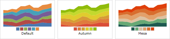 Three of the many built-in palette options BaselineThe customizable baseline value determines what the chart considers "positive" and "negative" values. Any value greater than or equal to the baseline value is considered positive, and any value less than the baseline value is considered negative. Alternate styles can then be applied to negative values to make them visually apparent. Several examples of visible baselines The baseline can optionally be displayed, and its appearance fully customized. Hot TrackingHot tracking displays a customizable tooltip which contains the values of the data point closest to the end-user's mouse cursor. The series data rendered in the tooltip is easily formatted via a format string, or the entire appearance can be modified with a custom data template. Hot tracking tooltips demonstrating customized formats MarkersMarkers are small bullets that mark the location of data points in a chart. Options are included for showing all or just certain kinds of markers (first, last, high, low, negative, etc.). Markers can also optionally be displayed using different styles based on their kind. Multiple built-in marker kinds are included. Several examples of markers RangesSpecific value ranges of the chart can be highlighted to convey additional information to the end-user. The ranges can be customized to take on any appearance and can render both horizontally or vertically. 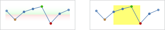 A couple gradient vertical ranges, and a solid horizontal range |
